11.1 Pie charts
Figure 11.1a shows a circular pie. If we divide the pie into four equal portions, as shown in Figure 11.1b, then each portion is or 25% of the whole pie.
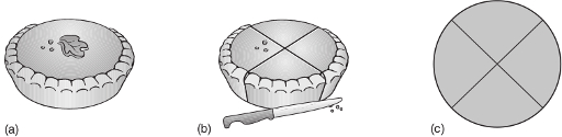
If we divide the pie into five equal portions, what percentage of the whole pie would each portion represent?
Each portion would represent , that is 20% of the whole pie.
Pie charts give a quick visual impression of the proportions that something is divided into; remember that the whole pie represents 100%.
We can present the data in Table 11.1 by a pie chart, as shown in Figure 11.2. Here, the sizes of the portions reflect the percentage composition of the Earth’s atmosphere at sea-level. Thus the whole pie (100%) represents the atmosphere, the largest segment (77.6%) represents the proportion of nitrogen, the next largest segment (20.9%) represents the proportion of oxygen, and so on.
| Component | Proportion/% of total |
|---|---|
| nitrogen | 77.6 |
| oxygen | 20.9 |
| argon | 0.93 |
| water (average value) | 0.5 |
| carbon dioxide | 3.6 10-2 |
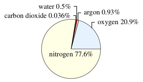
Note that pie charts can be drawn in a three-dimensional style, as shown in Figure 11.3. The two-dimensional representation in Figure 11.2 shows the proportions more accurately, though the three-dimensional representation is frequently used. In an accurate pie chart, the angle at the centre of the pie chart should correspond to the proportion of the component in question. Angles are measured in degrees (represented by the symbol °) and there are 360° in a circle (see Figure 11.4). So, in Figure 11.1c, where each of the segments represents of the whole, the angle at the centre of each segment is .

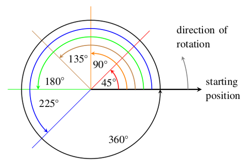
Question 11.1
What angle would you need to use for a segment of a pie chart representing 10% of the whole?
10% () of 360° is 36° so the required angle is 36°.