11.3 Histograms
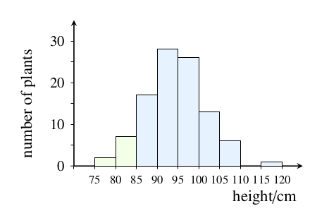
A histogram is similar to a bar chart in that numbers or percentages are again commonly plotted vertically, but on a histogram the horizontal axis is used to represent a continuously variable quantity such as height, mass or time. The purpose of a histogram is to show how the data are distributed into groups across a continuous range. Figure 11.7 shows a histogram which presents the results of measurements taken of the height of 100 irises. In principle, a plant selected at random could be of any height. Of those measured, a few specimens are particularly tall and a few are particularly short, but the majority are of intermediate height; this is typical of natural variation in populations. Note that on a histogram (as compared with a bar chart) the columns touch, because the entire range of values is represented. For the same reason, the height interval of 110 cm to 115 cm is included, even though there are no irises of this height. Finally, note that the height intervals are of equal size. This is common practice, although there are ways of constructing histograms using unequal intervals.
Question 11.2
Approximately how many of the irises in the field trials were less than 85 cm tall?
We need to combine data from two of the height intervals to obtain the answer. Reading from the vertical scale (note that there are divisions marked for every 5 plants) there are about 2 irises between 75 cm and 80 cm in height, and there are about 7 irises between 80 cm and 85 cm in height, so altogether there are approximately 9 irises of less than 85 cm.