12.3 Plotting a graph
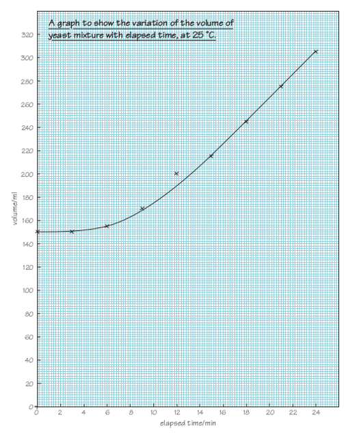
This discussion of how to plot a graph is based on the data shown in Table 12.1, which comes from an experiment in which the volume of a mixture of yeast, sugar and water at 25 °C was observed to increase with time. When plotting a graph of these results, or any similar data, you should work through the following stages.
| Elapsed time/min | Volume/ml |
|---|---|
| 0 | 150 |
| 3 | 150 |
| 6 | 155 |
| 9 | 170 |
| 12 | 200 |
| 15 | 215 |
| 18 | 245 |
| 21 | 275 |
| 24 | 305 |
Stage 1 Choose your axes
The first thing to decide is which of the two sets of readings (elapsed time and volume in this case) should go on which axis. In this experiment, the time intervals at which readings were to be taken had been decided in advance, before the investigation began, i.e. they were fixed. Such fixed information – termed the independent variable – is conventionally plotted on the horizontal axis, frequently referred to as the ‘x-axis’. The volume readings depend on the time at which the reading was taken and, consequently, these are termed the dependent variable. Such quantities, which depend on other variables, are plotted on the vertical axis, frequently referred to as the ‘y-axis’.
Stage 2 Choose your scale
Having decided that elapsed time should go on the horizontal axis and volume should go on the vertical axis, next you need to decide what scale to use on each axis. You should aim to use as much of the graph paper as possible (so that the graph is as large as possible, which makes it easier to read the values) while avoiding scales that are awkward to read and thus potentially confusing.
Look at the data in Table 12.1. What ranges of values need to be represented horizontally and vertically?
The horizontal axis needs to include times from 0 to 24 minutes. The vertical axis needs to include volumes from 0 to 305 ml (it would also be acceptable to plot a graph just showing volumes from 150 to 305 ml).
Assume your graph paper covers 13 cm in the direction you have chosen for the horizontal axis. You could use each 1 cm to represent 2 minutes, as shown in Figure 12.8.
Assume your graph paper covers 17 cm in the direction you have chosen for the vertical axis. What scale would be appropriate to include volumes of 0 to 305 ml?
One possibility is to use each 1 cm on the vertical axis to represent 20 ml, as shown in Figure 12.9, so each small 1 mm square represents 2 ml.
 Figure 12.9 Choosing the scale for the vertical (volume) axis.
In this example, both scales start from zero (the origin of the graph) but this is not essential – the scale for the vertical axis could equally well start at, say, 140 ml, which would make better use of the graph paper.
You should aim to use as much of the graph paper as possible when plotting a graph. However, sometimes it is not possible to do this without using a different scale that is difficult to use. For example, the value for a volume of 215 ml at 15 minutes might fall between the labelled divisions in an awkward way, so it is best to aim for straightforward scales where the plot uses at least half the graph paper. In Figures 12.8 and 12.9, 1 cm represents 2 minutes on the horizontal scale and 1 cm represents 20 ml on the vertical scale, respectively. In general terms, multiples of 2, 5 and 10 are usually satisfactory; scales involving multiples of 3 are to be avoided!
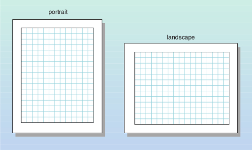
One final point relates to the orientation of the graph paper. Sometimes simply rotating the graph paper from portrait to landscape can make it much easier to find suitable scales, as shown in Figure 12.10.
Stage 3 Label your graph
For a graph to convey meaning to other people, it must be completely labelled. Each axis should be labelled with the quantity it represents (elapsed time or volume in this case), followed by a forward slash (/), followed by the units (min or ml). So the vertical axis of the graph should be labelled ‘volume/ml’ and the horizontal axis should be labelled ‘elapsed time/min’.
In addition to having labelled axes, the graph itself should have a title. This should include information about the content of the graph: for example, it needs to be clear that the graph illustrates the variation of the volume of the yeast mixture with elapsed time. The title should also include some information about the temperature.
What would be a suitable title for the graph being plotted on this occasion?
Here is one suggestion: ‘Graph showing the variation of the volume of yeast mixture with elapsed time, at 25 °C’.
Stage 4 Plot the points
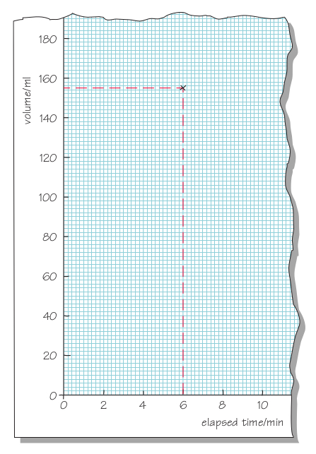
You are now ready to plot the points. Follow a procedure similar to the one you used to read the value from a graph in Section 12.1. So, to plot the point for which the elapsed time is 6 minutes, you should draw a real or imaginary line up from the horizontal axis for an elapsed time of 6 minutes (Figure 12.11). Similarly, since the volume of mixture was measured as 155 ml at this time, you should draw a real or imaginary line across from the vertical axis for a volume of 155 ml. Your point should be at exactly the place where the two lines meet.
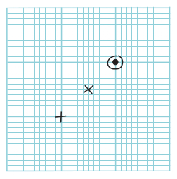
Several different conventions are used to indicate points on a graph, , + and being the best (Figure 12.12), but it does not matter which one you use. These marks make it clear exactly where the centre of the point is: for and + it is where the two lines cross, and for it is at the dot in the centre of the circle. The circle drawn around the dot simply makes the point clearer – it can be very difficult to see just a dot when you come to draw the curve. It also makes it difficult for other people to see where you have positioned the point.
It is very easy to make a mistake when plotting points and drawing a curve through the points, so you are advised to use a pencil rather than a pen for these tasks – and to have an eraser ready. There are computer programs which will plot points for you and draw the curve but, unless there is a reason why you cannot plot graphs by hand, you should make sure that you know how to do this.
Stage 5 Draw a curve through the points
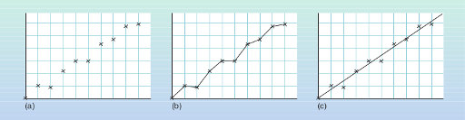
When you have plotted all of the points on the graph, all that remains to be done is to draw a curve that best represents the data. Before doing this, hold the graph paper at arm’s length and look at the points. Most of the graphs that you draw will represent a general trend, for example the way in which a child’s height increases with age, or a yeast mixture increases in volume as time passes. These are both continuous processes: you would not expect the child’s height to increase one month and then decrease the following month. However, with real experimental data, uncertainties in measurements sometimes lead to readings which vary in a rather erratic way (Figure 12.13). Provided you are sure that your graph represents a general trend (which is usually the case), you need to draw the smooth curve which best represents the data, not a series of short lines joining the individual points.
If the points appear to represent a uniform variation, the ‘curve’ which best represents them will be a straight line, as in Figure 12.13c. This is known as the best-fit line.
If common sense tells you that the line should go through the origin, the line can be drawn in this way. (For example, if it represents the variation of mass with volume for a series of aluminium blocks, when there is no volume it is reasonable to assume that there is no mass either.) Apart from this, the line should be drawn so that there is approximately the same number of points above the line as below it, at approximately similar distances from the line. Note that, generally, it is not necessary for any of the points to lie right on the best-fit line.
If it seems that the data cannot be represented by a straight line, a smooth best-fit curve should be drawn. This is a more difficult skill, but the same general principles can be applied, leading to a curve which is the best representation of the data as a whole.
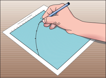
Many people find it easiest to draw a smooth curve if they place the graph so that their hand is inside the curve (Figure 12.14).
The completed graph for the data in Table 12.1 is shown in Figure 12.15, with a smooth curve drawn to represent the points. Note the point with an elapsed time of 12 minutes and a volume of 200 ml. This point does not seem to follow the general trend; it is probably the result of a measurement error during the experiment. It is best to ignore such points when drawing best-fit curves.