12.4 More complicated graphs
12.4.1 Multiple lines and area charts
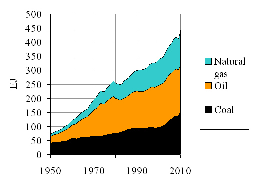
Graphs may show multiple lines, allowing a comparison between different categories. The different lines may be identified by using different colours or shaped markers set along the lines. The colours or marker shapes are shown in a legend next to the chart. For example Figure 12.16 shows world fossil fuel energy consumption for three different fuels.
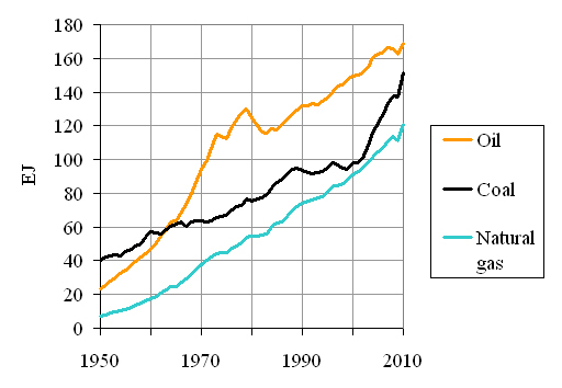
World consumption of oil has been highly dependent on its price. The world price of oil shot up by a factor of ten in only eight years as a result of a war in the Middle East and a later revolution in Iran. Can you spot the effects of these and say roughly when they occurred?
Oil consumption was increasing steeply until 1972, but by 1980 was falling. Something serious obviously happened between these two dates.
We may wish to show the same data to illustrate how each fuel contributes to the total world fossil fuel consumption. Figure 12.17 shows the data as an area chart. In this case the world coal consumption is shown in black at the bottom. The oil consumption is added above, but its consumption for any particular year is only the height of the yellow part of the chart. The natural gas consumption is again added on top. An area chart is a good way of showing a total and its components but it is less easy to appreciate changes in one particular component.