So my exams are over for the year and this is my first weekend of no OU work. Real nice. The exams went well – I hope – no real problems except I was horrified to see a question in the M359 (Relational Databases) exam regarding views and inserting records into views. Ooof! And I was dismayed that the invigilators spent all their time looking down with their heads buried in paper work. It took an absolute age to get their attention for extra paper and string. Not good...
Spirits remain high though so I thought I’d squirt out a positive note about the OU (having knocked out a couple of negatives ones). It goes way back to my first OU year and M150 (Computing and Information).
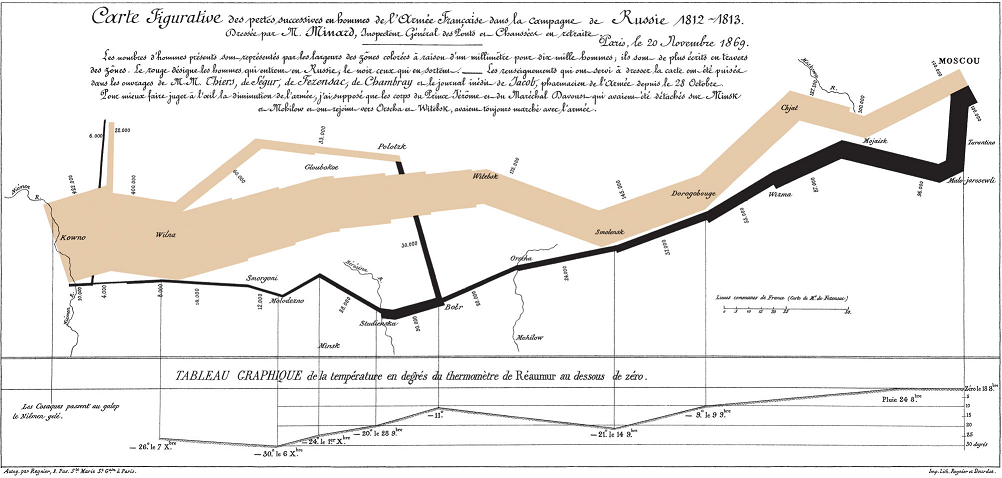
To illustrate the importance of symbolic representations and how complex data can be elegantly presented the course introduced a map created by Charles Joseph Minard. The map charts Napoleon’s less than successful 1812 wrangle with Russia. The map is notable because it shows a wealth of information including the army’s direction, location, density, size and the outside temperature during the retreat.

Any developer who has had to create a user interface for some prickly information will know what a battle it is to simplify complex data input or to display complex business information. Especially if you’re unlucky in MI building a report with time on the Y axis, cholesterol level on the X axis, grouped by animal type and hair colour for the first pancake day of each decade etc... Every time I encounter a tricky bit of UI design I always think of this map and its ambition. Simply, whatever design I end up with I always know that Minard would have done it with less controls, less labels and exposed more information.
So thanks to the OU for showing us this map.