OU blog

Personal Blogs

Design Museum

Xerte follow up - software that promises a good deal but doesn't always deliver

Visible to anyone in the world
Edited by Jonathan Vernon, Tuesday, 27 Nov 2012, 07:26

My background is corporate communications where our projects are produced by a team - in advertising an art director works with a copywriter, in web design we added a programmer and for e-learning we added a learning designer and subject matter expert - in education the teacher or tutor is this subject matter expert and at the most senior level is expected to do it all themselves.

I don't get this at all - we know that people have different strengths and weaknesses. There is a particular divide betgween those who can write and those who can visualise, between the author and illustrator, the copywriter and art director.

The result from too many teachers and tutors is either little online presence or a blog, sometimes a power point presentation.

I find resistance and unwillingness repeatedly and have sympathy because they should not be expected to do much other than be brilliant exponents of their subject.

They are rarely good at visuslisation or narrative, have had no training on use of slides so pack 'em full of words or irrelevant clip art and by habit write blog posts that are too long, too dense and too late. They hate to let go of their idea - it is theirs and no one else may touch or influence their brilliant conceptions.

I've given Xerte a go.

I have many users in mind for the content that only it can deliver - but in my case I know when I am stumped and if it feels like I'm having to conjugate verbs in Latin I'll go and find someone who can make it sing.

On my list of tools that promise a lot but fail, Xerte may escape this category for now, I inlcude Elluminate, Compendium, MyStuff and Cloudworks and Social Learn. They all have something in common.

I'll give Xerte another go as I see what I can deliver in terms of access. But as an e-learning platform it is slide show.

Clive Shepherd

On the pros and cons of being both the subject matter expert and the learning designer

http://clive-shepherd.blogspot.co.uk/2012/10/do-instructional-designers-need-to-know.html


Permalink Add your comment
Share post
Design Museum

Reflections on e-learning - September 2010 to September 2012

Visible to anyone in the world
Edited by Jonathan Vernon, Saturday, 22 Sept 2012, 06:07

New Software

Things I was starting to get my head around in 2010:

  • Skype (a phone call for free)
  • Delicious (don't get it, yet ... or need it?)
  • Outlook (Never used it 'til last week not being a PC person)
  • Google Docs (Up there and loading docs. Hear good things from all)
  • Compendium (Created a map for an e-tivity based on my H807 ECA. Populating this to share content with a producer).
  • Zoho (signed in but not sure)
  • Mahara (But Google does it for free and has seamless interplay with all your other favourite Google tools)
  • Pebblepad (Mixed reviews)
  • Adobe Share (Been using Adobe products forever so this should get my attention)
  • Internet Explorer (new to this Mac user!)
  • Dropbox (I've always been a box person)

Where I stand in 2012:

  • Skype (use often to friends globally, notably for a job interview with Getty Images, interviewing Dr about Qstream and on an iPad passing my brother and my nephews around a room of cousins between the UK and South Africa at Christmas)
  • Delicious (Still struggle, not least as I have more than one account and because I don't see the need to bookmark anything as to Google is quicker and with cookies enabled takes me into my choices)
  • Outlook (formerly trained at the OU on Outlook - training on a 2010 version while we had a 2011 in our office. Still hate it having been raised on all things Mac. Outlook has the look, feel and functionality of Microsoft DOS c 1992)
  • Google Docs (Use as a store to aggregate content, sometimes to share, wiki-like with fellow OU students who are more ofay with the technology than I am)
  • Compendium (Can't stand it - prefer a variety of free iPad Apps, including SimpleMinds, Bubl.us and several others).
  • Zoho (signed in and gave up)
  • Mahara (signed in a gave up)
  • Pebblepad (signed in and gave up - initially making do with the OU's MyStuff, which has been discontinued. Find it easier to aggregate content, while I'm an OU Student in my OU Blog, then cut and paste into one or more WordPress blogs - I had 16 at the last count)
  • Adobe Share (Don't have the budgets, may be of interest once back in a commercial office)
  • Internet Explorer (Never. Over the period have slowly migrated away from Firefox, like family, use Google Chrome almost exclusively)
  • Dropbox (Not really)
  • PicasaWeb - download for all images from camera, iPhone and iPad. Fix then post to some 50 albums, some with over 1000 images (the Picasa limit), pay for extra space. Uncertain or lack confidence though in degree of privacy, especially if screengrabs and other images are automatically uploaded to Google + images (same PicasaWeb account in a different format)

Where I stood in 2010 compared to 2012:

Old Software

  • Word (Yes, but far less often. I write far more often on the iPad using the AI Writer APP, emailing this to a PC to edit, or uploading into a blog to edit there)
  • Filemaker Pro (No longer. I ran it on Macs and iBooks from its inception but others don't prefering of all things the ghastly Excel). Have Bento, baby FileMaker, on the iPad.
  • AOL (still with AOL, but prefer Gmail and still thinking about changing supplier to BT or Sky)
  • Power Structure (Didn't upgrade, my iBook died and the software is on an rescued harddrive though I doubt it will work with a new operating system)
  • Final Draft (An execellent script writing tool though created for linear output)
  • Adobe Photoshop (Haven't upgraded, making do with Picasa)
  • Dreamweaver (haven't been near it, I never was a programmer type anyway, though cut my teeth in this in 2000)
  • Excell (A very reluctant user - just cannot see how this is used by some to create posters, or run a database that required large quantities of content in a cell. Filemaker Pro is better)

Blogs

  • Diaryland (Quite the thing in 1999). Locked forever. Up forever. Sometimes cut and paste. Always amusing to read posts on developments in web-based learning c. 1999
  • LiveJournal (Preferred by 2002). A stepping stone out of Diaryland.
  • WordPress (Expert) Over a dozen blogs, most notably Mymindbursts, though no longer a diary or journal, but a niche journal largely about e-learning, with subject intersts including creative writing, philosophy, tertiary education, history (First War), online and distance education, theories of education. Also blogs on swim coaching and teaching, on the Machine Gun Corps, on the trials and tribulations of a househusband (from old diaries and blogs), on various fiction themes - but also a number of Books of Condolences, in 2011 for colleagues, but very sadly in 2012 for my mother too.
  • EduBlogs (No more)
  • Blogger (No longer)
  • OuBlog (Extensively for all Masters in Open and Distance Education modules, now on my fifth and final module. Daily reflection, updates, aggregating resources, screen clips, diagrams, images, snips from forums, links to other blogs, tagging to assemble content for assignment, re-blog with re-writes to external blogs. Use it like an e-portfolio with CVs and job descriptions here too.)
  • Blipfoto (A picture a day for four or five months - until I have my iPhone to my son. I make do with an iPad and prefer a cheap phone to have kicking around in my pocket or bag ... and to avoid being online when out on the South Downs walking the dog!)

Social Networking

  • Facebook (Love hate. Great to be in touch with immediate family and trusted friends only. Got some groups going with boys I knew age 8-13 at boarding prep school. Got out of hand when a relation fell very ill and died as to the appropriateness of sharing our concerns and grief online. Inclined to disengage - do so only to find I am still there?)
  • MySpace (Never, though I am there)
  • Friends Reunited (Never since they started to charge, or since they came back)
  • Linkedin (extensive, professional use with several hundred contacts and activity in many groups. Feed blog content into Linkedin automatically, tailor some content for specific groups, particularly relating to e-learning for corporates and tertiary education)
  • Twitter (extensive, professional use. Did use TweetReach and various other tools. URLs shortened from WordPress, will use Bitl.y)

Other

  • Flickr (Used to use extensively - migrated all content to Picasa as Flickr tried to socialise the space and I found my pictures being offered for sale!)
  • Kodak Easyshare (Rescued 500 of 700 uploaded photos and migrated to Picasa before Kodak closed)
  • YouTube (Should be making extensive use of YouTube. Starting to digitise 40 hours of Oxford Undergraduate life 1982-1984. With permissions will migrate clips to the web in due course.)
  • Picasa (my favourite now, the teenagers are on Instagram and Tumnblr)
  • Ancestry.com (Covered every conceivable ancestor as far back as is possible online. Could make use of the 2011 census to track down a great aunt but not inclined to fork out anymore or to deal with spurious requests from people so off the map in terms of the family tree it is verging on trainspotting.)
  • Genes Reunited (as above. Not been near it) Of minor interest at a family funeral to figure out who were the common ancestors - both gentleman born in the 1870s it turned out!

Browsers

  • Firefox (very rarely, probably in erro)
  • AOL (winding up here for the last 18 months, should have got out long ago.)
  • GoogleChrome (Almost exclusively)
  • Internet Explorer (avoided at all costs)

What's new?

For the last 18 months extensive use of an iPad and associated Apps, so much so that it is the replacement laptop and even covers as a mobile phone as people know to email me.

Trying to do my final MAODE module on the iPad.

Proving remarkably easy to do so.

Very versatile, especially where resources can be downloaded as PDFs, even to read in Kindle version. Read from the Kindle, note take on the iPad and post online.

Books. We no longer buy them. Is a garage full of wonderful hardbacks worth anything? Glad I never bothered to put up shelves.

Magazines and newspapers. All redundant. Only kept the Guardian on Saturday to have something to line the guinea-pig hutch, when they went so did the newspaper!

TV. Rarely ever watched live. Prefer BBC iPlayer. Exception being the Olympics and Paralympics.

Pen and paper. I do. An A5 notebook and pen. Though prefer to type up notes as I go along.

Twitter Share. Reading an eBook and sharing a line or two with a note directly into Twitter. This aggregates content in an editable format and alerts 'followers' to a good read - usually on learning, education, e-learning, also on social media, story writing and the First World War. Sometimes some great out of copyright literature.


Permalink 2 comments (latest comment by Gillian Wilkinson, Friday, 21 Sept 2012, 18:04)
Share post
Design Museum

H800 wk24 Activity 3 Expressions of learning

Visible to anyone in the world
Edited by Jonathan Vernon, Tuesday, 8 Nov 2011, 22:05

Think about your own learning – the resources and tools you use, where and when it takes place.

Early mornings from 4.00am, weekends, mornings only 'til 10.00 or so.

DSC00832.JPG

Occasionally some reading in the evening.

But vicariously too, in a conversation, or going for walk, say looking at pebbles and shell washed up on the shore, or the layers of deposits in a chalk cliff.

What is your experience of being a learner?

If I'm not learning something new or building on my knowledge I am bored. I'm staggered I survived formal learning, I found the Oxford approach tedious, skipped all lectures, and relied instead on libraries and Blackwells which could between them supply every book or journal I wanted.

I failed to get far with a correspondence course on writing.

I learn best with a mixture of doing, reading/workshops and further application. I can be inspired or frustrated by my peer group. They can be a vital part of the mix, a course I did across Europe having the most refreshing mix of people.

What tools and resources do you use?

DSC01842.JPG

I'm slowly getting it all down to the iPad for its speed to the web, then grabbing and pasting into websites that I use as folders, eportfolios, writer's journal as well as open blogs. I also chuck things into my email folders to collate, aggregate or check through later.

What are your views on different technologies?

I make the time to try most things and will become temporarily hooked. Currently fixated on Linkedin, Wordpress blogs and Stumbleupon.

Likely to read most content as an eBook putting notes into iWriter. This is in stark contrast to printing everything off a year ago then filing it.

Forever grabbing screenshots or taking pics that go from Picasa to Picasa Web and then into blogs.

Can you think of examples where technology has made a significant difference to the way you learn?

When I started the MAODE I fell back on methods I had used during A' levels snd quickly filled several files.

DSC01634.JPG

A year on and I hold the iPad in my right hand and manage a kind of touchtyping with the other. I try not to rely on harddrives and memory sticks instead putting it online, increasingly as private or password protected entries in a number of blogs hat act as themes or categories.

I would worry about learning away from The OU and finding the VLE not up to scratch or being cut-off from fellow students.

Can you think of counter examples where you had a bad experience of a particular technology?

I hate Outlook and Excel.

I both instances I feel the nerd has taken over, that my mothball of a mnd is being shoe-horned into a match-box. Worse, My unregimented, freefalling, excitable mind is being containerised, my best thoughts quaterised. It disables some minds and enables the petty. These are to me like walking in crocodiles to the school dining hall; they are overly prescriptive.

I am starting to hate Word 2011 in favour of an iPad App, iWriter which is less like trying to write while dressed as a Morris Dancer and playing the Great Whurlitzer.

Interested in the potential of computers I joined an undergraduate group in 1983 but found having to learn programming was akin to sticking stamps onto envelopes with my toes.

P1090004.JPG

I used interactive DVDs successfully to learn AdobePhotoshop, FilemakerPro and Dreamweaver.

Simply a voice talking through the screen shots then getting you to do the same. The next best thing to having someone sit at your side and be your guide.

All self-paced, vital as I might prefer to do 20 intensive hours in one shot rather than nibbling at it.

What did this do to your motivation for learning?

There must be intrinsic motivation.

How did you deal with the situation?

Giving up. Which I know now was unnecessary. Thinking my mind isn't suited to a thing instead of tackling it.

Zoe%252520and%252520Toby%252520August%2525202010%252520054.jpg

Support is vital.

Some formal training, then support at your shoulder. Time to figure it out. Understanding as you get it wrong. Those expert at these things can be unsympathetic to new comers, assuming their knowledge, rather that helping or nuturing.

Had the motivation been there could I have found my own way into the technology I do wonder.

I love the intuitive, where the learning is self-directed and incremental. Anything that needs an instruction manual or behaves like the off-side rule will put me off.

I love the Sony flip. IT just does video. Like Google 'just does search'.

Excessive bells and whistles should be offered as Apps to add later rather than being offered up front.

Visualing metaphors I use to explain learning online:

It is like the letter a ...

  • A dandelion in seed (Content online)

DSC01701.JPG

  • The solar system (Social Media Networks)

Learning%252520how%252520to%252520Visualise%252520McCandless.JPG

  • Drops of ink in water (Content online)


Mycorrhizae%252520ENGESTROM%2525202007%252520SNIP%2525202%252520Google%252520Images.JPG

Akin to my ever changing Personal Learning Environment mindmap:

My%252520PLE.JPG

  • Lichen (How your knowledge grows/links)
  • Ball-bearings (Dependency and interaction)
  • A map (layouts, representation)
  • The water-cycle (Binary code as water molecules)
  • A Catherine-wheel (Spinning beautifully then falling of its stand!)

PDP%252520thermal%252520Motivation.JPG

  • A glider riding a thermal (Personal development)
  • Delibes, Lakme. (Music as metaphor. Dance. Entanglement. Rising)
  • Learning to sight read music
  • Soaring and bound

Bill%252520Furniss%252520%25252B%252520UKCC3%2525208NOV08%2525201.jpg

  • Swimming pool (coaching/training)

Each might emphasise different aspects of the process: –

  • What is being learnt
  • Contexts
  • Audiences

Ways of expressing yourself

  • Empathy
  • Shared experience

What artifacts (tools, resources, etc.) are being used?

Where and when things are happening

  • IPad
  • Photoscspe
  • Picasa
  • Artpad
  • Bubbl.us
  • Wordle
  • MRI scan
  • Engestrom's activity systems
  • Google Images
  • David Mcandless
Permalink
Share post
Design Museum

H800 WK21-22 Activity 2d VLE vs. PLE who wins?

Visible to anyone in the world
Edited by Jonathan Vernon, Saturday, 3 Nov 2012, 20:59

H800 WK21-22 Activity 2d VLE vs. PLE who wins?

  • John Petit
  • Martin Weller
  • Niall Sclater

Stephen Downes – Students own education

· How much do they actually differ in their views?

· What is my perspective?

· Freedom is lack of choice

· Parameters work

· Creativity is mistakes

· Have rules, the mischievous or skilled will break them anyway

· The end result counts.

a) This isn’t a debate. Neither takes sides and the chair interjects his own thoughts. A debate, whether at school, university or in a club, or in a court of law or the House of Commons, is purposely adversarial, people take sides, even take a stance on a point of view they may not wholly support, in order to winkle out answers that may stand somewhere between the two combatants.

b) During the MAODE this might be the second such offering as a ‘debate,’ the last being as weak. What is more I have attended a Faculty debate which shilly-shallied around the issues with at times from an audience’s point of view it being hard to know whose side the speakers were on?

c) As well as deploring the lack of rigour regarding what should or should not be defined as a debate, the vacuous nature of the conversations means that you don’t gain one single new piece of evidence either way. Generalities are not arguments, neither side attempts to offer a knock-out blow, indeed Martin Weller seems keen to speak for both sides of the argument throughout.

When Martin Weller implies that a VLE constrains because ‘There are so many fantastic tools out there that are free and robust and easy to use.’ I would like a) example b) research based evidence regarding such tools, which do offer some compelling arguments, these commercial and branded products have to offer something refreshing and valuable.

Unlike some university offering they are therefore not only effective, but vitally, they are fun, tactile, smartly constructed, well-funded, give cache to the user, are easy to share, champion and become evangelical about, explored, exploited and developed further. Here I compare Compendium with the delight of bubbl.us.

Here I compare blogging in the confines of the abandoned cold-frame that is the Victorian OU student blogging platform compared to the Las Vegas experience of WordPress.

I can even compare how WordPress performs externally compared to the shackled version provided by the OU. On the one hand there is a desire to treat students like sheep; there is even a suggestion in this chatty-thing between Niall Sclater and Martin Weller than OU undergraduates ought to offer the most basic environment in which to operate. Access is an important point, but you don’t develop players in an orchestra by shutting everyone in a hall and giving them a kazoo. And if that Kazoo requires instructions then it deserves being ignored. Having lived with it for a year the OU e-portfolio My Stuff might best be described as some kind of organ-grinder with the functionality and fun-factor of Microsoft DOS circa 1991.

Martin Weller makes the point about tools that might be used this before, during and after their university experience. There is a set of ICT tools covering word-processing, databases, number manipulation, calendars and communications that are a vital suite of skills; skills that some might already have, or partially have … or not have at all. The problem is in the accommodation of this widely differing skill set.

JV Exposure to new, or similar, experience of better as well as weaker programmes/tools, fashion, peer group, nature of the subject they are studying, their ambitions, who they are, how much time they have, their kit, connection and inclinations, let alone the context of where they are going online.

In this respect Martin Weller is right to say that ‘some kind of default learning environment’ is required first of all.

Caveat: You are going to need people to use the same kind of things in order to be able to communicate.

· University blog vs. their own bog.

· University e-portfolio vs. their own portfolio.

· Elluminate vs. Skype.

· Mac vs. PC,

· Tablet vs. laptop.

· Desktop vs. smartphone.

· Paper vs. e-Reader.

· University Forum vs. Linked in or others.

· Twitter vs. Yammer.

Swimming analogy: training pool, leisure pool, main pool, diving pool, Jacuzzi.

Niall Sclater makes a point about a student using an external blog that doesn’t have a screen reader. Do browsers not offer this as a default now? Whilst I doubt the quality of translation I’ve been having fun putting everything I normally look at into French or loading content onto an e-reader and having it read to me on long car journeys. The beauty of Web 2.0 and Open Learn is that developers love to solve problems then share their work. Open Learn allows these fixers to crack on at a pace that no institution can match.

Perhaps issues regarding passwords is one such problem which is no longer a problem with management systems. Saving passwords etc.: Other problems we have all see rise and fall might include spam. The next problem will be to filter out spam in the form of ‘Twitter Twaddle’ the overwhelming flack of pre-written RSS grabbed institutional and corporate messages that should without exception be ‘flagged’ by readers as spam until it stops. I never had a conversation with a piece of direct mail shoved at me through my letter box, or spam come to that matter. Here largely the walled, university environment in which to study, is protected from the swelling noise of distraction on the outside,

Niall Sclater talks about the Wiki on OU VLE, in Moodle ‘comprises what we consider is the most useful functionality for students. The OU ‘cut out a lot of the bells and whistles you find in MediaWiki’. New to wikis I enjoyed being eased into their use, but like a keen skier, or swimmer, having found my ‘legs’ I wanted incremental progressions. Being compelled to stay in the training pool, or on the nursery slopes, to return to by Kazoo metaphor, is like having Grade 5 flute, but having to play with six novice recorder players in Kindergarten. We move on and therefore what is offered should move with us.

Universities fail abysmally to sell their products to their captive audiences.

Commercial products are sold, invitingly to everyone who comes within earshot. There is a commercial naivety and intellectual arrogance sometimes over stuff created that must be great, because it is the invention of brilliant minds … and that its brilliance will be self-evident even if it sits their within its highly branded overcoat waiting for some time to take an interest and take it out for a test drive. Creators of these tools forget that a quick search using some of the terms related to the affordances of the product being offered will invariably produce something more appealing from the likes of Google, Adobe, Apple or Microsoft.

Nail Sclater points out that some students can be confused by too much functionality. I agree. If there is a product that has far too much functionality, it is Elluminate. And even for a library search, it ought to be as simple as the real thing … you go to a counter and ask for a title. Google gets it right. Keep it simple. Others are at last following suit. Or is the Google God now omnipresent?

Martin Weller stumbles when he says that Nail ‘hits on two arguments against decentralised PLEs by

a) Giving three arguments

a. Authentication

b. Integration

c. Robustness

b) He is meant to be in favour of PLEs.

i.e. academics are incapable of debate because they are, to use of Martin Weller’s favourite terms ‘contextualised’ to sit on the fence. A debate should be a contest, a bullfight ideally with a clear winner, the other party a convincing looser.

You wouldn’t let a soldier chose his weapons then enter the fray. There has to be a modicum of formal training across a variety of tools, and in a controlled, stepped fashion in order to bring people along, communally, for retention and to engender collaboration and participation and all that benefits that come from that.

Who at a time of change is going to declare their role, or department redundant? Brought into a new role, Social Media Manager, I feel I will have succeed in 12 months if I have handed over the keys to others, spread some of the glory about. That’s how I see it, a little bit of everybody’s lives. You can wordprocess, you can do some aspect of Social Media. There are other functions though that long ago were circumvented by clever software. Web 2.0 deplores the gatekeeper. It wants to put everything ‘out there,’ enabling everyone and anyone to make of it what they need and please.

Personally I’ve been loading content, text and images, in diaryland since Sept 1999 and have never had an issue with access, yet I have repeatedly found my OU e-portfolio failed, or that while composing a response in a forum the system fell-down and I lost what I was doing.

Nial Sclater argues in favour of VLEs to ensure usability, access, extension to students, common ground on terms of tools, opportunity and form an assessment point of view, use of content too.

While Martin Weller wants to ‘Support’ – an argument for VLEs. (I’ve now made the point several times that Martin Weller seemed unsure of which side he was on, and by personality and from experience, will never take a side in any case).

We DO want people going away being able to use package X. Do we turn out Roy Castle types who can play loads of instruments not very well, or a virtuoso performer who can at least play the cello well?

JP stepping in ‘as my confidence grew I got to know that and my confidence grew across the year as I got to know that and one or two other very limited and well-supported tools’

Nial Sclater’s point that the same tool is required for collaboration and assessment. This applies also to reading the materials provided and doing the activities so that these are the points of reference for assessments (as currently practised). How can a Tutor mark an assessment that is based on vegetables from a walled Victorian kitchen garden, when the student offers flowers grown from seed in a tub? To return to my sporting analogy, how might I judge a person’s ability to swim after 12 weeks if they’ve been learning how to sail?

Parameters have a purpose.

The greatest resistance to a writer is having no sense of purpose, no goals, no parameters, no set pieces, no one to be on their case. A free for all, perhaps as the new London Business and Finance School is finding, is that just giving students the lot and telling them to get on with it is not conducive to a viable learning experience. (Nor do I think it’ll deliver someone is able to work with others).

Permalink 1 comment (latest comment by Steve McGowan, Saturday, 16 July 2011, 15:33)
Share post
Design Museum

Technology Acceptance Model and the Four Pleasures of Patrick Jordan

Visible to anyone in the world
Edited by Jonathan Vernon, Saturday, 27 Aug 2011, 14:48

Fleshing out a visual strategy for social media for the OU Faculty of Business and Law in part from reading 'Inbound Marketing' (2011) David Merman Scott.

Putting Drupal into practice, laying the foundation for three wordpress blogs, hurting my head by watching Twitter feeds on TweetDeck, enjoying getting Linkedin.

Impressed (I'm very impressionable) by paper on the Technology Acceptance Model (Davis, 1989) and how it has been developed since.

I like the idea of Patrick Jordan's (2001) four pleasures related to technology adoption: physio-pleasure, socio-pleasure, psycho-pleasure and ide0pleasure; though I do NOT like the pseudo-science of the terminology.

From this I set:

I wish the OU student e-portfolio was a pleasure; I'm yet to find an e-portfolio that is so instead use a locked wordpress blog for the same functions.

(62777)

Permalink Add your comment
Share post
Design Museum

H800: 45 Week 8 Activity 2 (Parts 1, 2 and 3) Tools for Learning Design

Visible to anyone in the world
Edited by Jonathan Vernon, Friday, 5 Oct 2012, 23:18

PART ONE

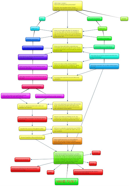
This is how I develop a Creative Brief ... this happens to be an MAODE exercise on Learning Design.

As a video producer this is the idea I'd sell to the client.

I'd then work with a coach and group of swimmers to set the scene and milk it.

This is the kind of thing corporate clients use to teams of 10,000 employees. This is also how I go about writing scripts, sometimes adding drawings, cut-outs from magazines and photos. Nothing hi-tech at the thinking stage ... which gives people more freedom to contribute.

A whiteboard marker pen on unforgiving wallpaper backing paper (30p a roll in from the reduced bin!). Stuck to the kitchen door.

PART TWO

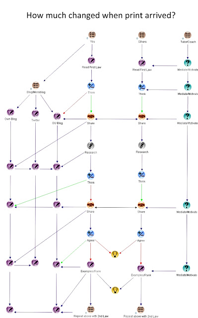
The Forum Thread deserves as Swim lane of its own with as much activity into it and Elluminate as I have put here into a blog/microblog.

How%20much%20changed%20when%20printed%20arrived%20COMPENDIUM.jpg

Often I find a dedicated thread such as e-Learning Professionals is more likely to guarantee a response to something I say; the reason for this is simple, they have thousands of active members.

There are reliable statistics to say what tiny per centage of people are happy to write, read, comment and contribute. 1% to write, about 4% to comment. This has to be reflected in forum activity too, however much it is required by the course. I've missed out blogs other students keep, and the links back and forth to these.

You'd be surprised how much goes on in the background.

I've found myself working things through with people in different tutor groups, who did the module a year ago ... or who have nothing to do with MAODE but have an answer. Which reminds me of the fantastic diagram drawing tool dia. How does Naughton’s journalistic point of view compare to those of an academic?

I worked through it alone, blogged about it and offered thoughts and replied in the tutor forum.

The degree or blogging I’ve put forward reflects what I consider an invaluable addition to taking part in Forum Threads. You express what you think, ‘stream of consciousness’ into your own blog, edited to140 character for Twitter than take part in a Forum where some back and forth discussion should come about.

The other invaluable form of participation is through a conference call – as Jonathan Swift said, ‘I don’t know what I mean until I have heard myself speak.’

This is akin to a treatment outline for a video. The script in our case is the ad-libs and verbatim responses of student and input from the tutor. I like the idea of swim-lines and can imagine the Tutor online as a coach, rather than a subject matter expert, as a guide and mentor.

The reality is that such rapport develops with fellow students.

It is a shame that there isn’t more continuity through your original cohort. I have used the Compendium to share projects, using the layers to attach documents and have another contribute. For a simple mind map I like bubbl.us, otherwise I’m as likely to do a sketch and photograph it to share … or draw directly into a paint/draw package such as ArtPad using a stylus and Wacom board. Like all tools you need to have a clear use for it, rather than playing in a sandpit. To be able to collaborate in a team people need to be familiar with and using the same software/platforms.

Compendium can be used as a basic mind-map or flow chart and with experience be used for much more, as an e-portfolio of sorts.

It is overly prescriptive. Tools need to be intuitive and follow common practices regarding buttons and outcomes. For a first draft I prefer marker pen on paper, followed by bubbl.us.

As Beetham’s Chapter 2 (Activity 2) points out learners will find their own way through a task regardless. We understand things differently, draw on different experiences and come up with our own metaphors.

Whilst I go with the ‘Swim Lanes’ analogy, I often think the reality is like a Catherine-wheel nailed to a post in the rain.

Should an exercise such as this be addressed in a way that has so scientific connotations? It is surprising how easy it is to share the narrative of a linear activity in a multitude of ways. A simple set of numbered bullet points, perhaps worked up as a presentation. As a board game, one step taken at a time. Or a set of activity cards. You can talk it through by counting five activities off on your fingers. I'll do one of these in the truly, joyful, brilliant www.bubbl.us and post it to my ou blog and extracurricular blog' 'My Mind Bursts' which in turn is fed to Twitter 'jj27vv.'

Make one of these mind maps, then change your mind and be tickled with the way the 'node' or 'bubbl' behaves . Go see! This and a list of wonderful tools from an H808 student who is a primary school teacher in Thailand. Work should be fun, especially learning design. After all, if you don't enjoy it, how do you expect your future students to behave?

PART THREE

Bubbl.us has gone from toy to a grown up tool with layers and the opportunity to add sound, images (stills and moving) and no doubt much more, none of which I have had time to try.

The old bubbl.us was like playing with kid's party balloons and when you deleted a balloon (or node) it blew up and burst into flames. This new version still does some magic to the eye, fading away like a mist, also when you save melting into the background like a rainbow of ice melting.

An extraordinary delight to the senses and apparently of far more practicle use than I credited it with a few months ago.


33pxxlo_New-Sheet.jpg


Click on this and it takes you to Picassa Dropbox. You can then enlarge it, save the code and help yourself. I think all the images I've put into this OU identify album is 'open to the public.'

Seeing this all again I am reminded of my inspiration David McCandless.

By working on this a few more times an art director or designer would turn it into a thing of beauty; it is this level of inspiration that sells ideas to committees, colleagues and others.

People buy into ideas. People like to be inspired.

The pedagogy must of course be sound, the right offering of activities, outcomes and learner flexibility and support is the OU magic mix.

P.S. Don't imagine I was familiar with any of these tools until I started the MAODE in Feb 2010, most of everything I now use I was introduced to by someone here.

PART FOUR

Add the role of the Tutor.

Get in a designer and make it a thing of information beauty.

Sell it internally and externally.

Schedule, produce.

Watch what happens and adjust accordingly.

Permalink Add your comment
Share post
Design Museum

h800: 44 Week 8 Activity 2. On learner's emotional responses to technology

Visible to anyone in the world
Edited by Jonathan Vernon, Thursday, 8 Mar 2012, 15:22
DSC00677.JPG

Pic from MMC Learning

'An approach to learning activity design (Sharpe et al. 2005) concluded that, as well as ICT skills, key issues were learners’ emotional relationship to the technologies they were offered – especially feelings of frustration and alienation – and issues around time management.'

In our tutor group and module forums we've gone through time management at length.

Understandably.

Though I suspect that for many of us time passing is the only certain thing in our lives. It has required therapy for me to downplay events when they DON'T go to plan ... that life as a Dad, husband, parent, portfolio-worker person, studying (two courses, this and sports related), as well as feeding the guinea-pigs, putting out the rubbish, sorting the recycling, putting air in the tyres on the car, fixing the fence ... collecting children from an event, taking them to the station ... let alone the other generation, four relatives in their 80s and 135 and 210 miles away.

I'm exhausted just thinking about it.

No schedule set for the morning, let alone the day or the week can be followed. (Which is why I get my hours in 4.40 am to 7.00am each early morning ... more pleasant with the sun joining me at last)

So, to the emotional response to technology.

I've come to apply the same kind of thinking to technology, yet more technology, especially if I don't like the look of it, as something that WILL, in the fullness of time, have value.

There is no point putting off engagement with it.

The same applies to a difficult to read text (there has been plenty of that lately). It WILL become clear, it just may take three or more attempts, could involve getting advice from others in the peer group, a search on the web and dare I say it a BOOK. I actually pick up copies of 'Facebook for Dummies' and 'Blogging for Dummies' as a matter of standard practice from the library (remember them?). These books are authentic, scurrilous and engaging. The body and mind enjoy the break from the computer screen.

I got 'Digital Marketing for Dummies' for my Kindle though ... how else can I read it in the bath while holding a coffee in my right hand (I am right handed) and 'the book' in my left, perfectly able to flick on through pages with my thumb.

Design isn't just programming when it comes to software.

Compare Mac to PC. Mac not only works, but it is obvious, intuitive and often beautiful to look at.

We are so used to the extraordinary simplicity of Google, YouTube and Facebook that we baulk if a piece of software, perhaps Open Source, doesn't have the look and feel of the familiar. It IS a DESIGN issue, as in creating a love affair with the object that has both form and function, rather than function alone.

Compendium; it is versatile, engaging and intelligent ... but could it dress better and be more intuitive and less 'nerdy' ?

Rethinking%20Pedagogy%20for%20a%20Digital%20Age.JPG

More from Sharpe and Beetham:

'The use of technologies can compound existing differences among learners due to their gender, culture and first language'. Beetham and Sharpe (2007)

I like this too:

Learners cannot therefore be treated as a bundle of disparate needs: they are actors, not factors, in the learning situation. (ibid)

And this:

They make sense of the tasks they are set in terms of their own goals and perspectives, and they may experience tasks quite differently if digital technologies – with all the social and cultural meanings that they carry – are involved. (ibid)

Perhaps we should be seeking advice on these feelings too, how they can get in the way of us tackling technology or a tough read/assignment. After all, if motivated, people will overcome such problems, but if we become demotivated it is habit forming.

REFERENCE

Beetham, H and Sharpe, R 'Rethinking Pedagogy for the digital age'. (2007)

p.s. This book needs an emotionally appropriate cover. Might I suggest a design from Helen A Dalby. Personally I'd like to see academic publishers make all book iPad friendly with illustrations throughout, maybe video and some interactivity too. Why stick with the rough, when you could make it smooth and cool. Video introduction from each of the authors please ... and links to their blog.

Sharpe, R, Benfield, G., lessner, E. and de cicco, E. (2005) Scoping Study for the Pedagogy strand of the JISC e-Learning Programme, Bristol: JISC. Online. Available. www.jisc.ac.uk/index.cfm?name+elearning pedagogy

Permalink Add your comment
Share post
Design Museum

Multimodality vs. a messup (also known as a mashup)

Visible to anyone in the world
Edited by Jonathan Vernon, Saturday, 27 Aug 2011, 10:52

Mulitmodality is the professional and practicle expression of a mashup.

Multimodality (Kress, 2010) is unique to using mixed electronic media. It is what I crave when listening to a podcast or watching something on YouTube. I want the interactivity, the non-linearity and the connectivity that is unique to a multimodal response to learning.

There's not much of it about.

Or is there?

Compendium's pretty neat. Not the best user interface, but it is non-linear and multi-layered and most of all, it only works in its digital form.

What else?

I enjoy Spaced-ed where I am currently doing World History in Maps and Core Anatomy for Medical Students.

See Learning by Degrees in the Harvard Magazine for a piece on the creator of Spaced-Ed, also Floreat Domus 2010, the alumni magazine for Balliol College, Oxford,

Acrobat Presentations

Although I am yet to use this, it feels like a combination of Skype and Power Point, with audio and video thrown in and superior graphics (it is after all Acrobat).


I invite further suggestions:


+

+

+

+


REFERENCE

Kress,G. (2010) Digital Literacies. A research Briefing by the Technology Enhanced Learning phase of the Teaching and Learning Research Programme. Julian Gillen and David Barton. London Knowledge Lab. Institute of Education. University of London. www.tlrp.org/tel

On of a pack of leaflets, reports and brochures I picked up at JISC in April. I only dug them out because I craved some e-learning literature in print. Odd that.

Permalink Add your comment
Share post
Design Museum

E-portfolios from the student p.o.v. H808.

Visible to anyone in the world
Edited by Jonathan Vernon, Monday, 29 Aug 2011, 16:19

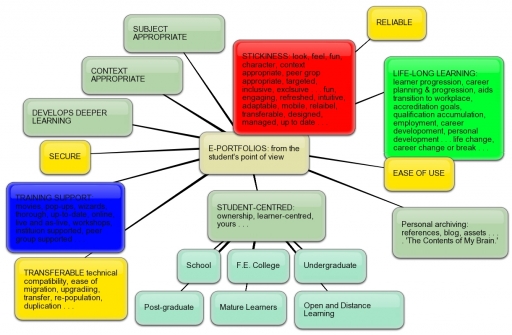
E-portfolios from the student point of view.


Bubbl.us learner-centred e-portfolios


I like what bubbl.us can do. Without fuss and with a sense of fun a few ideas on the back of the proverbial fag-packet (in my case in an A5 drawing pad) becomes something semi-permanent and easy to share. Commpendium takes this one step further, allowing each 'node' to contain layers of details as documents or attachments.

Here, after some weeks of this, I try to cover every corner, literally, on the topic of 'e-portfolios for learners.'

I read somewhere a hint of why students baulk at this - their perspective, for the most part, is short-lived. Several years working in the communication of graduate opportunities it was surprising how few could look beyond 'Day One' at their place of work, to their completing their first year ... unless, as in accountancy, law and some industries there was a longer-term career training period.

It isn't just as matter of context, it's a matter of perspective.

Anything 'sticky' can as easily become unstuck.

Remember how stuck we were on FriendsReunited, before MySpace and then Facebook came along?

On the one hand a software developer makes their platform 'interoperable,' but then you open the door to users switching platforms.

What is the commercial value of free software? What is the cost? Pop-up adverts inside your' virtual head.'

If someone can exploit it, they will.

Aalderink and Veugelers.


· Focus on competence-oriented education

· Emphasis on student development

· Fostering academic maturity

·Net generation oriented


REFERENCE

Aalderinck, W. and Veugelers, M. (2005) ‘E-portfolio’s [sic] in The Netherlands: stimulus for educational change and life long learning’ (online), paper presented at the EDEN 2005 conference in Helsinki, Finland, Portfolio Themasite. Available from http://www.icto.ic.uva.nl/surf/nl_portfolio/Publicaties/Downloads/aalderink_veugelers_2005.pdf- FOR ANALYSIS


Permalink Add your comment
Share post
Design Museum

Reflection in H.E. Creme. Bubbl.us. H808

Visible to anyone in the world
Edited by Jonathan Vernon, Monday, 21 Nov 2011, 23:59

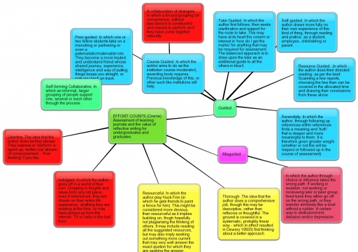
EFFORT COUNTS (Creme)

Assessment of learning journals and the value of reflective writing for undergraduates and graduates using Bubbl.us to construct the knowledge map from an initial sketch on a fag packet.

With special thanks to fellow student Lesley Morrell who shared this software with us in the first place. I like it as a draft before Compendium, where I will take it next.

Available as a dowload on request ... or to share through bubbl.us.


Effort that 'doesn't count' in a learning journal kept for purposes of assessment.

Resource Guided

In which the author does their directed reading, as per the brief. Scanning a few reports, choosing the few than can be covered in the allocated time and drawing their conclusions from these alone.

Tutor Guided

In which the author first follows, then seeks clarification and support for the route to take. This may have at its heart the concern or interest in 'how do I get the marks' for anything that may be required for assessment. (The balanced approach is to draw upon the tutor as an additional guide to all the others in blue)

Course Guided

In which the author aims to do as the institution course moderator), awarding body requires. Previous knowledge of this, or other such like institutions will help. With the caveat: ‘A collaboration of strangers’. In which a forced grouping (of convenience, without bias/favour) is constructed and required to perform as if they have come together naturally.

Self-guided

In which the author draws more fully on their own experience of this kind of thing, through reading and practice, as a student, employee, child/sibling or parent ...

Misguided

In which the author through choice or influence takes the wrong path. If working in isolation, not seeking or receiving tutor or peer group feed-back they either go off on the wrong path, or they wander aimlessly like a boat without a rudder. A certain way to disillusionment, delusion and/or depression.

Collaboration as peer guidance

In which one or two fellow students take on a mentoring or partnering or even a paternalistic/maternalistic role. They become a more trusted and understanding friend whose shared journey, experience, intelligence and way of putting things keeps you straight, or puts you back on track. Perhaps more effective where the group that collaborates is self-forming. In which an informal, larger grouping of people support one, several or each other through the process. Perhaps as effective, if not more so, where someone takes a leadership role. Either way symbiosis or reciprocity may (or may not) be expected or required.

Self-forming Collaborative

In which an informal, larger grouping of people support one, several or each other through the process.

Serendipity

In which the author, through following up references within references finds a meaning and 'truth' that is deeper and more meaningful to them. It is therefore given greater weight (whether or not this will be respect or followed up in the course of assessment).

Libertine

The idea that the author does as they please. They express or 'perform' a typed-up, written-out 'stream of consciousness' - 'free thinking' if you like.

Indulgent

In which the author goes off in a world of their own. Dropping in thoughts and ideas from any old place, even if referenced, they are drawing on their entire life experience, anything they are reading at the time, or may have picked up from the internet, TV or radio in the last hour.

Thorough

The idea that the author does a comprehensive job, though this may be descriptive, rather than reflective or thoughtful. The ground is covered in a systematic, probably linear way - which in effect resulted in Dewey 19933) first thinking about a better approach.

Resourceful

In which the author play Huck Finn (in which he gets friends to paint a fence for him). This might be considered more devious, than resourceful as it implies building on, though hopefully not plagiarising the thinking of others. It may include reading all the suggested resources, but may also imply seeking out something more current that may very well answer the exact question for which they are seeking the answer.

The next step, even if the word count has been exceed, is to put it through Compendium to add underlying reports and references.

I've already had a great experience of producing a project briefing document in Compendium, sharing this withou someone several hundred miles away and then discussing it on Skype. Compendium meant that he got what is clearly a draft, a working document, the way my mind has thus far thought the project through. He could then indulge where necessary his greater curiosity by reading the attached notes, documents or reports.

The trick with this continued reflection on reflection, beyond due dates, word counts or reading lists, will be to wrap it all up at some stage, editing along the way, and if it is going to be submissable, reducing it to a 500 word count.

This has to be the eighth or ninth effort at this, forays that have yet to benefit from the kind of academic rigour and effort that will no doubt deliver an end result.

The fear is that this is like shooting an arrow at the moon, when the target is 60 yards away - clear as dandy. But this is who I am, and how I approach things. The trick is to pay me on a fixed-fee basis, because you may pay for 20 hours effort, but you'll get 60.

Permalink Add your comment
Share post
Design Museum

Compendium

Visible to anyone in the world
Edited by Jonathan Vernon, Sunday, 12 Sept 2010, 15:00

I'm keeping a 'log' of my progress into Compendium private for now. I may in due course edit this down into some succinct steps picking out anything that may trip up the unwary or some new take on how it can be used.

Meanwhile, bouyant as a result of advice and suggestions given by other OU students I am going to do some housekeeping on usernames and passwords then give some other software a go if only to have a break from Compendium.

If you are looking at Compendium for the first time do get in touch, we could get our heads around this together.

Yes, two heads are better than one.


Permalink 1 comment (latest comment by Sylvia Moessinger, Sunday, 12 Sept 2010, 19:39)
Share post
Design Museum

Compendium Lesson 1

Visible to anyone in the world
Edited by Jonathan Vernon, Tuesday, 14 Sept 2010, 14:55

Trips. Finding out why I had no volume on the laptop so that I could view the animation. Eventually dig through the system set up to bring the volume up. With a 12 and 14 year old using this laptop from time to time wit hearphones might explain this.

Compendium is a visual way for organising ideas and linking documents and webpages.

Knowledge Mapping Software

  • Double Click
  • List view, visual view
  • Keeping track of websites and documents and how they connect to ideas, questions that you may be thinkng about, it gives you a way of linking and relating to arguments you mjay be wrestling with
  • A way of Linking together different resources - tagging them.
  • The spheres are 'maps; that can be opened, clocked or dragged.
  • Mindmapping with the affordances of drag and drop, multilayered, easily copied, changed and/or shared.
  • Tagging so that you can find them later on.

Trips: Despite following the animation to the letter and creating a map I cannot see how create a 'new document.' I have to wonder if pen and paper, grabbed, scanned and shared, wouldn't achieve much the same effect despite the infinte layers and links that Compendium affords, it is at least simple.

Trips: Elsewhere, learning Outlook for the first time, I repeatedly find having put in a hundred or so contact details, that I cannot reliably send a mail to a selected group. I am blind to the required button.

Permalink Add your comment
Share post

This blog might contain posts that are only visible to logged-in users, or where only logged-in users can comment. If you have an account on the system, please log in for full access.

Total visits to this blog: 13018489