OU blog

Personal Blogs

H810: Week 13 : Activity 26.1

Visible to anyone in the world

Week 13: Activity 26.1

1. There is a debate surrounding who is responsible (or most responsible) for accessibility. How helpful is this debate in ensuring that people working in post-16 education change their practices?

I feel that the debate is harming the situation. Too many people are sitting back and waiting for someone else to decide who is responsible, comfortable in their assumption that it will not be them!

If those with technical skills, such as learning technologists, are not ultimately or solely responsible for ensuring accessibility, what responsibilities do you think they should have and why?

I think that they should be responsible for training academic staff on the technical aspects of ensuring accessibility; the technical side of evaluation procedures with the associated interpretation of reports and code adjustments.

2. On pages 82-83, Seale uses an archaeology metaphor to try to encourage learning technologists to dig deeper beneath the surface of accessibility guidelines and standards. This is intended to develop a greater understanding of approaches to accessible design. How helpful do you think this metaphor is?

I really do not think this is a useful metaphor. Relicts of archaeology spread on the surface that give a hint to what happened in the past compared to digging deeper and finding relicts of the same age grouped together to give more information. I can see a vague link to guidelines and standards being grouped together to produce a clearer picture.

Can you think of an alternative metaphor, image, analogy or visualisation that could be used to help develop learning technologists' thinking in this area?

I am thinking along the lines of a family tree structure with the WCAG at the top as a global standard and then other groups of guidelines coming from these. It helps me understand that that they are all related and aiming for the same result but there are different methods of getting there. It also rationalises them to group them together. A set of references under these headings would be really useful for academic designers to quickly determine where to find the information they required and know what the focus/angle of the guidelines.
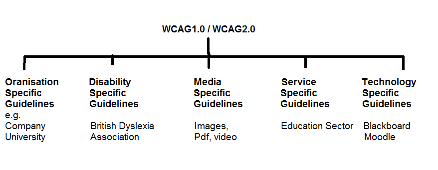
Family tree-type diagram showing groupings of guidelines

1. On page 98 Seale discusses the tensions regarding the use of technical tools versus human judgement to evaluate the accessibility of learning resources. What is your position concerning this issue?

Can we trust human judgement? If so, whose judgement should we trust - learning technologists working within educational organisations or external experts?

I followed an evaluation schedule that started with human judgement; proceeded to use two automated tools for a general assessment; used some tools for a specific purpose (e.g. colour contrast, readability analysis); went back to human judgement to check the results of the automated tools; and then went to beta testing and comments from specific users. I feel that this made a good testing schedule but ideally I would add in an easily accessible route to make comments about the resource that were recorded and gained a response from senior management. Nothing like a little pressure to improve human judgement wink

I would prefer to work with a learning technology team from within the organisation as they have superior knowledge of the aims and methods used within the organisation; they are easy to contact; and they have an incentive to get it right.


Permalink Add your comment
Share post

H810: Week 9: Activity 20.1: Finding guidelines

Visible to anyone in the world
Edited by Lynn Hunt, Sunday, 31 Oct 2010, 21:43

Find web resources with guidelines for each of the online learning elements in the list below, selecting those that would be most useful in your context.

I have recently changed jobs and, as part of my new role, I am supporting a student with a severe visual impairment in her second year studying a law degree at university. She lost her sight suddenly at age 16 years and has problems remembering the layout of web pages etc. I started working with her last week and found that she is struggling to access some resources and so I thought that this exercise would be useful to examine which guidelines would be useful to ensure the resources were accessible for her. She is using a pen drive version of Supernova.

  • Web pages
    Studying law relies heavily on being able to use two specialist databases hosted on websites: Westlaw and LexisNexis Butterworths. Previous students I have worked with have managed to use these sites on their own once they were used to them but my current student is still having problems after a complete year so I think it is time to look for other solutions!
    Guidelines for web pages do apply to this area but the added database functions add to the complexity of each page. Searching the web gave me the information that Westlaw is available as a plain text version in the US but I can find no link to it in the UK. I have emailed both companies for further information.
    For general staff guidelines on creating accessible web pages I like the WebAim version of the guidelines as these provide a basic list with links that explain in more details how to create the features required.
  • PowerPoint presentations
    The student has problems accessing PowerPoint presentations and has organised for her support workers to transcribe the slides into plain text. Her electronic notetaker then adds lecture information underneath each heading so all the information is in one place.
    The guidelines that I prefer in this case are still the WebAIM version as they are suitable for lecturers and contain guidance for all three versions of Microsoft Office currently in use!!
  • Word documents
    The student copes well with Word documents but, due to the versatility of having all the versions of Word currently in use, I still have to go with the WebAIM version of the guidelines.
  • PDF documents
    The student has had problems with inaccessible pdf documents in the past and now refuses to accept them from lecturers. She insists on all documents being given to her in Word. Having studied the guidelines on how to convert documents and the lengthy checking process required, I can understand that many busy lecturers just convert and trust they are OK without checking them. I looked at several versions of the guidelines but many were very much out of date and only quoting Word 2003. Many also had their own guidelines but referred to WebAIM guidelines as a definitive source. I did like the YouTube video that explained how to produce pdf documents but this was with an older version of Word as well.
  • Flash animations
    I was quite surprised to find that my daughter was writing an accessible website in Flash - firstly that she could do it at all and secondly that it could be made accessible! Adobe reports that the latest version is now very good with screen readers whereas the older versions needed a non-Flash alternative. This information seems to vary with who you talk to and which site you read! WebAIM guidelines still say that it is very difficult to access and alternatives should be provided.
  • Web video
    I found it difficult to find anything between far too general and specific uses for individual programs. I eventually found the Skills for Access guidelines which were at the right level for general guidance for lecturers.


Permalink Add your comment
Share post

H810: Week 9: Activity 19.2: Issues with guidelines

Visible to anyone in the world

I am getting so frustrated with out of date instructions! I use Office 2007 and most of the instructions are for older versions and have not bothered to update with the extra information. It can make quite a difference. For example, I wanted to investigate adding alt text to images in Word and the Jisc tech instructions were not updated so after a frustrating 15 mins I eventually Google searched to find more up to date instructions which quickly showed me that it was under the 'size' tab rather than 'format'. [Rant over]

Everyone with disabilities requires a different approach and this may be part of the reason that people keep trying to create different versions of guidelines. I think another reason is that it really does look good if your organisation seems to be proactive in creating their own internal guidelines - but that is just the cynic in me. A third reason may be that there are many types of people involved in creating resources and they all like a different slant on the guidelines i.e. programmers and teachers require different approaches.

I really liked the video introducing screen readers. I thought it was a good introduction to exactly why people need these guidelines followed but I did need to go on to find out more about how to use the things he mentioned. I still cannot find out how to bring up the window he showed with the headings listed on it and I coudl really do withknowing how to do this. Any ideas anyone?


Permalink Add your comment
Share post

This blog might contain posts that are only visible to logged-in users, or where only logged-in users can comment. If you have an account on the system, please log in for full access.

Total visits to this blog: 465015