OU blog

Personal Blogs

Design Museum

E-portfolios from the student p.o.v. H808.

Visible to anyone in the world
Edited by Jonathan Vernon, Monday, 29 Aug 2011, 16:19

E-portfolios from the student point of view.
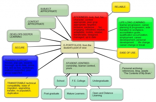
 

Bubbl.us learner-centred e-portfolios


I like what bubbl.us can do. Without fuss and with a sense of fun a few ideas on the back of the proverbial fag-packet (in my case in an A5 drawing pad) becomes something semi-permanent and easy to share. Commpendium takes this one step further, allowing each 'node' to contain layers of details as documents or attachments.

Here, after some weeks of this, I try to cover every corner, literally, on the topic of 'e-portfolios for learners.'

I read somewhere a hint of why students baulk at this - their perspective, for the most part, is short-lived. Several years working in the communication of graduate opportunities it was surprising how few could look beyond 'Day One' at their place of work, to their completing their first year ... unless, as in accountancy, law and some industries there was a longer-term career training period.

It isn't just as matter of context, it's a matter of perspective.

Anything 'sticky' can as easily become unstuck.

Remember how stuck we were on FriendsReunited, before MySpace and then Facebook came along?

On the one hand a software developer makes their platform 'interoperable,' but then you open the door to users switching platforms.

What is the commercial value of free software? What is the cost? Pop-up adverts inside your' virtual head.'

If someone can exploit it, they will.

Aalderink and Veugelers.


· Focus on competence-oriented education

· Emphasis on student development

· Fostering academic maturity

·Net generation oriented


REFERENCE

Aalderinck, W. and Veugelers, M. (2005) ‘E-portfolio’s [sic] in The Netherlands: stimulus for educational change and life long learning’ (online), paper presented at the EDEN 2005 conference in Helsinki, Finland, Portfolio Themasite. Available from http://www.icto.ic.uva.nl/surf/nl_portfolio/Publicaties/Downloads/aalderink_veugelers_2005.pdf- FOR ANALYSIS


Permalink Add your comment
Share post
Design Museum

Taking steps to migrate MyStuff content to PebblePad

Visible to anyone in the world
Edited by Jonathan Vernon, Monday, 29 Aug 2011, 08:00

I'm reaching the stage where I feel I may have to type entries such as this in Word and then paste them in. Why? Too often it closes before I save or finish and everything is lost. My loss, not yours.

Just owning up to buying an annual subscription to PebblePad. All the pointers say it is the right step to take, I can see that it will absorb everything I've put into MyStuff these last seven months about (700 pages) and allow me to do much, much more with it.

The movies that run you through how things work are clear. The buttons and actions seem intuitive and desirable. For example, when it comes to reflect I can follow the prompts. Even I can do this. And in relation to building evidence, once again, I will follow this H.E. inspired creation to perform as a graduate should.

Otherwise I'm finding Filemaker Pro as easy as when it first came out in Clarisworks in the 1990s and the various versions I've used since. It's just a pain and a shame that I'll have to buy a new version once the 30 day trial is over and a greater pain that details of 800 swimmers and 44 teachers/coaches will have to be added manually. (I may be able to get around this only if I very carefully ensure that most of the many fields I use match. Though refreshing my memory with the swimmers and deleting out of date records might be worth the effort as poolside all this stuff has to be in your head).

Today I've had fun with Bubbl.us and have been introduced a a slide-sharing tool - both courtesy of fellow student Lesley Morrell. Always one to want first hand experience of a tool before I can recommend it, I plan to take the Bubble I created on Reflection (see below) and work it through with Compendium, seeking out and adding reports and references as I go along. Whether the end result can be written up as a 500 word report is quite another matter.

This and plans to have a professional crew video a number of swimmers above and below water to then put through a broadcast post-produciton house come to fruition. The plan is then to generate material for a substantial 'reusable learning object' or what Salmon (2002) wants us to call an 'e-tivity.'

So a busy day.

Risotto done, Mushroom soup to make.

Permalink
Share post
Design Museum

H808 Core activity 3.1: Understanding e-portfolio software

Visible to anyone in the world
Edited by Jonathan Vernon, Saturday, 27 Aug 2011, 19:06

Core activity 3.1: Understanding eportfolio software

  1. Select two eportfolio or eportfolio-type applications. Familiarise yourself with the facilities offered by each of them.

  2. Produce a comparison grid (such as the one you get from the EduTools review if you click the ‘Product comparison’ button) for the key features of the two systems. (Note: you do not need to go into the level of detail that the EduTools does. Restrict your comparison to about six key features.)

  3. Post your comparison grid to your tutor group forum. You may find that other people have selected features or facilities that you did not notice or value. Discuss with your colleagues which features really are ‘key’ for an eportfolio system. Decide which of the systems you have discussed might be recommended for use on H808.

Annotate your comparison grid with any relevant comments from the forum discussion and store it in your repository of evidence.

Permalink Add your comment
Share post

This blog might contain posts that are only visible to logged-in users, or where only logged-in users can comment. If you have an account on the system, please log in for full access.

Total visits to this blog: 13019453