This part of the module materials brought up the memory of a time when research projects I was doing had small elements of SNA - Social Network Analysis. (See the International Network for Social Network Analysis for more on this.) Dating from before Facebook was even thought of , SNA involved making computer maps of people's connections. I expect the ones we drew up would look very clunky next to the visualisations linked to in this part of the module.
I also thought vaguely about social capital. Although this is more widely known in the Robert Putnam version, I prefer Bourdieu's more nuanced version. (I think I better write a separate blogpost about this, as I will need it for my own students )
At first I felt a bit stuck about the exercise. I do have a Twitter account but it's so old that I don't want to go back to it. I had decided to open a new one when the module starts officially - that seems like a good moment to begin tweeting.
I thought about exploring my Facebook connections, as Tony Hirst does. This could be interesting, since my Facebook contacts are a pretty diverse bunch. I have some far left buddies - one or two of whom I became friends with on Facebook and have never had a connection with outside of the virtual circle. I have some centrist right buddies whom I met in other contexts, and whom I politely try to bring back from the Dark Side (ie Brexit and their self-contradictory posts about immigration). I have an American friend who, after the election of Trump, went from posting pictures of her kids' tea parties to suddenly posting a lot of material about race politics and feminism, and a Catalan friend - you can imagine what he is posting just now. Some of my friends are from the queer communities, and post sexually exploratory art. Others are mums I know from school, they post pictures of nights out with their friends. Some of my cousins post art-y photos and others post photos of their dogs and one posts art-y photos of her dog.

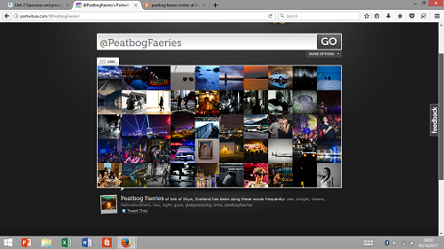
I determined to take part though. I used my brother-in-law's band's twitter name to see what the Portwiture app would produce.

Lovely! (Means nothing to me - but looks great
- Did the visualisation reveal anything surprising?
- Could you think of ways you might use a visualisation like this in your presentation?
- What else would it need to do to add benefit?
- Did you have any concerns about what could be found about the networks of others using these tools?