OU blog

Personal Blogs

Design Museum

Visualising Instructional Design for e-learning

Visible to anyone in the world
Edited by Jonathan Vernon, Thursday, 3 July 2014, 06:28

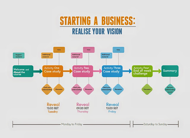
Fig. 1. 'Swimming Lanes' design for e-learning course on 'Starting a Business'. (C) 2014 Future Learn and the University of Leeds.

I keeping doing e-learning modules for a variety of reasons:

for the intrinsic value of the course (I have started companies a couple of times before, modest affairs, always profitable and want and even need to do so again. Simple, low turnover, service-based, a unique idea or product).

for the lessons I learn from the experience given my interest in e-learning. This is my third FutureLearn module, only two weeks duration. A wee piece of perfection. Informative. Clear. Applied. Enjoyable. Connected. Varied. If you study for the Master in Arts: Open and Distance Education (MAODE) you will come across and even create your own planning charts like the one above. This is a gem. It is so easy to see how the thinking has been realised. It is a pattern that is instantly transferable.

Clarity is crucial. Good design is simple. It is also a pleasure to look at.

Future Learn has some gems. E-learning is coming of age. 

Permalink Add your comment
Share post
Design Museum

OLDS MOOC WK 3 Activity 2 (or 1b)

Visible to anyone in the world
Edited by Jonathan Vernon, Wednesday, 22 Oct 2014, 09:48

Fig. 1. Activity Cards for curriculum planning downloaded from JISC

I'm very glad to be doing this OU hosted Massive Open Online Course on Learning Design

I have a couple of weeks in hand and desperately wanted to make and do stuff. I've joined one Cloudscape where the aim is to design learning on DIY Multimedia. I have three projects of my own too - not takers from others as they're rather 'out of the box' - ideas around lifelogging, augmented learning and virtual companions.

This exercise I recommend. Indeed, I think getting away from the screen and using bits of paper, getting on the phone, not relying on webinars ... and meeting face-to-face all makes sense.

OLD MOOC WK 3 Activity 2 Course Cards

Getting off the computer and into an activity, ideally a collaborative one, is always productive. A carefully moderated workshop can reveal the unexpected, more importantly it is an informed way to prioritise issues and to use a the combined expertise of a variety of people. From the OU Course B822 Creative Innovation and Change I learnt the value of constructing a team of people to address a problem - from different backgrounds, with different responsibilities and outlooks, even someone to rock the boat. No one person’s voice is allowed to override the views of others. Such a group would achieve a lot with this OULDI pack. Though game-like it is a valid and valuable tool.

Working alone there were a number of hurdles to overcome:

A black and white printer.
The sheets were printed off then painted. Not liking the look of the purple these cards all become yellow.
Ideally they would all be spray-glued to backing card to make them more robust - at least so that they don’t curl up at the edges.
On the first sweep I got the 38 number of cards down to 26. This was gradually reduced in 2s and 3s until there were the requisite 16.


Fig.2. Used a pairs table the 16 cards were ranked

Using a paired-sets in a table I was able to rank these 16 - clearly the exercise of discussing these with colleagues would have been extremely useful and the process of deliberation brought up issues of budget, resources and time-scale, and even refined the project as it is conceived and visualised as a certain number of activities.


Fig. 3. In rank order a diamond was created with the chosen cards.

  1. Problem Based
  2. Applied Concepts
  3. Mentoring in work-place
  4. Collaborative
  5. Scaffolded learning
  6. Practice based
  7. Student generated content
  8. Day Schools
  9. Blended approach
  10. Authentic resources
  11. Practice placement
  12. Professional community
  13. Portfolio or eportfolio
  14. Peer-support
  15. Active discovert
  16. Step by step instruction

Choose a maximum of 12 cards from the pack which define the key features of your course or module.

Step by step instructions Guidance and Support
Scaffolded learning  
Mentoring in the workplace  
Applied concepts Content and Experience
Authentic resources  
Problem-based  
Practice-based  
Collaborative Communication and Collaboration
Practice placement  
Day schools  
Student generated content Reflection and Demonstration
Portfolio or e-portfolio  


In terms of the module DIY Mutli-media I become very aware of the value of learning alongside an expert, of being with skilled practitioners even - and very much the need to have a project brief to work to. So very much a hands on learning experience with authentic tools to create a real object or digital asset, or activity. This would also take the learners away from the computer screen, even out of the classroom into a design studio or agency. In fact the 'Online' card didn't make it into the 16. Even though this is to develop skills in use of digital multimedia tools I felt I was organising a workshop for potters, painters and tapestry weavers i.e. there is a highly practical element to it and there's nothing better than having a live guide at your shoulder ... and if there has to be a compromise then it would be live or 'as live' instruction over the Internet.

My first career was in television

I got out of a graduate position in an advertising agency and became the 'runner' and 'production assistant' in a micro-production company. We were six and were down to three for most of the time. I learnt by latching onto an experience BBC Producer - so directing, producing and writing. Then on the job. In time I supplemented this with trade association workshops and some formal day or afternoon workshops. After four years I took a fulltime course. This exercise has made me see how much multi-media production is a craft skill - we may use keyboard and computer screens, but so do TV editors these days too. I've even used a broadcast video camera with iPad touchscreen like controls on the viewing monitor (nightmare!) ... for someone used to buttons and knobs.

I have been hugely encouraged to get away from screens and be with people face to face despite believing in all things e-learning. Even major practitioners will talk about activities away from the screen, or phoning a friend or colleague ... even expecting a phone call or a debriefing workshop. This is because those commissioning learning want results and will break away from the shoehorn of e-learning to do so ... great for scale, great for compliance, but hardly 'human'.

Perhaps the 'e-' is coming detached from 'learning'.

Learning is the thing, whether it is online, face to face, mobile or augmented. The 'e' has to stand for 'effective' - did it work! And student analytics and feedback will quickly tell you if you are getting it right or wrong.

Permalink Add your comment
Share post
Design Museum

Notes on Gagne's Nine Steps of Instructional Design

Visible to anyone in the world
Edited by Jonathan Vernon, Wednesday, 15 Aug 2012, 10:44

I would have found this invalauble commencing any of the Masters in Open and Distance Education Modules.

Gange’s model of instructional design

· Conditions of learning:

· Internal conditions deal with what the learner knows to prior to the instruction.

· External conditions deal with the stimuli that are presented to the learner

FIVE STEPS

FIRST STEP

Kind of outcomes to be achieved

Five types:

1. Verbal Information

2. Intellectual Skills

3. Cognitive Strategies

4. Attitudes

5. Motor Skills

SECOND STEP

Organise appropriate instructional events.

Gagne’s events of instruction:

1. Gaining attention

2. Informing the learner of the objective

3. Stimulating recall of prerequisite learning

4. Presenting the stimulus material

5. Providing learning guidance

6. Eliciting the performance

7. Providing feedback

8. Assessing the performance

9. Enhancing retention and transfer

Khadjoo. et al (2011:117)

In relation to teaching psychomotor skills:

Gaining attention

· Capture attention and arouse interest

· An abrupt stimulus

· A thought-provoking question

· Visual or sound stimulus (or multimedia)

Informing the learner of the objective

· Set learning objective

· Expectancy and motivation

· Identify, prepare, understand, perform and understand.

Stimulating recall of prerequisite learning

Associating new information with prior knowledge and personal experience and getting the learners to think about what they already know to facilitate the learning process. Khadjoo. et al (2011:117)

· Interactive discussion

· Ask questions, consider findings and confirm evidence.

Presenting the stimulus material

· New content presented

· Meaningful organisation

· Explanation and demonstration

· How to, position, monitor, test …

Khadjoo. et al (2011:118)

Providing learning guidance

· Correct performance

· Additional suggestions

· Use of examples (case studies)

· Graphical representations, mnemonics, add meaning …

Eliciting the performance

· The learner practices the new skill or behaviour.

· Confirmation of understanding

· Repetition to increase retention

Providing feedback

· Individual and immediate feedback and guidance

· Questioned answer

· Feedback from other learners

Assessing the performance

· Demonstration of what they have learned (no additional coaching or hints)

· Additional practice required

Enhancing retention and transfer

· Practice (Before, during and after)

· Spaced reviews

· Transfer of knowledge to new problems

· Practice, rest and repeat

· Consider:

o Objectives

o Setting

o Time

o Available resources

o Institutional constraints

o Content

o Number of learners (their characteristics and preferences)

REFERENCE

Gagne, R, Briggs L, Wager W, eds. (1998) Principles of instructional design. 3rd edition. New York: Holt, Rinehart and Winston.

Khajoii, K, Rostami.K.  How to use Gagne’s model of instructional design in teaching psychomotor skills. Gatroenterology and Hepatology. 4(3) 116-119
Permalink Add your comment
Share post
Design Museum

Gagne's nine steps for instructional design

Visible to anyone in the world
Edited by Jonathan Vernon, Sunday, 4 May 2014, 12:22

Picking through the OU Library for something on Gagné I found two great articles:

How to use Gagné's model of instructional design in teaching psychomotor skills

and

Using Gagné's theory to teach chest X-ray interpretation

However, no one can tell me how to put an acute accent on Gagné (neither of these reports did so).

Any suggestions?

And how to put an umlaut on Engeström.

I ask as I am fed up having this pointed out in every assignment I submit.


Permalink 4 comments (latest comment by Jonathan Vernon, Wednesday, 8 Aug 2012, 21:41)
Share post

This blog might contain posts that are only visible to logged-in users, or where only logged-in users can comment. If you have an account on the system, please log in for full access.

Total visits to this blog: 13022303