OU blog

Personal Blogs

New photo

Bruno Latour's Introduction to 2005 exhibition: Making things Public'

Visible to anyone in the world
Edited by Steve Bamlett, Tuesday, 20 Nov 2018, 19:11

Bruno Latour's Introduction to 2005 exhibition: Making things Public'

This is a note to self really but worth sharing, since this 2005 article came to me as a complete surprise and consolidate thoughts I've had spinning around a long time but in inchoate form.

The essay is:

From Realpolitick to Dingpolitick: or How to make things Public Available 

http://www.bruno-latour.fr/sites/default/files/downloads/96-MTP-DING.pdf (Accessed 20/11/18)

The linked issues I want to note, perhaps for later use, relate to Latour’s complex presentation of issues of representation (that combine the ideas of political and mimetic representation) and the nature of a true assembly (whether that be a matter of composition or democratic politics).


1.     Representation & Assembly:


I’ve noted pp. 6, 14, 16 and 25f.

Here are some quotations (no synthesis as yet in this tired old brain):

‘Procedures to authorize and legitimize are important, but it’s only half of what is needed to assemble. The other half lives in the issues themselves, in the matters that matter, in the res that causes a public around it. They need to be represented, authorized, legitimated and brought to bear inside the relevant assembly.

… (6)

2.      Representation

…bring together two very different meanings of the word representation that have been kept separate in theory although they have remained always mixed in practice. (6)

Questions we address are to the three types of representation brought together in this show: political, scientific and artistic. (14)

Then read on.

Politicians sell a problem (re – thing). :

…to the general public under the name of a faithful, transparent and accurate representation. We are asking from representation something it cannot possibly give, namely representation without any re-presentation, without any provisional assertions, without any imperfect proof, without any opaque layers of translations, transmissions, betrayals. Without any complicated machinery of assembly. (16)

Iconoclash

3.      Assembly

To assemble is one thing: to represent to the eyes and ears of those assembled what is at stake is another. An object-oriented democracy should be concerned as much by the procedure to detect the relevant parties as to the methods to bring into the center of the debate the proof of what is to be debated.’ (7)

& note things imply both unity and division around their meaning and application.

The point of reviving this old etymology is that we don’t assemble because we agree, look alike, feel good, are socially compatible or wish to fuse together but because we are brought by divisive matters of concern into some neutral, isolated place in order to come to some sort of provisional makeshift (dis)agreement. (13)

At the centre – the Ding: Heideger-ian ‘gatherings’

If the demos is such a welcome solution, it’s because it also divides into two. A paradox? No, it’s because we are ourselves are so divided by so many contradictory elements that we have to assemble.  (14)

What would a truly contemporary style of assembly look like. / It’s impossible to answer this question without gathering techniques of representation in different types of assemblies. …

One of those attempts is to design not one assembly but rather an assembly of assemblies, so that much like a fair, visitors or readers can compare the different types of representation. (21)

AND NOTE THE Double-edge of composition here – representations and assemblies!!!!

… as if we could abandon for good the task of composition. There must be some alternative to cheap universalism …. (25)

NEEDS WORK!

Permalink Add your comment
Share post
New photo

On ‘authorship’ and origination / originality and the art-object A844 Ex. 1.7.3

Visible to anyone in the world
Edited by Steve Bamlett, Tuesday, 20 Nov 2018, 17:00

On ‘authorship’ and origination / originality and the art-object A844 Ex. 1.7.3

Exercise

Now go to Lisa Pon’s article, ‘Paint/print/public’ (2005).

Before you start reading the text, compare the two images on p. 687 – Raphael’s original and Marcantonio Raimondi’s printed version.

·       Consider their differences (such as their medium, size, and the clarity of each image) but also viewership – how would each be viewed?


Thoughts prior to reading:

A print medium produced from a copper engraving like Raimondi’s is endlessly ‘mechanically reproducible’, although would still be too expensive for many at the time.

In contrast, a fresco painting is necessarily unitary and built into the architecture it illustrates and which frames it. It is therefore inevitably part of the ritual involved in seeing it for a selected elite audience. However its accessibility is also ensured by the difference in size. The originals width of 8.4 m is more than  eight times wider than the print which is necessarily transportable. Stuck in its architecture, the frame of the original is the arch to which it is a lunette. It compares to its companion pieces. The print has no need to reference such architecture in the shaping of the figure – background landscape composition. The original does to great effect, making arch and door part of the meaning of the whole. The fresco allows more clarity and access to individual faces in the group and the differentiation and allegorical reading of the participants is enabled by colour – the white clothing of the central allegorical truth and unity female figure. The painting has no observable putti. Were these necessary to add to fantasy effect in the print.

Added after reading Pons:

·       To Goethe the painting seemed less clear than a print. For him and a group looking at the image was part of a means of ‘studying’ it, that purpose being easier given a print’s potential for proximity. Each format generates its own type of public – from international students to cult congregation. (687)

·       Apollo is dropped from the print. (688)


·       How about the artist’s signature? (You can look up these images in a database if you want a better resolution.)

·       Only answered after reading paper. (SB)

This is discussed on p. 688-9:

Rather, the engraving asserts that the picture had been made by Raphael. As the inscription on the cartellino across the depicted window states, RAPHAEL PINXIT IN VATICANO: “Raphael depicted [this] in the Vatican.” The inscription spells out Raphael’s role in the making of Parnassus, while Marcantonio’s work on the engraving remains encoded in his three-letter MAF monogram, discreetly placed under Raphael’s explicit assertion of [p. 689] authorship.

And on 693: we are told Julius II’s name only appears on the painting.

Raphael’s authorship and authority was then made available more from Raimondi’s print.


Discussion from website:

As Pon argues, ‘Marcantonio’s engraving both made Raphael’s painting public and made a public for the painting’. (Pon, 2005, p. 686).

The importance of the inscription by Raimondi, declaring the work to be by Raphael, enabled viewers to connect the invention of the painting to Raphael, even when Sanuto copied Raimondi’s engraving, for instance. The print thus not only publicised the painting but generated a ‘community of viewers’ who accepted Raphael’s authorship of the original image (Pon, 2005p. 691). So much so that Vasari, as Pon notes, conflated the print and the original image when discussing Parnassus in his famous Lives (Pon, 2005pp. 692–3). The print thus creates a public for the painting – allowing a much broader viewership of the original.

Permalink Add your comment
Share post
New photo

Exterior Space & Internal Perspective, Masaccio’s Trinity A844 Ex 1.5.2

Visible to anyone in the world
Edited by Steve Bamlett, Tuesday, 20 Nov 2018, 09:53

Exterior Space & Internal Perspective, Masaccio’s Trinity A844 Ex 1.5.2

Exercise

1.     Go to Columbia Univeristy’s MCID to view a panoramic virtual image of Santa Maria Novella

2.     You want the interior that contains Masaccio’s Trinità (Figure 1.2); this is titled ‘Interior: Nave Panorama’

3.     Facing the main altar of the church, move to the left until you are in front of Masaccio’s Trinità (Figure 1.2).

Consider how the artist has treated space in the painting and in relation to the church interior.

Also consider the relationship between the individuals depicted. How is it similar to or different from the chapels and their paintings near it?

5.     Now do a search for ‘Masaccio trinity’ on ARTstor.

You will find a number of images, including a perspective diagram that demonstrates how Masaccio created the perspective.

Discussion

Masaccio incorporates the use of perspective in the painting to create the illusion of a chapel and to create different architectural zones or planes (Richardson, 2007, pp. 68–72). A brief description of the painting is available online.

On the plane closest to the viewer (the foreground) we see the donor, Lenzi, and his wife. In the second, we see the Virgin and John the Evangelist, and in the third plane we see the Trinity represented by Christ, God and the Holy Spirit (the dove). The different planes or spaces of the painting allow the viewer to move visually through the journey the individual must take to reach salvation: from prayer in the earthly realm, to the saints who are intercessors, to finally reach the Trinity. Through the use of illusion, the painting acts both as a chapel (architecture) and as a painting.

The skeleton in the tomb below is not the donor’s (who was probably buried on the floor in front of the painting) but Adam’s, the instigator of the sin that Christ would die to redeem. The presence of the donor portrait points to the need for individuals to not only represent themselves in sacred space (which was also a public space) – as the means for salvation – but also to assert their status, by displaying the ability to afford a chapel and to hire a well-known artist to complete the complicated programme.

A lot more could be said about this painting, but for our purposes it points to the convergence of artistic theories such as perspective with the religious doctrine of the Trinity and salvation and with the social practices associated with the church and donor chapels. This painting will be discussed further in the exhibition catalogue you are required to read in Section 4.

I had a go at this exercise but rather floundered with the prospect of using the virtual environment as a means of relating to interior space. It made me feel that the answer could only relate to the experience of digital space which is so disembodied. Relating to space is surely about proxemics of a kind that can’t be equivalence in virtual tour technology – and that includes sense of one’s own and other people’s body motion and a whole raft of sense impressions other than just the visual. The whole idea is interesting but has to be about the digital and virtual – where surely space is a different phenomenon as is time and motion.

So I thought I’d examine the pedagogy here instead – jumping to the attached Discussion and the learning goals identified in paragraph 2. Here is a very strong reading of the distribution of imagined space through the iconic use of perspective that is very Panofskian. Every aspect of space in the Discussion is treated therefore as contributory to a unitary meaning that celebrates the institutions of church, state and private wealth – including ideologies of hierarchy and necessary mediation. I have no doubt that this accords with contemporary Renaissance thought patterns but it fails to teach us to look at the signs and symptoms of space (the visual and two-dimensional ones at least available through the exercise. So this is what I thought I would concentrate on in the interests of my own autonomous learning.

My point generally is that course such as this MA SHOULD be sharing and facilitating this aim rather than ending up in one-way feedback. Of course, to be fair, this may be being done in the Forums. But I’ve chickened out of that space of chat and enforced intellectual constriction.

The sentence that does potentially point us to autonomous thought for me is this: “Through the use of illusion, the painting acts both as a chapel (architecture) and as a painting.”


This opens up the question of space that for me is vital in comparing visual and proxemics issues in the two stills on this page.

Of course the perspective from the virtual tour is unusual – only one of those moving body parts take in as they assess a picture and its spatial environment – but the contrasts are telling. The elimination of God the Father in reflected light may be a phenomenon related to the reproductive media, as indeed the reflection of the back-lighting in those tremendous arches of intersecting light that frame and highlight features of the painting. The reflected arc touches the smaller painted arc in the painting and can seem visually to radiate from, rather than on, the Godhead. It is hard to know how much this is an effect of introduced extraneous lighting necessary to the digital performance of this tour and how much from lighting effects that reflect circumambient everyday lighting and architecture. Moreover in the Renaissance lighting would have been another thing altogether and certainly not regular in the way modern lighting obediently can be in the interests of performative meaning-making.  

But what is clear is that the relation between the artefact as a painting and its perspective-created reflection in two dimensions of three-dimensional surrounding architecture is far from complementary (in either sense of the word). Even the momento mori to the base insists on this. The internal deceptive depths of the Trinity are clearly still a picture to any gaze and this is captured by the fact that not only does its internal architecture reflect the external but that it uses the external architecture to emphasise its very ‘framed-ness’ as art. The parallels of frames (arcs and parallel faux columns make Masaccio’s contribution competitive with the art of the church itself, ensuring that we attribute to Masaccio a creative power akin to the church architects and builders together and to God the creator with His Hands supporting the structures of pain, suffering and acceptance so endemic to the Christian message.


Masaccio has built and supported the crucifixion itself, the prime sculptural architecture of this piece. The balance of hanging from and supporting the structure of the Church is, I think, integral to the piece. This is stressed in those wondrous painted capitals to the painted columns. But it is not the sole meaning of the art, which depends on many perspectives. For instance see how the Masaccio ‘human’ contrasts with the gilded cross on the ornate pulpit in its proximity, from another less direct perspective. My view is that Masaccio’s framed architecture questions the pretension of its surroundings and the potential artifice in its purposes (whether Masaccio ‘intended’ that or not).

The paragone represented by this piece is that the painting unlike the real building represents the spirit not just the body – the Holy Ghost almost missing from the pictured Trinity. This is an excellent religious affirmation and honours the Church of his day but it is also a display of Masaccio as creative genius, using context, audience and space to ensconce and embellish his own art.

As the discussion says, “A lot more could be said about this painting”, but the point is not increasing the volume of commentary pedagogically but opening up debate qualitatively between learners facilitated into autonomy, at whatever stage. These kinds of end-staged discussions, feeding into a pedagogic system dependent on one-way feedback only, as OU is thus dependent currently, are dangerous signs of a learning institution not looking to its central purpose but instead to the structure of higher education currently and uncritically.

Permalink Add your comment
Share post
New photo

The role and miraculous agency of religious images A844 Ex. 1.4 & 1.4.1

Visible to anyone in the world

The role and miraculous agency of images A844 Ex. 1.4 & 1.4.1

The required reading for this subsection is Robert Maniura, ‘Persuading the absent saint: image and performance in Marian devotion’ (2009a). First read pp. 629–32, which provides a primary source by Guizzelmi and the history of how the image of the Virgin in Santa Maria delle Carceri in Prato came to be miraculous.

Consider the following questions:

·       What was the first miracle that the Virgin performed and what does this say about how Renaissance viewers may have approached these images?

The Virgin was seen by a boy to have ‘detached’ itself from the fresco on the disused prison wall and entered the prison to clean it (631f.). The implication we could assume is that images had the ability to summon or contained a real presence which could be release from its two-dimensions and enabled to achieve ritual ends. The cleaning of the prison is presumably about the consecration of the building (1684) in its path to becoming a holy church. The picture remained miraculous in that it exuded signs of the present body of Mary – bleeding, sweating, etc.

·       What other sorts of miracles did the Virgin/image perform?

Out of 94 in the collection surveyed, 10 involved the collector, Guizzelmi, himself  & another 2 involve family members. Earlier stories involve earlier custodians of the shrine. The role of ‘curation’ of the image then seems ritually tied to its ritual potential including embodiment, intercession and co-involvement in its own sacral ontology (633f.).

·       How is the image of the Virgin connected to Guizzelmi’s nephew’s miraculous recovery from illness?

The serial relations of bodily contact (touch) that appear to perform ritual connections between prototypical images (and their sacred embodied original) and things used to substitute for and sometimes copy that image, whether as wax or leaded figures or prints, that had themselves to be touched to the prototype before their ritual power can be released in touching the target of intervention. The power is a power of resurrection in small or symbol (power over the moment of life and death). 629f.

·       How does Guizzelmi thank the Virgin for this recovery?

He fulfils his ritual promise by using 10 pounds of new wax covered in silver to make an image of his nephew (once recovered) at the weight he was when intercession was requested. To fulfil the last part he ritually measure the nephew. The votive image was offered to Madonna (in swaddling clothes like Christ). The hint of ritual ‘sacrifice’ is heavy (a father gives his relative).

·       What role do images play in this account? And how many images are actually being discussed?

Images are consecrated by themselves with the aid of votives. There is the fresco image of Mary, the lead simulacrum, and the votive wax effigy of the nephew-baby. Note intercession is asked for of the Great Crucifix ‘of the Pieve of Prato’ before the Madonna of the Carcari is approached. So let’s say 4. The account below says 3 since it omits the Great Crucifix. I’ll stick by 4 since I think the sequence ‘sacrificed son’ to mother  offered substitute baby is important.

FROM DISCUSSION TO CHECK MY ANSWERS

The first miracle performed by the image of the Virgin involved her animation: she exited the painting and cleaned the prison. This signals an image culture that believed in the ability of pictures to not only perform miracles but also to become animated. The miracles that followed also continued the tradition of her ability to come alive, as she wept, sweated blood and opened her eyes, in addition to performing healing miracles.

Guizzelmi’s nephew was cured by having a lead figure of the Virgin (a copy of the painting) applied to his flesh. In thanksgiving for the cure, Guizzellmi promised to have a portrait of the child made in wax and covered in silver, and then placed it (swaddled in clothes) in the church in front of the image of the Virgin.
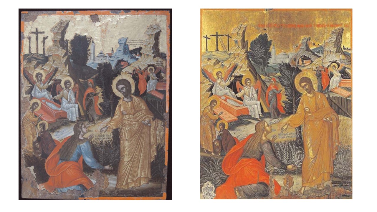
There are three images mentioned here: the original cult image of the Virgin, the lead Madonna  of the Virgin touched to the cult fresco Mary and the votive wax portrait of the child, which was gifted to the cult fresco image – these will be further discussed in the next exercise.

Exercise

In this exercise continue reading the rest of Robert Maniura, ‘Persuading the absent saint: image and performance in Marian devotion; you are only required to read pp. 629–42 (read until ‘... history of ideas’), and pp. 644–51 (start again at ‘The stories in Guizzelmi’s collections ...’ on p. 644).

·       Pay attention to the multiple images of the Virgin of Santa Maria delle Carceri: consider their medium, their connection to the cult image and their efficacy in performing miracles.

The Virgin delle Carceri is a figure from a painted fresco, whilst the small amulet is am existent lead figure consecrated by being touched to the painted image. The votive image is of wax covered with silver (expensive). The link to the cult image is one of consecration by image to the lead figure on ritual touch. The votive image is given to the painted image as a ritual of devotion to the Madonna and gratitude for use of her benevolent power.

·       Also keep in mind the public nature of these images.

They are public in that they are part of a means of publicly celebrating the power of the image – both recognising it before the public and demonstrating it by embellishing the display with votives known to come from their giver.

·       How are they being viewed and circulated?

Not by written publicity since the book record is relatively private (634). Tokens that have received by touch the power of the icon are worn on the person, on clothing or as jewellery (635). They adorn the body but also dedicate the body to the image and memory of its prototype. Prints are another type (637) and illustrate the issue of need for similitude between consecrated thing and its protype. Note in both cases a physical object is required (638) that can receive touches and impress them. Relics like the Marian girdle could having received power by being worn on Mary’s real body, could transmit this power to their physical objects that touch the believer (640f). The image takes part in a dramatic performance (644) – ritual (645). The similitude is needed because it is a prop in a drama. What is being copied is the ritual of approach to the holy one not the object representing that holy one (648f.). The ritual was that which cemented community identity.

·       What is the relationship between the cult image and its copies?

It is discussed 640ff. It is a mistake to see the relationship of one of identity. It is about the need for ritual substitution to distribute the power of the image (and ultimately its embodied prototype) across the community or public it serves. The issue is not about naïve belief in the agency of copies but willing suspension of disbelief, while still not believing, at the moment in which the copy plays its role in a ritual. We know the performance constituting the ritual is ‘unreal’ but know that it aspires to the real just as much as do we as we reach out to test it. Important section on p. 648: ‘inherent’ multiplicity of images because its role is to make multiplicity and division into oneness with an ideal – community (649) _> mimetic rituals.

Discussion from course

Maniura demonstrates that these multiple images – badges and prints – of the Virgin often performed miracles themselves, particularly for those who were too infirm to travel to the miraculous image itself. A particularly instructive example is the story of Mona Lisabetta (p. 637), whose cure is mediated by the woodcut print of the Virgin. Guizzelmi makes reference to these prints as being numerous and notes that he bought many in Florence, not in Prato; their production and circulation thus occurred beyond the original cult site (p. 638). These prints, even though they were reproduced in multiples, could perform miracles through ‘chains of touch’ (p. 639).

This raises issues around the relationship between copies and originals in this time period, and also alludes to the varied functions prints could serve, an issue we will come back to in 1.7. You may have also noted that the image dates from the fourteenth century and is by an unidentified artist – its fame is thus not linked to its author (the artist) but rather to its miracle-working powers.

Consider also the ways that images acted as surrogates, for instance, in the case of the wax image (standing in for the nephew), which was offered as a votive gift to the Virgin. Having understood the notion of publics, you might think about how the Madonna del Prato produced a specific form of public – the church as public space – which was not only a religious space, but one that was civic, social and cultural. In addition, the various copies that circulated of the image, from the lead replicas to the prints, allowed for a broader public. It connected, for instance, Mona Lisabetta, who could not physically go to see the Madonna but who had access to her through the copy.

Permalink Add your comment
Share post
New photo

The idea of 'making publics’ post-Habermas. A844 Ex. 1.3.4.

Visible to anyone in the world
Edited by Steve Bamlett, Monday, 19 Nov 2018, 09:34

The idea of making ‘publics’ post-Habermas. A844 Ex. 1.3.4.

Return to your notes about the public (from 1.3.1) and contemplate whether your ideas about the public and its historical shifts have changed after reading Habermas and, if you had the time, after listening to the Making Publics introduction.

I decided to read also: Introduction to Making Space Public in Early Modern Europe—Performance, Geography, Privacy Steven Mullaney and Angela Vanhaelen (2013)

My earlier ‘notes’:

Public in these examples (‘public opinion’ and the ‘public sphere’) is used adjectivally in which case it appears to invoke its binary antonym, ‘private’. Yet a private opinion whilst functioning in a similar binary relationship with public opinion is not the sole or probably the main usage of the term ‘public opinion’. As a known ‘the public’ might in part be synonymous with the ‘public sphere’ (or even ‘public domain’ but not quite, since it implies other spheres or domains. The public seems to name a ‘thing’. In that latter sense it relates to notions of the communal. But it isn’t the same either because we can’t define public without its binary private. In fact, the public is a splendid invention for capitalist and other societies where privilege, ownership and wealth are unequal. To talk about the public is to imply, and perhaps defend the notion of the private particularly in relation to issues of ownership, entitlement and access. This is so even where private means ‘subjective’ and ‘secret’ or ‘reserved’, although the relationship between meanings is nuanced. We have public entrances only to distinguish and justify the need for need for private entrances. We train administrators of bureaucracies and large enterprises ‘deal with the public’ since that ‘sphere’ needs to be constrained lest it or any part of it feels it has a right to demand access to what is reserved as private. Public then is a constrained or constricted area where the public is maintained in prescribed or permitted roles that do not allow the appearance of either the private or fully communal, where the private is perceivable as unnecessary.

Of course, these like all definitions are historically specific and will vary according to numerous historical and other factors. The major one here may be the discourses available to any period which may generate neologism and then vary the meaning of generated words by varying its contextual uses by the forces of conventions, accrued practice or ‘rules and laws’. The notion of multiple publics may emerge when we talk of specific groups.

For an image ‘having’ or possessing a public, seems to me a vague concept. In a sense here ‘public’ may suggest a determining bottom-up force that helps create or sustain an image in its present form and interpretation. This might be true of the ‘image’ associated with celebrity, although ere as elsewhere the determining factors are probably much more complex. But it could be applied to religious images or images of gender, race, disability and so on. In that sense are some 'publics' more influential and / or entitled than others. Do women for instance have public entitlement over images of them or are images of women as we have them in current society the possession and entitlement of those who use and abuse them, maybe men. The possibilities are endless.

The image is unlikely to have force to determine its public alone, since it feels impossible to attribute agency to an image. But the point remains that some images do have agency attributed to them – from religious icons to pornography. Is this a function of how those susceptible to that belief (in the magical power of the image (Freedman) become that images ‘public’ (those Catholics who visit Lourdes for instance or even followers of celebrity).

Returning to those (now green) notes is sobering. They were written in ignorance of what was to come and are therefore tangential to the narratives that follow in the course, although these too have multi-directionality. I benefitted from reading the Habermas essay, and more from continuing reflection, in terms of ideas about representation, which are still growing. The relationship between power, images and representation is obviously central to all the questions but I’ not at the point of articulating any of the thousand ideas that are spinning around rather disjointedly.

Other than that Habermas doesn’t offer much that might be usable. I was pleased that my notes anticipated some of these criticisms, although obviously not in the form of developed arguments, especially the hunch about ‘multiple publics’ (in the zeitgeist and its discourses anyway). My access to this idea comes from a long-life in the complex relationships between the politics f different publics of which I could be said to be a member. Some hints of how these ideas link to representations and images appeared, without me knowing it at the time, in recently sent-off TMA01. For instance, Burra seems to represent imagined communities by charging imagined space between figures as charged with interactional meaning. For me this says something about the relationships between art-objects, ‘publics’ and curation-spaces.

However, this material on ‘making publics’ is ever-so-important. Watching the video was time-consuming and I need to get to more to it. There are great quotations on ‘public spheres’ (Mullaney & Vanbaelen 2013:3):

  A heterogeneous and conflictual ensemble of social entities ….a multiplicity of publics and counterpublics that produce and occupy, in turn, a multiplicity of social spaces where collective identity and voice can be created, discovered, asserted and exercised.

There are even more feelers outwards in ibid:5 –

Publics are imagined communities, to adopt and expand Benedict Anderson’s rich concept, that are more or less concretely realized in physical or material spaces as well.

This is very rich. Again, it recalls how I used Anderson in relation to ‘imagined’ LGBTIQ+ communities.

Permalink Add your comment
Share post
New photo

Habermas’ definition in ‘The Public Sphere: An Encyclopedia Article’ A844 Ex. 1.3.2

Visible to anyone in the world
Edited by Steve Bamlett, Sunday, 18 Nov 2018, 16:33

Habermas’ definition in ‘The Public Sphere: An Encyclopedia Article’ A844 Ex. 1.3.2

Read Jürgen Habermas et al.,'The public sphere: an encyclopedia article (1964)(Habermas, et al., 1974) and consider how Habermas is defining the term ‘public’ and the public sphere. Also try to articulate what he sees as the differences between the medieval public and the bourgeois public sphere.

___________

The definition is insistently historical but not very precisely historical. For instance, whilst the ‘public sphere’ appears fully established in the 18th century, we examine only the ‘high middle ages’ to find an instance of where no such ‘public sphere’ could have been said to be formed. This leaves the vast duration of the Renaissance and seventeenth century as, should we say, transitory. Yet the notion that links monarchs to representation of higher power was more fully developed in the 16th/17th centuries and often read in retrospect into the supposed meaning of the middle ages – notably in Shakespeare in Britain. Habermas’ take on history is rather loose in one sense and over-simplified in its terms in another. The idea of the public sphere as a collection of private individuals, set up in potential conflict with the state through the former’s development of organs of articulation is surely simple in that sense. It certainly pays no attention to the history of communalism or its roots in history. As a result, it has no way of reading peasant insurrections that takes these as serious political articulations (whether rightly or wrongly).

Moreover, using the word throughout history as an index of change, makes some of the shifts in meaning hard to grasp especially in the complex world of postliberal advanced capitalism where covert control of the public and public opinion is the prize sought by private interests, such as organised and global capital.

The contrast of the bourgeois and medieval ‘public sphere’ hangs on a play of words focused on the ‘idea of representation’. In the Middle Ages the feudal monarch represented higher power and the inherited common land by virtue of this very aspect and part of the nation and thus made present again and again the sources of power to the eyes and imagination of everyone. This second sense of re-presentation is missing in the eighteenth century since political representation fragments with commonality and the state being forced to give attention to the self-representations of public opinion in the public sphere (pp. 50-51). This again is all very simplistic. Even in Byzantium kings could not guarantee that they were the true representatives of God, since they had through conflict to nullify the aspirations of the church at some points of history and this was even more the case in Western Europe (gulphs and Ghibelline conflict being the best representation of that).

DISCUSSION FROM COURSE:
Habermas begins his famous book by offering some initial thoughts about the public, many of which are also expressed in the first two pages of his article:

We call events and occasions ‘public’ when they are open to all, in contrast to closed or exclusive affairs – as when we speak of public places or public houses. But as in the expression ‘public building,’ the term need not refer to general accessibility; the building does not even have to be open to public traffic. ‘Public buildings’ simply house state institutions and as such are ‘public.’ The state is the ‘public authority.’

(Habermas, 1989, pp. 1–2)

As he argues in the article, there is a significant difference between the public sphere and state authority: ‘Citizens behave as a public body when they confer in an unrestricted fashion – that is, with the guarantee of freedom of assembly and association and the freedom to express and publish their opinions – about matters of general interest’ (Habermas et al., 1974, p. 49).

What had changed for Habermas was the relationship between the private, the public, and who had rights to be a public person. If in the feudal system the public sphere was one in which the lord was represented before the people, the new bourgeois public sphere allowed for state authority to be ‘publicly monitored through informed and critical discourse by the people’ (McCarthy in Habermas, 1989, p. xi). As Habermas articulates, the medieval representative public sphere was a ‘public sphere directly linked to the concrete existence of a ruler’ (Habermas et al., 1974, p. 51). By contrast, the bourgeois public sphere of the eighteenth century was made up of private people coming together to form a public body, who through things like newspapers could critique public authority itself (Habermas et al., 1974, p. 52).

The concept of the public sphere is largely connected to issues of representation, as it is broadly defined (political representation certainly, but also the material and textual forms of representation).

Permalink Add your comment
Share post
New photo

Images & the Public A844 2.1.3.1 Exercise Preparatory to Habermas

Visible to anyone in the world
Edited by Steve Bamlett, Sunday, 18 Nov 2018, 19:09

To begin thinking about the public sphere, consider the following questions and either write down your answers or type them into the box below; you will come back to them in 1.3.4.

  • How would you define the ‘public’, ‘public opinion’ and the ‘public sphere’?
  • Do these definitions depend on historical specificity? In other words, does the notion of the ‘public’ change over time?
  • Who would be an image’s public?
  • Does it depend on the image?
Public in these examples (‘public opinion’ and the ‘public sphere’) is used adjectivally in which case it appears to invoke its binary antonym, ‘private’. Yet a private opinion whilst functioning in a similar binary relationship with public opinion is not the sole or probably the main usage of the term ‘public opinion’. As a known ‘the public’ might in part be synonymous with the ‘public sphere’ (or even ‘public domain’ but not quite, since it implies other spheres or domains. The public seems to name a ‘thing’. In that latter sense it relates to notions of the communal. But it isn’t the same either because we can’t define public without its binary private. In fact, the public is a splendid invention for capitalist and other societies where privilege, ownership and wealth are unequal. To talk about the public is to imply, and perhaps defend the notion of the private particularly in relation to issues of ownership, entitlement and access. This is so even where private means ‘subjective’ and ‘secret’ or ‘reserved’, although the relationship between meanings is nuanced. We have public entrances only to distinguish and justify the need for need for private entrances. We train administrators of bureaucracies and large enterprises ‘deal with the public’ since that ‘sphere’ needs to be constrained lest it or any part of it feels it has a right to demand access to what is reserved as private. Public then is a constrained or constricted area where the public is maintained in prescribed or permitted roles that do not allow the appearance of either the private or fully communal, where the private is perceivable as unnecessary.


Of course, these like all definitions are historically specific and will vary according to numerous historical and other factors. The major one here may be the discourses available to any period which may generate neologism and then vary the meaning of generated words by varying its contextual uses by the forces of conventions, accrued practice or ‘rules and laws’. The notion of multiple publics may emerge when we talk of specific groups.

For an image ‘having’ or possessing a public, seems to me a vague concept. In a sense here ‘public’ may suggest a determining bottom-up force that helps create or sustain an image in its present form and interpretation. This might be true of the ‘image’ associated with celebrity, although ere as elsewhere the determining factors are probably much more complex. But it could be applied to religious images or images of gender, race, disability and so on. In that sense are some 'publics' more influential and / or entitled than others. Do women for instance have public entitlement over images of them or are images of women as we have them in current society the possession and entitlement of those who use and abuse them, maybe men. The possibilities are endless.

The image is unlikely to have force to determine its public alone, since it feels impossible to attribute agency to an image. But the point remains that some images do have agency attributed to them – from religious icons to pornography. Is this a function of how those susceptible to that belief (in the magical power of the image (Freedman) become that images ‘public’ (those Catholics who visit Lourdes for instance or even followers of celebrity).

COURSE PROVIDED Discussion

In what follows, we will consider some of these questions in relation to historical shifts, and of course in relation to the image.

Habermas’s seminal book examines in depth the emergence, brief flourishing and decline of a bourgeois public sphere, which was based on rational-critical debate and discussion. For Habermas, it was specific circumstances in the eighteenth century that allowed for a new civic society to emerge: new markets and commercial arenas; new spaces such as the coffee house where news and matters of concern were exchanged, discussed and critically engaged with; and novel forms of publicising news and debates in the emergence of the newspaper and journal. (For our concern with the image, the use of satirical prints to critique authority, often found in those publications, is especially relevant.)

In Habermas’ words:

The bourgeois public sphere may be conceived above all as the sphere of private people come together as a public; they soon claimed the public sphere regulated from above against the public authorities themselves, to engage them in a debate over the general rules governing relations in the basically privatized but publicly relevant sphere of commodity exchange and social labor.

(Habermas, 1989, p. 27)

It is important to note that for Habermas the bourgeois public sphere is a historically specific phenomenon, created out of the relationship between capitalism and the state in the seventeenth and eighteenth centuries, and thus relying on a largely Marxist interpretation of this time period. Thus, for Habermas, it was tied to changes that saw the solidification of the middle class into a ruling class. The other key idea is that the public sphere has a ‘two-sided constitution’, which for Habermas is about the ‘quality or form of rational-critical discourse’ and the ‘quantity of, or openness to, popular participation’ (Calhoun, 1992, pp. 4–5).

All of this might feel a bit unfamiliar to you, but it will start to make more sense as you read the rest of this subsection and Habermas’s text.

Permalink Add your comment
Share post
New photo

Le Corbuser's Tall Building Unité d’Habitation, Marseilles (1945-52) A844 Open Studio Set Exercise

Visible to anyone in the world
Edited by Steve Bamlett, Friday, 12 Oct 2018, 10:14

Updated: Friday, 12 Oct 2018, 09:58

Photograph: Roof level pool and children's play areas at Unité d’Habitation, Marseilles (1945-52) from Jenkins, D. (1999) ‘Le Corbusier: Unité d’Habitation, Marseilles (1945-52)’ in Dunlop, H. & Hector D. Twentieth –Century Classics 3 London, Phaidon, photo by David Cook. 


I chose this photograph to show that tall buildings are in fact relative. Their position on the roof is less important to the children herein than the objects turned to their playful use. Their horizon is at one with their surroundings and its heights are contiguous with theirs and in a sense visually 'reduced' to forms that are mirrored in the roof areas' interesting forms in concrete. We know such mirroring was intended by Le Corbusier. Iain Sinclair (2018:87 'Living With Buildings and Walking with Ghosts') talks about his intention to visit the block for the "experience" of 'that "magnificent" Le Corbusier roof, a measured progress around the panorama of the city, its mountains, money-stadium and shore at sunset.' 

The point is that we tend to see tall buildings and their summits as places from which to look down but here it serves an almost egalitarian practice in relation to both nature and society - persons, even little persons, become one with their high position. Le Corbusier's roof is not a site of a fabulous penthouse, like those in other private skyscrapers, but of family life across the bases of the social spectrum. Here however is the scary vista looking down.


Given Le Corbusier's flirtation with Vichy government, I feel uncertain about this historically but not in terms of social planning that still contained an aesthetic. In Beazley's World Atlas of Architecture, this building (p. 381) is given as an example of 'Brutalist Europe' but the text is more nuanced. European architects, Beazley argues, sought a different aesthetic and indeed a different social philosophy to animate their buildings. Towers of glass suited capitalism but not a social democratic vision. 

Brutalist?


Axonmetric


Jenkins (1999) describes it as the acme of Le Corbusier's work, based on 'experimental work with housing prototypes in the 1920s' and more contemporary, 'investigations into collective housing forms.'. According to Sinclair (2018), when subjected to fire in one of its duplex 'houses' (not flats), it was badly damaged in a small part but no-one died and the community lived on restored. The story of Grenfell Tower needs here comparing in terms of governmental neglect and disdain for public housing that contributed heavily to that latter tragedy. I'll slip a fe pictures in a blog to show the downside of Le Corbusier's project looked at from below, including an axonometric drawing (I only know about this from the A844 preparatory reading. 

All the best

Steve

Permalink Add your comment
Share post
New photo

Regulating the View: Who gets to go high? Looking from the Tall Building (1): The Shard

Visible to anyone in the world
Edited by Steve Bamlett, Wednesday, 10 Oct 2018, 17:27

Regulating the View: Who gets to go high? Looking from the Tall Building (1): The Shard

This room of our exhibition will explore pictures from a particular high place but will focus on the work of non-professional photographers, who Garret names ‘urban explorers’ (UE for short), whose aims in making photography is not primarily the production of an art-object but of an experiential record at some remove and considered as secondary and inferior to the experience thus recorded. Indeed this goes for the word-pictures of the experiences as well as collateral photography. This group is described by Bradley Garrett (2013)[1] who underwent ethnographic fieldwork with that group as a participant observer.

McKellar (2018) conceptualises The Shard as an example of a contemporary ‘viewing platform’ (3.2.1) that has emerged as an offshoot of the ‘blow up’ (3.3.2) of the London skyline. A deregulated City has spawned it seems a new ‘iconography of elevation’, and with it commercial practices that sell experience of that ‘elevation’. Hence the existence of an enterprise that whose brand and process is deeply involved with the ‘View from the Shard’ selling a group of commodities predicated on a common interest on that ‘view’, especially at ‘night’ when the prices rise. We need only vicariously experience a group of screenshots from The Shard website[2].


The word associations are clear – heights, luxury and the feel of the superhuman sensation, of going ‘further than the eye can see’. Gilbert (2010) is happy to see such experiences, together with the larger democratic potential of the internet represented by that global conglomerate Google as accessing a new means of satisfying the ‘pleasures of the imagination’ in an aerial vision that is freer and more democratic than that of the past. And it may do that, in the same way that the cult of the ‘celebrity’ in contemporary culture harnesses the identifiably ‘ordinary’, or the identifiably ‘common’, with emotional material that justifies the presence of hierarchy and freedom from mundane control from the top as a phenomenon of nature. The experience is one in which the democratic base of society justifies the experience of luxury, ‘high’ living and great prospects as one that belongs at the top and which it sees only irregularly and at cost and succumbs to its imaginative charm before it returns to where it belongs, nearer the bottom.

In a sense this is the Apollonian vision – it justifies an ordered hierarchy and sees its beauty as a reflection of the comfort at the top they temporarily occupy. That is why it is not, as Gilbert suggests, Dionysian – it threatens no-one and, in the end, votes to sustain the status quo. Those walls of glass are still walls and emphasise by virtue of the reflections they sustain an interiority that is smugly comfortable able to project its satisfaction into the outer world and to constitute ‘aerial views’ as things of a framed beauty. The external architecture supplies such frames which also hold up this structure – are the means of an uncommon but temporary elevation (of emotion and thought – ‘further than the eye can see’). From here ‘order, organization, and visual coherence’ of the external world is provided by the framing architecture and the comforts invisibly provided by its services. Of course from inside to outside the supporting architecture that holds up the curtain wall of glass must seem like a frame that protects and shelters.

This way of seeing things is therefore in danger of losing the nuanced view of the iconography of elevation McKellar proposes, though which she also questions as perhaps far from ‘offering true accessibility’. To get back to nuance we might need to look for a true Dionysian experience of a view from the Shard. I’m looking for this in the section of the exhibition in photographs by non-professionals of forbidden views from the top. Urban explorers as described by Garrett (2010) are people who refuse and deny rules that restrict their access, even when these rules are based (or rationalised depending on your attitude) by the health and safety of the ‘public’. Urban explorers penetrate depths unseen by others (parts of the disused Underground, sewers) and heights that take you to fear and privation, if also excitement, rather than luxury and comfort. As an example here is a poor reproduction of an unattributed photograph showing Garret (2018:2-4) in action as a participant urban explorer observer, pulling:

“… myself to the end of the counterweight (on the roof of the Shard) and peered down over the edge, down to the River Thames where the permanently docked HMS Belfast battleship looked like a bathroom toy.


The key picture is this one again unattributed and untitled. It shares with the other a sense of being framed in such a way as to make its frames conscious to us – bring a message of ‘I am just a photo inadequate to the experience I record’. This deliberate refusal of being art suggests that the photograph of object attempts a kind of neutrality between the viewer and the true artistic experience, unmediated views bought at the cost of transgression, danger and hard labour. This, if anything is the Dionysian that Gilbert only whimsically aligns with a person at home in high flight across London on Google. This is transgressive. We have no comfortable place from which to evaluate it as viewers.


Permalink Add your comment
Share post
New photo

Conservation & Tall Buildings: A844 Block 1 Sec 3 Exercises 3.2.1, 3.4.1,

Visible to anyone in the world

Conservation & Tall Buildings: A844 Block 1 Sec 3 Exercises 3.2.1, 3.4.1,

3.2.1

Gilbert, D. (2010) (‘The Three Ages of Aerial Vision’ in The London Journal 35(3), 289-99) argues that there are 3 stages in the development of an iconography of ‘aerial vision’ (291ff):

1.      A view of ‘topographical and built form’ of place that is as much inspired by imagination as observation, since the view itself cannot be realised, even after balloon flight.

2.      A view comprised by aerial photography (typified by Aerofilms Ltd.). These were closely linked to strategic military opportunities and to ‘camouflage’ defence operations.

3.      After the advent of 3-D static and kinetic visualizations of the environment from all angles and perspectives, including high above, enabled by digitisation of photographic data can allow the viewer to play with views obtained and their kinetic sequencing of zoomscapes. (293)

POWER

Both 1 & 2 lend themselves to being scenes with an Apollonian vision – hence not only emphasising height above (and the rarity and elitism (and divinity) of that view) but the coherence, order, organization and legibility of what is seen (check 298). Such a view is also the view of ‘power’ from a tower top – Panopticon, symbolic order of the phallus.

In 3 the use of aerial view as an ‘exercise pf power’ may still persist but it is countered by a Dionysian playfulness that moves between and obfuscates boundaries and binaries – up/down etc. – and is pleasurable, playful, resistant & disruptive (297) It is available too from the ‘London Eye’. Hence exercise of power is offset by disruptive revolt that side-lines the importance of new divinities like power & wealth. The view is no longer owned by the penthouse.

Gilbert jumps from this to seeing democratic potential in the aerial vision of the 3rd age.

3.4.1

Daniels, S. (1993) – provided – looks at the ways in which Prince Charles in the early 1990s privileged a view of how London should be viewed that he found in Old Master townscapes, especially Canaletto’s in the Royal Collection. As a monarch in waiting, he appropriates not only the sense of elitist ownership associated with aristocracy & monarchy but also of the Apollonian vision as Gilbert might call it. In Canaletto’s The Thames from the Terrace of Somerset House, the City in the Distance (1746-51) he instantiates the relations of divinity, clerisy and the mercantile commonwealth – the City of London and the vessel-plied Thames to be one that is ordered and hierarchical with God in command. This derives from perspectival tricks to enhance the relative size of St. Pauls in the view that Charles ignores. This may be the past but is a past – a heritage indeed – that must (like the Monarchy we assume) be preserved.


This is linked to the shifting iconographical meanings of St. Pauls as a restored church, divinity and city landmark (Resurgam) that was also used in photos of St Pauls during the Blitz. It is a Ship of State on the Thames and betokens the God-given (if achieved by mercantile means) Empire in building under God in the Eighteenth Century.

Even after the 2WW St Pauls becomes iconic for various shifting reasons such as a democratic and perhaps socialist vision uniting classes as well as urban & rural. This maintained in the 1960s where it becomes a ‘quintessentially English’ icon and sets the standard for a national skyline, silhouette, focal point, and standard of height aspiration compared to other lesser buildings.

The birth of Starchitecture however aligns Wren’s original creative vision with stars and starlets who see themselves as like him – Richard Rodgers (a ‘socialist’ Lord) and Norman Foster.

For 3.5.1 See Open Studio.

Permalink Add your comment
Share post
New photo

Queer theory and Interdisciplinary Histories: Callen, Anthea (2018) Looking At Men:

Visible to anyone in the world
Edited by Steve Bamlett, Wednesday, 10 Oct 2018, 22:20

A queer approach to sexual preference labelling in art-history (Queer theory and Interdisciplinary Histories): Intermezzo. Reflecting on: Callen, Anthea (2018) Looking At Men: Anatomy, Masculinity and the Modern Male Body.  New Haven & London, Yale University Press

Coming across this kind of excellent scholarly work necessitates a pause and reconfiguration in one’s thinking. This ticks many boxes for me.

First, it locates queer theory in interdisciplinary historical discourses – those namely of medicine, art-education, psychosocial norms, especial of masculinity class and race, although many more art-historical narratives impinge – issues relating to the definition of image and its relation to meaning (iconographic , naturalistic, conceptual and formal-historical), proportionality & aesthetic form and formlessness, ideologically contextual as opposed to positivistic theories of the ‘ideal’, notions of self, identity and diversity, the history of discourses of sports and war and, of course, the shift to a multi-disciplinary grasp of ‘anatomy’ in the nineteenth century.

This will be a necessary struggle for me however I begin to focus in on a topic, since the nude throughout the nineteenth and twentieth century requires this grasp of different disciplines which shape its meanings. But then so does ‘queer theory’  since it depends on an awareness of the specificities of the binaries which shape gender in any culture in space and time and the means by which these binary explanations of reality are established, maintained, challenged and survive challenge. The homosocial is made up from historical disciplines which in the nineteenth century mean things like the definition of concepts like ‘professionalism’ as well as normality and ‘appropriateness’ to norms. Of course however much I focus, that focus will be on a work, works, movements or artists or an artist but these questions will remain multiple ones and require attention, or, at least, awareness.

Callen’s book tries to look at the shift from the male nude as classical ideal (and the role of the Academies therein pace Edward Lucie-Smith) to naturalist ambitions to draw a statistical norm based on a theory of body economy (and its side-kick) efficiency which animated the work of art theorists and practitioners, as well as masters of male, health and physique and, of course, theorists of eugenic improvement.

She looks at works I see as central – Bonnat’s and Caillebotte’s nudes and briefly at Cezanne’s and other ‘bather’ motifs – but never really centrally to her argument. There are however very fine readings of paintings, whose importance I had not realised or guessed (or perhaps been even remotely aware of) such as Francois Sallé’s The Anatomy Class at the Ėcole des Beaux-Arts (especially in the brilliant reading that traverses pp. 130 – 139). Here class, the homosocial, age, profession, class, sexuality, envy and desire discourses intersect each other in a way that can ONLY be admired..

Yet love this book as much as I do, it sits and stares with a Sibyl-like stare at the dangers it flirts with of a discourse that doesn’t quite add up to  a single thesis, however many fascinating (established and novel) arguments it sets running. I look sometimes for more links between the excellent historical writing and research – on the modes of capturing dynamic motion in photography for instance in science and art schools (a lot to learn here) – and the main tenor of the argument. Likewise the book keeps returning thinly to the representation of women in homosocial contexts in ways that don’t seem to have space to be made solid.

On the other hand some comparisons seem profound despite being met en-passant, such as the brilliant comparison of the labouring bodies of coal carriers in Gervex and Monet, for instance (179f.), whilst other art-objects definitely needed more definition (such as Dalou’s La Fraternitie from the 10tharrondisement Marriage Hall – the most perfect kiss (p. 181) between two male nudes I have ever seen (in art or out of it). I also wanted more awareness of just how ‘queer’ (antagonistic to norms) is George Lambert’s Chesham Street (1910 - corrected. Thank you Ekaterina) on p. 123 but little is said. This is an image everyone must puzzle over.


Queer theory often liberates from intentionalism and the ‘intentionalist fallacy’ but this is not the case when Callen speaks of Etty’s Wrestlers (a painting I love (p. 87)), which to me is full of much more ambivalence about ‘racial’ categories than she allows as well as normative mid-Victorian racism.

One of the most useful bits of learning for me is the role of the flayed nude écorché model, which links my interests in Titian and de Ribera to their fate in nineteenth century anatomical models – especially in holding up a light to the importance of living over fragmented dissected bodies in anatomical knowledge.

Anyone who loves a wonderful enlightening read will love this scholarly book because it is so well written, but to me it is going to cause a lot of headaches. Writing with, and distinguishing oneself meaningfully from, such excellence will be hard work. But that’s life. Thank you, Anthea Callen, art historian, thank you!

All the best

Steve

Permalink 2 comments (latest comment by Steve Bamlett, Tuesday, 6 Nov 2018, 12:16)
Share post
New photo

Comparison of Noli Me Tangere late 16th C. versions: Ex 2.3.2 A844 OOps! Misunderstood exercise questions!

Visible to anyone in the world

Comparison of Noli Me Tangere late 16th C. versions: Ex 2.3.2 A844


(a)BM1994,0501.3                                (b)Michael Damaskinos, St. Catherine’s Monastery, Herakleion

 ·        What are the similarities between these two panel paintings?

·        What are the differences between these two panel paintings?

·        Why do you think the Cretan artefact was not deemed worthy of display in the National Gallery’s Sainsbury Wing?

It is a pity that the course has returned to giving exercises requiring just summary of your reading here but the exercise vseems worthwhile with an art form less known to most of us. However, I’d rather attempt a more amateur comparison than re-read and precis the long and highly specialist piece in Angeliki Lymberopoulou, Lynne Harrison and Janet Ambers,‘The Noli Me Tangere icon at the British Museum: vision, message and reality’ (2011, pp. 185–202, 213–14). Otherwise I might not learn how to see this.

Obviously the surface media are different between (a)’s restored state and that piece still in service. This could mean that (b) was heavily restored since most of the gilding has been taken from (a) in restoration.

The striking similarity is the pose used by the seated angel at the tomb stage of the narrative which the authors attribute to the Sibyl in Michelangelo’s Sistine chapel paintings. However, from top to bottom.

·        The ‘skyline’ is similar with from left to right Golgotha, rocks, bush, cityscape, more rocks with a visible cave in first rock-stack. However the middle cross on Golgotha has a ladder leaning on it refreshing its immediate meaning in relation to the Deposition – the start of this funereal narrative.

·        Lower the bushes in the landscape are more defined in (b) and differentiated. However gestures are very much the same in the actors across the painting. There is a reflection of the Magdalene’s ‘red’ clothing and angel wings. Iconography & red?

·        Lowe the Christ figure is larger in (a) and the folds of the clothes more ‘classical’ in look than (b). More use of size to emphasis the grandeur of Christ in (a) perhaps – left to the gilding in (b). The urn of ointment much more visible in (b).

Now look at the professional. I miss (just examples, I miss much more):

·        P. 6 The tears represented in a way that is transitional between fixed earlier Byzantine figures and more naturalist style (both).

·        More detail of setting in (b) than (a) – fence behind Christ (p. 7).

·        More obvious use of under drawing & incised lines in (a).

·        Additional inscriptions in (b) including signature.(7)

·        Donors in (b) (9)


Worthiness of Sainsbury Wing?

v  It is a copy of the original in expert analysis.

v  Its hybrid nature between western and eastern forms are not appreciated.

v  Byzantine art is not popular outside the East (Balkans, Greece & Russia).

v  It is small and difficult to hang with prominence.

v  It doesn’t tell a straightforward story about Medieval Art and transition to Renaissance.

v  Considered ‘primitive’ in the Vasari sense.

Now what is said in ‘Revealed Discussion’?

Clearly I misunderstood the purpose of the exercise, which was not to refer back to versions of same icon but: ‘The Stoclet Man of Sorrows is the earliest of the two, with a possible date in the thirteenth century, while the Noli me Tangere has a terminus post quem in the last decade of the sixteenth century.’ I don’t find the instruction all that clear and I would have learned more if I had understood properly, but that may be my fault.

This is essential:

They both present an iconographic dialogue, albeit in opposite directions: the Stoclet diptych presents us with Byzantine influences on a work produced in Italy, probably for a Catholic patron; the Noli me Tangere is essentially a Byzantine icon at its core, elaborated with Western influences to meet the specific requirements and tastes of the bi-cultural Veneto-Cretan society.

And the rest is very interesting.

All the best

Steve

Permalink Add your comment
Share post
New photo

Being ‘saved for the nation’ A844 Ex. 1.12

Visible to anyone in the world

Being ‘saved for the nation’ A844 Ex. 1.12

(a)   Thinking back now to Colls and Dodd’s thoughts about ‘race, class, gender’, and the notion of ‘critical heritage studies’ introduced earlier:

·        To what extent do you think this has had an impact on what is ‘saved for the nation’ and acquired and displayed by public bodies?

·        Are there examples you can suggest from your own locality, or that have had a high media profile?


1.      My immediate response to this was that I had explored this issues in the University of Leiden MOOC Heritage Under Threat I completed over the summer. The list of contributions is nearly complete in my rather poor contribution to Ex. 1.9. These contributions mainly relate to a given task performed on a chosen example from ‘my heritage’. It was introduced here. The point the course sought to make seems to be that learners explore what ‘my heritage’ means to each one of us. Through these I came to some rather reflexively convoluted conclusions about whether any individual owns any one unitary ‘heritage’. It also, involved thinking about what, in a heritage site, represents ‘my nation’. This site contains (at least):

·        an early ‘British’ (Brigantine?) defensive earthwork, probably much altered by the Romans it was set originally to defend against;

·        Eighteenth-century adit mines, made by families to eke out an income or subsistence.

·        The invisible site of a Chartist meetings by Huddersfield Chartists in the early nineteenth-century;

·        A tower built at the end of the nineteenth century to celebrate the ‘Empress of India’, the Victoria Tower.

·        The site used by my grammar school to focus hill-climbing cross-country runs;

·        A public-house used by people in the sixth-form of my class for safe ‘under-age’ drinking. It was a dive!

If ‘my nation’ then is anything it is a palimpsest – a thing in which has different meanings for different parts of me at different layers of its archaeology and retrospective development. For me,  these indicated issues of ‘race’ (Romans as invaders / colonisers, the limp connection to Brigantines or pre-Roman tribes, the India celebrated by the Victoria Tower in the perspective of the large East-Asian population who immigrated into Huddersfield at the time of my late adolescence), class (imperial against democratic interests divided by class – Victoria Tower  & the Huddersfield merchants who built it by subscription, coal-miners and Chartists and being a working-class council-estate dweller (before the term CHAVS was invented) in a predominantly middle-class grammar school) and gender (given the debates of the problems of identification implied by binary gender and heteronormative forms).

A palimpsest has a number of places where different layers of the past impinge upon one with different resonance through your life and self-reflection.

2.      This is such an example in my view because it links to work done on A843 and for the EMA. There I concentrated on the term ‘place-making’ in relation to the changes to my now native Bishop Auckland following the developments looked at in the preceding A844 exercise example – the attempt by Jonathan Rutter, a City investor and millionaire and highly formal Anglican Christian. His aim expanded since the newspaper campaign referred to in A844. By 2017 Bishop Auckland was being ‘place-made’ in very different wats, with the revival of:

·        Auckland Castle, its deer park (including deer-lodge) and original walled-gardens.

·        A Mining Art Gallery relating to local Durham mines and miner-painters opened 2017 (this was my EMA);

·        A faith museum currently being built behind the Gate House in Auckland Park,

·        A view-point and modern information centre being built in front of Auckland Park Gates (with a view to Binchester Roman Fort – the only developed hypocaust systems still visible in Britain).

·        A Spanish Art Gallery to completed the Zurbaran Jacob and His Sons (originally collected by a Bishop of Durham as a mark of his interest in a Jewish homeland) set and based on lending from the Prado and purchases enabled by Art-Fund.

·        A centre for Visual Art of Durham University.

If this place-making, in part justified by potential tourism-based income, is to be described as teasing out of the ‘place’ Bishop Auckland, some layers of a palimpsest buried at different levels of its past, including the subterranean underground paintings it houses by miners & former-miners. This palimpsest includes class and gender issues (the rooms of the Mining Museum are divided by gender) and even issues of race – the complex history of anti-Semitism in the Anglican Church for instance.


(b)   Here now are some final, very open-ended, questions for you to discuss with fellow students on the discussion forum and your tutor group:

I wonder how much I will use the forum. Through A843, or so I was told in an email by the Course Director, other learners were offended by how much I wrote and my generally strong personal take on things. All I could have said was that this was not meant to offend nor put other people off from shorter, more focused and course-centred contributions. However, I found all that process quite hurtful in the end and I think I may prefer talking to myself in the cyber-void of these blogs. The point is to stimulate my thought. Views from others helps but I’m not getting many, so I’ll just carry on.

Here goes!

·        Do present policies and strategies for ‘saving [works of art, visual culture and heritage sites] for the nation’ reflect the reality of the cultural constituency of the place where you live?

    • Clearly not. I think the ways in which heritage speaks in the Auckland Project represents various heritages and voices within these heritages. Saving Zurbaran takes on a new menu given the purchase through Art-Fund of an El Greco and collaboration with other Durham galleries owning significant Spanish work from the seventeenth century and later – including Durham University. This is best represented by the publication: Baron, C. & Beresford, A. (Eds.) (2014) Spanish Art in County Durham Bishop Auckland, Auckland Castle, The Bowes Museum & Durham University. The constituency is probably largely middle-class, professional & clerical and perhaps academic.
    • This is less the case for The Mining Art Gallery nor for the ‘intangible heritage’ projects that spring from it and are fostered by the Auckland Project such as older miners’ reminiscence grand memory groups, proggy-mat making, course in printing – using Tom McGuinness self-bought printing-press.
    • Local walkers (with & without dogs) in the Deer Park.
    • The range of variety of cultural audiences addressed can be over-estimated but there is more inclusive diversity here than could be predicted when the issue was just saving Zurbaran’s.

·        Is ‘saved for the nation’ now an outmoded concept?

    • Yes. Or it ought to be, although the maddest fringes of Brexit thinking will most surely resurrect it. Cultural mix in Durham is probably near the lowest in the region. Strangely that has fed the survival of nationalist (dare I say, racist) thinking in some quarters – although hopefully that is minimal.

·        If so, should it be updated – and if that is the case, how?

    • Not by simple place-making as explored in A843. Maybe I’d call it – palimpsesting: exploring the visible and invisible heritages of place and their diversities, communalities and interactions. Thus Bowes Museum was bought by the wealth made by one of the cruellest of the private coal companies that has fostered dark memories in working-class traditions. How are these conflictual interactions placed and discoursed. Not simply as a past curator, Frank Atkinson, did in this gallery by including mining memorabilia in the permanent collection, but perhaps by making these conflicts readable across the range of heritages – and including commonalities.
    • In a sense I’d do a repeat of my Castle Hill project for the Leiden university course. It would be a lifetime’s work. So don’t hold your breath.

All the best

Steve

Permalink 3 comments (latest comment by Anne McCann, Thursday, 1 Nov 2018, 15:05)
Share post
New photo

Byzantine Art curated: Ex. 2.3 A844

Visible to anyone in the world
Edited by Steve Bamlett, Tuesday, 2 Oct 2018, 13:36

Byzantinism curated: Ex. 2.3 A844

In 1947, an exhibition of early Christian and Byzantine art was held by the Walters Art Gallery at the Baltimore Museum of Art. Access a review of the exhibition by the German-American Byzantinist Ernst Kitzinger, 'The Byzantine Exhibition at Baltimore':

·        What are the points of interest that Kitzinger raises regarding this exhibition?

For me the points of interest relate in part to another question – who defines the space in which a representation of Byzantinism may occur. First who is Ernst Kitzinger?

Ernst Kitzinger was a German-born historian of late classical, early medieval and Byzantine art. Of a Jewish family, Kitzinger left Germany in 1934 shortly after defending his doctoral thesis and moved to England where he joined the staff of the British Museum. In 1941, Kitzinger emigrated to the United States and became a fellow at Dumbarton Oaks in Washington, D.C. There he became Director of Byzantine Studies from 1955 to 1966. In 1967, Kitzinger joined the faculty at Harvard, where he taught until his retirement in 1979. After retirement, he divided his time between Oxford and the Institute for Advanced Study at Princeton

Kitzinger in short was a scholar on the rise in the fluid social circumstances following the entry of the USA into the war against European fascism and the aftermath of the Second World War, a person who became director of the (still) most eminent centre of Oriental and Byzantine studies, Dumbarton Oaks. For me this explains the particular subject position developed through this piece. Let’s look at its characteristics:

1.     The emphasis on looking for a true representation of the non-occidental Byzantine, in comparison with earlier European exhibitions, is applauded, through the ‘exclusions’ operated (69), although he makes the point that the exclusion of African art may be a step too far in these exclusions. He also seems to quietly condemn the curators’ decisions not6 to include the finest USA collection – that of Dumbarton Oaks. Here he speaks for the newly adopted alma mater (69-end). He characterises the up & down sides of going for ‘representative examples of the average product’ (70) since it simplifies our sense of the range, achievement-potential and history of Byzantinism.

2.     He characterises the role of collectors in the curation of the exhibition – presumably at the cost of a more ‘professional’ (for him academic art-historical) perspective. The prominence of debt to private collectors can bias the act of making truer attributions – to the cost of this exhibition’s historical credibility (70).

3.     He characterises the arrangement of articles as by ‘fields of craftsmanship’ (70) and to some extent this seems to mean media used (‘silver room’ for instance). This creates popular magnificence to the eye but over-prioritises less important issues in the art: ‘Sumptuousness, though an important characteristic OF Byzantine art … may be a hindrance rather than a help in learning to appreciate its less accessible sides’ (70f.). Herein we see the subject position of the academic specialist flexing his muscles (weedy though they might be after so long in the library).

4.     He sees the benefit of the exhibition for the ‘interested layman’ (71) but is basically beating the drum for ‘anyone who is at all interested in this field’ (70). These are the professional players to whom Byzantinism is a field of specialist endeavour rather than a new area of interest. These ‘interested laymen’ will be misled by and ‘discouraged from making any historical sense of the material’ (70). Of course he keeps reminding us that his subject position is relatively rarefied (‘But these are the preoccupations of a specialist’ 70) but he insist on the value of a ‘clerisy’ of informed expert viewpoints who will guide laymen to the truth rather than visually attractive uncertainties’ and illusions. The role of the art-historical curator is here made.

·        How did this exhibition differ from previous ones?

See 2 above. The aim is to show ‘the character and extent of … Byzantine art to be found in American collections and museums’. The emphasis on collections (private ones) gets picked up by the scholarly Kitzinger.

·        How could a future exhibition on Byzantine art contribute to our better understanding of this culture?

He proposes (at the end) that future exhibitions will use space better to pick up hypothetical connections and links that are of use to the art-historian and which are more honest with the ‘interested layman’. They do this by choosing ‘to tell a story’. To do this they have to think more carefully about how they utilise scarce space – a curatorial role.

Whilst raking 2nd-hand bookshops I (found catalogue to the first national Byzantine Exhibition (or so it claimed) in Edinburgh in 1958 for the Edinburgh Festival and curated by David Talbot-Rice and his wife, together with the V & A. It again compares itself to West-European forebears including Paris rather than anything of the USA. Talbot-Rice as a curator is everything one would imagine, Kitzinger wanted. The catalogue emphasises telling a historical tale and is aimed, before it even mentions the ‘public’ to be ‘of great interest to specialists’ (Talbot-Rice 1958:8)[1]. Moreover the stress is not on the ‘representative … average’ but ‘masterpieces’.

[1] Talbot-Rice, D. (1958) Masterpieces of Byzantine Art: Sponsored by the Edinburgh Festival Society in association with the Royal Scottish museum and the Victoria & Albert Museum  Edinburgh, Edinburgh Festival Society

Permalink Add your comment
Share post
New photo

Reflections on Curation and Recurating : Matthew Akers, Director (2012) Marina Abramović ‘The Artist is Present’

Visible to anyone in the world

Reflections on Curation and Recurating Across Multiple Mediums of Artistic Production: Based on Matthew Akers, Director (2012) Marina Abramović The Artist is Present’ (104 mins) HBO Documentary Films & A Show of Force.

As I read through A844 material (currently on the theory and practice of curation), I came across a passage in Terry Smith (2012:198f.)[1]. He speaks here of an ‘emergent tendency’ called (by him) ‘recurating’. Here an ‘original performance is recurated with differences that make it not an antiquarian exercise bit a ‘contemporary exhibition. One recommended as relevant to current concerns’. He also calls this ‘double-play’ since the original is evoked whilst being superseded by new concerns. His example is the MoMA retrospective of Abramović’s work, and especially Night Sea Crossing, originally performed with her then husband and arch-combatant, Ulay.

Akers’ film is described by him (in an additional interview on the BFI film) as a recuration of the recuration represented by the MoMA show. We are in an endless spiral of reselection and re-synthesis here where each recuration evokes the one it historicises and reapplies to a new contemporaneity, in part defined by its transition between media, venue, audiences and re-examined ‘lives’. This makes this film a most rich resource for anyone wanting to reflect further on curation and the notion of contemporaneity, including contemporaneity’s composition in part from multiple pasts it reselects for examination.

This makes the film an inexhaustible mine of reflection of how ‘art’ defines itself in and against curation in an almost cyclical fashion as it gyres into the future. Art is the manipulation of bodywork in a frame that is itself framed and then reframed as it urges its relevance on a new contemporaneity. The beautiful thing about the film is the contemplation of art as presence. In the work Abramović sits on a chair for full days over 3 moths whilst visited by museum visitors, who sit as long as they like or dare and just gaze, receiving back a very active gaze from Abramović herself. It is a place where projection, introjection and mutual tensions and attachments within the dyad complete the work in part – although completed over again in the gaze of an omnipresent circling audience, some of which are in the queue to participate more fully. Abramović makes herself consciously into an enactment of the Mona Lisa in fact to show us what portraits might mean and what this self-portrait portends for the future of all participants who reflect and enact it.

Visitors break into tears, experience time differently (even one ten-year old), play the boundaries of participation – one visitor removes all her clothes to be escorted from the scene by security. It is about what art expresses, for whom and by whom. Each emotion is a performative act, such that it might be ‘acted’ AND is evaluated both as an emotional catharsis and a merely beautiful piece of acting. This kind of ambivalence is indeed, Westmacott, her biographer, says in an additional interview on the disc, at the heart of what this artist is and what ‘artistic presence’ (qua Belitung on Byzantine icons) is.

I can’t recommend the work enough. I will view it again and again I think.

All the best

Steve

[1] Smith, T. (2012) Thinking Contemporary Curating: Independent Curators International Perspectives in Curating No. 1 New York, ICI.

Permalink Add your comment
Share post
New photo

Pevsner on Englishness 1 & 2 and links to reflections on heritage. A844 Ex. 1.7-1.9 inclusive

Visible to anyone in the world
Edited by Steve Bamlett, Thursday, 27 Sep 2018, 10:11

Pevsner on Englishness 1 & 2 and links to reflections on heritage. A844 Ex. 1.7-1.9 inclusive

What suggests art- historical background?

My feeling is that the crucial issue is not the ontology of art historian – what am I? But its value and specialism. Hence, ever so delicately, Pevsner distinguishes his right to be a ‘professional’ rather than an amateur and ‘make a living out of’ it. The right to make a living inheres in something special and possibly elitist in the values, skills and knowledge that are claimed to be demanded by visual as opposed to linguistic or aural culture: ‘revelations which can reach us through the eye are less familiar’. This sense of a specialised culture accessible less commonly than other cultural objects is merely asserted not argued and feels extremely tenuous for that reason. Hence, he goes on to compare uneducated responses (those without art-history) to those able to penetrate the ontology of the art-object as it is seen in its own originating time and nation.

The contradictory theme of the urbane commentator who is nevertheless keen to appear as a ‘professional’ whilst performing merely as an English eccentric ought to been expected from Pevsner, given his strange situation as a professional art-historian in a university structure that had no art-history teaching in it. Pollock (2012)[1] mentions the stress on both ‘anomalous, full of eccentricities’ (357) – sometimes presented as particularly ‘anti-intellectual’(362), that were often to be enacted and enjoyed as particularly and warmly ‘English’, whilst insistent on a superiority behind it that must be ‘professional’ or craftsman-like, and based on literacy in the skills.

The historical constants are knowable (by those in the know) as ‘spirits of ages’ (probably Hegelian in origin) that can be assessed when we know what to look for as more important than individual variables relating to single artists. Along with this synchronic developmental field lies a diachronic one based in the ‘geography of art’, where we look for national characteristics.

National characteristics are distinct from the assertions of nationalism? Yet this is difficult to sustain in examinations of art, where contradictions and complications must be ignored to establish this (Lowe 2009). Both nationalism and national characteristic are likely to be ‘imagined’ beliefs rather than objectively established truths according to Benedict Anderson.

The features of life that are supposed as discernibly national, are: languages & terminologies, climate (bringing in Winkelmann) and the sequelae in nature brought about by climate – oak forests. Schama will help us unpack this use of the forest in imagined beliefs of the national characteristic. But how do we move from tis to the demand oak makes on church-makers for ‘high exacting craftsmanship’. The associative networks here are predominantly ‘imagined’ ones.

 Setting parameters for investigating Englishness. Are there contradictions, complications in framing the discussion?

1.      Englishness is established by learned comparison & contrast between different works from different cultures but across time (to establish the constant of a national character). This juggling with variables and possible constants in time-space is entirely ignorant of other sets of variables such as culture and social categories, some of which might be transnational.

2.      Englishness may be experienced by all or many English but is discerned, at the level of analytic knowledge, consciously only b the few educated to be thus able.

3.      The relationship between history and geography of art is grossly oversimplified. If more specific would it stand up? The methodology is from Wölflinn – ‘compare and contrast’ and can be used for synchronic and diachronic comparisons. His is all in the latter.

4.      The validity of ‘national characteristics’ are assumed verities based on ‘non-statistical comparisons. Yet they can be argued to be culturally imagined describing ‘communal’ values in the interests of colonial adventures.

5.      That associations are often specious and do not appear to mark ‘national characteristics’ is to be expected because they are not ‘universal’ truths. So what kind of truths. I’d say ‘imagined ones. The characterisation of them as part of an ‘atmospheric view of the world’ asserts its rather belief-led process, taking us back to Winckelmann assertions about climate.

Ex. 1.8 Perpendicular England.

No questions given. My notes:

1.      The Perpendicular is peculiar to England. ‘not even a remote parallel abroad’. Its features:

a.      Angularity – ‘square-topped tower’; square-ended chancel; ‘enclosed space should be like a box, or a cube, or a block.’. An arch that is really ‘an open triangle’.

b.      Shows architecture that is not kneaded or plastic moulded, but components added to each other.

c.      Uniformity & repetition, and stressing ‘flat surface’. Close & repetitive tracery.

d.      Seen again in Gothic revival, arts & crafts etc.

Ex. 1.9 Critical Heritage Studies Reading Rodney Harrison (2010).

As I finished these extracts with interest, I realised I’d read them before on a University of Leiden MOOC on Heritage under Threat. I covered many themes on exercises (compulsory for a ‘with Honours’ pass) date. They mainly concern a site near my birthplace – Castle Hill, Almondbury, near Huddersfield, although there is stuff on coal mining and Hamsterley forest. The concern for coal mining heritage runs throughout though.

https://learn1.open.ac.uk/mod/oublog/viewpost.php?post=206298

https://learn1.open.ac.uk/mod/oublog/viewpost.php?post=206684

https://learn1.open.ac.uk/mod/oublog/viewpost.php?post=206290

https://learn1.open.ac.uk/mod/oublog/viewpost.php?post=207689

https://learn1.open.ac.uk/mod/oublog/viewpost.php?post=207708

https://learn1.open.ac.uk/mod/oublog/viewpost.php?post=207740

https://learn1.open.ac.uk/mod/oublog/viewpost.php?post=207676

https://learn1.open.ac.uk/mod/oublog/viewpost.php?post=206683

https://learn1.open.ac.uk/mod/oublog/viewpost.php?post=207770

[1] Pollock, G. (2012) ‘Art History and Visual Studies in great Britain and Ireland’ 

Permalink Add your comment
Share post
New photo

Ribera’s Nudes –Men Penetrated by Pain:

Visible to anyone in the world
Edited by Steve Bamlett, Thursday, 27 Sep 2018, 10:07

Ribera’s Nudes –Men Penetrated by Pain: Ribera: Art of Violence Dulwich Picture Gallery (opening 26th September 2018.

How does the thesis that in the renaissance the nude male was associated with heroic violent interaction between men fare if we look at a key Baroque figure like de Ribera? It certainly links to that, but Ribera’s focus is not on men in relatively equal combat but in the passive suffering of a heroic body-figure under the hands of malign and/or justified torture. Usually this torture involves penetration of the skin and/or flesh – his favourite themes that run through his career being bodily punishment of an extreme kind in which the body surface is ruptured, cut and often manually or mechanically torn. Interest in the cruel mix of torture in which the victim’s bodily responses force him to collaborate in worsening his condition for instance, such as the strappado, but also penetration by weapons (St. Sebastian) or flaying. Ribera imagined different stages of gross torture (especially in the case of St Bartholomew), imagining him in twisting three-dimensional mobility of experience and expression of pain. He loves the moment of the scream through an open mouth – another orifice in the flesh where inside and outside meet in visions of wet (often blood-reddened and wet) rupture. His use of the idea of flaying in butchery emerges in the 1644 Bartholomew and the flaying of Marsyas. The flayer is shown at the minute when, having cut and exposed the flesh from skin (or hide in Marsyas’ case), he uses a hand (yes, even Apollo does this) to push down the patch of skin to expose a fresh wound.

For this reason, de Ribera was considered by Byron and Gautier as a lover of violence for its own sake. Others, including the curators of this exhibition feel that it is a means of communication about the role of senses in the understanding of art, particularly in that art stimulated by the paragone, the demonstration of the competing claims of sculpture and painting in terms of both knowledge gained bottom-up from a range of the 5 senses or in the exploitation of mimetic effects in multi-dimensional space. Ribera’s men in pain are often partially exposed near the picture-plane, whilst the body-in-pain twists in two actual and one virtual dimension (of depth). Pain naturally invites this motion which is caught usually as a stasis torn out of arcs of embodied movement. In the paintings in this exhibition, we see how this affects the picture frame in 2-dimensions as a stretching of the body to fill all available spaces – with bodily extremities reaching out to the ultimate edges of the painting’s frame.

For these curators this exhibition is of art and hence haunted by the head of Apollo (in flesh in the flaying of Marsyas) and as the a captured stone bust of Apollo Belvedere (the bust probably used is also in the exhibition) in a few surprising paintings but especially in his Bartholomew paintings, where the eyes of Bartholomew are contrasted with the dead impassive blindness as the former looks at God in the very physical c1628 version or, more worrying and intensely, the viewer in the 1644 version (for detail see this link). For our curators this proves the intention of meta-discourse in the pictures on the nature of art itself - whether in paragone or colore-disegno debates

Let’s say though that another theme is possible, which is the ways in which the Baroque nude male here transforms the conception of masculinity. No longer are we as interested in the heroic moment of male interaction but in the passive response (in fact a mix of active and passive responses) to violence (rather than of mutual violence). De Ribera appears to value in men the moment of their ability to suffer and endure whilst in bodily torment (where their bodies are penetrated by male social violence and its surface torn from an assumed depth that lies under opened orifices. Moths that scream in silence are such orifices. You can’t perceive them without haptic apprehension, some imagined but embodied performance in the viewer. That is why the surface that is torn is not only of the skin, but in the greatest painting (Marsyas) of the tree bark and the surface paint of the painting itself. The curators are good in their analysis of this in the catalogue.

What in seventeenth-century Milan makes de Ribera the poet of male passive suffering in the body? Of course, the Counter Reformation stress on the pierced body is part of it – in Bernini for instance, but something else is happening. A response o the male body that only in part looks like a return to Northern Gothic dwelling on the torn body of Christ, but in the sense of an artist, whose exposed inside is the sign of art (now based on Milanese art-under-sale and the rise of exhibition selling (as Haskell famously tells us) made men-in-solitary-pain.

For me a strange star in the show is a wizened older man in red and with a clear halo, brandishing a knife in one end and the removed skin with remaining facial features of St. Bartholomew. Make sure you puzzle here.

All the best

Steve

Permalink Add your comment
Share post
New photo

Labyrinths VI: Postmodern theory, the labyrinth and curation.

Visible to anyone in the world
Edited by Steve Bamlett, Sunday, 23 Sep 2018, 18:12

Labyrinths VI: Postmodern theory, the labyrinth and curation. A passage from Paul O’Neill (2016) The Culture of Curating and the Curating of Cultures Cambridge, Mass., MIT Press. P.91f.                   

This just wants quoting and preserving from section called ‘The Exhibition as Form’. It reflects on all my other pieces and gives potential to deepen them:

'As well as being linguistic or semiotic, exhibitions are spatial. …They induce forms that migrate between fields of haptic, visual, and auditory relations. …

(On Lyotard’s 1985 exhibition “Les Immatériaux’)

Focusing on the exhibition’s labyrinthine quality, Lyotard declared it a phenomenological and spatial form. In this, … tested the concept of the exhibition as a sensorial experience with its own qualities and properties that collectively produce its own genre of art in which ideas, artworks, objects, and zones of interpretation intersect, sensorially, philosophically and spatially.’

Linked to this quotation (but written before seeing it) are:

1.       The exhibition The Green Man in and of the Talbot Rice Gallery, Edinburgh University collated and curated by Lucy Skaer and others.

2.       An art installation on Maritime Lane, Leith Adam Linklater: Mythopoeia by Andy Cummings .

3.       An introduction through Charlotte Higgins’s new book.

4.       An addendum: the way in to Anselm Kiefer - a labyrinth with no end has, of course, no way out.

5.       A second addendum - Paul Broks: the labyrinth in the Neuropsycholgist's Odyssey (this one).

Steve

Permalink Add your comment
Share post
New photo

A queer approach to: 7. Curating the Male Nude

Visible to anyone in the world
Edited by Steve Bamlett, Sunday, 23 Sep 2018, 20:25

A queer approach to sexual preference labelling in art-history: looking at case studies in British mid-twentieth century art: 7. Curating the Male Nude

The aim of this group of blogs is to look critically at some of the publications relating to gay male artists in the mid-twentieth century. This is in part to begin trawling for a dissertation topic for my MA in Art History. My initial thoughts relate to focusing on one of these artists, although their contexts include each other, their treatment of male nudes in relation to the iconographic, contextual and stylistic features which propose such a subject for art (for some of the choices this will include photography as well as painting) and ‘queer theory’. This will look at the issue of labelling of course, particularly at the important terminology of ‘homosexuality’, which dominated the period. My hypothesis will probably be that such a term was, and remains, a means of marginalising, even to the point of negation, of such art. This blog looks at some reflections on the curation of male nude art collections / assemblies.

This is timely because of the upcoming Royal Academy exhibition, at which the Guardian critic, Jonathan Jones, smiled, because of its aim ‘for “parity” of naked men and women’, raises the issue of how and why the nude is a hegemonic female or male form across various culture & societies. This question has been asked, hence for my first example of curation is a book (perhaps even the sneered-at form of the coffee-table book) from 1998 by the then ubiquitous, Edward Lucie-Smith, Adam.[1]

Lucie-Smith’s final chapter is about the nudes as ‘The Mirror of Homosexual Desire’ and uses the term ‘homosexual’ in a totally unproblematic way. He is aware of queer theory, in its birth-pangs, but sees it, I think rather problematically and dismissively for all involved as ‘an offshoot of feminism’ (174). But his position is more nuanced than this erroneous reading would suggest. Queer theory is based on a belief that the querying of norms in art – representational or otherwise – creates the kind of crisis in signification, even if momentarily and cumulatively, that produces change from beliefs that have become conventional ‘truths’ in the teeth and frame of those norms. i can empathise with the Lucie-Smith of 1998 because at that time gay male identity needed prideful bolstering in those early days of change in legislation and mores that yet has not come to completion. Yet in 2018 we are much nearer. There is weight in queer theory’s insistence that we spend far too long creating binary distinctions between straight and gay, male and female when the issue for all is the regulation of desire and belief

Lucie-Smith (1998:179) also points out the immaturity of our early positions as gay men who used nude images (sparingly) as an index of a desire that must be legitimated and justified. Of the ‘characteristic art of the rainbow coalition’ (the union of left, feminist and identity politics) he writes:

It does not offer opportunities for the creation of new images of the male figure. Where male imagery is present, as in some of the complex compositions of David Wojnarowicz (1954 – 82), it is employed largely for its shock value, and is usually lifted from another source, such as male pornographic magazines

Although the argument about Wojnarowicz does not hold water held next to that Artist’s achievements in what is quintessentially QUEER ART, his point is sound and made clearer through the chapter. We do not make the male nude usefully into a possession of the gay community. What he (187) sees as more hopeful (and I agree) than that aim is that the: ‘meaning of male imagery seems to be becoming more ambiguous,… the male nude as a subject for art is currently going through one of its periods of radical transition.” This is a description, whether he calls it this or not, of queer theory in praxis, much more so than some of his own appealing photographs (John and Richard 1997) that bothy eroticise and, concomitantly, emotionalise relationships to and between gay male nudes.

Where this book is still valuable is in its perception that male nudity becomes radical when it is contextualised outside the normative – alongside domesticity in Hockney for instance (142), or in relation to the proud nudity of males with a disability (126f) or where gender roles themselves are brought into question, without recourse simply to the substitutive conventions of drag (132f). How much more however is done by two books representing more recent exhibitions in Munich and Mexico City.

These modern exhibitions are represented by two books / catalogues of exhibitions (three if we account for the version of the second one that is written in French and dealing with the exhibition when its focus was much more purely European[2]): for the Leopold Museum in Vienna (2012) & the Museo Nacional de Arte (MUNAL) (2014)[3].


The Munich exhibition probably remains of the exhibition and exhibition-catalogue of most use for me if I go with this subject and I have already used it to talk about male nudes in Ingres and Etty in A843. Its curatorial focus however is strongly on literary-visual-political discourses of masculinity with a stress on essays on sources in metamorphic poetry (17ff), negotiated identity in space (27), sexual semantics (37f.) after Winckelmann (an excellent 2 chapters 57 – 76 being on that influential figure himself). It opens with issues of decency and ends with the sublimations that made the nude the model par excellence of Nazi statehood. This curation has an obvious intent – to cause introspection about the nature of German concern with the politics of the male body.

The French Cogeval exhibition is in part represented again in Mexico City but the contrasts between European and South American iconology of the male nude is something much more than an additive. Here masculinity is looked at in terms of construction of it in worker politics of revolution as well as nationalistic state appropriations of the nude (p. 44f followed by material on ‘the classical ideal nude’ – also appropriated by the European right in the twentieth century). Nevertheless, this is a very rich source for a consideration of the male nude as iconic image of embodied notions – nature (175f), heroism (93f) and ‘truth’ (139ff.) are obvious ones. But what of pain (207ff.) and desire (231ff.). Here other traditions are important – especially in Spain. So I await a visit to the Ribera exhibition this week in Dulwich. But Renaissance forms are also mighty. I’ve begun to reflect on these but the Royal Academy exhibition this year will help further. The Mexican book also includes material that makes me joyous (especially on Ron Mueck).

 All the best

Steve

[1] Lucie-Smith, E. (1998) Adam: The Male Figure in Art New York, Rizzoli International Publications Inc.

[2]Cogeval, G. et. al (2013) Masculin / Masculin: L’homme nu dans l’art de 1800 à nos jours Paris, Musée d’Orsay

[3] Natter, G. & Leopold, E. (Eds.) Nude Men: From 1800 to the Present Day Munich, Leopold Museum & Hirmer; AND Arteaga, A., Cogeval, G., Ferlier, O., Mantilla, A. & Rey, X. [trans Dodman, J., Huntington, T., Itzowitch, C. & Penwarden, C.) (2014) The Male Nude: Dimensions of Masculininty from the 19th Century and Beyond Mexico, Museo Nacional de Arte & Paris, Musée d’Orsay. 


Permalink Add your comment
Share post
New photo

A queer approach: 6. Reflecting on Edward Burra through new material from Minton

Visible to anyone in the world
Edited by Steve Bamlett, Friday, 21 Sep 2018, 19:29

A queer approach to sexual preference labelling in art-history: looking at case studies in British mid-twentieth century art: 6. Reflecting on Edward Burra through new material from Minton

The aim of this group of blogs is to look critically at some of the publications relating to gay male artists in the mid-twentieth century. This is in part to begin trawling for a dissertation topic for my MA in Art History. My initial thoughts relate to focusing on one of these artists, although their contexts include each other, their treatment of male nudes in relation to the iconographic, contextual and stylistic features which propose such a subject for art (for some of the choices this will include photography as well as painting) and ‘queer theory’. This will look at the issue of labelling of course, particularly at the important terminology of ‘homosexuality’, which dominated the period. My hypothesis will probably be that such a term was, and remains, a means of marginalising, even to the point of negation, of such art. This blog looks at some reflections on

Reading this by Minton pulled me up short:

I may never paint a picture that will survive for in it is that weakness, lack of incisiveness which characterises all the self expression of homosexuals, but to paint it is inescapable.[1] (p.9)

For that is at the heart of a problem to explore. For Minton, being a ‘homosexual’ was the cause of his failure to produce great art and is here made equivalent to the same kinds of reason to which his suicide is sometimes (wrongly, I believe) attributed. The question should not be one of identity but of labelling and of the constraints in self-definition and self-expression this involves. For Minton, language being what it is, this state of weakness was equated with the word ‘queer’ too, used as a word of labelling Abuse.

Queer theory attempts to look at ways in which destabilised norms (not just sexual ones) allows open up our assumptions about the normal and fracture the ideological glue that holds them together. It may be that, for Minton, holding notions of self that inbuilt weakness were precisely the source of his indecisive ambiguities, in that he saw them not as a strength that exposed the constructions of the symbolic world but as a characterisation of self as other, weak to its strong stability. That Minton could be a wonderful painter, worthy of survival is shown I think when he began to paint men of other cultures. Simon Faulkner (cited Martin 201b[2]:63) argues that these images succeed because of the painter’s ‘avoidance of the overt queering of the black male body’. In fact Minton did not overtly queer any other male bodies, although, of course Burra did do so with all the bodies in his early art. Minton’s is in producing images of desire that queer his entire picture – that stop us making easy assumptions about identity or relationship in his most successful (and some less so) male figures and opening up potential.

So perhaps we need to look briefly at Burra via Martin (2011)[3]. Although it is true that there is overt queering of the white and black body in Burra, it is not always straightforward in its picture of desire – nor do I think it makes a virtue of labelling its figures or overall meaning ‘homosexual’. His great picture The Straw Man (1963) surely shows this, in ways it would be difficult to explain in few words, so I’ll use that as an excuse to leave it there.

The Straw Man (1963) Pallant House Gallery (on loan from private collection). Available at: http://www.culture24.org.uk/art/painting-and-drawing/art366630


In less great pictures, there may be a case for seeing ‘overt queering’, often using very obvious stereotypes, such as the sailor (see Three Sailors at the Bar 1930 & Dockside Café 1929). Yet even here there are complexities in which turn some signs of homosexuality (such as rings or the colour ‘pink’ in the 1929 painting) in on themselves in my view. These points need arguing but this is not the point of the blog per se. That is, to say that the weakness of ‘queer’ figurative art and the association of its key figures with suicide are not symptoms of ‘homosexuality’ (whether that oppressive term is considered as a medical-disease terminology or not in any part of its recent history) but of the norms, whose power queer art at its most successful overturns – both in its mimetic representations and compositional character. Let’s say it, Straw Man is a picture about liminality – desire turned violent in which the aesthetic, the meanings and the limbs of figures are all queered by contradictions and uncertainties. I think this is true of the early art but also true of the later non-figurative landscapes in which boundaries take on liminality and no road is ever ‘straight’ nor its determination known. 

My first Burra painting (in terms of seeing an original) was the haunting Near Whitby, Yorkshire (1972), where meaning, shape and colour are all queered in ways in which destabilises (most gratifyingly) that most ideological of terminologies -  of ‘nature’ and the ‘natural’.  This is done too in in his 1971 pointing Snowdonia No.2 where forms themselves are liminal between mist and apparition too, but too obviously and pointedly. The Near Whitby painting just ‘haunts’ and is more successfully Gothic than any of his less satisfying (excluding his wonderful Don Quixote set sketches and theatre furniture) fantasies from the 1940s.

In truth, Burra too is about unpacking and then discarding the term ‘homosexual’. It is too queer to be about such a dangerous and endangering stereotype of self as ‘the homosexual’. Only the latter is on the side of suicide – the former is about creative relief from norms that fail to either offer mimesis or vital internally conflictual art forms.

All the best

Steve

[1] Martin, S. (2017a) ‘Introduction’ in Martin, S. & Spalding, F. (Eds.) John Minton: A Centenary Chichester, Pallant House Gallery, 7-9.

[2] Martin, S. (2017b) ‘An Expression of Self: Minton’s Self-Portraits and Objects of Desire’’ in Martin, S. & Spalding, F. (Eds.) John Minton: A Centenary Chichester, Pallant House Gallery, 69-88.

[3] Martin, S. [Ed.] (2011)) Edward Burra Farnham, Lund Humphries, 69-88.

Permalink Add your comment
Share post
New photo

How do I represent ‘nation’ visually? A844 Exercise 1.5.3

Visible to anyone in the world
Edited by Steve Bamlett, Friday, 21 Sep 2018, 16:43

How do I represent ‘nation’ visually? A844 Exercise 1.5.3

1 Return to Benedict Anderson’s Imagined Communities  and read from p. 86 ‘The “naturalizations” of Europe’s dynasties …’ to p. 90 ‘… become an “English” language’.

As Anthony D. Smith has noted in analysing Anderson’s impact, ‘mass reading publics in vernacular administrative languages (a kind of “high culture”) were enabled to imagine themselves as sovereign, but finite, political communities, i.e. as nations, through the products of “print languages”. In other words, the boundaries of the nation came to coincide with those of a “print-community”’ (Smith, 1999, p. 49).

  1. ·        What, then, are the implications of this for us as historians of art, architecture, design and visual culture rather than the printed word?
  2. ·        Are those bodies tasked with saving art and built heritage for ‘the nation’ in fact dealing in easily recognised stereotypical constructions – and what are the implications of this for the use of public money to fund their activity?

1       The passage itself does not give clues to help in these rather difficult questions. However, a caveat is a good place to start. That is that visual nature of a medium does not distinguish it from language when it is written rather than spoken. That is because written (or typed, language has a visual form that allows for variability across a range of options: character of script or font, variations in character of script and font, contextualisation of the visual verbal sign (is it on a large high-street window, in a mirror, on a piece of paper, on a visible page of a book) etc. This is particularly important when we compare national-vernacular language communities with the cultures that preceded them with ‘a script language that embodied the TRUTH’ (see preparatory blog). The latter used language labels (see Byzantine Christian art in particular where WORD is flesh) as if it embodied the same truths as the visualised non-linguistic body. National art & architecture both can (buildings rarely don’t) bear linguistic labels, especially where that building ‘represents’ a NATION, SUCH AS a National gallery or Museum.

 That said language is part of the cognitive machinery with which viewers interpret visual material, Hence, the contextual discourse which surrounds the visual, including that introjected and projected into the viewer’s visual-interpretative processes will also be important.

 However perhaps there are other issues. Visual forms can also reflect processes such as Russification across an expanded Russian Empire (88) or Anglicisation across the Indian Raj. These forms manifest themselves in stereotyped clothing design with particular contexts, such as administration) in which the empire shows itself as ‘English/British’, whilst permitting a sphere of action (provided it is politically quiescent) that remains diverse. The important thing is that the imperial nation has a hold on hierarchies where real power is exerted. Hence in Scotland ‘Scottishness’ in dress/costume is invented in the nineteenth century because organs of power (law, commerce, government, administration etc.) remain firmly organised in English print that rules over those ‘folk’ forms. Even elements of architecture (such as the bungalow) can be taken, imitated in an English version from subaltern cultures such as that of old Bengal. Of course, it is very complicated.

However, certain landscapes can single also ‘national stereotypes’ as can stereotypes of climate and smell. I think though this is getting complicated. I’ll look at the ‘revealed discussion’ before going on with this and add a note if necessary.


2     I don’t think these bodies are dealing with forms that, like language, can be described as having evolved into a recognisable national form (although of course languages don’t really naturally evolve – they reflect power relationships just like any other human construction). Thus nations build a national visual culture often by adopting a bricolage of visual forms that take on national authority – In Britain the role of classical and some Baroque architecture - or by framing the visual in a certain formal setting into which its features are manipulated or composed. Thus art can be changed by the grandiosity of its framing, its placement at a height to which viewers raise their eyes, its context relationally with ‘other furniture’ in a gallery. It is removed from street culture or even native domestic culture or from practices that might be repugnant to a certain construction of ‘Britishness’. In a sense, we see Landseer doing this with Scottishness. We certainly see it in the Raj or in religious cultures which must succumb to an imperial-national stereotype, as Buddhist Nepal to China, or Mumbai to the Anglicised visual forms of Bombay.


In terms of Britain, art will be selected and displayed too in ways that subordinate local cultures or other forms of diversity brought about by class, ‘race’, ethnicity, gender, and sexual orientation in such a way that, though allowed to persist sometimes, they do not ‘challenge’ central orthodoxies. Again, as with above, I’ll reconsider after Revealed Discussion’ in an addendum.

2 With these questions in mind, look carefully at the following work by contemporary Scottish artist Calum Colvin: Anger (1993).


Figure 1.1 Calum Colvin, Anger, 1993, cibachrome, 37 x 46 cm. British Council Collection. Photo: Bridgeman Education.

·        What aspects of national identity or an ‘imagined community’ of Scottish (and/or British) nationhood are being interrogated here?

·        The reproduction is difficult to see and is not clear to me how much the visual elements are meant to be contra-distinguished or to merge. Thus the anachronistic elements, such as pictures of kilted battle set against Campbell’s soup tins and a McDonald’s printed logo may be intended to have relation to one visual scenario, or one (the older-fashioned one, may be overlaid on the other. The McDonalds logo may be on a painted flag that has been damaged in battle or may be a logo seen through damage done to a visual overlay of ideological Scottishness (fighting men in kilts) in an underlying set of images. But of course both McDonald and Campbell are important clan names in Scotland as well as global brands of a modern visual world. In fact here we have a complex setting of Americanised ‘Scottish names’ with a kitsch fiction of their origin in Scots as ‘tribal’ emblems. Is it that historical diversity in Scotland is being reduced here to the commodified standards of globalisation?

If there is a flag holding up the McDonalds logo, its pole is made of one of the many marks that scar the surface of the painting. Is it a pole or a scar on a picture surface or a terrestrial perceptual effect caught in static time? Are these marks shooting trails from bombs in modern warfare or again just damage done to the Scottish scene that has been painted? Even some visual elements seem to me ambiguous or liminal. Of course there is a bridge (a good boundary metaphor), river, loch and mountains, but is that a desirable built dwelling at the other side of the river bordering the loch or the forested mountain background I sometimes see it as.

 ·        Where, is it suggested, do challenges to/appropriations of this perception of the nation come from?

·        I think the answer I suggested above is probably what is wanted here. The appropriation of Scottish culture is by global USA culture which now uses English as its print-medium.

However there is an appropriation too of Scottishness by a very male myth of Scotland – the same that generated Braveheart. A very masculine aggression subverts all else at both sides of anachronisms we see here, involving too a kind of appetitive sexuality in which flesh becomes meat. I do not know what to make of the object, if such it is, in the bottom right of the picture. It seems organic and animal and has several layers of what look like teeth but could be stones, which advance on the fighting men. It has a queering effect on the picture – an effect that fails to allow us to find norms by which to interpret itself.

·        How are they presented in visual form?

·        I expect I will be totally off-key here. I think the issue here is that norms by which we interpret visual objects, such as outline forms, stereotyped colour relationships, visual proto-typicality (as a cognitivist might see it) are all compromised. That we cannot know for sure WHAT we are seeing, or that what we see changes as we take in diversities across a wide range of object-form, spatial-temporal, dimensional (depths versus surfaces) and tactile ambiguities and liminalities. There is even a play I would say between visual pleasure and disgust (that object I mention above with the potential to ‘teeth’). Of course what must happen is that form has become difficult to regulate. It is difficult to see how such a picture is ‘composed’ – its rhythms and  so on – and I suppose I feel before it a kind of radical discomposure in which images are uncertain to interpretation, and perhaps to recognition.

·        I have given a very driven interpretation of this. What shall I see in ‘Revealed Discussion’ (which makes it sound like the Revelation from the Gods – the breaking of the seals)? Let’s go and look.

·        In fact what is revealed goes much deeper than I did and is better because it knows and uses discourse about the materials used and compositional techniques. I have to say, that constituted real learning for me. I’m gratified. I* won’t add though so that other people, if they chance to see this, get the revelation from that discussion that I did.


Permalink Add your comment
Share post
New photo

‘My own nation’ implications and a theory? A844 Exercise 1.5.1 - 2

Visible to anyone in the world
Edited by Steve Bamlett, Thursday, 20 Sep 2018, 10:32

What does the phrase ‘my own nation’ imply? A844 Exercise 1.5.1

This exercise seems to imply that there is an answer to the question ‘what is my nation?’ However, truthfully, the answer isn’t so clear to me. The OU uses nation to differentiate the constituent parts of the UK but I’m not sure I identify with the term ‘England’. Not that the problem is eased by thinking of myself as British or belonging to Great Britain or the United Kingdom. In the end the terms are remote from any sense of implied ownership, of me of their referents or of their referents of me. One resists such a sense of legalistic ownership, yet in the end we are caught up in such legalist categories of identity. These categories are not just cognitions: they exert their power, for me and on me, as documents which could govern any future choices I might want to make – of domicile,   work or income and so on. In a sense they represent certain determinations of ‘self’ whether I own them or not, they own me and fit me into a whole series of extant power relationships, and include some which could emerge from complex forces in relation to as yet unseen circumstances. The issue and experience of Brexit is a case in point.

Is there a point in looking for associations of the term ‘my nation’ then? I think perhaps there is.  Not all of those meanings will I want to own consciously as a representation of myself but they will remain in the background. They include notions of racial origin, although the terms themselves are already compromised by ‘tribal’ origins that I don’t own – such as Angles, Bretons (Great and Little Bretons) and which don’t equate with current geography or political status, Nevertheless the sense of ‘race, ‘ethnicity’ or ‘tribe’ is an association. This causes problems of course in relation to these complex notions and their boundary with notions such as statehood and culture, and the end of the relevance of the term  ‘tribe’ (except as a means of differentiating a supposed (from the Eurocentric perspective) of lesser rather than greater cultural and/or economic-political development. So with the provision that this will happen with all terms – that they will become complex and hard to own by anyone as a conceptual representation of self, try:

‘Race’, ethnicity

Community (which allows for the sense of multi-racial/ethnic but does not always imply a community of communities with some indistinct boundaries between them).

Tradition ‘folk concepts

The sense of a shared past and/or ‘culture’

Political Belonging (enabling and constraining)

Geographical belonging (ditto). Including internal distinctions of capital, regions, districts, ‘parishes’ (for some but not me).

Government and a network of implied power relationships of citizenship

Issues of common faith or common beliefs

Institutions that represent that sense of nationhood in title or form or implicit claims.

Physical forms – traditions again, building, street plans and types etc.

You realise you could go on – so I’m not going to consult Williams now.


Theoretical terms in understanding nationhood: Benedict Anderson? A844 Exercise 1.5.2

Refer to my pre-course Preparatory Reading Notes.

To these I’d note that the key issues of the chosen passages for the course seem to me:

1.      That the concept of the ‘imagined’ is essentially to any notion of ‘nation’ or ‘national community’ that emerges. These are not things imagined by individuals in the first instance but by cultural work by peoples in certain kinds of determinate relationships with each other. They are not cognitions for the individual until they have been prepared (and evidenced by products) of a socially imagined category. Imagination here is something that is shared – building of common images. These images are created, shared (in an interactive manner) and developed as a sense of past, present and future identity project – a project that involves inclusions (of images and image components) and exclusions – and hence boundaries (not all of which are considered to be crossed or crossable with any or at least complete freedom – ties to notion of ‘freedom of movement’. Its  features:

a.      Objectively a modern concept but only in as far as it allows for a subjective sens of communal antiquity of origin (myth of origin perhaps – but driven heavily into the remotest part)

b.      It is universal as a category. No-one exists without a rewlationship to this category and one of its forms.

2.      It is rich in meanings in relation to power / politics but there is poverty of deep philosophical (ontological & epistemological) back-up.

3.      its characteristics as a concept are summed up as being:

a.      imagined

b.      limited / boundaried

c.      based in community

4. That the social / institutional practices by which these imaginations are threefold. However all three institutions / practices are interactive and share common development and some boundaries:

a.      The Census. There is a historical move to racialize the categories used to nominate nation (164) to the disadvantage of religious or belief-based categories. With race there is no fractions (166).

b.      The Map. Creates units with ‘state’ boundaries, which are relational with other states but also stable. They have IMAGINED ‘VERTICAL INTERFACES’ (172). They are a type that can be reproduced in space/time (175) – concept of reproducibility is important. Map becomes a logo or emblem.

c.      The Museum. To an extent the whole state is a museum curated by natural government of sites. The depth of archaeological sites relates to the imagined past of the nation. Linked to birth in nineteenth century of ‘colonial archaeology’ (178f) and of scholar-officials (179 I think of Ernest Jones in the 18th century). Good phrases ‘profaning processes’ of nation building (de-religionising) and ‘infinite reproducibility’ (182) A country’s past is selectively imagined and curated as if by nature.

Permalink Add your comment
Share post
New photo

Image or Object: Saving Mae West’s Lips for the Nation A844 EX 1.3 First Draft

Visible to anyone in the world
Edited by Steve Bamlett, Tuesday, 18 Sep 2018, 16:02

Image or Object: Saving Mae West’s Lips for the Nation – or an example of 1930s interior design work A844 EX 1.3 First Draft

The next part of the exercise will involve OpenStudio. …

·        Conduct an image search for one of the works that you have identified as being ‘saved’ following a successful campaign.

·        The search took place on 18th September 2018 and started in the latest edition of Art Quarterly, to which I subscribe. A number of items attracted me but the most relevant to the discussion that is current in the relevant page was The Mae West Lips sofa from Monkton House (1938) by Salvador Dali (1904-1989) and his most important British patron, Edward James (1907-1984).

·        Go to OpenStudio and to My Exercises, Block 1, Section 1, Exercise 1.3, Saved for the nation.

·        This is a draft prior to access being given tro Open Studio because I like to be in control of my own learning to a high degree – more than the course specifies. Certain decisions will be made about what and how I submit to Open Studio. It may be:

    • An update of this
    • A new project slightly more off-beam that reflects either:
      • My own interests
      • Work towards a dissertation theme.

Dali's Lips - basic V&A image

·        Make this slot visible to your tutor group.

·        In final OS draft but already visible here (in OU blog) to them and can be accessed via my Twitter account.

·        Upload your image to the slot.

·        See above.

·        In the slot’s description briefly describe the campaign that ‘saved’ the image you have selected.

The ’campaign’ here is difficult to describe as such, although national newspapers used government press briefings which indicated that a temporary export bar was placed on its sale by the Arts Minister John Glen as a result of lobbying from cognoscenti near to the art establishment. These articles (see Guardian November 17th) express the probable loss of the item should the asking price for the item (over £497K including VAT) not be found before May 1918. The minister talked about the piece as ‘iconic’ and ‘unique’: the ‘single most important example of Surrealist furniture made in Britain’. The stress on the link to British manufacture was important. It is valued in terms of its representativeness as an image or icon at one level (at this level this sofa was not unique – there were 2 identical sofas at Monkton and one was already sold and 5 had originally been made, with variations according to identified sites of placement, for the commission for Edward James. Hence this was not the only sofa representing Dali’s conceptual image, which James had asked to be made from his knowledge of Dali’s conceptual print (now in the Chicago School of Art), Mae West's Face which May be Used as a Surrealist Apartment, 1934–35. There is a famous one in Dali’s theatre-home in Figueres, of course.

If this sofa was unique is that it was torn from its context and re-designed collaboratively by patron and artist such that features matched the interior furnishings of the drawing room of Monkton House, James’ residence. The black tassled embroidered fringe in particular (looking little like the embroidery upon the epaulettes of a picador … or matador, ’ was added to match the room designed by Lutyens in 1902 and containing by 1930 a mélange of Victorian, Edwardian and Surrealist ‘styles’. No doubt the Spaqish fantasy was a pleasing concoction of both makers. James’ participation involved too lengthening the lip to make for more functional seating.

Once the sofa was saved it was more common to see its uniqueness as a ‘fascinating piece of interior design history, …’, according to Christopher Wilks, keeper of V & A furniture and textiles. What strikes me is the way in which terms like ‘unique’ and ‘single’ and ‘famous’ can be applied loosely to the ‘great artist’ Dali’s icon of Mae West lips, when the originality eventually is to be found in its role in a object whose design and making was in fact a historically time and space limited collaborative adventure. The Article in Dezeen (27th June 2018) – the source of much of the above information – helps to clarify this more than I have space for here.

The most telling ‘campaign’ event – with some (rather manufactured) drama is the justification of the export ban based on the deliberations of the Reviewing Committee on the Export of Works of Art and Objects of Cultural Interest (RCEWA), administered by the Arts Council.The ‘drama’ is represented by the debate in the papers about whether the item met the Waverley criteria for considering the item worthy of being saved by the nation. These criteria are as follows:

 The Committee’s function is to consider whether an item referred to it is of national importance under any of the following criteria.

a) Is it so closely connected with our history and national life that its departure would be a misfortune?

b) Is it of outstanding aesthetic importance?

c) Is it of outstanding significance for the study of some particular branch of art, learning or history?

The Applicant, whose interests are in selling the item to the highest (and therefore non-British) bidder answers ‘No’ to all these. The expert submissions counter all these objections in their submission. Issues of importance, in terms of the aesthetic and learning criteria of the piece’s significance relate to ‘provenance’ and the ‘circumstances of its creation’ (its history therefore), which take precedence over the mere object in assessing its value.

Its importance then is not because of the uniqueness of the object per se (there are documented ‘related extant versions’) or its date (it is relatively recent) is a reflection of the history of British interior design and the collaborations / amalgamations that involved.

However it is clear that the Committee was also influenced by the importance of the ‘image’ in the history of art and artistic genius, labelling it, at the end of their meeting minutes, ‘one of the most instantly recognisable pieces of furniture of the 20th century.’ It is ‘recognisable’ not because of features of its importance in interior design history but because the image is quintessentially attributed to Dali’s genius.

Permalink Add your comment
Share post
New photo

A queer approach to: 5. John Craxton

Visible to anyone in the world
Edited by Steve Bamlett, Thursday, 13 Sep 2018, 19:11

A queer approach to sexual preference labelling in art-history: looking at case studies in British mid-twentieth century art: 5. John Craxton

The aim of this group of blogs is to look critically at some of the publications relating to gay male artists in the mid-twentieth century. This is in part to begin trawling for a dissertation topic for my MA in Art History. My initial thoughts relate to focusing on one of these artists, although their contexts include each other, their treatment of male nudes in relation to the iconographic, contextual and stylistic features which propose such a subject for art (for some of the choices this will include photography as well as painting) and ‘queer theory’. This will look at the issue of labelling of course, particularly at the important terminology of ‘homosexuality’, which dominated the period. My hypothesis will probably be that such a term was, and remains, a means of marginalising, even to the point of negation, of such art. This blog develops some ideas around the work of John Craxton.

Craxton did not paint nudes as part of his public, nor, as far as I know, private, subject matter in art. This may be significant. His young men are always clothed and follow certain ‘simple’ types, a kind of Continental version of ‘Shropshire Lads’, though characteristically shepherds, goatherds, sailors and young working men dancing in Greek tavernas. These have a kind of stereo-typicality about them, even when they could be said to be based on realisations of his fantasy life. He loved the bars frequented by sailors from Souda Bay, conveniently near Chania. He smiled when the supporters of the fascist colonels reported him as a spy because an educated Englishman who loved sailors’ bars was thought to be, of necessity, interested in military intelligence.

This suspicion by some Cretan neighbours led however to one of his rare politicised actions: abandoning Fascist Greece until the fall of the colonels. His favoured genre though was pastoral, and pastoral is only ever indirectly political and at the level of a generalised iconological practice. And pastoral represented his insistence on idealising – Greek males in particular, such that the violent family blood feuds he knew of in Crete never get even suggested in his art, the only threat posed by his subjects being their luxurious and irreversible eating up of what is good and which sustains – like the goats he shows picking the last fig leaf of an isolated tree in a beautiful landscape (my favourite being Goat, Sailor and Asphodels 1986, a consciously iconographic work).

Pastoral in Craxton is hopeless beautiful and hopelessly flawed. His young men are as radically unreal as is the island itself at the level of his wishes, and, in a favoured icon of young men thrashing octopi, with a ruthlessness in their passion:

An island where lemons grow and oranges melt in the mouth and goats snatch the last fig leaves off small trees the corn is yellow and russles (sic.) and the sea is harplike (sic.) on volcanic shores saw the marx (sic.) brothers in an open air cinema and the walls were made of honeysuckle

Craxton hated the novel (and film) Zorba the Greek as being too critical of Greek country people, sailors and their character.

John Berger once tried to see the bare feet that characterise these young men as a hint of political realism, a subtle politics, but they equally act as an emblem of the naked essence of the men. They are often focused upon at the cost of massive distortions of the figure and its place in the landscape, or patterned as the emblem of masculine togetherness in dance. The examples are complex and not clear icons of attraction, though they approach that. Examples are Figure in a Grey Landscape 1945, Greek Fisherman 1946, Galatas 1947, Pastoral for PW 1948, The Dancer, & Two Greek Dancers 1951, Shepherds near Knossos 1947, Boy on Wall 1958, Workman III 1961, Voskos II 1984, Two Figures And Setting Sun 1952-67.

Craxton was a painter of queer pictures but I think he, unlike other case studies here, could be comfortable with the category of the homosexual which he could equate with Orpheus at the mythic level and the sexologists’ category. It did not stop him seeking marriage with Margot Fonteyn (but it didn’t get far) but it did stop him from using his privileged position to facilitate a gay lifestyle in a Britain that became increasingly oppressive for many of the unprivileged. Arcadia was gay and it lived in Greece, and latterly just in Crete. But his shepherds have complex desires. Collins (2018:181)[1] traces them all to a common type made up of complex private iconographic meanings but focused on friendship and George Psychoundakis the Cretan shepherd and Patrick Leigh Fermor’s Runner and dear friend, the ties with whom were not remotely sexual. Yet, despite this, using Craxton’s biography would go none of the way to understanding his art. Let’s take Still Life with Three Sailors, which he worked on (with variation) from 1980 – 1985.

Craxton’s friend, Patrick Leigh Fermor, traces the roots of the painting (cited Collins 2011:151) [2] to Byzantine icons of the visit of three angels to the house of Abraham. The largest version (ibid: 153) focuses on an empty chair at the picture plane occupied by the sailors’ caps, one labelled for the Greek Navy ship, Kriti (Crete). This empty chair is provocative – it is occupied but inviting (perhaps I get that from the way the abandoned fork lies in what looks like a plate of stuffed peppers). Craxton may be semi-present here, not least in the untipped cigarettes packet, labelled with his own name in Greek characters. In the last version it is part of what Leigh Fermor calls a pattern of wandering red in the picture – more prominent and modulated in this version than others by virtue of pink light patterns on the floor. In the trio the youngest sailor seems picked out from the rest, his arm spanning the table and his face lost in green shadow. He alone might look up to see the viewer and is the only one not given entirely to drink and thought.

Whatever it might mean, its iconography is private but it clearly focuses on desire, memory (a nostos painting to Leigh Fermor) and appetite. And there is the menace of the warning to the sailors to avoid breakages in any onset of post-prandial plate-smashing. It is most delicate, though tough and in it lies, I believe but I have not got there yet, something that is not ‘homosexual’ but is queer, a desire and appetite that momentarily floats free. This needs more work but it would unite it with the complex of appetites in numerous paintings of cats, trees and birds and their patterned, and labyrinthine, connections to each other.

All the best

Steve

[1] Collins, Ian (2018) ‘The Later Years: John Craxton’ in Arapoglu, E.. (Ed. trans. Cox, G. & Johnston, P.) Ghika, Craxton, Leigh Fermor: Charmed Lives in Greece, 3rd Ed. Nicosia, A.G. Leventis Gallery, 179 -186.

[2] Collins, Ian (2011) John Craxton London, Lund Humphries

Permalink Add your comment
Share post
New photo

A queer approach to : 4. The Two Roberts (Colquhoun and McBryde)

Visible to anyone in the world
Edited by Steve Bamlett, Wednesday, 12 Sep 2018, 08:40

A queer approach to sexual preference labelling in art-history: looking at case studies in British mid-twentieth century art: 4. The Two Roberts (Colquhoun and McBryde)

For contemporary footage, as well as access to the companion exhibition curated by Patrick Elliott see this wonderful short video

The aim of this group of blogs is to look critically at some of the publications relating to gay male artists in the mid-twentieth century. This is in part to begin trawling for a dissertation topic for my MA in Art History. My initial thoughts relate to focusing on one of these artists, although their contexts include each other, their treatment of male nudes (or not in this case) in relation to the iconographic, contextual and stylistic features which propose such a subject for art (for some of the choices this will include photography as well as painting) and ‘queer theory’. This will look at the issue of labelling of course, particularly at the important terminology of ‘homosexuality’, which dominated the period. My hypothesis will probably be that such a term was, and remains, a means of marginalising, even to the point of negation, of such art. My probable choice of artist at this stage is probably Keith Vaughan, hence this blog is a start in a later reading project. This blog covers two men, often thought of as a unit and sometimes as a trio. It is critical thought based on reading Elliot et. al. (2014)[1].

First of it is important to see that the work considered here includes no extant male nudes and that moreover clothed figures are often labelled (although not always) older lower-class (or peasant) women, although both women and men have an androgynous look. Many see self-portraits in pictures, especially by Colquhoun, of duos. I do not see the gender boundary-crossing here as either defensive (avoiding identification of a gay subject-matter) nor as mere transposition. Instead, it is clear that gender identity is throughout presented under a cultural sign of acting, masking and performance. In that sense, the two Roberts are nearer to queer and performance theory than any artist I have looked at. Their lives however intersected closely at times with both Minton and Vaughan.

But I also think that the Two Roberts cannot be used as the stuff of rescued homosexual icons. Their relationship to discourses of homosexuality is less evident, if there at all, than in Vaughan or Minton, and other, more political identifications present, however abstracted in their form and activity in their lives, based on their working class and Scottish origins. The two Roberts were known to Hugh MacDiarmid (if only as the ‘wild Scottish artists’ in The Company I Kept) for instances and had defined views of Scottish nationalism and politics on the left, with regard in particular to dispossession and loss. 

It seems to me too that their imagery, especially in as far as it relates to the ‘mask’ is under-researched. I am particularly interested in the difference in facial masks between the two, which seem to me adverted to in the theme of Colquhoun’s wonderful monotype, Mother and Son (1948).

There is too much here for a useful summary blog. However, here is art that would respond to queer theory. Far from trying to derive a narrative of the two Roberts from the pictures, it would be useful to look at how they produce images that queer relationships between figures that forefront acts of representation (mimetic and symbolic) themselves and their assumptions. My feeling is they do this with thought about shadows, reflections and framing – perhaps even framing. An influence here could be Hogg. When we deal with Scottish art - expect that difference!

The blog has done for me what I required for myself – opened up some questions, so I’ll stop there.

All the best

Steve

[1] Elliot, P., Clark, A. & Brown, D. [Eds.] (2014) The Two Roberts: Robert Colquhoun & Robert MacBryde Edinburgh, National Galleries of Scotland.

Permalink Add your comment
Share post

This blog might contain posts that are only visible to logged-in users, or where only logged-in users can comment. If you have an account on the system, please log in for full access.

Total visits to this blog: 54987