OU blog

Personal Blogs

New photo

On being asked to write a TMA on a postgraduate course in Art-History

Visible to anyone in the world
Edited by Steve Bamlett, Monday, 11 Feb 2019, 11:52

West (2018)[1] writes:

Writing about architecture takes several approaches, and it is important to distinguish between them. These can be summed up as a connected trio:

·        history

·        theory

·        criticism.

Few individuals can combine these three approaches, although knowledge of each must inform the output for any one of them. Be careful that you understand the difference between writing a historical account and writing a critical assessment of a work. TMA 03, for example, does not ask you to assess the success or failure of a work. 

As a learner, I find that unhelpful. The point seems to be that I am warned from assessing ‘the success or failure of a work’. It is hard to see that anyone approaching even the bare title of TMA03 would make this error. To remind ourselves the title, without the long tail of its ‘guidance’ and ambiguous references to Susie West’s thoughts in section 4, of which the above is an example, is:

Part 1

Draft a preliminary literature review incorporating an outline of possible research questions and themes. (1000 words) (34% of your mark).

Part 2

Write up 2–3 of the research themes for your chosen case study. (2000 words) (66% of your mark).

Where therein is an invitation to ‘assess the success or failure of a work’.

And then there is the ‘connected trio’. The warning not to combine these seems also quite leading, as being more than advisory: perhaps threatening failure in the task. What trait, that West imagines to characterise postgraduate learners? I imagine it can only be that such learners might so far outreach themselves as to think that they can aspire to challenge the categorical assumptions she makes about history, theory and criticism. We are to believe, for instance, that distinguishing history from theory is totally possible: that history could be (and should be if that learner know what’s good for him/her) conceptualised a-theoretically. West elides the obvious problems here by choosing to warn us off ‘criticism’ rather than theory, else she would have had to have written:

TMA03 for example does not ask you to investigate the theoretical frames that support the work you are studying.

This would be self-evidently nonsense, since a literature review and exploration of themes at Master's level would clearly be enhanced by some sense of the theoretical approach to history the work will take.

My problem is that, as one of the learners receiving such instruction, it feels appropriate to me to approach the notion of an ‘interior’ precisely through both history the act of capture of the phenomenon in consciousness. We start with the senses, of course, but all the senses in concert and in the light of the body’s sense of space (proprioception). In turn those interact with the cognitive-affective perceptual systems that combine with senses in perception moving both bottom-up and top-down.

And this can be historically validated. Consider a ‘room’ or other space in Woolf’s fiction for instance. Mrs Ramsay apprehends those spaces as knowable only in relation to consciousness. Mrs Ramsey in To The Lighthouse apprehends a room only in terms of the intentional force of her consciousness in shaping it. As the dining-room door is held open for her:

It was necessary now to carry everything a step further. With her foot on the threshold she waited a moment longer in a scene which was vanishing even as she looked, and then as she moved … and left the room, it changed, it shaped itself differently; it had become, she knew, …, already the past.[2]

An interior space here is in fact a ‘time-space’ known only in relation to the body that moves through it and is agentive in its shaping in doing so. This could be claimed to be ‘theory’ but it is also ‘history’ since it involves direct apprehension of the passage of time. For me this can, and would, shape one’s response to interiors as designed and shaped, and continually re-configured by the act of living bodies moving through them and moving ‘things’ within them, like doors, tables, fire-screens, room-screens, furniture, ornaments, paper or paint coverings ……

Hence my interest in phenomenology. But while my interest rises, Susie West haunts me with her strictures of over-reaching, of thinking too much for myself, of departing from a template. But taking even a basic definition of phenomenology, its use is apparent:

 Basically, phenomenology studies the structure of various types of experience ranging from perception, thought, memory, imagination, emotion, desire, and volition to bodily awareness, embodied action, and social activity, including linguistic activity. The structure of these forms of experience typically involves what Husserl called “intentionality”, that is, the directedness of experience toward things in the world, the property of consciousness that it is a consciousness of or about something. According to classical Husserlian phenomenology, our experience is directed toward—represents or “intends”—things only through particular concepts, thoughts, ideas, images, etc. These make up the meaning or content of a given experience, and are distinct from the things they present or mean.[3]

To study these things is NOT, as West suggests, to seek to know Duncan Grant’s, or Vanessa Bell’s, intention in creating the interiors they did – in shaping space, light, lines and pattern etc. It is to research how meanings in the cognitive-affective realm, overdetermined almost certainly by the socio-cultural semiological-domain, shape and reshape sense perception and Husserlian ‘intentionality’ of that we call, once apprehended, an ‘interior’. That is to say that the placing and decoration of a mantelpiece is not immune from the meanings associated with the ‘fireplace’ or ‘hearth’ it surmounts. It is even less immune from meanings of hearth that helped co-shape notions of family, subjectivity and collectivism that are part and parcel of the things assembled to make up interiors.

 This is a personal argument but it feels urgent. To learn is to adventure but it ought not to be to accept over-prescription. Educators can lead but they can’t determine – that is a much more complex cooperative endeavour between persons, and including autonomous learners, objects and their intersecting agencies. I feel as if I becoming drawn into Bruno Latour here – but let’s leave it there. Course leaders in the history of art have to empathise with learner aspiration, in as far as this is confined to learning and not ‘grades’, and not put up barriers, whose sole purpose is to lower expectations of not only learners but learning as the intentionality behind the existence of institutions like the Open University.

[1] West, S. ‘The Scope of Architectural History’ in A844 Block 3: Section 4 Research issue: researching architecture. Available at: https://learn2.open.ac.uk/mod/oucontent/view.php?id=1312044&section=3 (accessed 10/02/19)

[2] Woolf, V. (1964 Penguin Ed.) To The Lighthouse, Harmondsworth, Penguin, p.128

[3] Smith, David Woodruff, "Phenomenology", The Stanford Encyclopedia of Philosophy (Summer 2018 Edition), Edward N. Zalta (ed.), URL = <https://plato.stanford.edu/archives/sum2018/entries/phenomenology/>;.
Permalink Add your comment
Share post
New photo

V & A removed its Elmgreen & Dragset video for a time- back to YouTube

Visible to anyone in the world
Edited by Steve Bamlett, Tuesday, 5 Feb 2019, 10:36

Since mounting this blog, the video has been restored. What happened there then!

In a blog I mentioned Elmgreen & Dragset's Tomorrow exhibition. The video link there has been taken down by the V & A but they've left the transcript. Here's a sad thought. It shows too though the power of using positive thought and the internet against corporate decisions or accidents (which ever it was).

The pity about removing the video is that it gave a long visual introduction to the installation itself including the images I mention in the blog. The boy in a live-size hearth, viewed over the small scale of an ash-tray bearing a reproduction of the little boy in the fireplace and a large & costly stubbed cigar lying on the  ashtray. It really is no substitute the transcript because in the 10 minutes it ran (thought too long a time to hold our attention on the course I'm studying) it included a great shot of the Holocaust Memorial and its proximity to the Murdered Jews Holocaust Memorial. 

This is a sad loss then.

Fortunately, the artist took the character from Tomorrow, and whom they called Norman Swan, and gave a sequel interiors exhibition in 2015 where the cues to the story of Norman's life as a mixed-up gay man (in/out/domestic/public/inside/outside) are clearer and seen in this 6.5 min video on YouTube.  The motif of the little boy there too, with the ashtray, but this time sat on top of a wardrobe.

It does virtually the same as the 'lost' video. Well, rather more, I think!

ELMGREEN & DRAGSET "Past Tomorrow" Galerie Perrotin, New York - 16 April - 23 May 2015

https://www.youtube.com/watch?v=ATt1mxDcv9s (opens in new window)

All the best

Steve

Permalink Add your comment
Share post
New photo

USING OWN HOME in an A844 exercise - relating to images on Open Studio (course use only)

Visible to anyone in the world
Edited by Steve Bamlett, Wednesday, 30 Jan 2019, 21:51

Using our home to discuss the 5 qualities of architecture A844 Ex 4.2.2

Image 1 here. All images on (restricted access) https://learn2.open.ac.uk/mod/studio/slotedit.php?id=1312146&sid=0&type=110&ssid=608643

Image 2 here

Image 3 here

Basic exterior description

·        Form: symmetric from front elevation and based on rectangular forms under a pitched and tiled roof. Standing off the road up a short drive. Built in the 1930s of red-brick and ash-mortar (usual in homes of this era in mining country). Asymmetrically developed to back with extension (1960s?) (seen looking from the non-extended end to include scullery, downstairs toilet and over it, extending to original wall a bathroom on the first floor. A symmetrical flat-roof

·        Space: the exterior expresses the organisation of interior spaces through basic symmetry of equal-size (roughly) rooms to either side of a passage and staircase. The dominance of the passage is now concealed by conservatory across the front of the house, which is flat-roofed but has been adapted following rain entry. Space is organised as small, discrete units, with no or limited visual interconnections; no significant variation in spatial experience beyond the functional.

·        Design: theory of design ultimately derived from the modern movement’s priority of function (long, multipurpose living room). The house built on elevated ground above ground but surrounded by mature trees. All windows have been replaced by wood-effect PVC French windows and door with brass door furniture. There is a simple stained glass design in top windows of French panels. Utilitarian design veneered by effects aiming unsuccessfully at aged appearance.

·        Order: modular, in the sense that the ground plan is generated by three rectangles (living room, kitchen, dining room), which probably dictate the form.

·        Structure: load-bearing walls, red-brick with ash mortar construction.

 NOW to INTERIORS.

Start with the fact that the boundary between exterior and interior is constantly compromised. There is immediate visual access to conservatory, serving as a rather cluttered art-library. From outside we see bookcases and free-standing book-piles with busts to the front (Dickens Centenary Bust and a garden ‘classical’ but of once Roman style in alabaster but strongly weathered and lichened. This stands on a ‘garden-centre’ mock classical plinth. The intention is clearly to disturn signs of exterior/interior placement in fitting with flagged flooring. Reproduction picture are there and about – an anoymous collage, reproduction Picasso & Degas.

This theme is there in visual access to back porch containing large AlastaIR Gray designed poster for his own version of Lanark as a play in the 1970s.

See conservatory from within

Image 4 here

Here ‘statuary maintain outward gaze, The conservatory has been divided at front main door by free-standing bookcases (reproduction, antiquarian and IKEA mix) and are cluttered, although the mix of outdoor / indoor continues with plant arrangement around it. Dickens squats on a plinth made to look like a pile of books. Clutter is totally embraced here, even in disposition of smaller busts of writers, artist and musicians (as well a Cretan Runner head (tourist-Crete). The dog is an essential interior feature and part of the clutter of living. Movable steps show that library is functional.

To the Passage

Image 5 here

The passage from the top of the staircase from where you get the view of the bathroom by turnind to your left (on the way down). The passage has a dog-bed near the radiator, a dog, and busts (a phrenology head) and lithographs (these are by miners who were and are also painters. You can see ‘The Nature Walk’ (of Murton Village in the East Coast of Durham) but not ‘The Pantry’ (a picture of a storage shed nearly Gothic in its conception. The section of the living roo has faux pottery, more art books and a reproduction bust of Dante wearing a rainbow gay-liberation bow-tie.

TURNING ROUND IN THE LIVING-ROOM

Image 6 here

Image 7 here

From Dante looking to the opposite corner note TV controls a large pouffe and a reproduction fireplace surrounded by busts of a mummy (Museum copy) and  a classical bust. The fire is pretend-natural fuelled by gas. Further busts to table with books which are being used cluttered on the table (and unseen in the pouffe). Tennyson is there but busts are otherwise classical. The other side of the sofa is bookcase with a collection of Carroll (my husband) and Hugh MacDiarmid (me) next to a reproduction Titian and topped with classical copies – including a plaster ‘satyr’ head the seller of which claimed to be one of the BM’s old reproductions. You can’t see Milton but he’s there too. The paintings are an Ashley Jackson print (from the town where I was born of Holme Moss) and an original North-East  painter’s sea painting of the North Easst coast. Little statuettes around are, of course Discobulus, Hygeia (from Athens museum) and the Boy removing a thorn.

My husband didn’t let me show the dining-room.

QUEER INTERIORS

This is a duel idea in the literature. Queer was reclaimed by the male gay movement as a word once used negatively against ‘homosexuals’ and in this usage is positive – it blazens a desire not to be thought to be the ‘norm’. But it is also a marker of any transgression of the normation whether that be heteronormative or homonormative. In the literature, even when both senses are simultaneously used it can be important to distinguish the usesa to look at nuanced meanings. This is particularly the arena of the USA art-historian, John Potvin. I’ll use Potvin (2014). [1]

Applying this theory to the case above is a work in progress and for another time. Potvin’s (2014:23) analysis quotes a Law Society memorandum in the 1950s stated, ‘male persons living together do not constitute domestic life’. This is one context of alienation of gay men from the notion of the domestic. The second is binary gender categories which identify the feminine as if it represent a real unseen essence (identifiable in the end as the presence or absence of ‘balls’ – a less material issue that people think) that could inhabit persons of either gender. The enemy of such views are ones that see masculinity and femininity playing off against and within each other and terribly named for things so playfully interchangeable, liminal and non-essential. The third is the sexualisation of the ‘homosexual’ such that it is the primary marker of the ‘category’. Potvin’s queer interiors stress the way domesticity is marginalised in accounts of the queer, sometimes militantly since it smells of stereotyping. Potvin using literary and evidence from art carves a space for a ‘queer interior’ that situates the domestic in difference. To do this Potvin (2014:12) uses Charles Rice’s view that ‘the interior emerged in a domestic sense as a new topos of subjective interiority and … practices of self-representation in domestic life’. I hope he goes further though than ‘self-fashioning’ into redefinitions of even more sacred concepts than interiors – hearths, homes, families and communal support. Obviously this might be more hard-nosed than Kate Millett’s versions for which she paid a high price for just a bit of naivety. Its politics are radical and pedagogical. As he says (p. 29) this may surprise precisely because, ‘it is within spaces of the modern interior, rather than the alienating public sphere, that culture of this nature could actually take place’.

TO CONTINUE

[1] Potvin, J. (2014) Batchelors Of A Different Sort: Queer Aesthetics, Material Culture and the Modern Interior in Britain Manchester, Manchester University Press.

Permalink Add your comment
Share post
New photo

Asking for advice on interiors - Added to A844 fora

Visible to anyone in the world

Hi everyone

I wondered if anyone else has committed themselves to the idea of researching an 'interior'? Please ignore if not in that game.

Has anyone any thoughts about the problems involved in thinking about interiors? I strongly feel that the course materials side-step many conceptual problems by focusing quite a lot on 'period rooms' or materially recreated interiors, as if they are the chief 'object' of study. 

First this begins by asking us to think about an interior as a 'room', as if that were an interior's basic unit. For me, that is like thinking that interior walls have only one side and aren't joint borders between other rooms, communication spaces - passages and hallways - or hidden features (such as servants' stairways or food hatches or a lodger's room). Like museum period rooms it is a static concept. In an interior is a hidden door (like the door between dining-room and kitchen in Charleston, which was hidden at points of its life behind Bell linens when not in use by Grace the servant) a 'door' or not. Is a door absorbed or negated into an the frequently changing time-bound idea of what an interior is?

Interiors are highly ephemeral (they can change within the space of a day) and any materialisation of them is likely to be one from which their major function (living) is absent. Living involves a scenario for human performance and temporal metamorphosis - Vanessa Bell & Duncan Grant liked shifting curtains and furniture about. This could be equated with what living was all about. What kind of static freezing of an interior is the 'interior' we examine, or are we allowed to see such interiors as continually transformed by phenomenologically by perception and/or usage.

My worry is that TMA03 (heavily hinting as it does that Sec. 4 of Block 3 is part of the question definition) insists on visiting a 'material' interior and hence immediately simplifying an interior to its non-phenomenological non-performative aspects. One way Bell and Grant became invested in an 'interior' was by seeing their manifestations of interiors (including the many avatars of Charleston over time and temporary inhabitants of complex human formation as a concept. One way I wanted to look at this is through the association with Vogue and the 1929 publication The New Interior Decoration by Vogue's editors. But how does habitation by people who lived 'in squares and loved in triangles' change the perception of domestic space.

I fear TMA03 ties us into a concept of an interior that is too tangible or based on archival material about space that does not  exist or survive for the ephemeral manifestations of a concept such as is, I think, an interior. I think I can write what I'd like to  without visiting Charleston or Knole (opening late Spring) but the assignment guidance wraps that decision up in caveats about your tutor's views and so on, as if some criteria for its evaluation existed bound to the link to the 'material' space.

I'll ask this then in both fora, and get advice where I can. 

If you can help, please do.

All the best

Steve

Permalink Add your comment
Share post
New photo

Styles (2006) on lodging-houses, the homes of the poor and evidence for them Exercise 3.5.3

Visible to anyone in the world

 Styles (2006) on lodging-houses, the homes of the poor and evidence for them Exercise 3.5.3

I want to use this exercise to reflect again on different kinds of evidence in architectural history. Linked to this is the ever-present concentration on ‘thing theory’ and materiality in the literature. This is something we need to come to terms with, since the issue about the definition of things, objects and commodification and mass-production are all interlinked but I still really only have the pointers from the course on this and may need more reading.

In its portrayal of work on interiors this section has concentrated on ‘probate inventories’ as evidence of the materials in which we see, often though in list-form rather than ordered as an appearance, which they also were, the home-interiors of the rich and ‘middling’ (that horrible vague word. There is important evidence taken on the importance of a population of single women on p. 11 (original 70).

The persons dealt with by styles own nothing, rent (by choice it is somewhere naively said). The whole issue seems to be that the role of CHOICE and agency raised by probate inventories in the life of the rich can’t be applicable to this class in which choice of accommodation was limited by income and unmet needs raised by a way of living they would not have chosen anyway. Now too things can’t be presumed to be owned by these persons. We move from probate inventories to police inventories related to theft. Here an issue rises between the ownership of things between tenant lodger and landlord.

Very interesting data is raised in comparing these inventories in changes of the relative importance to owners, tenants and criminals of item types – linen staying stable in importance (with good critical-caveats) but the importance of metalwork things, often utilitarian rising). The reflection on this evidence comes on p. 10 (original 69).

Permalink Add your comment
Share post
New photo

Graphic Visual Evidence for discussing interiors Exercise 3.4.3

Visible to anyone in the world

Evidence for discussing interiors Exercise 3.4.3


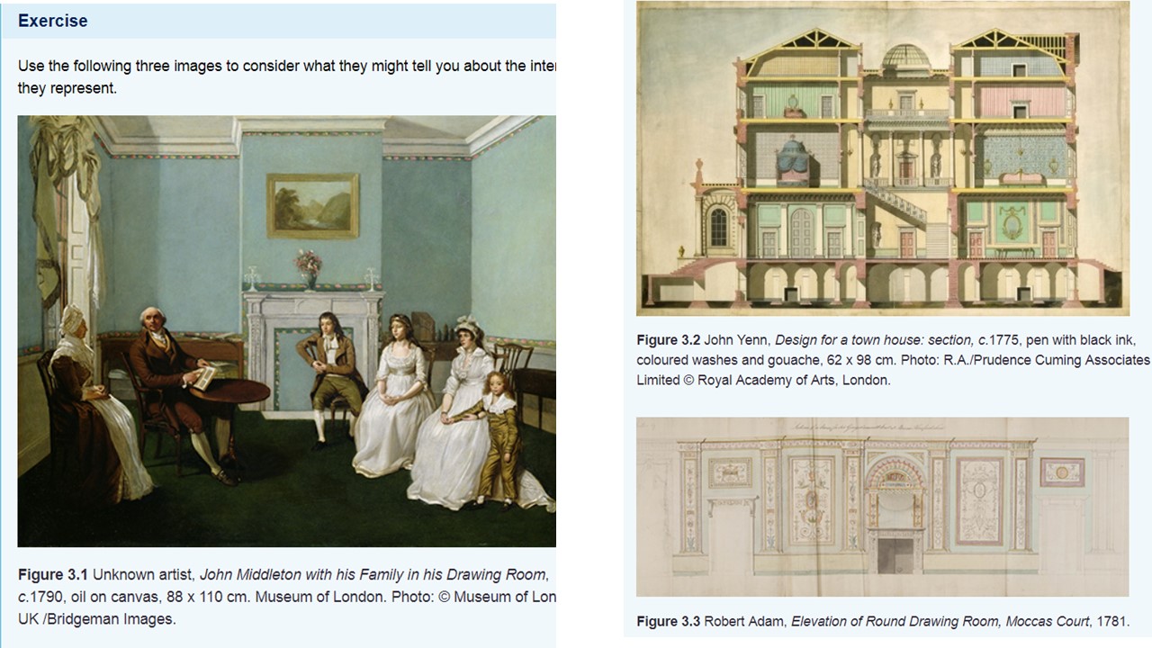
I will use this blog exercise to look at how we use visual figures of different types as evidence in discussions of interiors. They cover painting, architectural orthographic cross-sectional designs &an architectural (Adam) ‘elevation’.

The discussion in the text refer to the dangers of using paintings as evidence since we know that the representation of detail following design issues related to the use of a flat painted surface that always predominated over issues of mimesis. This will not be even intended as an ‘accurate’ representation.

If anything, it represents a reflection to the family of family ideology. The central placing of father and son across a ‘hearth’ records the import of family as a scheme of patrilineal ownership descent, which side-lines the wife who looks towards the men, and daughters and younger son. The son in fact sits ahead of the hearth and the hearth clearly is symbolic of the trans historical home he will inherit, together with responsibilities to family. Land is represented as an ideal in a landscape hung over the mantel.

The family circle an empty space in which the ‘conversation space’ glories but I don’t sense communion here rather the display of communication as a feature of home and a theory of intimacy, which is rather theatrical – perhaps the veneer Dickens is in the 19th C to satirise in the Veneering family. What we notice about space is its emptiness. The whole of the area of the painting above the mantelpiece excludes the figures who sit in much darker space. Light is used to emphasise the palatial space of high ceilings that almost transcends the space inhabited by temporal figures. Here is patrimony – its focus the hearth-breast.

The cross-sectional design offers evidence of the use of varied room-heights in terms of importance and ‘intimacy’ of the rooms – public rooms and staircases being central. Again a house for show with showing entrance, grand-staircase, classically decorated rooms below, fading into those with more patterned colour where women might hold some limited power -  children’s bedrooms less still with less imposing and less ‘antique’ furniture and decoration. Presumably lowly attic rooms housed servants but, as in the painting, they are present through their absence. I cannot find the ‘service’ staircase.

The Adam elevation bruits a Renaissance feel – an attempt to aggrandise English families with the effects of the palazzo. Again the hearth is very important and the breast above the fireplace with its Roman arch. Doors too are grand. One could go on.

Permalink Add your comment
Share post
New photo

Alternative models of the period room A844 Geffrye Museum Blog 3.3.2 Exercise

Visible to anyone in the world

 Alternative models of the period room A844 Geffrye Museum Blog 3.3.2 Exercise

Now view ‘The collection and display of the period room’ recorded at the Geffrye Museum of the Home in East London.

While you view, consider the differences between the presentation of period rooms at the Geffrye and those Bryant describes at the V&A. Transcript in notes.

 The rooms are presented to be viewed via an absent fourth wall and any sense of the tactility of our experience of interiors is studiously removed. The objects look as if they have never been moved and never will be. One does not even have a sense of their maintenance by cleaning and so on. This robs the experience of any sense of the individual psychology of interior-making and ongoing evaluation or of shared social factors – family and the role, if any of servants. This is disguised too by an irritating focus on the ‘middling’ nature of social class presented across the rooms. We aren’t aware or made so by the curator that to be ‘middling’ probably meant very different things at each date (1630 – 1910) and that the scale on which the ‘middling classes’ appeared on was continually changing.

 The decision to organise rooms by date rather than ‘period’ at least admits to a kind of variability. I rather like Marjorie Quennell’s idea of peopling rooms with cut-outs. This created probably the necessary artificiality and theatricality and stopped anyone believing this was about what life felt like across a range of senses – a bit like a Brechtian alienation effect.

 The role of evidence in the recreation of rooms – largely written or published evidence & social records – probate inventories in the 18th C, later sales catalogues or retailer or manufacturers records of sale. The judicious use of recreating more ephemeral items like the 1910 lampshade is interesting.

 The 1910 room would make interesting comparison to Omega style in Bloomsbury but the latter comes from records covering feelings about interiors, including diaries, photographs, paintings (often of people in rooms where the room is incidental). The issue about being a contrast to shows ‘leaders of elite taste’ raised in the Discussion below, will have to be considered when looking at Omega, but it is more complex than a straight comparison. My interest is raised in ‘mantelpieces’ and the display of objects thereon – very important in cluttered Charleston.


Course Discussion

Like the V&A, the Geffrye now has a chronological span of rooms; however, these do not end in 1900 but go well into the twentieth century. Although the Geffrye’s rooms were always also intended to be educational, their focus was on objects associated with everyday life, rather than on design reform as at the V&A. This reflected Marjorie Quennell’s pioneering work on the education of young people and her emphasis on social rather than political history. It was she who arranged the collections in a sequence of period rooms and ‘peopled’ the spaces with painted boards of life-size figures. Nevertheless, it was tropes such as elite tradesmen including Chippendale and Thomas Sheraton that were used to distinguish the eighteenth-century rooms in the museum’s handbooks.

Although it retains the doll’s house model of viewing without a fourth wall, like the V&A the Geffrye now pays close attention to appropriate details and some rooms are based on surveys of actual sites. One key difference is that the Geffrye recreates room types of a particular date representing London’s middling sort rather than those of leaders of elite taste across Britain at the V&A, although at the V&A the Henrietta Street room represents a ‘polite’ drawing room rather than an aristocratic one.

For the furnishing of the early rooms the Geffrye makes particular use of probate inventories, whose reach, however, in the seventeenth and eighteenth centuries was still limited to the wealthier half of the population and focused on moveable goods rather than fixtures such as wall coverings and chimneypieces.

Permalink Add your comment
Share post
New photo

The Museum Period Room at the V&A Exercise 3.3.1 A844

Visible to anyone in the world

The Museum Period Room at the V&A Exercise 3.3.1 A844

To consider some of the shifting ideas and challenges involved in the display of the eighteenth-century interior in the museum, now read a short article by Julius Bryant, ‘Curating the Georgian interior: from period room to marketplace?’ (2007). It comes from a special issue of the Journal of Design History: ‘Eighteenth-century interiors, redesigning the Georgian’.

As you read, note down what Bryant sees as the key questions about the status of eighteenth century interiors as a resource for curators and historians.

Bryant states all of these questions on p.345 col.1:

·       Is the value of such installations in museums rising or falling?

o   The value of the original pre-21stC installations are falling. They are exhibits presented at full size but to the eye only via the use of a missing 4th wall. They give restricted non-touch, non-contact access to people with no access to the life of elites whilst naturalising and normalising those divides illustrated. Herein the lower classes see elite decoration, furnishings and staging of objects from a limited and distant perspective.

·       Do changes that occur in 2001 reflect wider changes in museum curation?

o   The new installations though using similar installations, invited spectation of the rooms from within. The 4th wall is restored and we enter through a door. Features then of rooms as experienced everyday, if in unfamiliar sizes and grandeur, are experienced a being used by the spectator/experiencer. The latter finds tasks and information within the room rendering them participants in learning (of finding what exists though not creating new knowledge) rather than passive recipients thereof. This reflects the role of curation as an arranger of experiences.

o   The prevailing values remain those of nascent capitalism and the adoration of fetishes, such as elite objects of manufacture and consumption – Wdgewood pottery, Adam furniture etc.

·       Does the management of such installations raise the potential of further curatorial innovations.

o   It remains in the control of the curatorial team and does not involve participants other than in allowing them to access already stored knowledge. We do not learn more about how rooms and interiors function to normalise inequality and conformity to norms within the elites represented.

o   If access is to be more democratic and egalitarian, then the function of such segregated interiors needs to become knowable – in terms say of the role of servants and service functions, the means of separation from the marginalised, whether in terms of class, gender, disability, ‘race’ and sexuality or powerful norms that exclude unrecognised liminal non-categorised experience.

o   It still retains the aura of objects, access to which remains largely visual – the varnishing of a fireplace caryatid by Grant for instance.

o   In my view, it does not allow equal conceptual access to the sense of alternative ‘interiorities’. However it also needs to allow the viewer not to minimise the pastness of the past.

Discussion from text

‘The Georgian’ formed the largest section of the V&A’s ‘English Primary Galleries’ (opened in 1951), which Bryant compares to a giant doll’s house made up of a series of stage sets. The period rooms were laid out chronologically and stylistically, based around what he describes as household names, including a collector, LordBurlington, the architect Robert Adam and tradesmen who supplied the elite: Thomas Chippendale and Josiah Wedgwood. Bryant notes some drawbacks in the presentation, since although presented as an enfilade, many of the rooms in fact came from town houses and were assembled by dealers in the early twentieth century.

With the reopening of the V&A’s British Galleries in 2001, new interpretations were adopted by curators, albeit still following a chronology of styles ending in 1900 and conceived around the concerns of the 1990s when the galleries were planned. Although the galleries were still rooted in elite consumption, the period room from Henrietta Street was included to provide a focus on more middling consumerism.

The model of the doll’s house viewed through a missing wall was also abandoned, in favour of reconstructed fourth walls allowing visitors to enter through doorways and the use of what Bryant calls ‘historically appropriate new flooring, colour schemes, curtains and chair covers’. Other parts of period rooms were displayed as what he calls ‘authentic fragments’, such as the section of the British Galleries showing interiors by Adam, an approach that has been adopted more recently by the Bowes Museum in County Durham.

Permalink Add your comment
Share post
New photo

Interior installation and Queer Interiors: Elmgreen & Dragset Exercise 3.2 A844

Visible to anyone in the world
Edited by Steve Bamlett, Sunday, 3 Feb 2019, 17:02

Interior installation and Queer Interiors: Exercise 3.2 A844: Elmgreen & Dragset 

To illuminate their position, view this interview with the artists about the installation (from 4.55 minutes to 7.40 minutes). What was the artists’ starting point?

The text of the interview with Elmgreen and Dragset is below (downloadable from V&A link). I can’t say how happy this way of opening this Section of the Course made me. But this was so because I ignored the instruction to listen to only 2-3 minutes of the 10 minute interview. So first my caveat on the pedagogy here:


There is a notion of academic focus that means a principle of relevance is applied to search for research data and sources, that occurs too in the selection and editing of our reading but I think it often comes too soon to encourage lateral and creative thought. This is probably totally necessary but it means that principles of economy often interfere with the interpretation of these data in what I see as damaging ways. Below you see that very valuable reflections are seen, in a preliminary search to be cut out of our understanding of the work of these artists. I’ve made sections in red. This includes:

1.     their ideas of what it means to shape ‘installations’ including ones in practical use that are recognised as ‘interiors’ but guided by everyday concepts of work and home life and their interactions;

2.     The role of conceptual art in the context of a framework dominated by Christian icons and narratives;

3.     (at end) the role of diversity in planning for the exhibition of art to a public (more strictly speaking to diverse ‘publics).

4.     The main one for me: the role of queer artists in the making and performance of art, including the queering of the normative. One example might be their recent (2018) installation at Whitechapel Gallery: here reviewed by Adrian Searle in obvious gay male solidarity.

 The very thought of this has obviously overexcited a couple of young men, who have abandoned their trousers and Calvin Klein briefs by the door to the gallery offices, and gone off to get up to something or the other in a quiet corner. Maybe they are in the changing rooms by the pool. Galleries, like public swimming pools, are good for a bit of cruising. I found myself giving one of the security guards a bit of a glad eye. Talk about relational aesthetics. Fancy a dip?

Searle, A. ‘Elmgreen & Dragset review – a deep dive into sadness, humour and sex’ in The Guardian Wed 26 Sep 2018 14.46 BSTLast modified on Wed 26 Sep 2018 16.58 BST Available from: https://www.theguardian.com/artanddesign/2018/sep/26/elmgreen-dragset-review-a-deep-dive-into-sadness-humour-and-sex (Accessed 24/01/19)

But delighted I was. Here is a summary why: The first target of art-history courses these days is a caveat against crude biographical approaches. Although probably worth addressing, this is often taken as a means of seeing a null relationship between extended concepts of life (absorbed often into ‘social history, or, if you’re lucky, psychosocial history) and art. Like the Vorticists, I think this must be restored.

 This can mean being afraid to address issues of sexual orientation which Elmgreen and Dragset address directly, whether in a Holocaust Memorial, a poolside scenario or a the narrative of a man’s growth from boy to ‘failed’ man (as in Tomorrow 2013). The latter is telling. We know this is art ‘about’ sexual ‘orientation/development’, not because it is explicitly about a gay male (it may or may not be) but because it is the representation of a concept – that of the ‘interior’ that is ‘queered’: it cannot be easily legible from frameworks of understanding that are normative. Hence it disrupts expectations at nearly all points, even when it represents the norms of ‘home’, retrospective memory, the comfort of home, the role of work (especially work focused on designing other people’s interiors) and ‘family’ (whatever we take that to mean- biological families or ‘families-by-choice’, which the radical gay movement once lauded). We see a lonely boy in a fireplace dominated by sentimental self-representation that denies his development or squashes it with phallic imagery in lieu of life like a cigar (even though, ‘a cigar is sometimes just a cigar’ it means something in terms of group-gendering identity and fixing it in too solid a representation).

This choice of section-opening I love because it in part raises how I might approach interiors in the thought, art and life of Duncan Grant. I might concentrate on Charleston but interiors can never focus on one artist – they are always about collective lives, work and representations. This doesn’t just mean we ’include’ Vanessa Bell too in a naively inclusive paradigm but look at the meanings sustained by a home wherein inputs were trans-historical and trans-personal, and, of course, transsexual and ranged between objects and decoration of uncertain boundaries). Charleston is a queer home I would hypothesise in many ways – less obvious and conscious than those in Elmgreen & Dragset but no less integral to the way we conceptualise an ‘interior’, starting with its definition (no mean starting task).#

 So here goes!

Steve

 V&A Transcript

 Damien Whitmore: Elmgreen and Dragset are the rising stars of the contemporary art world and in October this year they will be presenting a major exhibition at the V&A and it promises to be absolutely extraordinary. I’ve come to their studio in Berlin to find out more about their ideas, their creative process and what motivates them.

This is a former water pumping station and I wonder if that’s a kind of metaphor for how you work together - in terms of the free-flow of ideas and the constant pumping out of work.

Michael Elmgreen: Yes, filtering a bit of the dirty water and turning it into drinkable water, ha ha. There are not many industrial buildings from that period (1924) left in Berlin. It was fantastic to find this building and then be able to shape it and transform it after our own needs. Our idea with making a studio this way was to mix private lives with the more work-based activities, where the transitions between your private personal life and your public image become kind of blurred.

Damien Whitmore: You are very well known in the contemporary art world, obviously, but for V&A visitors you may be less well known. So could you perhaps say a bit about what kind of artists you are, how do you describe yourselves?

Ingar Dragset: We get our ideas from daily life - anything can inspire us. You know, it can be a newspaper article, it can be a book we have read, it can be a political situation, changes in society.

Michael Elmgreen: The kind of art we do has several formats, our works have different aesthetics. We are not really bound to certain materials or certain formal languages.

The Trafalgar Square piece ‘Powerless Structure Figure 101’ depicts a young boy on a rocking horse. He is situated on the Fourth Plinth were you have had different art projects commissioned for the past ten years. We got commissioned to make something for 2012 - 2013 and decided to show a bronze sculpture in the size of the other sculptures already existing in the Square, working with the issue of a Christian sculpture. Well, next to it is King George [statue] who looks a little bit darker and more dull and serious and we sort of coming up with a sculpture that would cheer up the old chap a bit.

Ingar Dragset: The memorial in Berlin is the official German memorial to the homosexual victims of the Nazi era. We were in a way appropriating the visual language of Eisenman’s Holocaust Memorial on the other side of the street. We also made a concrete slab, but in our concrete slab you can look through a window and you see a film of two men engaging in an eternal kiss. We selected the kiss because we wanted to show something that everyone can relate to - something emotional - something you can relate to whether you’re straight or gay, no matter sexual orientation.

Damien Whitmore: You work in contemporary art museums, you work in shop windows, you work on the street as artists and curators and you now work in museums. They’re very, very different and we actually gave you a disused Victorian textiles gallery, how was that?

_________________ Selection starts here

Ingar Dragset: The V&A very kindly let us walk through the museum and come back to the director and tell what kind of spaces we were fascinated by and where we would like to work. So when we found the Textile Galleries we thought these were absolutely brilliant because they were not yet renovated. They hadn’t got refurbished with modern climatization [controlled air conditioning] and all the equipment you need now for a contemporary exhibition space.

Michael Elmgreen: ‘Tomorrow’ is almost like a film set for a not yet realised movie. It could be a Visconti or a Bergman movie. A domestic setting inhabited by a fictional character, about whom we have made a whole script . Our starting point was creating his home with all the objects and artefacts and artworks, furniture included and then from that we developed the script. Later on in the process we elaborated on the setting inspired by the script. It was a rather dynamic process.

Damien Whitmore: Could you tell us a bit more about the central character who plays this role in ‘Tomorrow’?

Ingar Dragset: The central character in the exhibition is an elderly architect, 75 years old, a failed architect. He had a lot of great ideas, he was quite visionary but he never got to realise any of his projects. He was a part-time teacher, probably at Cambridge. Visitors can see a lot of his models in the study that we install as part of his home. You do get a sense that this is a grand South Kensington apartment, all these things have trickled down through generations and now maybe the old architect living there might be the last person to sit on this from the family empire.

End of selection ______________________


Michael Elmgreen: If you respect your audience you have to consider them as complex as yourself. They are diverse, they come from many different backgrounds, so I don’t think we have such as an ideal spectator in mind when we create our works. We try to make visual statements, that are open, and that you can interpret in various ways and get something out of them. Often your audience will create and elaborate on the artworks in a much more interesting way than you ever could do yourself - they make it wilder, more romantic, sentimental or perverse than your intentions were to start with.

Permalink Add your comment
Share post
New photo

‘(Queer?) Interiors’ for TMA03: in lieu of A844 Ex. 2.42 on McKellar ‘Peripheral Visions’ and 2.7 on Gandy ‘The Paris sewers'

Visible to anyone in the world

Blog: ‘(Queer?) Interiors’ for TMA03: in lieu of A844 Ex. 2.42 on McKellar ‘Peripheral Visions’ and 2.7 on Gandy ‘The Paris sewers’; Redeeming Material for Use on chosen topic ‘(Queer?) Interiors’.

This is a note to self. It is based on having enjoyed in a way Sec 1 & 2 of the Block. I am loathe to work on exercises when I know I want to work on Duncan Grant, and Bloomsbury ‘family’ interiors. These sections read as very bitty and like an introduction more suited to undergraduate work. This may be so with the relevant section on Interior spaces. However, I find things of interest that may feed forward theoretically into ‘Interiors’.

1.     In section 1, that would be the essay on Dumbarton Oaks. This raises issues about discussion of space in terms of dynamic-body phenomenology. If one can discuss ‘steps’ in relation to the experience of garden space, one can do the same with motive-objects in human dynamics in interiors like stairs and staircases, furniture, doors and windows. This will be important in looking at Omega furnishing as well as full interiors at Knole, Charleston etc.

2.     Section 2a would pick up McKellar’s analysis of ‘interstitial space’:

o.     Definition ‘interstitial’:

                                                i.     Interstice /ɪnˈtəːstɪs/ noun plural noun: interstices

1.     an intervening space, especially a very small one.

2.     "sunshine filtered through the interstices of the arching trees"

3.     synonyms:         space, gap, interval, aperture, opening, hole, cranny, crevice, chink, slit, slot, crack, breach, vent

4.     "the interstices between the soil particles"

ii interstitial /ˌɪntəˈstɪʃ(ə)l/ adjective: interstitial

1.     of, forming, or occupying interstices., "the interstitial space" ECOLOGY

(of minute animals) living in the spaces between individual sand grains in the soil or aquatic sediments. "interstitial fauna"

For McKellar’s purposes, the analysis is turned on immediate hinterlands of cities (Vauxhall in 18th C. London or Hampstead). These margins are also, I think, thinkable as ‘liminal’ since they are neither of one clear status or another and create a space where the intermediate levels of experience between categorical binaries can happen: male/female, civilised/wild, male/female. Aren’t interiors full of potential for ‘interstitial space analysis?

3.     In section 2b, the essay on Paris sewers raises transferrable theory in relation again to the phenomenology of the body and the splitting of use/waste, pure/filthy, that would animate features of interior design, after, if it existed Gandy calls (p.32) a ‘new intolerance under the sensory realignment of modernity., in the 19th C., where the smell of excrement lost any association of fertility and life and associated with ‘disorder, decay, and physical repulsion’.

This surely happens in the 18th C. (Norman Brown’s ‘the excremental vision’) not the 19th – else what of The Dunciad and Swift’s ‘Stella shits’. I suppose though one’s disgust in the 19th C. might be said to be so profound that one cannot even name it – just as Haussmann avoids mixing water with excremental waste in Paris sewers, at first at least.

So there you go some issues to carry forward to those that will appear in Section 3.

Steve

Permalink Add your comment
Share post
New photo

Ex 2.2 A844 Block3 Gender & space: Elizabeth Wilson Into the Labyrinth

Visible to anyone in the world
Edited by Steve Bamlett, Monday, 21 Jan 2019, 21:44

Ex 2.2 A844 Block3 Gender & space: Elizabeth Wilson Into the Labyrinth

Once you have finished the extract go back and make a list in the box below of as many of the paired characteristics or contrasting terms as you can which Wilson discusses as framing our understanding of the urban. What do you think the impact is of this way of defining the city?

The ’list’ given by Wilson is on p. 152;

NATURAL

MONOLITHIC

PUBLIC

PITILESS

RICH

BEAUTIFUL

UNNATURAL

FRAGMENTED

SECRET

ENVELOPING

POOR

SUBLIME

MALE

CULTURE

CITY

FEMALE

NATURE

COUNTRY

But I started making antinomies like this as I read and before getting to p. 152 and knowing it was there. This is what I got.

Living

Beautiful

Familiar

Self

Normal

Legal

Non-criminal

Same

Stasis

Still

Full

MINOTAUR

Dead

Ugly

Strange

Other

Abnormal

Illegal

Criminal

Different

Change

Moving

Empty

SPHINX


Of course the last one is the culmination of the essay.

One impact is to set up a preferred and not preferred option, but it isn’t always clear on which side this falls. We could say that these binaries express socio-cultural determined preferences and what becomes subordinated to these.  These issues are obviously to the fore in doppleganger myhs such as Jekyll and Hyde, or Dorian Gray.

For Wilson the issue is to explain how left radicalism often damns the city because of its alliances in this binary. However she then insists that this is at a contrary to the experience of her life as a woman – that women and the city have a hidden connection other than at the level of male otherness or repository for his unacknowledged desires – the prostitute stereotype.

She sees that ‘making strange’ as a function of cities has a role in freeing women from patriarchal norms that may be akin to the experience of her own longing and desire despite men not because of them (149f.)

Steve

Permalink Add your comment
Share post
New photo

Using Exercise 1.6.3 Class and the Body

Visible to anyone in the world

Using Exercise 1.6.3 Class and the Body

Now read Robin Veder, ‘Walking through Dumbarton Oaks: early twentieth-century bourgeois bodily techniques and kinesthetic experience of landscape’ (2013).

What do you understand to be the affordances that Veder discusses?

Discussion

Veder defines affordance as ‘interactive opportunities, in this case between the physical environment and the human body’ (p. 8). In this case study, the affordances arise between material and visual components of the garden, specifically the use of steps, and the user. It is the particular characteristic of the varieties of steps, their dimensions and their placing, that set up the possible scope of action from the walker. These affordances, to be successfully interpreted by the walker, need to be responsive to contemporary expectations about movement within the social context of the design.

Veder brings close attention to the archive in order to suggest that the functional and aesthetic considerations within Dumbarton Oaks’s grounds are underpinned by contemporary discourses about elite leisure and the body.

I didn’t feel like working on this exercise as set because by now I’m certain I don’t want to work on landscapes for TMA03. I think I’m heading towards using interiors as my research area, probably narrowing down to either Bloomsbury (Duncan Grant & Vanessa Bell).

However the concept of affordances offered by interior design is clearly analogous. Interactions between the physical shaping of rooms and communication between rooms and the affordances for sitting, lying, walking, going up or downstairs and more complex activities. The latter might include the performance of reading and other intellectual work, love, romance and sexual desire (especially transgressive sexual desire). The concept of the room, performative norms inscribed in rooms and transgression of those norms, in relation to form, order and the appropriate can be looked at in terms of design for tidiness or its reverse (whatever that is).

Scope of action for the inhabitant of an interior is very interesting in terms of interior design is a wonderful topic and I’ve been stimulated into this mode of thinking by re-reading Virginia Woolf’s Orlando, thinking about Duncan Grant’s relation to norms of gendered identity and how this is made manifest in his work for Eddy Sackville-West at Knole, Charleston and maybe the role of Omega. Objects in rooms can be part of this. So now o Block 2 and cities but really on the way to ‘interiors’ in Part 3.

Permalink Add your comment
Share post
New photo

1.5.1 Landscape Character A844

Visible to anyone in the world

1.5.1 Landscape Character A844

Read the description of rolling estate farmlands given on Suffolk Landscapes, and view the inset graphic for the ‘Composite of Characteristic Features’ which shows the key features. ‘Estate’ is not defined here, but you should take it to be a unit of land ownership (usually centred on a core of house, gardens and parkland) which sits above individual tenant farms and has a diverse range of habitats relating to the production of timber, game birds or fishing.

·        What are the designed aspects identified within this landscape type?

It depends how ‘design’ is characterised but ‘human design’ enters with use of the land for human purposes (‘Landholding and Enclosure pattern’). Not everyone will equate these patterns as design. They are patterns built out of numerous variant contributions over space and time. In so far as there are patterns, they are likely to reflect usage and agreed or informal constraints on usage, but they will often reshape geology and the appearance of landscape to the eye. The issue of estate development is important because of the shift from more communal forms to those based on aggregated land ownership, exploitation or public and private objectives.  Issues of settlement and urban growth only involve design in a very complex way too. The way the piece uses ‘ancient’ in scare quotes is interesting since looking ‘ancient’ can be a matter of design rather than just tolerance or negligence of aspects of landscape with no known current human interests implied.

·        How far is this an interpretive statement?

What is ‘designed’ is always interpretive. The term was used as evidence for God’s hand in creation. Design that leads to ‘patterns’ need not be the product of a unified or even pre-meditated plan, although elements of planning may come together and some will have accidental similarities – just as ‘enclosure’ ridded us of common lands and the concept of commonwealth. When Suffolk County Council say that the whole has a ‘tidy estate countryside feel’, a very complex ideological judgement is made that has a lot to do with concepts of imposed human order (the ‘tidy’) rather than beauty or other aesthetic category. There remains a sense of ‘God’s in his Heaven/All’s right with the world’ (Browning’s Pippa Passes).

When an evaluative word like ‘good’ is used, we wonder how the values underlying it are formed – particularly in relation to the phrase, ‘good despite the post war modification of the field patterns’.

Permalink Add your comment
Share post
New photo

Ex. 1.3.3. Garden Cemeteries A844

Visible to anyone in the world

Ex. 1.3.3. Garden Cemeteries A844

Now read an article by James Stevens Curl, ‘John Claudius Loudon and the Garden Cemetery Movement’ (1983, pp. 113–56). What does Curl suggest that Loudon wanted to achieve through good design? Identify Loudon’s principal source for improved design.


The main aim seems to be to serve as a record of the meaning of a national community and to enhance its public face (not least in dealing with matters of life-hygiene) and good mental health. In thgis it seems to be happy to remember the dead but to honour them as a past rather than a present or future presence. The real purpose of cemeteries seems to be to display the values of the present and its ability to let go of the past and display their aesthetic taste, belief in progress, and public hygiene lack of obsession with the past for its own sake. It rather rejoices in the freedom offered to the forces of decomposition (p.137). It makes a lot of the defeat of mawkish belief in the power and dread of death and the dead (138).

The description of the Glasgow Necropolis makes me want to see it, although the terms of praise are utilitarian largely (‘economy. Security, and picturesque effect’. (139) The link of taste to ‘instruction and education’ (141) shows the way in which future needs predominate over those of past or indeed the mere present. The cemetery is a ‘record’ that keeps records.

Permalink Add your comment
Share post
New photo

Lillie Catalogue: The essays on Architecture in Renaissance Painting: Based A844 Ex. 4.4.5-6

Visible to anyone in the world
Edited by Steve Bamlett, Sunday, 9 Dec 2018, 20:44

Lillie Catalogue: The essays on Architecture in Renaissance Painting: Based A844 Ex. 4.4.5-6

 1.     ‘Entering the picture’ elaborates on how the viewer might enter in the picture through the architectural devices employed by painters of the Renaissance.

In reading this part of the catalogue, consider how Lillie is answering the question: ‘to what extent [were] late medieval and Renaissance artists engaged in creating pictures that could be visually inhabited?’ (Lillie, 2014).

The material here is surely transferrable to our understanding, other factors being taken into account, of all representational art in that the use of door, window, and other frames always force a contrast between a surface  as an imagined interior and the barriers and invitations to a viewer’s entry to them. This meticulous scholarly intervention though creates the potential to talk about all these issues and relate them to themes in content as well as form – not least the issue of interiority. The sense of creating place out of space means that we can deal with notions of familiarity / unfamiliarity (Freud’s uncanny), feelings of belonging or estrangement and the relationship of these themes to notions of community and divine grace.

2.     ‘Place making’ outlines the ways in which architecture could construct a sense of ‘place’. The introductory section analyses how Veneziano’s Virgin and Child was incorporated into the street, which should allow you to link this with the discussion in Section 1 of this block about miraculous images in public space.

In the exhibition space, the painting was placed high above the entrance to the gallery, along with the contemporary etching and map showing its placement and the ceremonial route (Figures 3 and 4 in the online exhibition catalogue). This points to the ways that display is also crucial for exhibitions and can help elucidate some of the important points the exhibition raises.

Here the distinction between space and place is crucial, as is the cusp between them in the notion of defamiliarization, derealization and anachronism. We can come to a place that is not yet a place – is experienced as alienating space and this has important functions for the artist, viewer and artistic meaning – especially the more numinous forms of the latter – mysticism, religious mystery and so on.

The role of real display settings – whether a church or gallery is implicit here and how meanings become related to issues of hanging the works.

3.     ‘Architectural time’, the final essay, examines the ways that artists attempted to portray time through architecture. In particular, it looks at the issue of time in relation to the Nativity, and seeks to answer the following question: ‘What roles does architecture play in creating, structuring, or confusing time in these pictures?’ (Lillie, 2014).

You might want to think about why the author has chosen the Nativity as a particular subject to explore this theme

Obviously the answer to the latter is in the reading. It is because the nativity has become the origin of all time and a cusp between old and new time that are created with it. This raises the importance of anachronism and how the temporal and a-temporal might be visually displayed – usually by violent contrasts of present, past and unknown, for which incongruent buildings, ruins and so on can stand in.


Ex. 4.5.6

For catalogue entries remember to include:

·       an in-depth visual and textual analysis (including provenance and material condition)

·       references to other relevant images and collections

·       an individual bibliography.

Before reading the exhibition catalogue’s conclusion, consider what you have learned from the exhibition.

·       Was it successful in conveying the role that architecture has to play in Renaissance paintings?

    • Yes. It made available new ways of talking about the relationship of content, form & context, whilst engaging in close readings of the pictures themselves in terms of different layers of meaning and relevance to viewers contemporary to the paintings and after.

·       Do the works of art chosen support the arguments made in the catalogue essays? Do they answer the questions posed?

    • Yes. But that is barely surprising, given the resources of the National Gallery. What would surprise would be choosing paintings that might be more resistant to those readings but in which they still have relevance. Much nearer to a way of working that questions its own historical assumptions. A less historicist take (or its potential, would be also be interesting to have such as in Rubin’s work.

Permalink Add your comment
Share post
New photo

Analysing an Introduction and Text of an Exhibition Catalogue for their arguments. A844 Block 2 Exs.4.4.3 &4.4.4

Visible to anyone in the world
Edited by Steve Bamlett, Saturday, 8 Dec 2018, 12:13

Now read Amanda Lillie, ‘Introduction to the online catalogue’ (2014). As you read, take notes on what you think the exhibition is about, and what the exhibition is trying to argue.

This starts from an assumption about the viewing history of Renaissance painting: that it represents a poor understanding of the role of architecture represented within the picture. This assumption is dramatized in the video by co-curator Caroline Campbell, whose dramatic role is to appear as a more naïve handler of paintings she knows than the invited academic curator (this recipe has been repeated in Monet & Architecture in 2017 At the National). For instance she says: “One of the pictures I find most stimulating to look at in the context of this show is a painting I'd never really thought of as being particularly architectural before, …”. This chimes with Lillie’s statement that people have overvalued figures over this architecture within pictures and by extension figuration over composition.

In the written catalogue introduction, a key idea is to insist on the metafunction of architecture inside paintings as an aesthetic and structuring function involving flat space and imagined depths, akin to the term ‘composition, as long as this unction is taken to understand ‘perspective’ also. Perspective, of course, was at heart an architectural concept.

One mistake is to clear away from the term aesthetic above the sense that the function is only or primarily ornamental and hence Costa’s playing down of ornamental architecture is focused to turn our attention to its ‘overarching’ role in sustaining the imagination of space, or of pointing meaning through iconographic use of colour (Helen’s palace in Strozzi).

The idea of ‘strong unified inner frameworks’ is, of course, a norm from which distortion adds further to meaning as in the excellent analysis of Titian’s ‘tilting basin’ (p.3ff) down to meticulous ‘ornamental’ detail, such as a three-dimensional gorgon-head. The issue of visual rhetoric is important here. Other examples further elaborate the interpenetration of aesthetic form with content and meaning (and, of course, in sited work, immediate external architectural content.


Read Amanda Lillie, ‘Constructing the picture’ (2014). (Make sure to read all four parts of the essay.) Once again, keep in mind how the author is constructing her argument through both visual and textual sources, and consider the following questions:

·       How is architecture related to the religious function of some of the images provided – in particular, the altarpiece?

    • Let’s stay just with the altarpiece. The function guides the design or the act of ‘desegno’ such that meaning and liturgical purpose are made consonant with the privileged holy narrative and its order telling in a hierarchical structure. The meaning of the altar dominates narrative whilst requiring it as a support in the predella pictures. I’m not sure why these structures are called ‘welcoming’. They don’t seem so to me.

·       How is architecture related to composition and Alberti’s directions for composing a painting?

    • Composition in Alberti is a governing principle, with sub-principles like ‘istoria’ and ‘decorum’, which suggests that form and meaning assemble around the principle of compositio. The principles are the same for architecture proper and the architectural demands of the painting. Under these principles are mathematical and physical principles aimed at endurance of structures, including notions of measure, proportion and perspective.

·       How is architecture related to the all-important development and use of perspective in paintings?

    • Both are dependent on such a notion but not in the manner of serving simple realism as sometimes thought. Architecture does not just sustain a notion of reality but the free play of fantasy too, or of s governing meaning driving the structuration. Hence unsettling double =-take perspectives in Crivelli governed by needs of Annunciation message. Artists were not bound to perspective for its own sake – note Parmigianino (2).
    • ‘Perspective is one of the many strands woven into the picture’ (3) on Masaccio Trinity.
    • Perspective (in say, the ‘geometric pavement’ s used to dispose and compose groups of figures as hallmark of  Renaissance painting’ (6).

These research questions are more directed at a particular theme within the larger role of architecture in Renaissance paintings and are good examples of more focused questions.

Discussion from Course

The architectural framing within paintings allowed for an integration into church space, as many religious paintings were commissioned for specific sites. Architecture integrated into paintings could also serve a practical purpose as a way to set the scene but also as a way to plan the composition. Indeed, it can be related to Alberti’s discussion on the compositional phase of a painting, as well as other treatises for artists. Perspective certainly plays a role in the use of architecture in paintings, but the exhibition seeks to integrate it as part of ‘architectural and spatial representation, treating it as one aspect of fictive architecture, rather than a separate practice’ (Lillie, 2014). The presence of architecture is not only a way to make pictures seem real; it is often used as a symbolic metaphor, whereby real buildings are manipulated, distorted or changed to convey that symbolism. Similarly, perspective is also manipulated; it is often only one part of a painting.

Permalink Add your comment
Share post
New photo

Using digital searches in a art-history dissertation. Exercise Block 2 Sec. 4.3.2

Visible to anyone in the world
Edited by Steve Bamlett, Friday, 7 Dec 2018, 18:27

Using digital searches in a art-history dissertation. Exercise Block 2 Sec. 4.3.2

Now read H. Brandhorst, ‘Aby Warburg’s wildest dreams come true?’ (2013) and consider the pros and cons of digital databases, particularly for your own research.

This wasn’t for me a useful read because if anything it reinforced a strong message in this section of the course that image research is ultimately a means of modernising Panofsky’s iconographical project. It may be that the course is actually saying that. There appear throughout it hints of the best option for a safe way forward, particularly ones which make you think you are dealing with theory whilst actually reproducing the hoariest of approaches to imagery and the image.

Reading Brandhorst feels like reading Frances Yates except for the sense you need to devote your life to projects in Yates is missing in Brandhorst, who is described as an ‘independent researcher’. In a sense this essay is really just a version of debates about metadata in digital technological circles – the words, phrases and other signs used to store, categorise and connect data in a knowledge web. Inevitably, even for images, these have to be words and subject to linguistic disciplines of a kind. Hence the act of storing is always already an act of interpretation, as it was for Warburg and Panofsky if in different ways, since the former embraced, even if sometimes reluctantly, the subjectivity and potential to mania involved in the project.

There is a sense in which all research is like that from George Eliot’s Casaubon onwards – from pigeonholes to connectionist webs. Like them connections can often depend entirely on how you write the categories used for storage. Like Dorothea most of us, really, can’t wait for the Casaubon in us to kick the bucket in order to make our connectionism more visceral and organic.

For me, looking for the category of ‘nude male groups’ (nude AND male AND groups in Boolean terms) is anyway a way of connecting Bruno Latour’s views of the relationship between assemblies and representation to concerns with bodies arranged in and as part of the total space that makes up an artistic composition. But once you create such a category you are dependent on others having done so too if your search is to have many hits.

However. I’m left here I a kind of quandary. What does the discussion say?

Discussion

Brandhorst’s article reveals the ways in which a fairly simple image – a man carrying another – can actually be linked to a variety of themes (moral and religious) and iconographic meanings. His article reveals a very crucial part of art historical investigation, ‘the associative links that connect visual and textual images, motifs, and themes’ (Brandhorst, 2013, p. 73).

Even if you don’t subscribe to the iconographical approach as articulated by Panofsky, the ability to interpret images and understand their meaning is a crucial part of art history. The ways a motif might be copied, and how its meaning changes in that process, is again something art historians are particularly attentive to. You will recall from A843, Block 3, that the practice of iconography emerged from a text-based approach to images; however, there is also a fundamental visual element to the way meaning is made through mapping images and bringing together different types of image.

Most importantly, Brandhorst articulates the difficulty in using language for images, particularly in terms of categorising them in databases or collections. Gathering information about images, and, in particular, historical images or ones that are removed from our own cultural and social understanding, involves a complex process. That is, we can’t expect digital databases or photographic collections to necessarily give us answers; they are tools by which we build up knowledge to eventually make connections that can construct an understanding. The digitisation of images is thus not only about making more images available, but needs to be thought of in terms of how we do art history, and how we approach images and texts and the relationship between the two.

Back to me

Well! I was convinced before that the project ‘involves a complex process’. In the end research involves a dialectic where struggle with the materials is still the main point. That is what I gained at the end – as well as an irritation with the digressive return to iconography which certainly doesn’t help me, given the latter's focus not only text and image but on image as one element of a whole composition we recognise s a picture. My interest isn't in one configuration of the 'figures' available to painting from the visual world – whether ‘man carrying another’ or ‘woman as gift-bearer’.

Permalink Add your comment
Share post
New photo

Future of Art-History: Concluding on Images A844 Ex. 3.4.3

Visible to anyone in the world

Future of Art-History: Concluding on Images A844 Ex. 3.4.3

Read the given extracts from Georges Didi-Huberman, Confronting Images(2005 [1990]).

Do the conclusions reached by the October group and the contemporary image-theorists mean that academic art history, as currently practised, is obsolete?

My first thought was that I think they do, and that that is without looking for even more telling evidence of the complicity of art-history with a reactionary tendency to value an unholy trinity identified by Didi-Huberman as knowledge, spectacle and money. Held together like that knowledge tends to take the form of the latter, a rationale for what is immediately apparent about the nature of success and learning – the rewards it yields to successful individuals who embrace the identity it offers in the academe or art-institutions.

The section of Didi-Huberman on the tone of certainty in art-history (2) is particularly telling and reminiscent of the most off-putting symptoms of connoisseurship and expert-knowledge, the immediately cashable forms of adjudging quality, authenticity and value as if these issues were reducible to an absolute and bounded judgement.  Surely he is right to see in any approach to art a tone that reveals that at least some of the issues involved are difficult to grasp. They are complex in that their means are emergent, never simply revealed. His answer is to embrace openness not closure.

Discussion from course

To an extent, they clearly do. But you should also note the caution expressed by Didi-Huberman that: ‘Only buzzword mavens and fashion mongers could hold that, in this domain, anything is over’ (Didi-Huberman, 2005 [1990], p. xx). He says there is a need to ‘engage in an archaeology’ (Didi-Huberman, 2005 [1990], p. xx) of art history in order to progress beyond its institutionally-imposed limitations. He is suspicious of that academic rationalism which believes everything susceptible to explanation by the word (the sovereignty of the logos). Instead he seeks to develop an approach to images – including art – which is open precisely to the ways in which they escape from verbal reason and logic.

I want to conclude by looking at two contemporary works of art, both of which function as powerful images.

Exercise

Conduct an online search for images of:

Romuald Hazoumè, La Bouche du Roi, 1997–2005

Ivan Plusch, Process of Passing, 2012/2014

·       Give a brief analytic description of what you can see.

·       Then offer an account of what they might be ‘about’.

They differ of course. Plusch shows a setting that is almost deconstructed and the conventions of its space disrupted. A red carpet rises off a floor that has been archaeologically dug or otherwise refeatured in ways that don’t recall its past uses. The idea of passing as death and the loss of meaning of visual signs such that they look fore mergent meaning.


In the Bouche, waste products assemble into form but looked at more nearly are both traditional waste (oil cans) or historic artefacts or copies thereof.


I would suppose hat he are both about a process of finding meaning where a process of assembly is evident but its meaning is not. This though he processes by which meaning is drained from components is, at least, plain to see.

 Discussion from course

In the Hazoumè, you can see black plastic containers arranged on the floor.

In the Plusch, you can see a red carpet ascending into the proscenium arch of an apparently empty theatre.

Hazoumè is using black plastic containers to make an image of the eighteenth-century slave ship Brookes.

Plusch is using the trappings of official iconography to make a kind of memento mori of Soviet culture.

Both works seem to operate on a terrain expanded beyond a narrow sense of the aesthetic as such, drawing complex questions of geography and history within the ambit of contemporary art. They use the dimension of the visual to produce condensed yet somehow open-ended images. Ideally these may draw the viewer into a felt need to research their own historical-geographical relationship to what it is they are seeing. They seem to achieve this in ways that are distinct from the way in which a documentary film, or a book, might do. They don’t really stand on their own, but nonetheless there is a sense in which they make something of their own out of much broader materials.

To this extent, they seem compatible with the expanded remit for iconology propounded by Mitchell, Belting, Latour and Didi-Huberman.


Permalink Add your comment
Share post
New photo

Theory of the Image A844 Exs. 3.4.1

Visible to anyone in the world

Theory of the Image A844 Exs. 3.4.1

Read the given extracts from:

W .J. T. Mitchell, Iconology: Image, Text, Ideology  (1986)

W .J. T. Mitchell, Picture Theory: Essays on Verbal and Visual Representation (1994)

Hans Belting, ‘Image, medium, body: a new approach to iconology’ (2005)

Bruno Latour, ‘What is iconoclash? Or is there a world beyond the image wars?’ (2002)

October group, ‘Roundtable: the predicament of contemporary art' (Foster et al., 2004).

What sense have you gained of the changing terms of an understanding of the relation of word and image?

These essays don’t really provide anything like a linear development of theory and lots of issues seem to be contingent on the kind of works that are being discussed. I can’t, for instance, see Belting’s contributions as easily divorced from debates about the image related to the transition from image as real presence to construct and hence the rooting of the debate in systems of belief.

There is always a concern expressed at the inability of a single academic discipline to address the debate and the critique of attempts by art-history to do so start with addressing the inadequacy of iconographic approaches. In Mitchell (1986), the debate centres on how ‘image’ is used in discourses, revealing its dependence, in iconography for instance, on the written word, or, at least a ‘dialect of word and image’ (43). His view is that this dialectic is not essential quality of the ‘image’ but a historical variable wherein the specific configurations of word – image relationships serve political interests. Hence the need to distinguish in the debate relationships between image, text and ideology (the latter being the role of the relationship in contemporary social power relationships (I think). One version of this he explores in Mitchell (1994) named as ‘the pictorial turn’ within postmodernism (15). For him it equates (16, p. 3) spectatorship with reading as a process of decoding the presented stimulus.

His answer is not to deconstruct iconology but o reconstruct it in terms of the self-awareness of the image of itself as an image and the debates it feels thence a need to enter – like the paragone themes of Renaissance culture.

Belting’s (2005) insistence on new critical vocabulary -  image, medium, body – is not a mere addition to text and ideology but a further deepening of the self-consciousness of imagery about itself that is not, as Panofsky is, confined to discourses about art (303) The aim is to ally with ‘neurobiology’ – to find all images a compromise between origination as endogene and exogene (304). In all he tries to deepen ‘ideology’ so that it touches more closely the stuff of images – media used to represent and body in action.


The body, as owner and addressee of images, administered media as extensions of its own visual capacities. Bodies receive images by perceiving them, while media transmit them to bodies.  (315)


The body as ‘archetype of all visual media’ (316) is almost he ‘primitive’ of the image.

On ‘anachronism’ (to develop later) - & Didi-Huberman

 pp. 316f. & on digital image (317)

Latour’s (2002) notion of iconoclash. This looks at the fate of modernist iconoclasm (equated with Greenberg’s attempt to purify painting to a flat surface) under conditions where non-art icons of the West are being destroyed to the discomfort of even modernists (911).

The Roundtable discussions focus on the disappearance of the ‘bourgeois public sphere’ BB 679. What it leaves us with is a yet undeveloped terminology for the diffusion of images across different kinds of space, including cyber-space.

Discussion from Course

The relationship of visual images to verbal language and literary narrative has been long and fraught. Both W. J. T. Mitchell and Bruno Latour discuss the Second Commandment where, it goes almost without saying, the prohibition on images is delivered in words. In the more recent post-Renaissance Western tradition, pictures and words were powerfully imbricated in doctrines such as ut pictura poesis and the Sister Arts. Visual art functioned as a supplement to literary narrative, for the most part biblical or classical. By contrast, modernism’s assertion of the autonomy of art can be understood as a defence of the independence of visual art from literary narrative.

However, the mid-twentieth-century reaction against modernism involved a pronounced ‘linguistic turn’: not merely restoring the traditional relationship of visual and verbal, but regarding the visual as a kind of language. A wide range of social activities, ranging from popular culture to ‘high’ art, were opened to a mode of analysis that was essentially rooted in linguistics. The positive effect of this was enormous. The language of semiotics flared through art, art history and cultural studies like a bush fire, vaporising pieties about art and the spirit like so many old rags. Not only were the connoisseurish archaisms of art appreciation swept away by the ‘new academy’, but the modernist attempt to theorise art as exclusively of that new understanding of images was ‘that they must be understood as a kind of language’ (Mitchell, 1986, p. 8).

In the face of this, Mitchell’s innovation, a ‘pictorial turn’ which ushered in contemporary image-theory, was to assert, quite unequivocally, that ‘Images are not just a particular kind of sign’ (Mitchell, 1986, p. 9). Mitchell saw images as crucially distinct from the realm of language. But at the same time, this was not a return to earlier ideas of words or pictures transparently representing reality, nor to the modernist myth of the complete separation of the visual from the verbal.

Exercise

What factors stimulated this change of perspective?

As a (informed I hope) guess before discussion:

1.     Globalization of world economies & digital space as a replacement for transcendence.

2.     Associated growth and distribution of images and markets for commodified versions of the image in trade, commerce, politics and ‘leisure’.

3.     Distrust of transcendence but fear of its absence. At heart that may be about fear of the loss of power of the ‘hand-made’, the product of art & craft as activities rather than objects.

Discussion from Course

Two factors seem to have come together to stimulate a renewed acknowledgement of the power and specificity of the image, and a corresponding desire to move beyond the bounds of art history as such. These were, on the one hand, a growing apprehension about the increasing ‘academicisation’, in a negative sense, of the ‘new academy’ itself; and on the other an inescapable awareness of the growing power of an image-world beyond the scope of academic art history as institutionally constituted, in the badlands of the mass media and the internet.

Mitchell began to regard images as having a kind of agency, and to sketch an account of imagery which grounded their power ‘in social and cultural practices’ (Mitchell, 1986, p. 9). For this task, ‘the parochialism of art history’( Mitchell, 1986, p. 12) as conventionally understood, even in its sophisticated new incarnation, rendered it inadequate. The stakes were higher. Pictures and words, though marked by ‘some difference that is fundamental’ (Mitchell, 1986, p. 44) were nonetheless compacted together, and not to be parcelled out into the fiefdoms of separate academic disciplines. It was, precisely, the relationship of the two that was important. ‘The dialectic of word and image seems to be a constant in the fabric of signs that a culture weaves about itself’ (Mitchell, 1986, p. 43).

In subsequent works, Mitchell spoke of a ‘sense that changing modes of representation and communication are altering the very structure of human experience’ (Mitchell, 1994, p. 3). In this perspective, a newly critical iconology would aim to investigate ‘the basic construction of the human subject as a being constituted by both language and imagery’ (Mitchell, 1994, p. 24). To this end, ‘tending to the masterpieces of Western painting will clearly not be enough’ (Mitchell, 1994, p. 15).

Permalink Add your comment
Share post
New photo

Abstraction as image? A844 Ex. 3.3.3 - 3.3.6 inclusive

Visible to anyone in the world
Edited by Steve Bamlett, Tuesday, 27 Nov 2018, 16:13

Abstraction as image? A844 Ex. 3.3.3

Conduct an online search for (I’ll put one example for each):

·       ‘Suprematist’works by Malevich from c. 1915–20

·       Dynamic Suprematism 1915-6

·       ‘Neo-plastic’ compositions by Mondrian from c. 1919–29

·       Piet Mondrian No. VI / Composition No. II (1920)


·       Abstract ‘reliefs’ by Ben Nicholson from c. 1935–40

1935 (white relief)

·       ‘Abstract Expressionist’ compositions by Jackson Pollock from c. 1947–50.

·       Number 23 (1948)


How would you describe these works, relative to those you have previously discussed?

These are clearly not ‘images of’ some recognisable object in the outside world but are rather patterns which are either regular or irregular, using geometric form or free flowing lines (Pollock). This is not to say that the artist may not intend viewers to use their images to visualise some otherwise invisible ‘abstraction’ – an idea or state of feeling or being (or part-being). The lie is given to the search for flatness by Nicholson’s reliefs. Colour may or may not be used and recognisable shapes may be entirely bounded or non-orthogonal. They can be described only with a difference, although issues of relative depth can be effect of size and colour of shapes as well as overlaps. They may be pictures of effects too, such as motion and rhythm. Titles suggest such possibilities.

Abstraction as image? A844 Ex. 3.3.4

Do you think it is legitimate to refer to such works as ‘images’ because of the various ideas which they body forth?

The ideas I had before seeing the Discussion weren’t much different from now, being innately suspicious of arguments that rest on statements like: ‘ It might be thought to be stretching the term ‘images’ too far. ‘ The idea of a term having limited stretchability means very little outside of the analogy within the metaphor of language as either being tensile or brittle. It is neither one nor the other except by agreements made about language by its users through various social mechanisms.

Hence let’s get to brass tacks. In one sense they are obviously ‘images’ if an image is something we see rather than something we hear or  smell. There is no stretching here. The writer here is confusing this meaning with that of ‘being an image of’'. In a sense we need to look at these issues through the idea of representation. Is it a representation of something visible elsewhere – a mimesis or copy – or of an abstraction (the unconscious, conflict etc.).  Or is representation merely the action of creating an image irrespective of its reference or meaning.

Abstraction as image? A844 Ex. 3.3.5

Now conduct a third online search for:

·       ‘combine paintings’ from the 1950s and 60s by Robert Rauschenberg

(Untitled c.1954), usually known as ‘The Man in a White Suit’ (Crow 2014 56ff, 68ff).  

·       silkscreen ‘paintings’ by Andy Warhol from c. 1962–68

·       Marilyn Monroe (Marilyn) 1967


Taking the two sets of work by Rauschenberg and Warhol, how would you describe the status of images in them?

I think the Discussion looks so ‘abstractly’ at these interesting examples that I can’t relate  to the argument, except for the perception that Warhol makes images of ‘images’. The whole project of post-modern abstraction seems to be about how images are assembled and adapted and manipulated through interaction using colour, effect of specific media materials and their combination in 2-D or 3-D as in Untitled. Sometimes I feel the task of plotting a line of development of the image may completely undermine whatever the image has become historically (as I tried to explore in this blog about Rauschenberg with its return to issues of biography and themes like, as here, sexuality:

https://learn1.open.ac.uk/mod/oublog/viewpost.php?post=208804

For me, the issue is representation as an action or performance. This action and performance also involves the viewer in bodily action, especially in combines. It may be hat art becomes an ‘image’ of itself (whatever that may mean) but it is also to allow image-making to become the issue – playing with the determined, borrowed and its transformation through looking and mobilising and adjusting to visual queerness of the image under unexpected manipulation.

Abstraction as image? A844 Ex. 3.3.6

Now conduct an online search for:

brushstroke paintings by Roy Lichtenstein from the 1960s

Brushstroke 1965

paintings by Art & Language of Portraits of V. I. Lenin in the Style of Jackson Pollock from c. 1980 

Portrait of V.I. Lenin with Cap, in the Style of Jackson Pollock III (1980


paintings by Gordon Bennett from the late 1980s/1990s, including the Triptych and Home Décor series

Home Décor series (6)


How do you think the ‘image-dimension’ works here? In fact, what is it that is being ‘imaged’?

In each case there  is a motivated extension of an interest in images (or images of images) that are manipulated by change of context – most obviously in Gordon Bennett who appears to be taking native Australian imagery and using it (by virtue of titles and arrangement in a context of commercial images used in sales practice) as parodic of home decoration. You can describe an image and then distort and thus change its relation to meanings – this foregrounds the meaning (as in Brushstroke) or in forcing the viewer to sek an image where none may be there. 

Discussion From Course

In the case of the Lichtenstein, it is an image of a painted brushstroke. But it is not just an image of any brushstroke. It is not, for example, an image of Lichtenstein painting his kitchen. As with the Rauschenberg, it is an image of Abstract Expressionist art, and all that goes with that in terms of notions of subjectivity, authenticity and self-expression. But now it becomes the sole focus. Or rather, instead of the commodified image and the unique gesture being held in tension (as in Rauschenberg), here the latter is itself collapsed into the former. The point being, of course, that here the ‘image’ is taken even further away from its source by being rendered mechanical. The mark of spontaneous creativity, the trace of modernist authenticity, is recast as the culturally typical token; recast, in fact, as ‘image’ – just as much as a singer or a film star, or a fizzy drink. Modernism is, so to speak, brought down to earth: the earth of 1960s American consumer society.

In the case of the Art & Language painting, a further political dimension is added. On the grand historical stage, the post-Second World War period was defined by the Cold War. In the propaganda war, each contending superpower had an official culture to advertise. In the case of the Soviet Union, this was a culture of social responsibility and cohesion, voiced through the official art of Socialist Realism. In the case of the USA, it was the culture of the American Dream consecrated around the free individual. One such emblematically free individual (along with the cowboy) was the modern artist. This contestation was at its most intense in the 1950s and 60s. But the first Cold War had mutated into ‘détente’ during the 1970s. By 1980, however, with the rise of the political right in Western societies, and the stagnation of the Soviet Union, a second Cold War was on the cards. Art & Language constructed a complex image by juxtaposing tokens of both artistic cultures. This is not a collage as such, rather a forcing of the two images of the contending cultures themselves into a ‘monstrous détente’: the subject matter of Soviet Socialist Realism rendered in the style of American Abstract Expressionism.

In the third case of the paintings by Gordon Bennett, an Australian Aboriginal artist, the political dimension is subject to further expansion. We are now beyond the framework of the Cold War, in a situation of deepening globalisation, marked by tensions between nation-states and multinational capital, as well as by increased attention to issues of cultural identity and the legacies of colonialism. In Bennett’s work, various tokens of ‘fine art’, ranging from perspective diagrams, to the geometric abstraction of Mondrian and the gestural abstraction of Pollock, are made to stand as images of Western culture as such. Little in the way of qualification or nuance is permitted. The erstwhile image of aesthetic transcendence or personal freedom, whatever the complexities of its actual historical relationships within the dominant cultures of Western capitalism, is here transformed into a token of Western colonialism. In effect, Western art is turned into an emblem of Western culture, which is itself regarded as client to the politics of colonialism. The quintessential symbol of Western freedom – art, ‘modern’ art included – viewed from the perspective of the colonial subject, becomes just another component in its repressive armoury.

Permalink Add your comment
Share post
New photo

So what did ‘Raphael like about David’s backside’? (p. 150). Reviewing, from the bottom-up: Rubin, P.L. (2018) Seen From Behind: Perspectives on the Male Body and Renaissance Art New Haven & London, Yale University Press.

Visible to anyone in the world
Edited by Steve Bamlett, Monday, 26 Nov 2018, 19:34

So what did ‘Raphael like about David’s backside’? (p. 150). Reviewing, from the bottom-up: Rubin, P.L. (2018) Seen From Behind: Perspectives on the Male Body and Renaissance Art New Haven & London, Yale University Press.

Rubin’s book isn’t a lot of things: it isn’t a development of queer theory although it references that theory well in Chapter 2 (on the ‘queer [teapot] pose in Eakins and his artistic forebears [50]) and Chapter 6, in particular, and in a more nuanced way. It also isn’t in any way an attempt to present a consistent thesis, other than insisting in the instances represented by 6 very different chapters the fact that there are competing visual-rhetorical modes, and sometimes literary analogues of these (I kept thinking of Chaucer who isn’t mentioned though Dante, of course, is), of the male posterior. Sometimes this involves female ones too, although Lucian makes it clear for one Athenian, at least, this is because her backside reminds him of Ganymede (44).

In the first chapter it is clear that at least three emotional domains in particular cover the posterior and these variously recur: disgust, humour and desire. Of course these interact sometimes but mostly we stay in many chapters with the latter, ‘the spectre of the ideal male nude’ in Chapter 6 being the best. Herein lies a source of thinking about how desire of the male for the male tied itself in with both historical ideologies of the masculine, homo-sociality and academic conventions, tropes and topoi – notably that of homosocial bathing. And here, at last we find a better example than Durer’s woodcut of an open-air male-bath: Domenico Cresti (or Passignano’s) Bathers at San Nicolo (1600) and the case for linking that and Michelangelo’s studies, the partial origin of all academic studies of the male nude (we are told), to a tradition that explains further what traditions Cezanne was both building on and breaking from in his male nude Bathers (1890). There are many examples of such long duration comparisons – they illuminate for instance the V-legged dorsal view of Caillebotte’s 1844 Man at His Bath. There are traditions of such a stance and migrations from its original meanings – in this case from masculine aggression in war from Pollaiulo Nude Man Seen from Three Angles (early 1470s) through David’s imperious Intervention of the Sabines (1799) to Bazille’s relaxed but manly Fisherman with a Net (1868) [113ff].

The fact that there isn’t a simple synthetic argument but rather six nuanced essays with common themes is a strength here. Thus the discussion of how multiple perspectives of the body seen all around from infinite viewpoints is beautifully tied to conventional themes of Renaissance art. This includes the paragone (the competition for priority) of art and sculpture and then gently inserted into the practices this set up – finishing nude bottoms perfectly even when designed (p.180ff.) for a collector’s inset wall-niche (where that bottom could not possibly be seen). Only in the chapter following this is this convention art-historical discovery segued into issues that queer the clarity of our statements about our ‘love’ of art. Comparing the ‘justification’ of an almost obsessive concern with the buttock in Cezanne with Michelangelo, she says (in a way that allows multiple unsaid motivations of artist or viewer to remain gelid in the air of both artists’ respective centuries):

Grandiose as they are, they lack the heroic motivation that had traditionally justified staring at men’s backsides. They threaten to make the viewer a voyeur (210).

Although the issue of humour isn’t explored in many later chapters, it fills Chapter 1 (the section called ‘Dirty Talk’ (p.26ff.)) and infects the prose so that every sentence sometimes seems to have a double-entendre or pun about the desirability of the ass, a bit like the one in my title or an exploration of why the butt of most jokes (visual and otherwise) is the butt – whether in a fourteenth-century Flemish parchment anti-clerical illustration or a Newton cartoon of 1797 (28f.).

There is much here that is just straightforward art-historical scholarship of the highest order (even with some of the tedium of exempla that sometimes involves) but there is also much that opens up new hypotheses about why male nudity cannot be conceived without the necessary dorsal views. And the book insists that this isn’t just because of artistic emulatio from Leonardo’s [130] Study of a Man Seen Behind (1503-7) to Rossellini’s [140f] use of the Farnese Hercules in Voyage to Italy (1954).  The treatment of dwarf nudes is splendid (156ff)  and telling and has a lot to do with the nude as something we handle – in reality or imagination (158). There is a lot to be gained from little dips into this book. For instance the narrative that links Pollaiuolo’s Battle of Nudes (1470s) to Signorelli’s use of ‘shapely buttocks’ as his ‘signature (42), especially in the incredible Figures in a Landscape: Two Nude Youths (1488-9).

There is more to say. This is a very good book indeed. Together with Anthea Callen, this has been a great year for re-thinking the male nude.

Permalink Add your comment
Share post
New photo

On Steinberg's critique of Greenberg A844 Ex. 3.2.8 A brilliant bit of online pedagogy

Visible to anyone in the world
Edited by Steve Bamlett, Monday, 26 Nov 2018, 19:12

Exercise

Conduct an online search for:

Velazquez, Christ in the House of Martha and Mary. In National Gallery

Artist Diego Velázquez

Artist dates 1599 - 1660

Full title Kitchen Scene with Christ in the House of Martha and Mary

Date made probably 1618

Medium and support Oil on canvas

Dimensions 60 x 103.5 cm

Inscription summary Dated

Acquisition credit Bequeathed by Sir William H. Gregory, 1892


Rembrandt, The Holy Family. In Hermitage, St. Petersburg

Author:

Rembrandt van Rijn. 1606-1669

Title: Holy Family

Place: Holland

Date1645

Material: canvas

Technique :oil

Dimensions:117x91 cm

Inventory Number:ГЭ-741


Now read the extract from Leo Steinberg, ‘Other criteria’  (1968/72).

1.     What does Steinberg make of Greenberg’s claim of a qualitative distinction between old and modern art in terms of the latter’s self-reflexivity?

    1. First of all, he exposes the implication in Greenberg’s thinking that pre-Modernist figurative art lacks self-reflexivity (that is, that it does not refer to itself as art in a self-conscious way) p. 71.
    2. He uses visual evidence from the paintings themselves to support the self-reflexivity of the masters. In particular he calls attention to consciousness of framing-bands (71) in Giotto which remind us of the illusion created.
    3. As art develops into the exploration of realistic illusion, it still uses frames such as doorways, windows and mirrors to develop the idea of illusion alongside that of depth. This is presumably why we are asked to search the Velasquez (clever teaching this) which illustrates precisely that point, though Steinberg uses other examples. They are ‘forever inventing interferences with spatial recession. … they maintain an explicit, controlled, ever-visible dualism.  Fifteenth-century perspective was not a surface-denying illusion of space, but the symbolic form of space as an intelligible coordinate surface pattern.’ (74)

2.     How does Steinberg back up his claim, and what different aspects of Old Master art does he review?

    1. As above. Starts with Giotto and then takes on 15th C.-16th C. from Raphael’s use of anachronism  to the elaborate framing of mirror-effect in Michelangelo in the 16th.  To prove ‘all art is about art’ (76). Presumably we have the unmentioned Rembrandt because this uses interesting recessions that are made consciously fictive by both dramatic frameworks of spatial irregularities and anachronism – the book held by the Virgin is clearly a Dutch tome.

3.     Where do these reflections on the relation of Old Master art to modernism lead Steinberg?

    1. To reduce Greenberg’s claim to one supportive only of the ‘purity’ of the way Modernist art deals with surface. But this even belies modern art. Analysing Rothko will show patterns of variable visual depth and sometimes employ framing effects to achieve that.
    2. The last thrust is cruel and perhaps a bit elitist in tone and prejudicial 9about the provincial against the ‘mainstream’: ‘a provincialism to make the self-critical turn of mind the sufficient distinction of modernism’.

Discussion from Course

1.     Basically, Steinberg relativises Greenberg’s absolute distinction into one of degree, and shows that Greenberg’s claim of an objective difference is more like a subjective preference.

He argues that all major painting since Giotto – not just modernist painting – has called attention to its own art status, presenting its illusions of three-dimensional space, as he puts it, ‘between quotation marks’. The exceptions have been explicit trompe l’oeil illusions, and the academic art of the nineteenth century. Interestingly, Steinberg views this latter not as the continuation of the Old Master tradition, but a symptom of its debasement and ultimate collapse, precisely because of its commitment to unreflective illusionism.


Figure 3.7 Samuel van Hoogstraten, Trompe l'Oeil, 1655. Akademie der Bildende Kunste, Vienna. Photo: Erich Lessing Culture and Fine Arts Archives/ART RESOURCE, N.Y./ARTstor. 

2.     Steinberg proceeds to list several features of Old Master art by which such art drew attention to its status as art. This was achieved by a range of devices, including ‘radical colour economies’, ‘proportional attenuation’, over-emphasis on detail, and the quotation and referencing of other art, as well as ‘internal changes of scale’ and ‘shifting reality levels’. However, in addition to such formal/technical features, he also says the ‘recall to art’ may be brought about by subject matter: including elements such as internal spectators, and the use of doorways, windows and mirrors to ‘soliloquise’ about the ‘nature of illusion itself’.

3.     He sees the two epochs sharing more than is permitted by conventional categories, such as ‘representational’ and ‘abstract’, or ‘content’ and ‘form’. On the contrary, he sees art’s need to indicate its status and limits as ‘perpetual’, and that this can ‘take many forms’ in different periods:

At one historical moment painters get interested in finding out just how much their art can annex, into how much non-art it can venture and still remain art. At other times they explore the opposite end to discover how much they can renounce and still stay in business.

As usual a brilliant Discussion.

Permalink Add your comment
Share post
New photo

Online pedagogy in art: comparing A844 Block 2 Sec. 2 and Exercises 3.2.2, 3.2.3, 3.2.4 & 3.2.5 in Sec. 3

Visible to anyone in the world
Edited by Steve Bamlett, Friday, 23 Nov 2018, 18:17

Online pedagogy in art: comparing A844 Block 2 Sec. 2 and Exercises 3.2.2, 3.2.3, 3.2.4 & 3.2.5 in Sec. 3

Having recorded real disappointment about the pedagogy revealed by exercises in Sec. 2 of the course, I was really rather thrown back to find that Exercises 3.2.2, & 3.2.3 merely asked you to read quite short selections of prose. It was my fear that when I revealed Discussion about this reading I would have just been told what to think about that reading.

I judged too soon. They didn’t. Indeed they were a model of what online learning and teaching using computer-revealed feedback might be.

I think the reason I did not expect that is that Section 2 provides exercises used computer-revealed feedback that read as the ‘correct’ answer of the exercise task. I believe, maybe in part a pedagogic prejudice of my own, that such a strategy achieves, obviously unintentionally, the hidden educational agenda of lowering learner expectations of their own role in deference to a notion of the always reliably scripted authority of teachers and textbook writers. Indeed these ‘feedbacks’ even patronise the learner into believing they are they picking up a skill that, in the context of spectatorship in painting, always reveals the correct answer. Take this example from Ex. 2.5.4 (on Chepstov) Edwards says: 

“Once you get the idea, this one is quite simple (the clue is in the title).”

This instructs me as a learner that what is being taught is a script ruled by a dominating idea or principle that educated teachers, tutors or writers have but that I don’t have (yet). Hence I can be expected to do the easy ones with clues in the right places but not more challenging ones – like the one to follow on Caillebotte. No doubt this is a laudable kind of mentorship or apprenticeship approach but it rather translates any academic discipline that can be taught that way to a kind of technical exercise.

But in these early exercises in Section 3, this is not what I find. I read through the pieces – right up to 3.2.5 (and a bit further) before going for the reveals so that I could preserve some integrity as having at least contributed to the comprehension of the passages (from Aurier, Barr and Greenberg twice respectively). I found that satisfying. 

However having now returned to the revealed feedbacks I had clearly misses some of the sophistication of the digital pedagogy in this section. The computer-revealed feedbacks were not attempts to impose authoritative readings of the texts learners like me have read but amplifications of points in the texts and then application of these amplified ideas to stimuli (examples from visual art) and to the histories of art that can be unfolded from the implications of the texts.

This is to say that these feedbacks did not primarily make me check my understandings against an expert tutor but took my understandings, added them to those of the expert and developed them. That is, I felt herein cognitively involved – ‘I too (was) a contender’ (sorry Marlon) in academic debate. This has a lot to do with the management of tone and hence relationship between digital writers and their audience of learners. It maintains authority but does not impose or substitute expert readings for those of the learner. Notice how the prose addresses you as a thinking subject – something we, at least subliminally, must register:

But nevertheless, the fact that a photograph remains in some respect an image of something else, is at the heart of its power. It was so then too, the indelible sign of the photograph’s strength. Or, if like Aurier, you were thinking about art and imagination, the irremediable sign of its weakness. (3.2.2)

Notice the pedagogic power of that phrase ‘you were thinking’ in which the addressed is built into the rhetoric and hence the argument and the refined art-historical language it introduces. It empowers me. This is the effect (even in the much shorter feedback on Barr) in fact because the prose does not substitute its own understanding for yours but develops understanding by adding to the context of the original quotation, so that the reader is taken on a journey of comprehension rather than having their comprehension checked.

In Greenberg examples whilst a first revealed feedback does check comprehension to some extent, its tone is that of collusive meaning-building that corrects by sharing the onward movement in a thoroughly shareable co-learner’s language, by opening with something near to colloquial style.

He basically says the modernists reverse the terms of the equation.  (3.2.5)

When it is more teacherly, it is because it communicates ways of reading language in sophisticated (and not-to-be-assumed ways) as in the revealed first feedback in 3.2.4.

In both of the second revealed feedbacks new stimulus art-objects are introduced so that again we feel we are carried forward intellectually rather than contemplating our own performance as a novice. It works by assuming some kind of more equal partnership in that journey introducing technical terms as it precedes:

The governing value of such art has been ‘mimesis’ or imitation. (3.2.4)

To put it in terms we have been discussing here, according to the understanding of key modernist critics …, modernist artists went to great lengths to purge their paintings of images … (3.2.5, whilst absorbing us in learning how to read Rothko together).

I am going to really enjoy Section 3. I can see that.

Steve

Permalink Add your comment
Share post
New photo

Rather unengaging and unfulfilling exercises on ‘The imaginary spectator’ Ex. 2.2, 2.5.4, 2.6.1 Tintoretto, Chepstov, Clark on Manet

Visible to anyone in the world
Edited by Steve Bamlett, Friday, 14 Dec 2018, 09:49

Rather unengaging and unfulfilling exercises on ‘The imaginary spectator’ Ex. 2.2, 2.5.4, 2.6.1 Tintoretto, Chepstov, Clark on Manet

One of the problems for me in these exercises is that they seem set up to elicit a 'correct' and rather limited answer. I haven't therefore been as full as I perhaps would had I thought what any learner had to say mattered. I think in this style of teaching, it doesn't matter and I respond along those lines.

Looking at Susannah or Elders A844 Ex 2.2


There is an obvious sense in which the fullness of our view of Susannah is contrasted with the restrictions on viewing her of all the internal observers – the 2 elders by complex looking positions which confront barriers and distance as an issue, whilst Susannah herself must have an unseen and occluded view. However, I don’t agree with Edwards that our subject-position can be summarised thus:

Regardless of our actual age or gender, it provides us with a particular place from which to look: that of an older man spying on a naked woman. Tintoretto invites us to adopt this imaginary position, binding us into complicity with gendered power.

Cannot our view be that of Susannah on herself. Hers is a more privileged even if limited one but it is openly enjoyed. In this case I’m not sure we are cast into the role of rapist or even voyeur, given the openness of the space immediately next to the picture plane. That’s openness is stressed by the contorted viewing position aspired to by the elder in the lower left.  Surely the point is that we are given alternatives or choices in our viewing position that sometimes does not render the image of woman into that of a victim.

 Ex 2.5.4 Who is the imaginary spectator here? Chepstov


The spectator is at a position below the stage and therefore looking up the ‘actors’ in the Communist meeting, although we are also pointed visually to a coffin like structure that is pushed towards the picture-plane. Whilst the vanishing point can take us no further back than a closed door, our vision is also pointed to lighter margins, especially to the after-sight of an intrusive vision from an open door to the right.. The sense of frames within frames is important and places us as an aware audience.

Does this make too many assumptions however:

Regardless of your class or politics, Cheptsov’s painting invites you to occupy this subject-location as the rural recipient of the communist ‘good news’. This can be called ‘propaganda’ as long as we are prepared to see the effects of capitalist mass media and advertising as ideological interpellations too.

Ex 2.5.5  Caillebotte


Clearly the atmosphere is light – where a couple of lovers or spouses or …. Whatever feel familiar although the viewer looks up (literally) to the man who is very much in control.

Exercise

Now read an extract from T. J. Clark, The Painting of Modern Life: Paris in the Art of Manet and His Followers (1985, pp. 239–55).

·       Consider Clark’s claim about the subject position of the viewer and pay attention to the evidence he assembles for his argument.

·       What makes this image an exemplary modern artwork for him?

Hide discussion

Discussion

Clark places the painting’s inconsistencies and incongruities at the heart of his description. He begins from the contemporary criticism: the figure was badly drawn and insubstantial, the mirror and reflection ‘botched’, the light ‘indecisive’. The cartoonist Stop highlights these oddities (Clark, 1985, pp. 240–1). He focuses on Manet’s attention to glitzy surfaces and ephemeral fashion; the barmaid’s blank, expressionless gaze; the odd orbs of light; the loose paint handling and the trapeze artist’s socks. For him, Manet’s bar ‘is a painting of surfaces’ and a display of painting as surface (Clark, 1985, p. 248).

Clark highlights the dislocations and spatial complexities, taking them as symptoms of a significant ideological disturbance. Is it a mirror? Can we be sure, he asks, the rear view of a woman, so far to the right, is the barmaid’s reflection? If this is her reflection then the male figure in the top hat is the viewer staring back: ‘we must be where he is’ (Clark, 1985, pp. 249–50). The picture creates a subject location for an imaginary bourgeois-male spectator. Irrespective of whether the actual viewer is male or female, s/he is placed imaginatively in his shoes. At a time when it was known that these barmaids sold sex as well as beer or champagne (guidebooks to Paris and novelists were clear on the point), Clark suggests, the reflection in the mirror indicates a man in the act of soliciting this woman (Clark, 1985, p. 243).

Manet’s picture may be superficially similar to Tintoretto’s in inviting you to occupy the position of a masculine viewer looking at a woman as an object of desire. However, the bar creates a viewing position that foregrounds the unseemly aspects of middle-class life. In fact, Clark suggests that this painting is more disturbing. The oddities and dislocations don’t allow this position to become definite or fixed. We are, simultaneously, in his place and yet not there.

Manet doesn’t completely reject the ideology of bourgeois-masculinity in this painting, but he doesn’t affirm it either. The position we are offered involves looking askance, with a cool and contemplative gaze, at something alien and strange. The subject position the picture constructs enables us to watch ourselves looking at a woman as an object of desire. We see ourselves chatting her up or propositioning her, but from somewhere else. This out-of-body experience involves a dandyish detachment, rather than radical critique. However, that dislocation allows us to mark our distance from prevailing ideology.

Many readers who have engaged with Clark’s argument have focused on this question of masculine viewing (often forgetting the bourgeois component), but for him this is only one dimension of what makes Manet’s picture an exemplary modernist artwork. As I indicated, he attends to the discontinuities, oddities and jarring effects. Most of all, I think, he focuses on those elements that fail to add up; the points where the viewer is unable to decide what they see. He has much more to say than I have indicated here; for instance, he offers an important account of the woman’s blasé detachment as a symptom of modernity (Clark, 1985, pp. 253–5). In his description of this picture, the points of indeterminacy provide homologies for experience in conditions of capitalist modernity.

The argument might not be easy to grasp, but I think Clark is suggesting that Manet found a way to employ pictorial uncertainty that raised questions that capture the pervading sense of insecurity and ambiguity in modern society. There is no stable viewing position in A Bar at the Folies-Bergère, and hence no place of moral certainty for the beholder.

I have to say when I read this discussion I abandoned my own readings, feeling quite pushed by the whole section into a very limited reading – this one rather than the more nuanced one in Clark. The comparisons feel forced – especially that between Tintoretto and Manet where I feel that there are many more factors to take into account.

On the whole I’m less than enthusiastic about Section 2 as teaching, although I enjoyed reading many parts of it.

It is power for the course that I feel so patronised by: "The argument might not be easy to grasp,...". This is a course at Masters level.

Permalink Add your comment
Share post
New photo

Observing a Curator’s Tour: Laing Gallery with Curator Amy Barker regarding her curation of Exposed: The Naked Portrait on 21st November 2018

Visible to anyone in the world
Edited by Steve Bamlett, Tuesday, 11 Dec 2018, 15:19

Observing a Curator’s Tour: Laing Gallery with Curator Amy Barker regarding her curation of Exposed: The Naked Portrait on 21st November 2018

For Gallery information on curator-tour format click here. For more information on Exposed, click here.


The purpose of this reportage is to think about art-curatorship following a reading of O’Neill’s (2016:42ff) history of curatorial discourse since the late 1990s[1]. Charting a period now in decline when curation that took on the subject-position of the creative auteur curator-artist, it shows how curation now might now occupy the ‘critical space’ abandoned by art criticism. Curators were to become curator-auteur-critics, O’Neill quotes Liam Gillick:

My involvement in this critical space is a legacy of what happened when a semi-autonomous critical voice started to become weak. … The brightest, smartest people get involved in this multiple activity of being mediator, producer, interface and neo-critic. It is arguable that the most important essays about art over the last (10) years … have been … produced around galleries, art centres and exhibitions. (Cited ibid. p. 43.)

With this in mind I took myself  on a visit to hear the public tour (small fee over internet) by the curator of this exhibition, Amy Barker.  There is no catalogue for this exhibition (unfortunately). It is a reflexive and situated (in terms of the current holdings of the Laing) recuration of an original small exhibition (of 12 pieces only) by the National Portrait Gallery (NPG). This meant that important works like Gilbert and George’s In the Piss took proximity to wonderful holdings in the Laing from Bloomsbury (contrasting nude males by Duncan Grant and Vanessa Bell for instance) that are part of the Laing’s glory.

There was however no sign of anything like full authorial control in Amy’s presentation, even though she made it plain that selection, grouping and ordering of works was both a curator’s responsibility and privilege. Descriptive schematisation of groupings and porous boundaries between the groupings was also continually asserted. Moreover, although Amy’s name never appears in the Galley material to indicate her ‘ownership/authorship’ (and I am not saying that is how Amy sees herself), it was her decision (no doubt subject to teamwork even at planning) to start the exhibition with Clark’s distinction between the ‘naked’ and the ‘nude’. This distinction is somewhat blurred however in the following sections. Moreover, there is some sense of the complexity of the way nude models were rejuvenated by new uses -  with the growth in the nineteenth-century, for instance, of nude models, especially ecorché (flayed) models, for the use of medical/anatomical study. 

Nevertheless there is a useful dialectic set up from Clark's loose distinction about the status of the nude as ‘art’ or something other, whether that be objective medical study, pornographic voyeurism or a philosophy of the human subject. The latter was favoured by artists such as Duncan Grant, whose attempt to balance eroticism, art and a philosophy of the ‘human’ is mentioned en passant in the labels to an oil portrait of the naked mountaineer, George Mallory (whom Grant also photographed (not though in this exhibition) much more suggestively) as a philosophy that linked sexuality to Praxiteles and Plato.

Hearing a curator is fascinating since one sees that statements about curators as critics primarily are always partial. Barker’s nuanced ‘talk’ showed her balancing equally important priorities including mediation between a ‘public’ gallery and a potentially censorious ‘public opinion’ about the limits of artistic representation (possibly tested most by Gilbert and George she felt) and the economic practicalities involved in the optimisation of the use of a Gallery’s own resources in exhibition-making. Curation is not an easy job under conditions of reduced spending of course and we do curators a disservice if we see them primarily as frustrated art critics. But critique there certainly is – at its most interesting in the comparison of how portraits are constituted between artist and sitter in Morley’s Christine Keeler photographs (for taste click here)  and how poses become means of creating a pose-stereotype that can be used critically (in reflexive re-use for a naked Joe Orton, Barry Humphries and a non-naked ‘Edna Everage’). These issues illustrate not only technical innovation in art but also the meaning of the exhibition’s title – what it means to be ‘exposed’ in terms of human publicity and vulnerability. Speaking of which one found oneself unable to take one’s eyes away from Sam Taylor-Wood’s ‘David’, which queries artistic interest in Davids and is a startling innovative portrait in video of David Beckham (click here for grainy reproduction by an exhibition-goer (not me) part-video).

This line of talk – of curatorial critique - also looked at some splendid postmodern and feminist inversions of the trope of the female nude and Barker concentrated on these, although I was itching to ask why she inserted between such exempla the massive Gilbert and George.

The balance between female and male nudes is there but I would have liked this to be theorised. Indeed it is likely that privately it was thus theorised by this impressive curator but again let’s diverge from O’Neill’s thesis. It is her privilege as a curator to stay silent about such theorisations. It makes the ‘spectator’s share’ in ‘co-curating’ the more spacious and all visitors such be grateful for these spaces.

There is another chance to hear Amy Barker on this topic. Please take it. It’s worth it. If not – go to the exhibition. It is full of treasure. Appended to it is ‘Dressed to Impress’ which use clothed portraiture to point the issue of how signification occurs in portraiture and why (even if we prefer our figures fully clothed) we need to reconsider the Naked Portrait.

[1] O’Neill, P. (2016) The Culture of Curating and the Curating of Culture(s) Cambridge, Mass., MIT Press.

Permalink Add your comment
Share post

This blog might contain posts that are only visible to logged-in users, or where only logged-in users can comment. If you have an account on the system, please log in for full access.

Total visits to this blog: 58582