-
Ugly Fonts
-
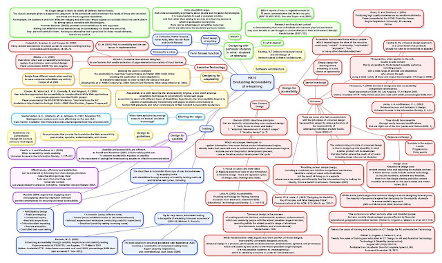
Universal Design
-
User Generated Content
-
University in your pocket
-
Upgrades
- User Centred Design
Ugly Fonts is directly related to learning and the idea that something that is harder to read is more likely to stick as information. For me this puts into question every kind of 'spoon feeding' information from the TV or slide show, to games that supposedly teach instead of getting students to stand at their desks and take notes with a pencil for an hour at a time. Seriously, properly directed effort is the way to support learning. Technology can make it too easy; it ought to make it hard(er).
Universal Design is a philosophy and if variety and difficulty, as I suggest above, is what matters, then why might I think that 'Universal Design' has a role? Universal Design makes for transferability.
The 'University in your pocket' is how an MBA student described the Open University MBA he was doing while on service in Afghanistan (a colonel in the Royal Marines).
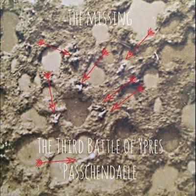
'User Generated Content' - such as this, provides multiple voices. If, for example, you seek out blogs on a subject that interests you each will have a different voice. You find the voice that expresses things in a way that makes sense to you and follow. You want to learn something, so you get a fourth and fifth opinion if you like.
UGC can be anything at all, from a blog post or a video, to the kind of annotation of an iconic First World War photograph I've done above. It is a blog, or shared student project, it is teacher content and lecture notes too. Shared content offers a reader a multitude of ways into a subject until they find one that fits the bill for them.