OU blog

Personal Blogs

Christopher Douce

TM356 new tutor briefing 2018

Visible to anyone in the world

On 8 October 2018 I helped to deliver an online briefing to introduce new tutors to TM356 Interaction Design and the user experience, with a number of module team and staff tutor colleagues. What follows is a really brief summary of what was covered during this session.

I’m posting this blog for a couple of reasons: (1) so I can effectively share notes with everyone who attended, (2) so I can look back to see what I did when I helped to run a briefing, and (3) so I can easily remember what I’ve done when I get to that part of the year when I have my annual appraisal!

Agenda

The structure of the briefing was as follows: begin with some introductions and an ice breaker (so the new tutors can meet each other), present an overview and background of the module, and then present a summary of the module materials. The next part was to say more about the role of the tutor and the way that the module applies something called the Group Tuition Policy, including a description of all the key learning events. At the end there was a Q&A session.

The main ‘presentation’ part of the session was recorded, but the icebreaker session and the Q&A wrap-up session was not.

Tools

One of the slides mentioned the key tools and technologies that could be used for learning. These were: Open Studio (for the sharing of designs), discussion forums (module, cluster, tutor group), Adobe Connect for online tutorials (with the tutor, cluster forums, and module wide events), and prototyping tools (such as Balsalmiq).

Module materials and philosophy

A significant part of TM356 is based around a project; students are asked to think about an interactive product, which can be the focus of their investigations. There is also an emphasis on ubiquitous computing, iteration and prototyping.

The module consists of four blocks: an introductory block, a requirements block, a design block and an evaluation block.

Block 1, the introductory block has 4 units. These have the titles: Unit 1 - What is interaction design? Unit 2 - Goals and principles of user-centred design, Unit 3 - The ‘who, what and where’ of the design context, and Unit 4: Interaction design activities and methods. 

Block 2, requirements for interaction, also has 4 units: Unit 1 - Knowing the Users, Unit 2 - Exploring activities and contexts, Unit 3 – Data gathering for Requirements, and Unit 4 - Establishing Requirements.

Block 3, design and prototyping: Unit 1 - Understanding and Conceptualising Interaction. Unit 2 - Interface Types. Unit 3 - Design becoming concrete through prototyping, and Unit 4 - Conceptual design: Moving from requirements to first design.

Finally, Block 4, evaluation, has the following units: Unit 1 – Introduction to evaluation, Unit 2 - From data to information, Unit 3 - Planning and conducting an evaluation, and Unit 4 - Module reflection.

Tutorials

The module has three clusters (groups of tutors) which are broadly split across the UK. This module does have face to face tutorials; there is one towards the start of the module, and one towards the end. Here is a summary of the current group tuition plan:

  • Interaction Design - getting you started
  • Project choice workshop (module team)
  • Preparing for TMA 2: practising skills - data gathering for requirements
  • Prototyping and the development of concepts
  • Design Hackathon (module team and some tutors)
  • Prepare for TMA 3
  • Preparing for TMA 4: practising skills for evaluating your design
  • Preparing for exam: revision sessions (one block per cluster, and shared)

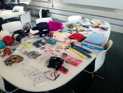
The design Hackathon is an event that is organised by the module team that is intended to expose students to collaborative design work. Suitable materials and electronics will be provided, and a topic for design activity will be agreed by the team beforehand.

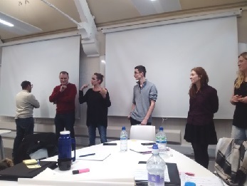
At the event, tutors will help facilitate the students' work and reflections, in preparation for TMA03. For the 2018 presentation, the Hackathon will take place in Milton Keynes and Edinburgh at the same time, and students who were not able to attend physically will be able to connect to an online room and view presentations from both face-to-face groups to get some idea about what happened during the event.

Q&A and wrap up discussion

I didn’t make notes during the Q&A session, but I do remember a few things. I remember using the screen sharing tool in Adobe Connect to show tutors different parts of the TutorHome page and the module website. I also remember mentioning the importance of the tutor’s forum, highlighting a resources area, and a discussion about the introductory letter.

I’m also pretty sure that I emphasised that every tutor should make good use of their staff tutor (their line manager): their job is to answer questions about anything, and address any worries that they may have.

Permalink Add your comment
Share post
Christopher Douce

RSA: The power of design thinking

Visible to anyone in the world
Edited by Christopher Douce, Thursday, 28 Sep 2017, 13:15

This blog post has come from a set of notes that I’ve made during an event that took place on 26 September 2017 at the Royal Society of Arts, London. The event was a lecture, entitled ‘the power of design thinking’ by Sue Siddall, who works as a partner at IDEO, an international design and consulting company.

My interest in a design has emerged from my interest in computing. I have been an associate lecturer for an interaction design module for ten year and before then I studied software development, specifically looking at how computer programmers maintained computer software. During my studies, I briefly stepped into the area of design: software maintenance can, of course, mean software design. Also, for a brief period of time, I helped to manage the tutors who delivered a number of design modules at The Open University, until there was a restructure, and I joined the School of Computing and Communications.

A history

Sue presented a story of a career, where she moved from the subject of law, to advertising and then into IDEO. An interesting note I made (regarding advertising) was: ‘simple ideas enter the brain quickly; if you throw ten balls at someone they won’t catch any, but if you throw one, they will catch one’. A key point regarding a transition to design was the importance of putting human beings at the centre of everything.

Examples

One slide conveyed the message that we use design to tackle complex problems, products, services and environmental issues. We were presented with two very different examples. The first example was about designing a series of nutritional products for people who had a particular metabolic condition; children didn’t want to consume products that were designed in such a way that singled them out from others. A key idea was to reframe a question from a business problem to a human centred problem. A thought was that this change in perspective could change the nature of an entire business.

The second example was uncovering ways to run, organise and structure private schools in Peru. By looking at the systems and by considering the end users point of view, curriculum was designed, teachers were supported and it was mentioned that financial models were provided.

Final points

We were left with three things to take forward: (1) the importance of asking user centred questions, (2) create movements (amongst staff and people), not mandates (to tell them to do things), and (3) be optimistic and consider the opportunity of uncovering better ways of doing things.

There were two questions that I noted down from the audience. The first was: how do you get, nurture or encourage diversity of thought amongst people [when it comes to designing products, services or systems]? This question was answered in terms of diversity of employees. As Sue as responded, I thought about different idea generation techniques that has been taught on a design module that I once studied for a while.

The second question was very interesting: can design thinking be used for bad things? Expanding on this: can designs be used to hook people into using things that are not good for them, or nudge them towards taking certain actions? At this point I remember the earlier link to advertising. A quick search reveals a whole subject area called ‘nudge theory’. The answer was in terms of people are becoming more familiar with the ways in which people are manipulated. A comment was that designers have an ethical responsibility. As this answer was given I recalled the emphasis on ethics within my own discipline by organisations such as the British Computer Society.

Links and reflections

During the talk I collected (which means writing down) a number of links. The first was to IDEO.org. Drawing on a constant habit of browsing webpages, I tried to find an about page that offers a simple summary of what this site was all about, but I couldn’t find one. Scrolling down a big page led me to the following: ‘we design products, services, and experiences to improve the lives of people in poor and vulnerable communities’. There was also a reference to DesignKit.org,which is described as a ‘book that laid out how and why human-centered design can impact the social sector’ (IDEO website)  Another site mentioned was OpenIDEO.

From a personal perspective, I think I was expecting something slightly different from the talk. Looking outwards from my own discipline, I see that human-computer interaction has changed fundamentally as computing devices are becoming embedded into everything. It is also interesting to see the shift from HCI to the idea of user experience. I have also been curious about the onwards extension to the broader area of service design. What I found interesting was the way that design thinking was presented in terms of being able to address bigger and organisational problems. I totally agree that humans are, of course, the most important part in any system: understanding their needs, motivations and desires are paramount.

What I was expecting was more detail about exactly how ‘design thinking’ was applied in these situations. Some tools were mentioned (such as personas), but I wanted to know more. It is at this point that I thought: I need to go look at those resources.

Permalink
Share post
Christopher Douce

TM356 Hackathon

Visible to anyone in the world
Edited by Christopher Douce, Thursday, 16 Feb 2017, 14:55

Every computing and IT department in a university has its own unique focus; some might pay lots of attention to the design and development of hardware. Others may place emphasis on programming languages and the foibles of operating system design. 

The OU Computing and IT degree programme places a special emphasis on the connections between computing and people. In some ways TM356 Interaction Design and the User Experience is a module that totally reflects this focus: it is all about the process of designing interactive devices and systems that allow us to address real problems that people have to face.

The TM356 Hackathon is all about design. Although a lot of OU teaching is at a distance, the Hackathon is unique in the sense that it is a face-to-face teaching event that allow students to meet with module teams and computing researchers.

But what is a Hackathon? ‘Hackathon’ comes from an obvious combination of two words: hacking and marathon. The hacking bit comes from the idea of creatively meddling with technology. The marathon bit means that the participants will expend quite a bit of (positive) energy doing this over an extended period of time.

In essence, the Hackathon is an opportunity to create some physical designs to some real world problems by working with other people over a period of a day. An important question is: why physical prototyping? Why not do some sketching (which was the focus of the module, M364, which it replaces)? The answer to this question is simple: computing is more than just a website; it has moved from the desktop computer and into the physical environment. Physical prototyping helps us to envisage new types of products and devices; it encourages participants to develop what is called ‘design thinking skills’.

What follows is a short summary of the first ever TM356 hackathon event that took place at the London School of Economics on Saturday 4 February. In this post I’ll try to give everyone a flavour of what happened. I’m writing this so I remember what happened, and also to give other TM356 students a feeling as to what might be involved.

Introduction

The day was introduced by module presentation chair and Senior Lecturer Clara Mancini. Clara said that an important aspect of interaction design is collaboration. The Hackathon event enables different students to work together to gain some practical hands on experience of prototyping. This experience, it is argued, can help students with their own TM356 projects and help them to prepare for their tutor marked assignments.

There were three key parts to the day: a tutor led discussion about projects, a series of short presentations by researchers, and the actual hackathon workshop where everyone works together on a specific theme. The event concludes with a tutor led discussion about how students might begin to tackle their assignment.

Project discussions

Since there were nearly thirty students, we were all split up into different tables to begin with our ‘project discussions’. During the module students are asked to create a prototype design for an interactive product. An important thing to note is that an interactive product doesn’t have to be a website: it could be anything, since interaction design and computing is gradually moving away from the desktop and into the environment.

The table that I sat at had some really interesting project ideas: a system for an improvised comedy group, a mobile friendly design for a government website, a remote control for people who have physical impairments, a tool to log and scan documents, and a navigation and route planning system. 

Looking at research projects

A number of OU research assistants and research students were also invited to the Hackathon. Their role was to share something about their own interaction design research projects with a view to inspiring the Hackathon project work. Researchers were sat at different places in the Hackathon room. Students were invited to meet the researchers, who were either working on their doctoral work, or on post-doctoral research contracts, to find out more about what they were doing.

There are two projects that I remember: one was about the creation of digital prototypes using electronics and cases made using 3D printers. The second project was about electronic fabrics or electronic textiles (e-textiles, Wikipedia), which could form the basis of wearable computing platforms. We were shown a camera that could be worn as a necklace, and a device that hospital patients could use to make subjective measurements of pain.  The electronic textiles were used in a research project about how to motivate groups of people who have special educational needs.

The Hackathon

The theme of the Hackathon was: ‘wearable technologies for health and well-being’. We were encouraged to think about the different ways that the term ‘well-being’ could be considered. We were also encouraged to think about issues that might affect wearable technologies, such as: demands on comfort, how we might pay attention to a product or a device that is worn, how it relates to the environment or the activity that we are engaged with. There are also practical issues to consider, such as how to organise input and output, cleaning and charging.

All the students were given access to a range of prototyping materials: this included card, paper, coloured pens, pipe cleaners, string, as well as some basic electronic devices, such as Arduinos. Marian Petre, a professor in the department made the important point that it wasn’t about the end result, it was about the thinking and the decision making that led to the creation of a prototype.

Photograph of materials that can be used to create a physical prototype

As a short aside, any student who has taken an OU module called U101 Design Thinking: creativity for the 21st century (Open University) would be familiar with some of the design thinking (Wikipedia) ideas and skills that the Hackathon and the module team were trying to expose and develop.

All the students sat in tables with either a tutor, researcher, or module team member. To get everyone going I suggested that the group should try some ‘divergent thinking’ before going onto doing some ‘convergent thinking’. To put it another way: we brainstormed what was meant by the terms ‘wellness and wellbeing’ before choosing a topic and exploring it more depth. When we had settled on an idea, we then went onto building a simple physical prototype.

Of course, our prototype didn’t doing anything: it was all about understanding the broad concept of use, and understanding the design goals and trade-offs. During the process, we would also uncover requirements and learn more about the potential user, the activity, and the environment in which the product would be used.

Presentations

At the end of the design activity all project groups were asked to make a short presentation about their prototype.

Photograph of TM356 students describing their Hackathon project

I’m not going to say anything about what each project was about since I wouldn’t want any of the design to unduly influence any thinking that might go on within any future events. Instead, let’s just say that the projects had very different objectives and they were all brilliantly creative.

Final points

Towards the end of the Hackathon and just before everyone got stuck into going through the third TMA (which was all about design), I noted down a few points that were made by the module team: the point of making makes you become aware of issues and limitations; you begin to think about electronics, materials, size of products and the environment. Design thinking is relating to uncovering the needs of the users and starting to think about practical issues. The design process is, of course, iterative. In the process of design, the prototypes become objects of communication.

The face-to-face Hackathon is complemented by a series of three online events that aim to address similar issues. The first online session presents the idea of a conceptual model and allows students to discuss prototyping approaches. The second online session enables students to speak with one another about their projects, and the final session explores different interface types. Rather than being equivalent to the face-to-face Hackathon, these sessions can be considered to be complementary; similar issues are discussed and explored in different ways.

If you are a student studying TM356, I hope this short blog post gives you some idea about what it is all about. I also hope that it will inspire you to attend the session. There is a lot to be gained by coming along!

Acknowledgements: the Hackathon was designed by the TM356 module team and run with help from research assistants and doctoral students from the School of Computing and Communications. Special thanks are given to and associate lecturers who play such an invaluable role and all the students who came along at the first TM356 Hackathon.

Permalink Add your comment
Share post
Christopher Douce

AL Development: Sketching and Prototyping, London

Visible to anyone in the world

On the evening of 8 December 2016, my staff tutor colleague, Asma, set up and ran an associate lecturer development event for tutors who were working on a number of design modules. Incidentally, this was also one of the last AL development events that were run in the London regional centre, before it closes at the end of January 2017.

I usually take notes during these AL development events, so I can share some notes to everyone afterwards, but I became pretty busy chatting to everyone which meant that I didn’t have the time. This blog post is, subsequently, a pretty short one, since I’m relying purely on my fallible memory.

The event was advertised to design tutors in two Open University regional areas: in London, and in the South East. Although design tutors were the main ‘target group’, the event was also open to tutors who worked on a module called TM356 Interaction Design and the User Experience (OU website). The aim of the event was to share tips and techniques about prototyping and sketching. These techniques could then, in turn, be shared with students during face to face tutorial sessions.

The session was really informal. It was, in essence, a kind of show case. Different activities and demonstrations were placed throughout the room on different tables, and participants were invited to ‘experience’ sets of different activities. One activity was all about sketching using shade, lines and texture (if I remember correctly). Another was a scene where we could practice still life drawing. In fact, we had a choice: a set of shells, or a set of objects which represented our location.

A collection of objects that represent London as a tourist attraction

I remember two other demonstrations or ‘stands’: one was about the creation of physical prototypes and another was a show and tell about how different drawing and sketching techniques could be used to represent different product designs. I was particularly taken by the physical prototyping demonstration: we were shown card, bendy steel wire (which could be easily bought in a hardware store), and masking tape. The wire, we were told, could be used to add structure to physical objects; pieces of wire could be bent and twisted together, and taped onto the back of segments of card, to create the surfaces of objects.

I tried my hand at sketching, but I have to confess that I didn’t get too far: I soon became engaged in discussions about how these different techniques might be useful during a longer tutorial about physical prototyping. Another thought was: how could we replicate these kinds of prototyping and interactive activities when we have to use online tools? Or put another way, how could we run sessions when students can’t physically get to a classroom. It is clear that there no easy answers; I now wish that I had made better notes of all the discussions!

Not only were we all exposed to a number of different techniques, some of the tutors also had an opportunity to catch up with each other and chat about how a new module was going.

An interesting question is: could it be possible to run an online equivalent of this session? The answer is: possibly, but it would be very different, and it would require a huge amount of planning to make it work: things don’t spontaneously happen in the online world like they can during a face to face session.

Although the office is closing, there are different planning groups that are starting up to try to make sure that essential associate lecturer development activities still continue. I’m not sure when there will be another face to face session quite like this, but I do hope we can organise another one.

Permalink Add your comment
Share post
Christopher Douce

Module debriefing: M364 Fundamentals of Interaction Design

Visible to anyone in the world
Edited by Christopher Douce, Tuesday, 22 Nov 2016, 15:16

The first Open University module that I was a tutor for was called M364 Fundamentals of Interaction Design. I have some faint recollections of going to a module briefing which took place in Milton Keynes. When the module finished (and I found myself on the module team) I decided to run an unofficial module debriefing. This blog post has been derived from a set of notes that I made during the debriefing that was held in Camden Town on 16 July 2016. It is a part of a larger piece of work that I hope will be useful to inform university teaching practice across Computing and IT modules. Eleven people attended, most of them were associate lecturers. There was one staff tutor (a line manager for associate lecturers), and the original M364 module chair. 

Initial comments

A really interesting point was that the module doesn’t teach what is meant by ‘justification’. This is important because the TMAs for the module don’t necessarily have right or wrong answers (instead, students might present answers that are not appropriately justified).

A comment from tutors: students who are taking M364 as a first module may struggle, especially when it comes to the writing; they can also be shocked by the amount of reading that they have to do. The four blocks ‘dart around’ the set text, which can be disorientating. 

Marking

Marking is considered to be very time consuming because tutors need to understand the material very well. Anything between 1 hour and 3 hours per assignment is reported, which is at odds with the university guidelines of 45 minutes. In my own experience over ten years, I rarely got the marking down to an hour per assignment. 

Tutorials

The more students that attend the day schools, the more exciting they become. It’s important to offer real world examples (I regularly used door handles).

Exam marking

One tutor reported that they loved doing exam marking since it can inform other types of marking. An interesting observation is that the marking for M364 seemed to take longer than with other modules. It was also a challenge to try ‘to read their minds’ (in terms of looking for evidence of understanding).

Terminology

One observation was that there were occasional differences in the way that terminology was used within the module. There were also differences in terminology between modules, i.e. the terms ‘use cases’ and ‘scenarios’ are different in modules such as M256 (which is a Java module). Some English as a Second Language (ESL) students can find things especially difficult, since there are so many terms (especially in terms of the usability and the user experience goals).

Culture

Block 2 contains a section on culture and cultural dimensions, which hasn’t made it into the replacement module, TM356. Students sometimes took the section about culture very literally, but this aspect of the module did lead to some really lively discussions during tutorials. Even though the research about culture that is featured in block 2 can be criticised very easily, it offered a useful vocabulary.

Module team

The overwhelming view was that the module team responded to any problems and issues very quickly and efficiently. (This view wasn’t just expressed because a member of the module team was at the debrief meeting). 

Monitoring

During the module, monitoring was, by and large, allocated to a single monitor. Once that monitor had decided to move on, or wasn’t available, monitoring responsibility was handed over to another volunteer. There was the view that monitoring could have been distributed more widely across all the tutors. Key points were: ‘you learn more from monitoring than being monitored’ and ‘you see how others are marking’.

Tutor resources

One thing that I’ve noted down was that a roadmap of the course would be considered to be useful. Perhaps there could be more materials about the ‘mindset of correct, not correct’ answers. A challenge for new tutors is to understand the philosophy of the module, and it might be useful to convey the point that feedback to students has to be relevant to context of the tuition (or, put another way, tutor comments have to be aligned with and relate to what the students have submitted).

Something else that would be useful would be to have specimen TMA solutions: one that is very good, another that might be mediocre, to allow tutors to ‘align’ their marking.  In a similar vein, it would be useful to share different examples of marking practice.

Guidance to tutors is considered to be important: encourage new tutors to be flexible, and tell them not to be afraid of moving away from the module materials (if they find it appropriate to do so). Also, don’t expect to be perfect; this is a subject that doesn’t have perfect answers. 

Further work

During the debriefing event (which was, in essence, a focus group), I made a recording of all the discussions. My next step is to transcribe the recording so I can try to compose a distilled summary of what amounts to over 10 years of collective distance learning teaching practice of a subject that I feel is pretty difficult to teach. At the same time, I hope to present a short seminar so I can more directly share stories and experiences with some of my colleagues who teach different Computing and IT modules. I have no idea when I’m going to be able to do this, though; I’ll just try to fit it in when I can!

Permalink
Share post
Christopher Douce

Using the cloud to understand the user experience

Visible to anyone in the world

In mid-July I went to an event at University College London that was all about interaction design and the user experience.This blog post is a quick summary of some of the key points that I took away from the event.

The theme for the evening was all about how to do remote user testing.User testing is a subject that is covered in the Open University M364 Fundamentals of Interaction design module. Interestingly, the evening also had connection with another module that I have a connection with: TM352 Web Mobile and Cloud.There were three talks during the evening.For the purposes of this blog, I'm just going to say something about two of them.

Remote user testing

The first talk of the evening was by a representative from a company called WhatUsersDo (company website).Here's a quick summary of the business: if you've got an interactive product and you need to test it with real users, you can contact this company who have a bank of on-line testers.These testers can then be videos and recorded using your products or interfaces.When the testing has been completed, analysts can review the data and send it back to you in a neat report.

In essence, you can get lots of qualitative data relatively easily.You also don't have go through the challenge and drama of recruiting participants and organising lab sessions.Lab sessions, it is argued, are expensive. Instead, remote testers can their laptops (and smart devices) which have embedded video cameras and microphones.

The thing is: how does a recording find its way from a research participant to a user experience analyst?The answer is simple: the cloud helps them do it.Apparently the WhatUsersDo infrastructure is undergoing continual change (which isn't too surprising, given the pace of change in computing).Apparently, the business uses Amazon EC2, or Elastic Compute Cloud (I think that's what it's an abbreviation for!)Other bits of interesting technology include the use of Angular.JS (Wikipedia) and MongoDB (Wikipedia).

SessionCam

SessionCam (company website) also helps users to do user testing, but adopts a somewhat different approach to WhatUsersDo.Rather than to ask users to talk through their use of a website (for instance), SessionCam actually records where the users look when the move throughout a website.

I was very curious about how this worked.The answers seemed to be pretty simple: through the use of 'magic tags' that were embedded in a web page.It also works through the magic of cookies.I also had another question, which was: if the system is tracking user 'movements', then where does all this data go to?The answer was also pretty simple: to the cloud.Like WhatUsersDo, SessionCam also makes use of Amazon cloud storage.

A really interesting aspect to all this, is that the company was able to gather and store information about thousands of user interactions.The company could then create what was known as 'heat maps'.These were rough pictures of where users go to on a website.

Reflections

This event has taught me two things: the first is the interesting ways that cloud technology can be used to create a niche business or service.Secondly: the unassailable fact that I need to always keep up with changes in software technology.

I've seen Angular mentioned on an increasing number of job adverts.A quick skim read about it mentions some bits of tech that I have used at various times: HTML, the DOM, Javascript and JSON - but I haven't used Angular in anger.In fact, I know hardly anything about it.The same applies to MongoDB: I know what it is, and I know what it does, but I have never found the time to mess about with it.This is something that I really ought to do!(And the same applies with the use of Python, and this might well become a subject of another blog post).

In some respects, these companies represent two mini case studies about the use of cloud technologies.A couple of months back, I went to a talk about a company that shared financial data 'through the cloud'.There are loads of other examples out there.

Permalink Add your comment
Share post
Christopher Douce

Gresham College: Designing IT to make healthcare safer

Visible to anyone in the world

On 11 February, I was back at the Museum of London.  This time, I wasn’t there to see juggling mathematicians (Gresham College) talking about theoretical anti-balls.  Instead, I was there for a lecture about the usability and design of medical devices by Harold Thimbleby, who I understand was from Swansea University. 

Before the lecture started, we were subjected to a looped video of a car crash test; a modern car from 2009 was crashed into a car built in the 1960s.  The result (and later point) was obvious: modern cars are safer than older cars.  Continual testing and development makes a difference.  We now have substantially safer cars.  Even though there have been substantial improvements, Harold made a really interesting point.  He said, ‘if bad design was a disease, it would be our 3rd biggest killer’.

Computers are everywhere in healthcare.  Perhaps introducing computers (or mobile devices) might be able to help?  This might well be the case, but there is also the risk that hospital staff might end up spending more time trying to get technology to do the right things rather than spending other time dealing with more important patient issues.  There is an underlying question of whether a technology is appropriate or not.

This blog post has been pulled directly from my notes that I’ve made during the lecture.  If you’re interested, I’ve provided a link to the transcript of the talk, which can be found at the end.

Infusion pumps

Harold showed us pictures of a series of infusion pumps.  I didn’t know what an infusion pump was.  Apparently it’s a device that is a bit like an intravenous drip, but you program it to dispense a fluid (or drug) into the blood stream at a certain rate.  I was very surprised by the pictures: every infusion pump looked very different to each other and these differences were quite shocking.  They each had different screens and different displays.  They were different sizes and had different keypad layouts.  It was clear that there was little in the way of internal and external consistency. Harold made an important point, that they were ‘not designed to be readable, they were designed to be cheap’ (please forgive my paraphrasing here).

We were regaled with further examples of interaction design terror.  A decimal point button was placed on an arrow key.  It was clear that there was not appropriate mapping between a button and its intended task.  Pushing a help button gave little in the way of help to the user.

We were told of a human factors analysis study where six nurses were required to use an infusion pump over a period of two hours (I think I’ve noted this down correctly).  The conclusion was that all of the nurses were confused.  Sixty percent of the nurses needed hints on how to use the device, and a further sixty percent were confused by how the decimal point worked (in this particular example).  Strikingly, sixty percent of those nurses entered the wrong settings.  

We’re not talking about trivial mistakes here; we’re talking about mistakes where users may be fundamentally confused by the appearance and location of a decimal point.   Since we’re also talking about devices that dispense drugs, small errors can become life threateningly catastrophic.

Calculators

Another example of devices where errors can become significant is the common hand-held calculator.  Now, I was of the opinion that modern calculators were pretty idiot proof, but it seems that I might well be the idiot for assuming this.  Harold gave us an example where we had to try to simply calculate percentages of the world population.  Our hand held calculator simply threw away zeros without telling us, without giving us any feedback.  If we’re not thinking, and since we implicitly know that calculators carry out calculations correctly, we can easily assume that the answer is correct too.  The point is clear:  ‘calculators should not be used in hospitals, they allow you to make mistakes, and they don’t care’.

Harold made another interesting point: when we use a calculator we often look at the keypad rather than the screen.  We might have a mental model of how a calculator works that is different to how it actually responds.   Calculators that have additional functions (such as a backspace, or delete last keypress buttons) might well break our understanding and expectations of how these devices operate.  Consistency is therefore very important (along with the visibility of results and feedback from errors).

There’s was an interesting link between this Gresham lecture and the lecture by Tony Mann (blog summary), which took place in January 2014.  Tony made the exact same point that Harold did.  When we make mistakes, we can very easily blame ourselves rather than the devices that we’re using.  Since we hold this bias, we’re also reluctant to raise concerns about the usability of devices and the equipment that we’re using.

Speeds of Thinking

Another interesting link was that Harold drew upon research by Daniel Kahneman (Wikipedia), explicitly connecting the subject of interface design with the subject of cognitive psychology.  Harold mentioned one of Kahneman’s recent books entitled: ‘Thinking Fast and Slow’, which posits that there are two cognitive systems in the brain: a perceptual system which makes quick decisions, and a slower system which makes more reasoned decisions (I’m relying on my notes again; I’ve got Daniel’s book on my bookshelves, amidst loads of others I have chalked down to read!)

Good design should take account of both the fast and the slow system.  One really nice example was with the use of a cashpoint to withdraw money from your bank account.  Towards the end of the transaction, the cashpoint begins to beep continually (offering perceptual feedback).  The presence of the feedback causes the slower system to focus attention on the task that has got to be completed (which is to collect the bank card).   Harold’s point is simple: ‘if you design technology properly we can make the world better’.

Visibility of information

How do you choose one device or product over another?  One approach is to make usually hidden information more visible to those who are tasked with making decisions.  A really good example of this is the energy efficiency ratings on household items, such as refrigerators and washing machines.  A similar rating scheme is available on car tyres too, exposing attributes such as noise, stopping distance and fuel consumption.  Harold’s point was: why not create a rating system for the usability of devices?

Summary

The Open University M364 Fundamentals of Interaction Design module highlights two benefits of good interaction design.  These are: an economic arguments (that good usability can save time and money), and safety.

This talk clearly emphasised the importance of the safety argument and emphasised good design principles (such as those created by Donald Norman), such as visibility of information, feedback of action, consistency between and within devices, and appropriate mapping (which means that buttons that are pressed should do the operation that they are expected to do).

Harold’s lecture concluded with a number of points that relate to the design of medical devices.  (Of which there were four, but I’ve only made a note of three!)  The first is that it’s important to rigorously assess technology, since this way we can ‘smoke out’ any design errors and problems (evaluation is incidentally a big part of M364).  The second is that it is important to automate resilience, or to offer clear feedback to the users.  The third is to make safety visible through clear labelling.

It was all pretty thought provoking stuff which was very clearly presented.  One thing that struck me (mostly after the talk) is that interactive devices don’t exist in isolation – they’re always used within an environment.  Understanding the environment and the way in which communications occur between different people who work within that environment are also considered to be important too (and there are different techniques that can be used to learn more about this).

Towards the end of the talk, I had a question that someone else asked.  It was, ‘is it possible to draw inspiration from the aviation industry and apply it to medicine?’  It was a very good question.  I’ve read (in another OU module) that an aircraft cockpit can be used as a way to communicate system state to both pilots.  Clearly, this is subject of on-going research, and Harold directed us to a site called CHI Med (computer-human interaction).

Much food for thought!  I came away from the lecture feeling mildly terrified, but one consolation was that I had at least learnt what an infusion pump was.  As promised, here’s a link to the transcript of the talk, entitled Designing IT to make healthcare safer (Gresham College). 

Permalink Add your comment
Share post
Christopher Douce

Gresham College Lecture: User error – why it’s not your fault

Visible to anyone in the world

On 20 January 2014 I found the time to attend a public lecture in London that was all about usability and user error. The lecture was presented by Tony Mann, from the University of Greenwich.  The event was in a group of buildings just down the street from Chancery Lane underground station.  Since I was keen on this topic, I arrived twenty minutes early only to find that the Gresham College lecture theatre was already full to capacity.  User error (and interaction design), it seems, was apparently a very popular subject!

One phrase that I’ve made a note of is that ‘we blame ourselves if we cannot work something’, that we can quickly acquire feelings of embarrassment and incompetence if we do things wrong or make mistakes.  Tony gave us the example that we can become very confused by the simplest of devices, such as doors. 

Doors that are well designed should tell us how they should be used: we rely on visual cues to tell us whether they should be pushed or pulled (which is called affordance), and if we see a handle, then we regularly assume that the door should be pulled (with is our application of the design rule of ‘consistency’).  During this part of Tony’s talk, I could see him drawing heavily on Donald Norman’s book ‘The psychology of everyday things’ (Norman’s work is also featured within the Open University module, M364 Fundamentals of Interaction design).

I’ve made a note of Tony saying that when we interact with systems we take information from many different sources, not just the most obvious.  An interesting example that was given was the Kegworth air disaster (Wikipedia), which occurred since the pilot had turned off the wrong engine, after drawing from experience gained from different but similar aircraft.

Another really interesting example was the case where a pharmacy system was designed to in such a way that drug names could only be 24 characters in length and no more.  This created a situation where different drugs (which had very similar names, but had different effects) could be prescribed by a doctor in combinations which could potentially cause fatal harm to patients.  Both of these examples connect perfectly to the safety argument for good interaction design.  Another argument (that is used in M364) is an economic one, i.e. poor interaction design costs users and businesses both time and money.

Tony touched upon further issues that are also covered in M364.  He said, ‘we interact best [with a system] when we have a helpful mental model of a system’, and our mental models determine our behaviour, and humans (generally) have good intuition when interacting with physical objects (and it is hard to discard the mental models that we form).

Tony argued that it is the job of an interaction designer to help us to create a useful mental model of how a system works, and if there’s a conflict (between what a design tells us and how we think something may work), we can very easily get into trouble very quickly.  One way to help with is to make use of metaphor.  Tony Mann: ‘a strategy is to show something that we understand’, such as a desktop metaphor or a file metaphor on a computer.  I’ve also paraphrased the following interesting idea, that a ‘designer needs to both think like a computer and think like a user’.

One point was clearly emphasised: we can easily choose not to report mistakes.  This means that designers might not always receive important feedback from their users.  Users may to easily think, ‘that’s just a stupid error that I’ve made…’  Good designs, it was argued, prevents errors (which is another important point that is addressed in M364).  Tony also introduced the notion of resilience strategies; things that we do to help us to avoid making mistakes, such as hanging our scarf in a visible place so we remember to take it home after we’ve been somewhere.

The three concluding points were: we’re always too ready to blame ourselves when we make a blunder, that we don’t help designers as often as we ought to, and that good interaction design is difficult (because we need to consider different perspectives).

Tony’s talk touched upon wider (and related) subjects, such as the characteristics of human error and the ways that systems could be designed to minimise the risk of mistakes arising.  If I were to be very mean and offer a criticism, it would be that there was perhaps more of an opportunity to talk about the ‘human’ side of error – but here we begin to step into the domain of cognitive psychology (as well as engineering and mathematics).  This said, his talk was a useful and concise introduction to the importance of good interaction design.

Permalink Add your comment
Share post
Christopher Douce

Interaction design and user experience for motorcyclists

Visible to anyone in the world
Edited by Christopher Douce, Sunday, 9 Feb 2014, 16:04

Has anyone ever uttered the following phrases:  ‘it must be me!’ or ‘I must be stupid, I can’t work this system!’  When you say those words the odds are that it is likely that the problems have little to do with you and have everything to do with the system that you’re trying to use.

Making usable systems and devices is all about understanding different perspectives and thinking about compromises.  Firstly, there’s the user (and understanding what he or she wants to do using a system).  Secondly, there’s the task that has to be completed (and how a task might be connected to other tasks and systems).  Finally, there’s the question of the environment, i.e. the situations in which a product is going to be used.  If you fully understand all these aspects in a lot of depth and balance one aspect against another, then you’ll be able to design a system that is usable (of course, this is a huge simplification of the process of interaction design, but I’m sure that you get my point).

Parking a motorbike

A couple of months ago took a course at my second favourite academic institution, CityLit.  Since it was pretty good weather (despite being January), I decided to ride my scooter into the middle on London and park in one of the parking bays that were not too far from the college.  The only problem was that the City of Westminster has introduced a charging scheme, and this was a system that I hadn’t used before.

This blog post is a polite rant (and reflection) of the banal challenge of trying to pay Westminster council a grand total of one pound and twenty pence.  It turns out that the whole exercise is an interesting example of interaction design since it helps us to think about issues surrounding who the user is, the environment in which a system is used and the task that has to be completed.  Paying for parking sounds like a pretty simple task, doesn’t it?  Well, let me explain…

Expecting trouble

Having heard about the motorcycle parking rules in Westminster, I decided to do some research.  I expecting a simple system where you texted your bike registration number and location code to a designated ‘parking’ telephone number, and through the magic of mobile telephony, one English pound was added to your monthly mobile phone bill and the same English pound was appropriated to Westminster Council.  Well, it turned out to be a bit more complicated than that.  Payments don’t come from your phone account but instead come from your credit card.  This means that you needed to connect your phone number to your credit card number.

When you’ve found the motorbike registration site (which isn’t through a recognisable ‘Westminster Council’ URL), you get to create something called a ‘parking account’.  When logged in, you’re asked to enter the registration number of your vehicle.  In my case, since I’m pretty weird, I have two motorbikes: one that makes the inside of the garage look pretty, and another one (a scooter) that I sometimes use to zip around town on.   There are enough spaces to enter the registration codes for four different bikes. 

The thing is, I can’t remember the registration numbers for any of my bikes!  It turns out that I can hardly remember anything!  I can’t remember my phone number, I can’t remember my credit card number and I can’t remember two registration numbers.  I must be an idiot!  (Thankfully, I remembered my email address, which is something else you need – just make sure you know the password to access your account).

There was another oddity of the whole system.  After you’ve got an account, you login using a PIN code, which is the last four numbers of your credit card.  I never use these four numbers!  Again, I don’t know what they are! (Unless I had to look).  I was starting to get a bit impatient.

Arriving at the parking bay

The ride to the middle of town was great.  It was too early in the day for most people, which meant that the streets were quiet.  After parking my bike, I started to figure out how to pay.  I looked at an information sign, which I immediately saw was covered in city grime.  I also immediately saw that it didn’t have all the information I needed. 

I visited the parking website and discovered that you needed FOUR different numbers!  You needed a phone number, a location number (where your bike is parked), a day code (to indicate how long you’re parking your bike for), and the final four numbers of your registered credit card.  Thankfully, I had the foresight to save the parking telephone number in my phone, so I only had to send three numbers (but I would have rather liked to avoid messing around with my wallet to fish out my credit card; it meant unzipping and then zipping up layers of protective clothing).

Coffee break

At last, I had done it.  I had sent a payment text.  To celebrate my success, I visited a nearby café for a coffee and a sit down.  About ten minutes later, I received a text message that confirmed that I had paid for parking ‘FOR THE WRONG BIKE!’ 

The text message confirmed that I had just paid for parking for my ridiculous bike rather than the sensible city scooter that I had just used.  Also, when I registered both bikes on the system, I entered the scooter registration first, since it would be the bike that I would be using most.  At this point, I had no idea whether the system was clever enough to stupidly assume that I had written either (or both) of my bikes to Westminster at the same time.  There was no clear way to choose one bike as opposed to the other.  Again, I felt like an idiot.

Then, I had a crazy thought – perhaps I ought to try to look at my ‘parking record’, since this way there might be a way to change the vehicle I was using.  I logged in to the magic system (through my smartphone), entering in my last four digits of my credit card, again, and found a screen that seemed to do what I wanted.  It encouraged me to enter start and end dates (what?), and then had a button entitled, ‘generate report’.  A report on what?  The number of toys found in Kinder Eggs that are considered to be dangerous?  I pushed the button.  Nothing happened.  I had no parking history despite having just sent a parking text.  Effective feedback is one of the most obvious and fundamental principles of good usability.

Chat

It took be around five minutes to walk to the college.  When I got there I discovered two other motorcycle parking bays that were just around the corner.  I then made a discovery: it seemed that different bays seemed to have the same location ID.  It then struck me: perhaps the second number I had been entering in the phone was totally redundant!  Perhaps it’s the same code that is used all over London!

 During my class I got chatting to a fellow biker.  After I had emoted about the minor trauma of trying the pay for the parking, my new biker friend said, ‘there’s an app for this…’  Again, I thought ‘why didn’t anyone tell me!’  So, during a break I found the right app and started a download.  After a couple of minutes of nothing happening, I was presented with the delightful message:  ‘Error downloading: 504’.

Final thoughts

A really good interaction design principle is that you should always try to design systems which minimise what users need to remember (there’s this heuristic that has the title ‘visibility of system status’).   On this system, you needed to remember loads of different numbers and codes.  The task is pretty simple.  There is a fixed fee.  The only variable that you might want to enter is either the length of the stay (in days) and the choice of the vehicle.  But what happens if your phone runs out of charge and you want to use a friends phone to pay?  You’ll then have to make a telephone call with an operator, all for the sake of one pound twenty.

There’s also the environment to contend with.  I had to take gloves off, fumble around in my pockets for my mobile phone and then enter numbers.  The information sign was pretty small (and I can’t remember it mentioning anything about using an app).  I dread to think how difficult the process is if English isn’t your first language, and you don’t know that Westminster has bike parking fees.

One final thought is that one approach to learning more about the user experience is to observe users in the things that they do.  This is an approach that has drawn heavily from the social sciences, and on Open University modules such as M364 Interaction Design, subjects and techniques such as Ethnography are introduced.  Another approach to learning about user successes and failures is to search on-line, to learn about the problems other people have experienced.  Although this isn’t explicitly covered in M364, it is an interesting technique.

All this said, the second time that I needed to pay, I used the ‘pay by phone’ parking app.  The ‘504’ error message that I wrote about earlier had miraculously disappeared (why not a message that says, ‘please try again later?) and I was able to download the app and then press a couple of on-screen (virtual) buttons and enter in the last four numbers of my credit card (again, a number that I haven’t yet memorise, since no other system asks me for it…).  I even managed to pay for the right bike, this time!

Permalink Add your comment
Share post
Christopher Douce

Animal Computer Interaction : Seminar

Visible to anyone in the world
Edited by Christopher Douce, Sunday, 4 Nov 2018, 11:09

As a part of my job I regularly visit the Open University campus in Milton Keynes.  On the 5 June, I managed to find some time to attend a seminar by my colleague Clara Mancini.  Over the last couple of years, I had heard that Clara had been doing some research into the subject of Animal-Computer Interaction but we had never really had the opportunity to chat about her work.  Her seminar was the perfect opportunity to learn more about the various ideas and projects she was working on.

After a short introduction, Clara mentioned a number of topics from human-computer interaction (or 'interaction design').  These included topics such as the use of ambient technology.  This could include the use of smart sensors that can be embedded into the fabric of buildings, for example, so their environmental conditions and properties can dynamically change. Other topics include the use of augmented reality.  This is where additional information is presented on top of a 'real' scene.  You might say that Google Glass is one product that can make good use of augmented reality.

Clara also spoke of the interaction design process (or cycle), where there is a loop of requirements gathering, designing and prototyping, followed by evaluation.  A key part of the process is that users are always involved.  ACI is very similar to HCI.  The biggest difference is the users.

History and context

It goes without saying that technology is being used and continues to be used to understand our natural world.  One area which is particularly interesting is that of conservation research, i.e. understanding how animals behave in their natural environment.  One approach to develop an understanding is to 'tag' animals with tracking devices.  This, of course, raises some fundamental challenges.  If a device is too obtrusive, it might disrupt how an animal interacts within its natural environment.

Another example of the application of technology is the use of computer driven lexigraphic applications (or tools) with great apes.  The aim of such research is to understand the ways that primates may understand language.  In conducting such research, we might then be able to gain an insight into how our own language has evolved or developed.

Products and systems could be designed that could potentially increase the quality of life for an animal.  Clara mentioned the development of automated milking machines.  Rather than herding cows to a single milking facility at a particular time, cows might instead go to robotic milking machines at times when it suits them.  An interesting effect of this is that such developments have the potential to upset the complex social hierarchies of herds.  Technology has consequences.

One important aspect of HCI or interaction design is the notion of user experience.  Usability is whether a product allows users to achieve their fundamental goals.  User experience, on the other hand, is about how people feel about a product or a design.  A number of different usability experience goals have emerged from HCI, such as whether a design is considered to be emotionally fulfilling or satisfying.  Interaction designers are able to directly ask users their opinions about a particular design.  When it comes to designing systems and devices for animals, asking opinions isn't an option.  Clara also made the point that in some cases, it's difficult for us humans to give an opinion.  In some senses by considering ACI, we force ourselves to take a careful look at our own view of interaction design.

Aims of ACI

Clara presented three objectives of ACI.   Firstly, ACI is about understanding the interaction and the relationship between animals and technology.  The second is that ACI is about designing computer technology to give animals a better life, to support them in their tasks and to facilitate or foster intra and inter species relationships.  The third is to inform development of a user-centred approach that can be used to best design technology intended for animals. 

Clara made the very clear point that ACI is not about conducting experiments with animals.  One important aspect of HCI is that researchers need to clearly consider the issues of ethics.  Participants in HCI research are required to give informed consent.  When it comes to ACI, gaining consent is not possible.  Instead, there is an understanding that the interests of participants should take precedence over the interests of science and society.

Projects

Clara described a system called Retriva (company website), where dogs can be tagged with collars which have a GPS tracking device.  Essentially, such a product allows a solution to the simple question of: 'if only I could find where my dog was using my iPhone'.  Interestingly, such a device has the potential to change the relational dynamics between dog owner and dog.  Clara gave an example where an owner might continually call the name of the dog whilst out walking.  The dog would then use the voice to locate where the owner was.  If a tracker device is used on a dog, an owner might be tempted less to call out (since he or she can see where the dog is on their tracking app).  Instead of the owner looking for the dog, the dog looks for the owner (since the dog is less reliant on hearing the owner's voice).

Dogs are, of course, used in extreme situations, such as searching for survivors following a natural disaster.  Technology might be used to monitor vital signs of a dog that enters into potentially dangerous areas.  Different parameters might be able to give handlers an indication of how stressed it might be.

As well as humanitarian uses, dogs can be used in medicine as 'medical detection dogs'.  I understand that some dogs can be trained to detect the presence of certain types of cancers.  From Clara's presentation I understand that the fundamental challenges include training dogs and attempting to understand the responses of dogs after samples have been given to them (since there is a risk of humans not understanding what the dog is communicating when their behavioural response to a sample is not as expected).

One project that was interesting is the possible ways in which technology might be used to potentially improve welfare.  One project, funded by the Dogs Trust, will investigate the use of ambient computing and interactive design to improve the welfare of kennelled dogs.  Some ideas might include the ways in which the animals might be able to control aspects of their own environment.  A more contented dog may give way to a more positive rehoming outcome.

Final points

Clara presents a question, which is, 'why should we care about all this stuff?'  Studying ACI has the potential to act as a mirror to our own HCI challenges.  It allows us to think outside of the human box and potentially consider different ways of thinking about (and solving) problems. 

A second reason connects back to an earlier example and relates to questions of sustainability.  Food production has significant costs in terms of energy, pollution and welfare.  By considering and applying technology, there is an opportunity to potentially reconceptualise and rethink aspects of agricultural systems.  A further reason relates to understanding about to go about making environments more accessible for people who share their lives with companion animals, i.e. dogs who may offer help with some everyday activities.

What I liked about Clara's seminar was its breadth and pace.  She delved into some recent history, connected with contemporary interaction design practice and then broadened the subject outwards to areas such as increasing prominence (welfare) and importance (sustainability).  There was a good mix of the practical (the challenges of creating devices that will not substantially affect how an animal interacts within their environment) and the philosophical.  The most important 'take away' point for me was that there is a potential to learn more by looking at things in a slightly different way. 

It was also interesting to learn about collaborations with people working in different universities and disciplines.  This, to me, underlined that the boundaries of what is considered to be 'computing' is continually changing as we understand the different ways in which technology can be used.

Acknowledgements:  Many thanks to Clara for commenting on an earlier part of this blog.  More information about Clara's work on Animal -Computer Interaction can be seen by viewing an Open University video clip (YouTube).

Permalink 2 comments (latest comment by Jackie Doorne, Friday, 19 Jul 2013, 14:13)
Share post
Christopher Douce

HEA workshop announcement: User experience and usability for devices and the web

Visible to anyone in the world
Edited by Christopher Douce, Monday, 13 Feb 2017, 12:40

A HEA sponsored workshop that is to focus on the teaching of interaction design, usability and user experience is to take place at the Open University in Milton Keynes on 27 June 2012.

The workshop aimed to bring together academics and teachers with the view to sharing experience and best practice.  More information is available from the HEA website but the key themes and principles behind the workshop is described below.

Interaction design, usability and user experience

Human-computer interaction (or interaction design, as it is now known) is a subject that touches upon so many different areas of computing; it impacts on areas such as web design, the design of mobile applications, the creation of video games, educational technology and so many others. There are also very obvious connections to industry and commerce, not to mention engineering, where system designers need to create usable interactive systems and interfaces for a range of different users.

Two of the key terms which are often spoken about when discussing interaction design are that of usability and user experience. Usability refers to the attributes or features of a product that enables the users to achieve an intended outcome. User experience, on the other hand, relates to the feelings or sense of accomplishment that might accompany an interaction with a device.

This interdisciplinary workshop aims to bring together technologists and educators from institutions throughout the UK who teach interaction design and related subject areas. Its overall intention is to share experiences and expose challenges, such as how to address complex issues such as the design of products for diverse users.

Topics can include, but are not limited to:

  • Approaches and techniques used to teach interaction design
  • Approaches and techniques used to teach the development of web technologies and any other interactive systems
  • Development of mobile applications and tools
  • Understanding usability and user experience
  • Teaching of accessibility and interaction design
  • New and novel pedagogic approaches for the teaching of usability and user experience
  • Practitioner reports (education and industry)

Format

Those who are interested in sharing something about their teaching practice or their research are invited to submit short abstracts.  The abstracts will then be reviewed and those that are successful will be invited to submit papers that are 4-5 pages long which are to be connected to a presentation of 20 minutes.  It is envisaged that there will be a panel session at the end of the day to allow common themes to be identified and to expose some of the challenges that educators face regarding the teaching of interaction design and related subject.

If you are interested in attending, please submit a 300-500 word abstract to c.douce (at) open.ac.uk, using the subject heading 'HEA workshop'.

Key dates

Below is the list of the key dates to bear in mind:

13 May 2012 - Deadline for the submission of abstracts

18 May 2012 - Notification of acceptance

17 June 2012 - Deadline for final papers

Registration information for the event will be made available at least two weeks before the date of the workshop.

Permalink Add your comment
Share post

This blog might contain posts that are only visible to logged-in users, or where only logged-in users can comment. If you have an account on the system, please log in for full access.

Total visits to this blog: 1976927