OU blog

Personal Blogs

Design Museum

A year in the life of ... in less than a minute

Visible to anyone in the world

My world for the best part of a year ... just get me through February.


Permalink
Share post
Design Museum

A day is a long time in e-learning!

Visible to anyone in the world
Edited by Jonathan Vernon, Friday, 11 Dec 2020, 13:31


I tried to run with too much and came unstuck. A 90 minute class is long. The two 3 minutes breaks don't give them a break ... but longer we have found and they can go off and not return.

Clicking through a set of tabs prepared to show/share worked well enough, though with adjustments made each time I have taken this class (five times this week) risked my opening the wrong tab, or being unsure of the revised tab. Then wanting to use all of: Polls, Breakout Rooms and Breakout Rooms with Jamboard was a push too far.

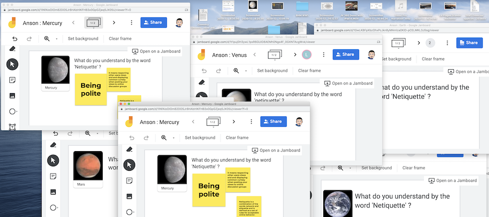
Multiple Jam Boards open simultaneously

I set up no fewer than five Breakout Rooms and labelled each: Mercury, Venus, Earth, Mars and Jupiter. Fine, but when we went to the rooms they had only been given Viewer status and were not able to alert me to this until they returned to the 'main room'.

I tried again later once I had changed the permissions but this time did the room settings double or change again? One person was on their own in Jupiter. So had Meet shuffled the students. And it took them time to get started. In the end it looked as if only one of them or a couple of them in 'Mars' did anything at all.

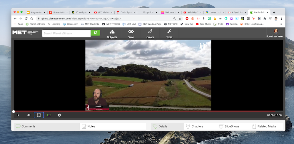
Battlefield Virtual Tour demonstration one tab opened of many in the window

However, I did keep to the two breaks. I didn't play two longer video clips and found I had time in hand, so could watch all of the demonstration of the Battlefield Virtual Tour.

I learnt that in the group most were on laptops, one on a desktop and two on phones.

Whether I get any takers from Screencastify is another matter. 

Permalink Add your comment
Share post
Design Museum

Time out to reflect

Visible to anyone in the world
Edited by Jonathan Vernon, Wednesday, 9 Dec 2020, 21:21

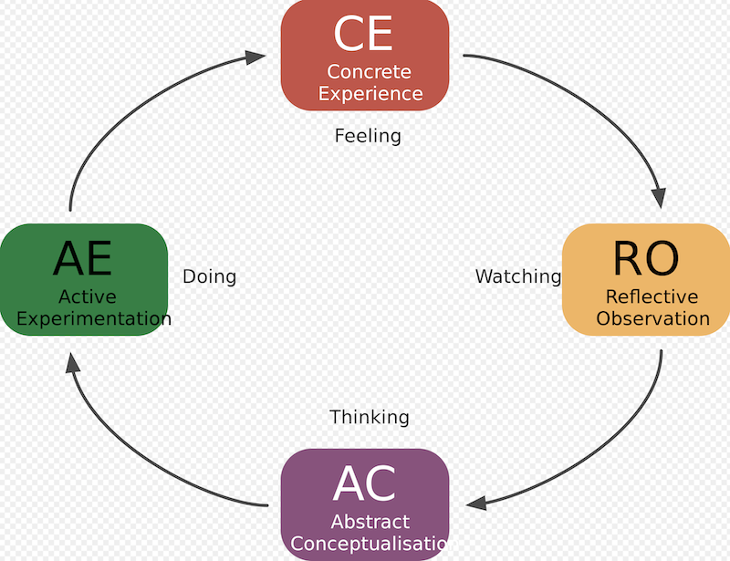
Kolb's Reflective Cycle

By Izhaki - In OmniGraffle, CC BY 3.0, https://en.wikipedia.org/w/index.php?curid=40793898 

I am three formal 90 minute online classes in with two more to go. It is the same topic, but a different group of students each time. I made a slight overhaul in the hour before today's session.

I am yet to watch back any of the Meet recordings.  

The following passed through the entire cycle: 

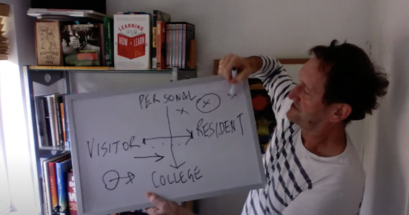
I had a clip of Oxford Uni academic taking us through hsi ideas of 'Visitors and Residents' online. Rather than him, I ran through it myself to the webcam with a whiteboard. Old school, but I hoped would give me a chance of explaining it in my words. Is it relevant that students are this self-aware?

JV on camera using a mini white board to talk about the idea of 'Visitors and Residents' online

A haircut is due and there is reason why older people wear shirts with a collar or a roll top smile

Ditto 'Netiquette' as an icebreaker, something they should all have been drilled on and understand, yet the feedback in the Chat from 22 students was low - four at most caring to give me a sentence. Many more would respond to a closed question with 'Y' or 'N'. I tried Q&A the other day and had no questions at all. I rather thinking typing is an issue - noit least if they are on a phone, but because they are certainly not able to touchtype - only touch thumb.

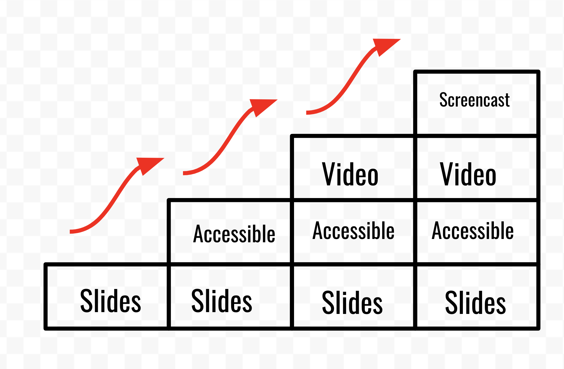
I guess therefore I am going through this process. I know what can be fixed swiftly and do so. Indeed, while a video was playing, by way of demonstration I made some of the slides 'accessible' simply by increasing the font size, putting in a pastel shade background and right justifying the text.

The element where we looked for words to describe enhancements or augmentation to reinvention was dropped. I had begun with a Business School diagram introducing SMAR (which I have not used at all). I then struggled to find the words myself so certinaly couldn't provide a simple, clear activity for them to do for three minutes. Instead I quickly created the following and then moved on to the 'Lessons for today'.

Steps to enhance a slide presentation: accessible, add audio and video, make it a screencast, go interactive.

I also dropped flicking through some pages from DK online showing the historic development of the gun from flintlock to plastic submachine gun. Interesting in its own right, but not the right comparison for the above stages. 

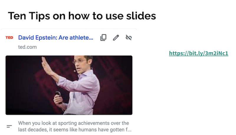
JV presenting in MEET and introducing Ten Tips on slides for TED lectures

The Gun > https://pubhtml5.com/cqlx/ftcx 

Ten tips on out to use slides by David Epstein of TED lectures

I brought in a TED lecture from from David Epstein on how athletes have improved over the last 85 years. Interesting in its own right, but was to show the interplay between a presenter and their slides > https://bit.ly/3m2iNc1

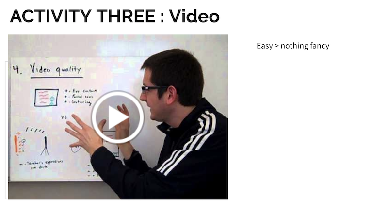
Five ways to simple video for the classActivity Three I want to replace with my own video so from the outset the message is for students rather than me saying that they should hear 'student' every time the presenter says 'Teacher'. Also to diminish the negativity on some slide presentation types than might be overly reliant on the slides and the handouts rather than students taking notes. Taking notes is a totally foreign concept, not even students who may benefit from recording audio or video so they have something to play back. I nabbed this LINK > https://youtu.be/GuA8fPCHu9c from Open Learn's Take Your Teaching Online'. 
I should test my theory of 'learning at the speed of desire' > motivation is all. If they are motivated they could Google my intentions and get their own top tips on presenting, using slides, video and screencast technology.

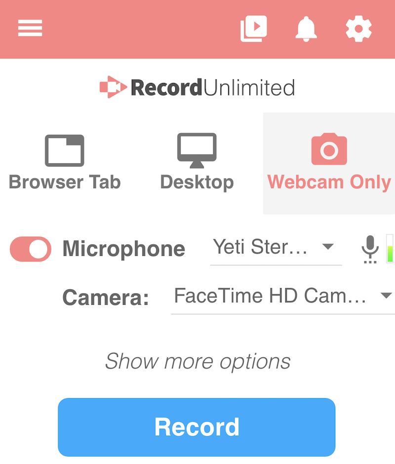
Last session like today having gone through all the buttons on the Screencastify minidashboard dropdown I once again inadvertently hit the Webcame record.

Screejcastify dropdown dashboard

Let's hope I don't do this for the next two sessions. I'll put a note to self in the slides.

My feelings? Good. The first session felt like a dress rehearsal, the second like a technical rehearsal. It can only improve. Getting engagement and evidence of learning from the students is another matter entirely.

Soon after viewing the above I headed into town for a haircut. 


Permalink Add your comment
Share post
Design Museum

Ten tips on how to make better slides

Visible to anyone in the world

Age 17 or 18 in the learning centre at Appleby I had a go with the reel to reel black and white Sony video camera to record a video of me showing someone how to create a slide show ... using a box of physical slides. This is like writing a book to tell someone how to cave paint.

Four decades later, even if they are digital, why or why are we so hooked on the 'slide'.

Anyway, these are useful suggestions on how to make the most of them > Ted 10 Tipe for Better Slide Decks


Permalink Add your comment
Share post
Design Museum

Low-Tec Video : And why this is the most important thing I have been told in 2020

Visible to anyone in the world
Edited by Jonathan Vernon, Thursday, 3 Dec 2020, 06:10

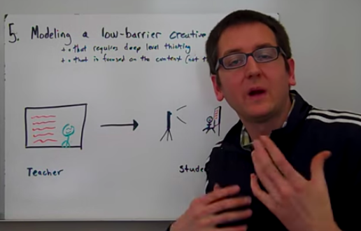
Demonstration of using low-tec video to record a component of a class and share it with students

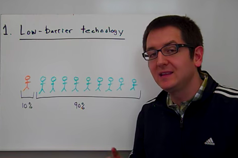
1) Low barrier technology > flip the classroom

  • Camera on a tripod with a white board

  • One record

  • No need for fancy cameras and editing which will put most off

Demonstratio of using low tec video to record a class

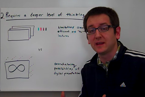
2) Requires a deeper level of thinking

  • Gets to the essence of what you have to say.

  • Brief, treatment, script, know what you want to say.

Demonstration of using low tec video to record a class

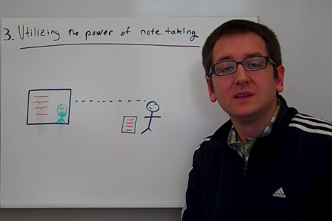
3) Utilises the power of note taking 

  • Increase retention of information

  • vs the density of notes on PPT. 

  • Vs printing off and handing notes. 

  • Develops handwriting 

Demonstration of using low tech video to record a class and share.

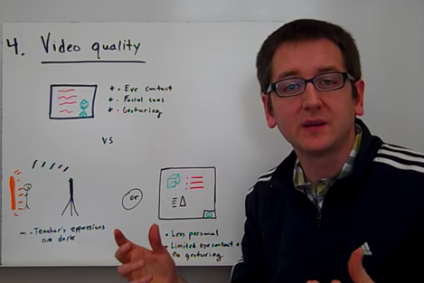
4) Benefits of Video

  • Eye contact

  • Facial Expressions 

  • Gesturing to keep the student engaged 

  • Teacher 

  • Screen Capture with the teacher in a thumbnail 

Demonstration of using low tech video to record a class and share.

5) Modeling a low barrier creative process

  • Focus on the content not the technology 

  • Beware the overwhelming possibilities it is NOT about the font or colour that matters. 

  • Freedom is lack of choice / keep it simple

REFERENCE : Why use low tech video to flip the class  Part of Week 3 of the Open Learn course : Taking Your Teaching Online.

Permalink Add your comment
Share post
Design Museum

The man with the plastic mask : Fibreglass Jacket Demo

Visible to anyone in the world

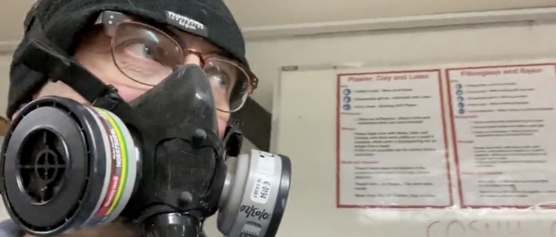
JV masked up to video a demonstration of using resin to create a fibreglass jacket

This blog auhot masked up to video a demonstration of using resin to create a fibreglass jacket.

It's been a frenetic and insightful day being able to double up with a class observation for my PGCE while videoing a demo of how to create a 'fibreglass jacket' with resin for Stageprops and efx at Northbrook MET. 

Google them for their website and Instagram where all their goodness and greatness is on display. 

My task, once requiring a team of at least four, was to video and publish. The team of three would have been camera, sound, lights and a producer/director. But that was three decades ago making video demonstrations for the health & safety team at BNFL Sellafield! Where the full suits worn once the site was active resembled the above.

Several lifetimes ago.

Then it was into a Meet to discuss and share outcomes from Wonkhe@Home conference and what this tells us about how to develop and support a vibrant 'Student Voice' during and post-Covid. The world of learning is a-changing.

Onwards.

With frustration my intentions and wish to attend tonight's PGCE class in person I have needed to come home and be online. With brilliant tutors you come to relish being in their presence. The difference between the online and face to face experience could not be more stark: in many situations the learning context, the feeling that you are part of a collective experience, and seeing the tutor and others so that you can 'read' their face and body language all counts for something. So much of this naturalistic impact is lost when you go online, at least with current systems.

What is needed is quality 360 for image and sound so that you can feel you are there. And in the room to be a laptop open on a trolley (I'e been told a partner of a law firm has been meeting staff like this) or more Sci-fi in approach, an iPad glued to a panel ... or at least the back of the chairs where we may have otherwise sat.

Some institutions, the banks and top law firms and ad agencies are no doubt doing this already > not in undercapitalised FE colleges though.


Permalink Add your comment
Share post
Design Museum

How things have changed

Visible to anyone in the world

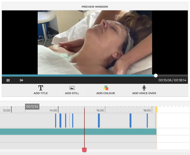
The Planet eStream editor - adding captions

Over three decades ago I sat in an edit suite at Molinare on Great Marlborough Street to edit 'Which Firm of Solicitors?' a video and book we were sending out to law undergraduates. To create the title sequence we hired a freelance designer in who created the sequence by getting six one inch tape machines to coordinate their output. I can do this with an EFX in iMovies or Adobe Premier.

Captions required a person a desk alongside the sound engineer and editor.

Captions were keyed in and as meticulously placed as blocks of letter in a printing press. I do these off the keyboard in any App or platform that supports video. 

I am the one man band I was in my teens and early twenties - the one man band I was glad to escape from - yet here I am once more. My trajectory has taken a few turns, life moments and decisions that took me away from the action rather than towards it.

I wasn't so mentally suited to the brutal competition of the 'media'. A jobbing director is in an even worse position than a jobbing actor. 

So creating video is now more akin to painting by numbers? 

There's some methodology and science behind this edit. I'm not beholden to putting captions in a set place. I can change the size, font and positioning. Some research says put the caption where the eyes are taken - place them close to the action. Our field of attention is that small, don't be shy and leave captions to the fringes along the bottom. If you have to pause to read them you have failed.

And remember, the viewer can as easily pull up subtitles if this is what they want. When it comes to learning it is my prefered approach because then you see how a word is spelt as well as hear how it is pronounced and thus you have a greater chance of recalling it.

Permalink Add your comment
Share post
Design Museum

Practice and rehearsal

Visible to anyone in the world
Edited by Jonathan Vernon, Sunday, 1 Nov 2020, 17:40

A Crayola-drawn plate of food on a paper plate

As my 15 minute micro-teach takes shape the idea of having students draw a plate of food to show what they had for breakfast is turning problematic when I give it a go in practice.

My 24 year old daughter things its childish (I don't. I think wax crayons and felt-tip pens are comforting and fun reminders of nursery school).

The issue in practice is the time I give to people within the 15 minutes.

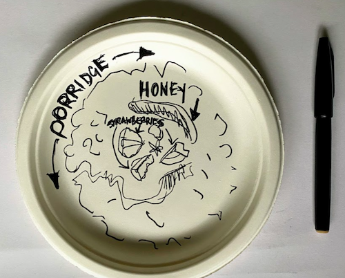
This is not the test of their ability to do a drawing of a piece of bacon (fairly easy) or baked beans (a little more tricky) or porridge (advanced to impossible).

A paper plate on which a black pen drawing of a bowl of porridge has been attempted

It is simply to create a talking point. The solution therefore is that they use a black felt-tip pen only to draw and outline and then write what it is.

I can say they'd have a chance to colour it in after the class, or for homework smile 

It might be 10 years since I ran something like this; that was a 'creativity, innovation and change' workshop. I had what amounted to a swim coach's lesson plan with strict timings of when we should be moving through the tasks.

With only 15 minutes I'll be doing the same on Thursday.

I will even script it and record a video (we may not be able to go into an evening session at college).


Permalink Add your comment
Share post
Design Museum

Assume nothing

Visible to anyone in the world

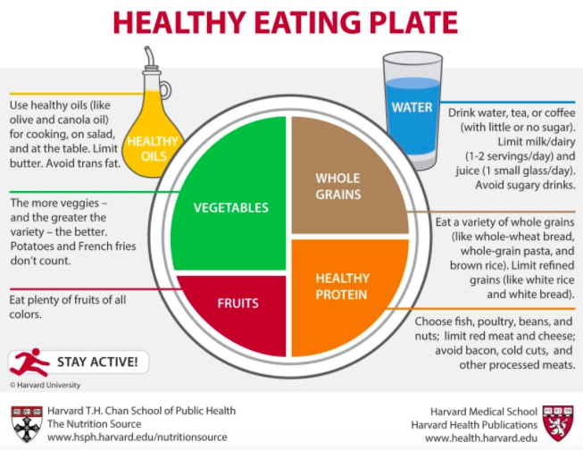
Plate of Food from Harvard T H Chan

Be open and ask. Speaking with the head coach about a series of classes I will give to swimmers at various levels and their parents and guardians on healthy eating and hydration for sport I pointed out that the videos he'd put up on the club website weren't great: it was hard to hear what the young nutritionists from Swim Englands were saying because they had loud music over what the were saying ... to the point that it drowned the out. He had put them up there without looking at them.

I have by now watch close to 16 nutrition for young athlete videos from the US and UK: I have found a couple that will work better.

I'm still at the exploration stage with this. I am still watching, reading, having ideas ... finding that may others have thought along the same way already - which is reassuring. I'm not going for originality, rather effectiveness, appropriateness and simple enough for me to be able to deliver it and field questions.

Everything is orientating towards the 'Plate of Food' as a way to visualise what should be on the plate, in what portions too.

Permalink Add your comment
Share post
Design Museum

Play Time

Visible to anyone in the world

Osmo Mobile 3 Combo gimbal for smartphone videography

I'm at it again. Having upgraded my phone I couldn't resist adding a gadget that will allow me to recreate some movie style effects - or to simply track something or someone with ease. 

Permalink Add your comment
Share post
Design Museum

So easy and intuative

Visible to anyone in the world
Edited by Jonathan Vernon, Thursday, 31 Oct 2019, 12:57

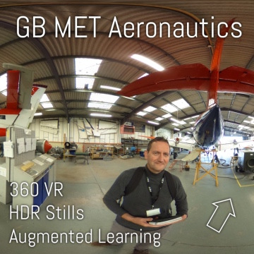
Using ThingLink to create a simple, clickable, 360° tour of the Learning Resource Centre (LRC) at one of our 5 sites at GB MET for SEND students (Special Educational Needs and Disabilities) I simply shot this clip on an iPad, which uploaded to my Google Photos album. I could have edited but had no need to do so. Labelled and downloaded I simply added the clip which can play on a loop until the user clicks away. I clicked on a microphone 'audio' button and added a simple commentary and we're done.

What I did find however, is that using the text box with a video clip sees the clip severely cropped. Next time I will also shot some far wider frames, possibly with a bias to the right hand side of the frame, so that the automatic cropping complements the video playback rather than rendering it useless - It is hardly good practice to show someone the need to press the Ctlr, Alt and Delete buttons together if you can only see one button. The SEND students I am advised have the mental age of children under the age of 10. 

Here's the link to this frame : https://www.thinglink.com/video/1244289378725920769 


What do you think?

How might these be used?

Health & Safety training and tours of college workshops?

Visits to distance building sites?

Underwater interactive tours of underwater cave systems?

What happens if you shrink to the size of a pea and are then accidentally swallowed? 

Permalink Add your comment
Share post
Design Museum

Creating e-learning for SEND Students

Visible to anyone in the world
Edited by Jonathan Vernon, Wednesday, 30 Oct 2019, 10:11

Now that the development phase is passing into review, first with an SEND tutor and then with SEND studens themselves I am learning:

    • Value of Video Demo: signing in to a the resource centre, logging in to a computer.

    • Importance of talking them through things we may take for granted.  

    • Pick out key things, in this case opening and closing times.
    • Add a quiz to this to give it emphasis and to engage them.
    • Tell them often. They love repetition and will return regularly to something for a reminder
  • As Immersive Reader provides, best to have text on blue, yellow or green background and use Comic Sans as their favoured font as it is less 'harsh' than others.

  • Not all have Smartphones, say 5 out of 14 have no phone. 

  • 360 headsets would be fun to use if we had them, but proper ones!

  • 85% are auditory, or visual/auditory learners

    • Though my learning from the OU is that these learning preference categories are a nonsence unfounded in any science. Rather in this instance it is a medical aid surely? Someone who cannot see, or cannot hear will have a preference away from seeing or hearing - naturally, with it having nothing to do with learning.

I am delighted to share this with the OU community and my followers. Thoughts and comments please!

I was delighted with the course tutor's response, though I'm mostly awaiting for a response from a number of the SEND students themselves. It has to work for them, and be adjusted, even reinvented so as to appeal to and to work for them!

https://www.thinglink.com/mediacard/1244284378704510977  

“Slick, professional … and a lot of clicking which they will love!”


Permalink Add your comment
Share post
Design Museum

Kitting up to shoot video 12 Must haves

Visible to anyone in the world
Edited by Jonathan Vernon, Monday, 28 Oct 2019, 13:44

Video Production Kit

  1. PC with video card, RAM and screens

  2. Full HD camera with Manual 

  3. Memory - lots of cards

  4. Filters - for shallow depth of field

  5. Fluid head tripod e.g. Manfroto 501 

  6. Sound Recorder and Sound Recording Production  - Tascam or Zoom HR4N

  7. Headphones

  8. External microphone - e.g. shot mic AT83JB 

  9. Mic stand boom pole

  10. Lighting & Disk Reflector

  11. Editing Software like Hit Film Express or Adobe Pro 

  12. External hard drive

And some skill at framing, interviewing, planning, manual settings, light and sound, uploading, manipulating and editing ... 

https://youtu.be/E61zIyOM6ls


Permalink
Share post
Design Museum

A College TV Station. But will students watch it?

Visible to anyone in the world

I'm not quite a BBC Controller, but being the lead on Planet eStream selecting the content that comes onto the college network it supports feels a little like that. I run through some 24 subject areas vacuuming up content that I believe will be of interest to teachers and their students. A few teachers are getting involved too. These programmes can be edited, put into playlists, have slides added and even be turned into interactive quizzes.

The skill lies in the ability of the teacher to integrate it into their learning schedule.

We need to find a way to let students see the Electronic Programme Guide: 70+ channels, all terrestrial, many European and radio too, and some public broadcasters from North America. 

Permalink Add your comment
Share post
Design Museum

Instructional Videos; How to ...

Visible to anyone in the world

Take a sequences of video clips on your phone. If you got the shot first time and you have them in order that is you instructional video.

As the safety helm for a sailing club I need to remind myself every few months when I got out how to get away from the birth. A quick look at this helps. It works better than their training manual of photos and text.

It even has someone talking me through what to do. 

Good enough. 

Permalink Add your comment
Share post
Design Museum

Elearning for Students with Special Education Needs and Disabilities (SEND)

Visible to anyone in the world

Projects for the next four months with Open Access release in the New Year. 

Using a Cash Machine (ATM)

Learning points: 

1.       How many numbers are in an individual pin

2.       How to protect yourself from others seeing your pin number

3.       The colour of the button you press once you have entered the pin number

4.       In the home screen what does each tab mean i.e. cash withdrawal, printed balance, onscreen balance etc

5.       Who should know your pin number and why is it important that no one knows your pin number (outcomes)

Approach: Linear video with synched slides and bold caption on Planet eStream. 

Crossing the Road/Puffin/Pelican crossing

Learning points: 

1.       Where and how to stand when crossing the road (well back from the edge of the kerb, looking and listening for dangers etc)

2.       Look at the dangers of crossing the road (not paying attention, walking across the road when traffic is coming, not using crossing points)

3.       Colours of the Pelican Crossing lights – Green mean go or stop

4. When crossing still be looking and listening out for traffic

Approach: Linear video with synched slides and bold caption on Planet eStream. 

The Learning Resource Centre, Broadwater 

Learning points: 

1.       Who to go for help and what help they can offer (buy pens, change password and computer advice)

2.       Where the quick read books are within the LRC

3.       360 tour of the LRC, especially chill out room (is it a chill out room?)

4.       How to start the computer

5.       How to use the printers

6. Swiping in and out of LRC

Approach: ThingLink 360 tour with interactive hot spots, tour links and voice over narration. 

Independent Travel Training

Approach: Scenario-based elearning. Video with voice over, text and interactive prompts.


Permalink Add your comment
Share post
Design Museum

How to use an ATM

Visible to anyone in the world

How things come around.

Starting out in corporate video training and information films in the 1980s I found myself working with an ex BBC Money Programme Producer Alan Scales who won the contract to replace a carousel slide show (really) sent round to all branches, with video. One of the stories we covered was the opening of Abbey National's first cash machine at their Baker Street Branch (and HQ). That was 1985 or 1986.

Here I am in 2019 planning to create a simple 'how to video' for Students with Special Educational Needs (SEN). This will include how to use an ATM and to use a Pelican Crossing. No production team - just me, a camera and tripod, student actors. No budget so no producer role. I'll cut it on my desktop. It will be 'hosted' on Planet eStream, as a play alone video, or with a second screen of synchedslides. 

I would have hoped after 34 years to have moved on but my 'career' has been a constant spiralling up and down and off in all directions as I catch fermal, or come to earth with a bump, or jump out (with or without a parachute


Permalink Add your comment
Share post
Design Museum

Turning her life upside down : a shocking take on how being a refugee might feel

Visible to anyone in the world
Edited by Jonathan Vernon, Wednesday, 21 Aug 2019, 14:40


Part 1:

https://youtu.be/RBQ-IoHfimQ


Part 2: 

https://youtu.be/nKDgFCojiT8


Permalink Add your comment
Share post
Design Museum

Flying

Visible to anyone in the world
Edited by Jonathan Vernon, Saturday, 16 June 2018, 19:50

It has taken 8 years. Maybe it has taken 18. I have in one vast loop gone from linear to interactive.

Only in the last week have I felt that I have arrived.

Academic training (MA ODE)

Two decades in corporate training.

And now, technology both permitting and expecting me to do everything, I find myself creating some 12 VR tours.

  • Catering
  • Aeronautics
  • Motor Vehicle Workshop
  • Theatre
  • Swimming
  • Sailing
  • Prop Making for Theatre & Film
  • Carpentry
  • Painting & Decorating
  • Electrics
  • Plumbing
  • Hair Salon &  Beauty

These are immersive, self-directed, celebratory, click through experiences of an learning environment augmented by clickable hotspots that show video, or images with audio or text. 

Come out of this and you get hit with a quiz of extreme close up photos, mid-shots and questions. 

Your have to be told that this is coming up.

It can cover:

Induction

Health & safety

Basic & advance learning and training

It can be as great as the tutor who takes up the challenge and the skills and insight of the 'enabling' person or team that creates the VR. 


Permalink Add your comment
Share post
Design Museum

As in sport, so in education - motivation is the key to success

Visible to anyone in the world
Edited by Jonathan Vernon, Friday, 12 Dec 2014, 07:20
From E-Learning V

Fig.1. Start Writing Fiction FutureLearn MOOC from The OU

I've struggled on two and three week MOOCs but like hundreds, even thousands of others I am entering the penultimate week of eight weeks studying with The OU on the FutureLearn platform. I've said here often that I wished I'd done the Creative Writing BA and if this taster is anything to go by I would certainly have done so ... but money has run out, if not the time I give to these things.

Besides writing fiction this has been the best example of many of how collaborative learning online has a significant future. It makes much else redundant; some courses here at The OU need a shake up now, not in five years time. The 'presentation cycle' of 8 to 12 years will need to be halved in order to keep up. I no longer want the traditional distance learning course of text books and DVD, even if the text and the DVD is put online. It has to be designed and written again onto a blank canvass: migrating books and video, even interactive DVD to the WEB completely misses the most valuable part of being online - interaction with others. Putting content online simply saves someone on distribution costs - not a saving that is passed onto the student.

In 1999 I was expected as a Producer to migrate DVD content to the web. It didn't bandwidth for images, let alone video, made it redundant, let alone the spread and layout of content. Its the kind of transitionary phase all industries go through. Suddenly the old way we learn is looking like the cart and horse, with first e-learning efforts looking like the horseless carriage. In due course hybrids will give way to something wholly new.

Permalink
Share post
Design Museum

Gamification of the First World War

Visible to anyone in the world
Edited by Jonathan Vernon, Thursday, 28 Aug 2014, 08:45

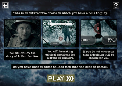
 Fig.1. The BBC's First World War 'game'

Powerful. Rich. Fast. Makes you think. The perfect morning opener to a history lesson - though the 'F***!' word would not be welcome. I'd question its use. Many soldiers were 'God fearing, church-going Quakers'. And it will be a barrier to its use in many schools. 

The idea of having linear drama interspersed with choices is a 'cross media' or 'multi-platform' gold standard that was dreamt about, even proposed, a decade ago - but quite impossible except at huge expense and on DVD. It offers an interesting way into narratives such as 'Sliding Doors' or 'Back to the Future' where you as the viewer and protagonist could make choices about what you do and how you respond. 

A detailed report in Creative Review

Watching Horizon last night on Allergies I was tempted to go online. Try transcribing what is said in these programmes and you might not fill a couple of sides of A4: they don't say much. For me this is a simple example of how video is often the last thing you need as a piece of learning: a TED lecture would be better, a dozen TED lectures better still.

For all the buzz and excitement around distance and online learning I wonder if the connectedness of the Internet and the gargantuan levels and variety of content is the e-learning legacy - creating the environment in which people can travel virtually rather than prescriptive learning.

More WW1 games from the BBC 

Permalink Add your comment
Share post
Design Museum

Don't make it easy

Visible to anyone in the world
Edited by Jonathan Vernon, Saturday, 2 Aug 2014, 11:58

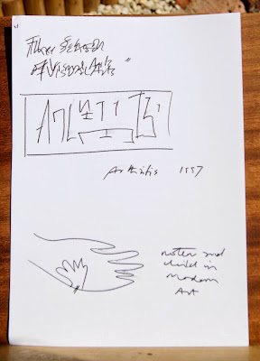
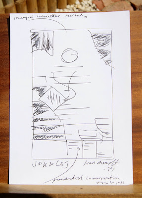
Fig. 1 Some ideas from the Ivan Chermayeff 'Cut and Paste' exhibition at the De La Warr, Bexhill

As photography isn't allowed instead of moving from the gallery with my iPhone or camera clicking at everything and anything that caught my eye I was obliged to get out a sketch pad. Just as Ivan Chermayeff says in a exhibition video 'most people don't know how to see'. 

We risk making everything too easy with e-learning: photos, screengrabs, instant research, transcripts of video, video as audio only or highlights or summaries thanks to others.

The above ideas were for:

a) A School of Visual Arts talk he was giving with a colleague

b) Arthritis - with letters torn from a type font catalogue and jumbled around

c) Mother and Child in modern art - a signal Margritte or Matisse like cut out.

What I would have missed entirely, and I do it no justice here, is a collage of tickets and seating allocation to the inauguration of John F Kennedy on the 20th January 1961. (Before my time, I'd been conceived a few weeks before at a New Year's Eve party. Not even I can remember that far back).


Fig.2 Sketch of an Ivan Chermayeff collage/poster using bits and pieces from attendance at the inaugurations of US President J F Kennedy


Permalink 2 comments (latest comment by Jonathan Vernon, Friday, 25 July 2014, 23:08)
Share post
Design Museum

V is for Virtual Worlds

Visible to anyone in the world
Edited by Jonathan Vernon, Friday, 30 May 2014, 09:33

  • Virginia Woolf

  • Vygotsky

  • Van Gundy

  • Video Arts

  • Video

  • Virtual Worlds

  • Virtual Careers Fair

I add Virginia Woolf as she makes a very good argument for having 'a room of your own'; this can be difficult to achieve, a laptop might help then you can make any space your own. An iPad better still as I will work in the bath. But best of all, a room, even a cupboard-sized room, with a desk and a shelf is what you need. Not an e-learning thing. Just a thought on learning.

Vygotsky should be read from the original translations. He was writing in the 1920s. The translations came out in the 1970s.

Van Gundy is one for creative problem solving.

Video Arts went interactive but kept their roots in drama-reconstruction of business scenarios using top talent from TV and film. It's surprising who you find has done one of these in the post student drama school days. 

Video in e-learning. Of course. But the lessons are that if watching TV worked there'd be more of it. Watching tv is too passive; you have to do something, not least make an effort, if you brain is going to engage. Video is good for variety, for motivation and inspiration, but not all the time. Back to back talking heads bores students. Often a 'how to ... ' video is the only way.

Virtual Worlds have come from gaming. Very expensive. Can become out of date both from the technology and the look and feel. But they engage people. As with video, not all of the time though.

Monk’s House, Rodmell

VanGundy, A.B. (1988) Techniques of Structured Problem Solving, 2nd ed, Van Norstrand Reinhold. Te hniques 4.01, 4.06, 4.57


Permalink Add your comment
Share post
Design Museum

Online vs. Face to face Learning

Visible to anyone in the world
Edited by Jonathan Vernon, Monday, 5 May 2014, 06:44

I'll add notes here as the differences between the online and 'traditional' learning experience dawn on me as I do the two in parallel. Actually there's a third comparison I can make - that of L&D which the other week included something neither of the above formats offer - 'learning over a good lunch!'

Time Managment

The 'traditional' seminar or lecture forces your hand somewhat - you have to be there. Many these days are recorded, though mine will not be. I'm inclined therefore to take either a digital or audio recorder along to record these things. I have, just a couple of times over three years, got behind with the online course as I kept putting it off.

Travel ... and the associated cost

It'll be around four hours door to door once a month. This means getting up at 4.30 am. Not of course something someone in full time tertiary education needs to do. Off peak, unless booked well in advance it'll cost £74 return ... £24 if I stick to exact trains. The last train home was heaving. I could and did 'work' the entire journey whereas home is a constant distraction.

Eating on campus

Lunch I may have to take with me as the campus only had premade Spar sandwhiches at every outlet. A jacket potato or pasta would have been better.

Nodding off

After lunch I did something I last did in double Geography on a Friday afternoon. I sat at the back, cupped my hands over my eyes as if in deep thought ... and fell asleep.

When to put in the hours

Something, however common to many people on any part-time distance learning course is 'the early morning shift' - putting in 90 minutes or so before breakfast. 

Library Services

While this and other support services are offered to us on our VLE it was invaluable to to have a person run through it as a presentation in person. This kind of stuff should be given a linear expression ... a mini-module for newcomers and as a refresher. All I've done, two years after the event, was a webinar. 


Permalink Add your comment
Share post
Design Museum

The extraordinary power of images

Visible to anyone in the world
Edited by Jonathan Vernon, Saturday, 29 Dec 2012, 17:53

Ante-smoking%25203.JPG

Fig. 1. End of Year 2012 Ante-smoking TV commercial and campaign

If you find the current anti-smoking ads powerful, in which a cigarette grows a life-like tumour as it is smoked, then imagine what the word 'disembowel' conjures up?

I do not suggest that you Google the word as I did wanting to correct my spelling 'disembowl' - which, if correctly defined might mean nothing more challenging that taking a bowl out of a cupboard, or away from a child who is playing with their breakfast.

I deliberately offer neither a link, nor an image.

It shocked me that even I could so naively stumble upon a gallery of such horrific proportions that includes CCTV footage of road accidents and the aftermath of murders, killings and war zone collateral damage. I am now forever damaged. My mind will run amok with these images forever - to scrub them would require cognitive behaviour therapy and hypnosis.

If I ever need to put my teenage children off the idea of riding on a motorbike, or getting a motorbike of their own I know what Google search will will put them off, potentially keep them off a pedal bike too. I've now seen what happens when a truck hits a stationary motorbike that is waiting to take, in this instance, a left turn off the main road.

I believe in the power of images - for advertising and for learning purposes.

I believe that the more genuine the image, however contrived and constructed, in its appropriate context - the more memorable the facts, events and circumstances are as a force to inform or educate. I believe also that where this image is animated, live or as live video, with both visual and auditory clues, the more powerful it becomes.

The police don't show reconstructions of traffic accidents to drunk or reckless drivers - they show them the real thing.


Permalink 2 comments (latest comment by Jonathan Vernon, Saturday, 29 Dec 2012, 17:49)
Share post

This blog might contain posts that are only visible to logged-in users, or where only logged-in users can comment. If you have an account on the system, please log in for full access.

Total visits to this blog: 13018725