OU blog

Personal Blogs

Design Museum

Too busy to blog

Visible to anyone in the world

Age 13 I started a Five Year Diary. Very quickly you feel you have to write something each day. I did. A few cryptic notes. Decades later I blog. For a while it was a blog a day. These days I scramble notes together across the day. Thinking about it I could readily blog three or more times a day: I don't. 

Too busy to blog does not mean I am not at least regularly noting things down. It just takes a click to Recent Documents or search in my notes to find out. I do this to keep a record of things I may forget. 

This morning I went into my 'study' (tiny broom cupboard of a space) and saw a page of notes I had put down in the middle of the night. I forget the thoughts or that I'd written them down - but am glad that I did as it forms the spine for a talk I have to deliver on employability in 10 days time.

Meanwhile my focus is on three things: observating online sessions delivered by others and writing up a report, preparing and delivering my own online sessions and getting my head around the Learning Designer from UCL's Knowledge Lab featured in their Blended Online Learning FutureLearn MOOC. 

Permalink Add your comment
Share post
Design Museum

Keen

Visible to anyone in the world

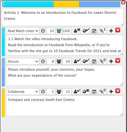
Eager to get some time in doing this 'teaching online' thing I took a group of 'Adult Learners' this afternoon on use of Social Media. I used the Learning Design tool from UCL Knowledgelab - just an electronic planner which automates some of the processes, things I have done here with sets of cards or shared in online in 'swimming lanes' or what not.

Learning Design layout

The laugh is that we did the above for nearly two hours. It took a good 15 to 20 minutes just to get my 'students' in the same place and after that I wanted to give each person a thorough chance to reveal their interest and experience for everyone's benefit. I skipped one or two things as a result, but nonetheless gave time to the links I put up. These breaks to check a few links were always limited to just 3 minutes. The discussion afterwards could easily last 15 to 20 minutes as I gave feedback to each response and there were 7 in the 'Class'. Not a regular college class. 

I find the above of value nonetheless and if I use it for an observed class next week at least I will have practiced it.

Permalink Add your comment
Share post
Design Museum

Back at College (remotely)

Visible to anyone in the world

Day one we get a breifing from the head and vice-principal via Meet in which our position within current Government guidelines are shared. We look forward to the New Year and the multitple challenges our insitution will face.

Meanwhile I am looking at materials that could be used by tutors to help them progress with their teaching online. I'm unimpressed which what is offered. Each college/institution is unique - some more unique than others, so trying to provide training that is aimed at a different cohort, with different needs and using a different platform for teaching will help no one and irritate everyone.

Meanwhile I have today to decide whether to sign away £1,700 and take a Masters level module in Instructional Design with the University of Illinois. I'd be more tempted if I could spare the money.]

Meanwhile, I tentatively press on with migratting content by various categories to me external e-learning dedicated blog 'Reflections on E-Learning'.


Permalink Add your comment
Share post
Design Museum

Payback after 10 years !

Visible to anyone in the world

From frontline trooper to recently commissioned, junior officer and rapid promotion.

Getting to grips with the tools for two years I am at last inching towards supporting senior lecturers, heads of department and management on what online learning looks like and how to implement it.

The nuts and bolts of particular tools is my daily activity, but there is at least awareness that what I have here over the last 10 years has value for learning planning and design.


Permalink Add your comment
Share post
Design Museum

Beat Asthma Before Asthma Beats You

Visible to anyone in the world

My asthma awareness script for age group swimmers is now done. The next step is to cost it, fund it and produce it. I feel like the teenage who got into video production age 17 - 40 flipping years ago!

Am I as excited? A bit, though I lack the drive and have far too many other distractions.


Permalink Add your comment
Share post
Design Museum

Learning Design with Anna Sabramowicz

Visible to anyone in the world


In my second week of a six week bespoke course on using scenarios in learning design with Anna Sabramowicz. Aware of her, her work and influence via LinkedIn for many years I leapt at the opportunity to learn her approach. I immediately feel the time, cost and effort on this is justified. It all rings true. I feel at home. I described it to her as the feeling a muscian or singer might get coming back to sheet music to sing or even compose a song after a decade - at first it feels a struggle, but then it all fits into place.

Is that what I wanted 18 years ago when I started the MA in Open & Distance Learning as it was then? Is this practical insight into creating online learning what I had hoped for from the MA ODE which I finally took and completed between 2010 and 2013?

Is this what I had been looking for in my short spells in a Brighton eLearning agency?

The real magic is to feel that my researching, enquiring, planning, developing, creating, visualing and dialogue writing skills and experience can all be used in creating drama recreations, or cartoon enactments that offer the user a number of choices. The MAODE also rings true with course design, the 'swimming lanes' and flow charts that we worked on - and my efforts to simplify this to a few lines of coloured bricks in the style of Gilly Salmon. 

I will be working on a subject that I had worked up into a PhD research proposal - getting young people to follow a better regimen when it comes to taking their asthma drugs. 


Permalink Add your comment
Share post
Design Museum

Blinkered to Learning Opportunities

Visible to anyone in the world
Edited by Jonathan Vernon, Saturday, 2 Feb 2019, 14:06


I'm worried that eLearning is too prescriptive. This will depend of course at what level a student is being taught. Primary is different from Tertiary. At primary there is stuff you need to know, at tertiary you can be expected to explore around the subject. However, believing that a student can pick up everything in the most suitable way simply from what is put before them is surel a mistake.

The online learning I have experienced is rather of this type. You are blinkered to anything other than the content presented to you. This might work for some people, or even most people, unfortunately for me, I know this approach does not stimulate me at all.

I am trying to become a certified Google Educator Level 1. This is fairly basic communications stuff, though with some parts of the Google Suite I never touch. The 'learning' is repetitively of the same type and format: read a bit, watch or listen to a few examples, typically a teacher reading a portaprompt off camera (always from the US) in tones that lean towards sales pitch rather than candid revelation. My Teflon brain smells a rat and won't buy it. There are interludes to complete a multiple choice quiz. When you have done this for 12 hours and studies as many units you sit down to a formal 3 hour online test. I don't respond well to having been expected to wear blinkers all the way through the training, and remain blinkered during the test There is no room for manoeuvre: there is their way or the wrong way.

How many MOOCS are of a similar ilk? The learning is a kind of conveyor belt where through reading, answering questions and watching videos you are supposed to become conversant and more importantly a competent practitioner.

I need to be set tasks, I need to fail at these tasks and been corrected, I need to be recognised and rewarded when I get something right. Over time, a lot of time, what I am doing, why I am doing it and how I do it makes sense. This is what I call practical learning. I do best when such learning is on the job. I do best when two years in I am faced with an exam. The narrative of my learning follows the Hollywood Arch which builds towards a climax. I cannot abide coursework because my first efforts are invariably terrible. Here at the OU I was known to get grade in the 40s or 50s. It took a couple of years to reach the stratospheric heights of grades in the 80s (and one 92).

Take the blinkers off. Don't put your students in blinkers, Expect them to venture far and wide. Encourage them to look around, and therefore click around the many resources they can find and be informed by. 

Permalink 2 comments (latest comment by Jonathan Vernon, Wednesday, 6 Feb 2019, 11:20)
Share post
Design Museum

I am the Ghost in the Machine

Visible to anyone in the world

Working with a Richoh Thetga SC 360 camera I am finding that I keep ending up in the picture. Inadvertently I may have set the self-timer. I take the picture then re-emerge from my hiding place and end up in the picture. Nor have I got the electronic settings right. AUTO clearly has too low a shutter speed in order to allow the maximum light into the 'frame'.

On the one hand I am enjoying the novelty and the experimentation. On the other hand I am constantly questioning their use and value in education. A 360 image is just one of many kinds of image, and framing that could be used. The question should not be 'how do we use this technology' and shoe-horn it into a piece of learning, but rather what is the desired learning outcome and what tools would be best suited to achieve this.

Colleges are only just beginning to have the resources to have a Learning Technologist on board, however we also need Learning Design.

My aim will be to import both Learning Design and Communications skills to the tasks at hand. As a 'communicator" i will start to introduce the 'Creative Brief' in order to help establish the context in which a piece of work will be delivered. I will also start to think about the learning design, Of course all of this should be done with the 'subject matter expert' - the tutor. 

On a scale of tutor involvement we can go from a classroom or tutorial where the students are expected to hang on the educator's every word. At the other end of the scale the tutor, and subject team, involvement is hidden in the design and content as a piece of self-directed learning. In between we have blended learning where a class are monitored and guided by a human presence - ostensibly they have work to get on with, but someone is there to get them started, to direct them and keep them focused.

So much to do! So much to learn! So much to achieve!

Any of the coures content I am working on could of course be used with many thousands of students, and be repeated each year (so long as the syllabus remains the same). With scale there ought to be a better budget too.

Permalink Add your comment
Share post
Design Museum

How we learn online

Visible to anyone in the world
Edited by Jonathan Vernon, Monday, 16 May 2016, 22:29

In my last post I featured Gilly Salmon: great video isn't it? But is it still current. I rather think three things have caused a major shift in the kind of 'learning design' that Gilly Salmon suggests:

1) There is next to now need to have human interaction from the course team, or moderators in the form of PhD or MA students making a contribution to discussions. 

2) Her 'Five Stage Model' works for an Open University 'distance learning course' where a group of 12-16 students are assigned an 'associate lecturer' to watch over things, mark assignments, answer questions and act as a catalyst to discussion. However, this no longer works where there are 10,000 students (or a lot more) on the course.

3) Who is paying for it? There are two key considerations regarding students paying for the course they do: a) by paying a fee (always relative to their ability to pay) they are more likely to complete the course b) a model that is designed to be 'free', and free of other long term funding or cash flow is doomed for a myriad of business reasons.

This is how the model works. Self-explanatory? This student blog platform is a piece of the 'Green' - it is a technical response to allowing students to share and discuss stuff. Yellow is anything you are asked to do as part of your course: watch a video, read some text, answer some questions. collaborate on a paper. Blue is your associate lecturer. In truth it also includes your fellow students. I found back in 2010 that those on their last module of the MAODE were, with a couple of exceptions, happy to engage, point things out and explain a concept. You get to play this role when three years later you are on your last module.

Here's how I've re-interpretted Gilly Salmon's five stage model;

Flow chart using coloured bricks to explain Gilly Salmon's Five Stage MOdel

My version of this, based on the many MOOCs I have done, not least through FutureLearn, but especially through Coursera, is that the model in 2016 needs to look more like this:

An idealised flow chart for a module of online learning that uses coloured building bricks

This is what I feel works:

Testing almost from the start. This could be just TWO questions in a so called 'multi-plechoice quiz' but it is a start and it established a precedence. This builds to maybe 8-12 questions at the end of a week of learning (say 2 hours) where participants are expect to get 80% right before they continue. Why not? Where's the value and what is the point in continuing with a course where you already don't understand 60% of what has just been taught. A 40% pass mark is far too low. 

In reality, in a MOOC, there is no, or next to no 'blue row or column'. It is quite impossible, for not impossible, for a member of the course team to be engage in the learning experience. There are exceptions. If you happen to be online at the same time then it is cool when the author of the learning drops in: there words are hung upon, as happened with Barb Oakley in her 'Learning How to Learn' from Coursera.

A vital row, or column I am missing - perhaps I should replace that blue row, is, of necessity the moments when the course creators need to be persuading those who can pay to purchase the course and a certificate, say £35 ... especially where a course has another five weeks to run. In part, it is this payment that engenders some greater commitment to see it through to the end. 

There are always options to complete the MOOC for free: typically by offering your skills as a voice spotting errors or suggesting improvements. 

There are other ways to 'monetise' a MOOC: the author having 'the book of the course' and the platform having some percentrage rights to the sales. A MOOC that gets 140,000+ participants will get a lot of books sales. Barb Oakley's books went to the top of the New York Factual Books charts.


Permalink
Share post
Design Museum

Learning how to learn online with FutureLearn and The OU

Visible to anyone in the world
Edited by Jonathan Vernon, Friday, 12 Dec 2014, 07:18
From E-Learning V

Fig.1 My progress on The OU MOOC on FutureLearn 'Start Writing Fiction' (c) FutureLearn 2014

More than any module or exercise I have done over my four years with The OU, it is a MOOC in FutureLearn that is giving me the most thorough experience of where the future or learning lies. I'm in week seven of eight weeks of 'Start Writing Fiction' from The OU, on the FutureLearn platform. Just in these few weeks I've seen the site change to solve problems or to enhance the experience. Subtle lifts and adjustments that make a positive out of constant adjustment. Those tabs along the top: activity, replies where under a tab. I think 'to do' is new while 'progress' was elsewhere. This is a responsive platform that listens to its students.

In the final week we submit our third piece of work.

As assessments go these are far less nerve racking than a TMA. The first piece was 300, the second 500 and the last will be 1000. These are assessed by fellow students. In my case I had one, then two reviews. Most people seem to get at least two sometimes three. The system is designed, I'm sure, to try and ensure that everyone's work is reviewed at least once. Tens of thousands, certainly thousands of people are on the course.

We're here to the 19th of December or so ... if you follow the tracks as laid.  

I hazard a guess that between 20-100 have posted there final piece already. Some, I know, got to the end of the entire course a few weeks ago; I looked ahead to see out of curiosity. There have always been 20 who post comments one, two even three weeks ahead. If 20 are posting I hazard a guess knowing my stats on these things that another couple of hundred could be clicking through the pages to read and observe. They may, like me, be coming back later. They may only be following the course, but not participating. Often, it is like standing on a stage looking into the gloom of the auditorium. Someone probably out there. One or two let you know. The rest don't.

I hope those that race ahead come back ...

I find that if I get ahead then I slow down and retrace my steps. To learn in this connected and collaborative way you are far better off in the pack ... it is not a race to get to the end first. In fact, those who do this have already lost. They've missed the point. I'd suggest to people that if they have the time to do the week over. That's been my approach anyway - the beauty of these things is everyone can come and go as they please, at a pace that suits them. Skip a bit. Go back. Follow it week by week, day by day ... or not. Whatever works works?

There's another very good reason to stay with the 'pack' or to come back and do a week over - the platform depends not on tutors and moderators commenting and assessing work, but us students doing a kind of amateur, though smart, peer review. This is what make a MOOC particularly vibrant, memorable and effective. Not listening to an educator telling us what's what, but the contributors sharing, figuring it out, answering each other's problems in multiple ways. We all learn in different ways and at a pace that shifts too. I find that often a point I don't get first time round, on the second, or third, or even the fourth visit to an activity someone, somewhere puts it in a way that suddenly brings complete clarity - their way of seeing a thing, or expressing it, makes more sense than the writes of the course could manage. Because they can only write one version, not the 'tartan' that comes from an intelligent, threaded online conversation.

Permalink Add your comment
Share post
Design Museum

Why some online learning works better than others

Visible to anyone in the world
Edited by Jonathan Vernon, Friday, 17 Oct 2014, 14:43
From E-Learning V

Fig.1 This is what a reading list looks like - too much of a good thing makes it a bad thing

I 'do' e-learning for two reasons:

  • love of a subject, or a desire to fill holes or build mountains in my knowledge
  • fascination in e-learning: what works and what does not.

FutureLearn is a magic platform

I love it's simplicity, clarity and intuitiveness. In the right hands it's the perfect cup of coffee. (and once a day takes about as long to consume)

Classy copy

The considered, edited and crafted content doesn't dick about: it is a brief talk, or walk and talk BBC documentary style opening (video), followed by a a dozen paragraphs of a succinct piece of required reading that is then opened to the 'floor'.

'Connectedness' is enabled

The threaded discussion looks more like this bulletin-board cum blog cum student forum. Perhaps, as this has developed over the last decade, is where the idea came from? As a bulletin-board each time you comment your thoughts are placed on the top of the pile: someone has to read it when they log in, or at least there's a  greater chance of that.

This connectedness is facilitated and encouraged further by alerts you get as others comment in a thread you've contributed to or started. 

Your contributions are sorted for you and so build, without you needing to do so yourself, into a threaded line of thought - you can see how you are learning, how your knowledge improves and your ideas develop.

There are parameters

There is a word count for each posting. 1200 characters I think and a time frame during which you can edit (15 minutes). 

There is a modicum of overload

We, as students, are the masters of the time we have, or want to give to a thing. We are also the ones who know and control the pace. It is too simple to say that some people read faster than others, so can consume more. We approach text in very different ways. What is crucial and done in the FutureLearn module I'm doing on the 1919 First World War Paris Treaty is the amount of reading offered. It is more than enough, but not overwhelming. It takes itself and its students seriously by saying that 'we think you can read all of this and contribute to the discussions in the time allocated - five hours a week'.

Module teams get it wrong when content is sparse or when they overload the student with that laziest of get-outs 'the reading list'. Getting it right requires effort, confidence in the subject you are teaching and a belief and understanding of the way people learn and the platforms and tools now available and how their evolving use impacts on learning. I'm doing a couple of FutureLearn modules: 'Writing Applications' at two hours a week, compares to World War 1: Paris 1919 at five hours a week. The contrast couldn't be greater. 

It's like the first offers you a small cup of coffee: no refills. Instant. You get it with milk whether you like it or not. While the second gives you a rich cup of coffee and, if you want them, a couple of refills. No more. There are parameters. 

FutureLearn keeps it simple

What matters are the words people type. There are none of the mess of unnecessary buttons provided here. Honestly. Keep it simple OU. They just muddle things massively. Where used they invariably take away from the ability to communicate. It is enough of a challenge to type on a QWERTY keyboard. Plain text does the job. In the hands of the amateur (all of us), being able to add colour, change font size and a whole lot more serves no useful purpose. 

Content is self-moderated by the group

A simple alert button allows you to flag something to let moderators know that something inappropriate is going on: hateful language, foul language, 'drunken' rants ... 

Go see

'There's something for everyone'.


Permalink Add your comment
Share post
Design Museum

Peace in pieces

Visible to anyone in the world
Edited by Jonathan Vernon, Saturday, 2 Aug 2014, 10:58

Fig. 1. Poster commemorating the bombing of Hiroshima for Japan, 1985. Ivan Chermayeff, de la warr pavilion, Bexhill.

Trip FIVE to this exhibition, this time with my brother-in-law, is imminent. What I adore about exhibitions here is that they are 'bitesize' and smart; they are a perfect 'mind burst'. They are the ideal repeat show too as with each visit you see more, and see differently ... and are influenced of course by the person you are with.

The right image says what each viewer sees in it.

This idea naturally translates into any and every conflict we see today: MH17, fractured and not yet stuck together, the Middle East utterly smashed into dust - I have this visual in my head of Hanukkah Lamp, the smoke from which forms a fractured map of Israel and Palestine. 

From E-Learning IV

From a learning point of view to start with a poster such as this is to follow Robert Gagne theory of learning design; also the natural skill of storytellers and good communications: get their attention.


Permalink Add your comment
Share post
Design Museum

Preach to the converted

Visible to anyone in the world
Edited by Jonathan Vernon, Saturday, 2 Aug 2014, 11:27

 Fig. 1 My big sister and me

'Preach to the converted' is the mantra of advertising; increasingly it should the mantra of e-learning. Give potential students what they want in a way that they are already open to. Don't force feed platforms and tools that are foreign to them, nor pander to the book, pen and notebook when by its very nature if you are learning online you are in front of a computer screen. Blended learning is how it is. Increasingly there is no 'e' - it is simply learning in the 21st century.

'Preach to the converted' ties into the need to know who your students are - in all their diversity. There's a bunch of personas used by the Open University to help with this. We're a handful of shifting types across a spectrum of some 12 personas. This helps educators design for hidden, massive audiences.

Fig.2. The Santorini Museum

Big Sis and me both wanted a book from the Santorini Museum.  

We'd done the Akrotiri excavation and did the museum in our separate ways (family event on the island with people arriving at different times and staying in different place. When we met up we agreed immediately at the frustration at no having a shop at either location. You whet your appetite on a subject are ripe for a bit more. I even started looking for a two week course on Archaeology in Future Learn. No book. Not much of a website. Ample content with each artefact. 

Visitors to museums are converts; not just easy to sell postcards and tea-towels too, but ready to learn and suckers not just for 'the book', but just as prepared to come to the talk, even, these days, to sign up to a taster course.

Permalink Add your comment
Share post
Design Museum

The Good, the Bad and the Ugly - all you need in the learning mix

Visible to anyone in the world
Edited by Jonathan Vernon, Friday, 1 Feb 2013, 09:03

JENGA.JPG

I love the beauty of  Jenga. Like Google, it's simple and it works.

Simplicity has a purity about it. Don't knock it. Behind its functionality and its look and feel there will be some hard thinking.

'Keep it simple, stupid'. (K.I.S.S) may be a training cliche but there is considerable truth in it.

I've now had three years here at the OU and here on this Student Blog platform (short of five days, first post 6th Feb 2010).

I've been working on my ideas regarding learning and e-learning design in particular Courtesy of THE OU hosted OLDs MOOC 2013 (Online Learning Design - Massive Open Online Course)

I'm experiencing what feels like undertaking an 8 week written examination - the contents of my brain are being pushed through the cookie cutter.

And out comes this:

The Good, the Bad and the Ugly

(Of course I had shut down for the gadgets for the day and was brushing my teeth when this came to me).

The%2520good.JPG

The Good

Learning events or activities, moments that make the participant smile, think, reflect, nod in agreement, understand, be informed and generally feel good about the world and this particular learning experience. Hit them with some of this, as the say so succinctly across the Atlantic - at the 'get go'.

The%2520bad.JPG

The Bad

The effort required and built into the learning. OK, we want them to love this too, and you can if you're 'in the flow', have done your work, have wrestled with what you didn't understand, asked for help, listen to fellow students, gone out of your way to do extra reading and research until you have it, one way or another.

There needs to be assessment.

An assignment is a soft assessment to me - though like everyone I have terrible days when the thing just slips through my fingers like a snowball on the beach. A dissertation or end of module assignment is tougher, but tough and 'bad' in a certain way - like commitment to a triathlon. And a good analogy as working on and developing three issues at 2,000 words a pop is about right. And you won't get far if you leave training to the week before. It's a slow burn.

The 'bad' has to be the written examination.

They have to be hated and feared, and like learning lines for that school play, you have to get it right on the night (or day). And what do you do if you act? You have good lines to learn, you learn and rehearse your lines and you practice, and do a test run or two. The curtains going up is the equivalent of your turning the examination paper over. I feel the fear from a year ago - April 2012. I hadn't sat a written exam in 30 years. All my undergraduate and school-boy fears came back. I used rusty techniques that had last seen service during my first degree.

Bad is good. You want to do everything not to feel like you are naked on stage - a dream we all have when faced with such an 'exposing' test?

The%2520ugly.JPG

The Ugly

Shock 'em. Not scare the witless. Have up your sleeve some smart stuff. Whether an idea or the technology offer a creepy and certainly memorable surprise.

Boring a student into making a fact or issue stick is like throwing mud at a brick wall - it'll stick, it'll coagulate and build up, but is easily washed away in a shower and destroyed in a storm.

Use storytelling techniques perhaps, better still, follow the pattern of a ghost story.

Scare them? I'm back on fear I guess.

We humans are fearful of many things and will go out of our way to avoid, run away or confront our fears. As I said, the idea here isn't to lose your students, but to empathise with them, understand the ugly side of their learning experience then help them confront their worst fears. It is ugly having to tackle the parts of a subject that stink, but inevitably these are the blocks at the base of JENGA.

So can I apply it? And can I go back to bed now?

Which leads me to another theme - we no longer simply bring work home with us, we take it to bed and sleep with it. If this pisses you off then let me introduce you to 'working with dreams'. If you are prepared to get up for an hour in the dead of night, or can flick on a light without invoking divorce then scribble stuff down to catalyse the thought in the morning. Can work wonders, can produce nonsense, can just be some things you need to put on the supermarket shopping list ... or another dream of being naked on the stage, not knowing your lines and needing the lo but all the exits are locked and the orchestra has stopped and you have to say something.

Which, courtesy of the wonders of the mind, has me in the front row of a performance of The Tempest at the University Theatre, Newcastle when I was 13 or 14. Caliban was naked, covered in mud and wearing a prosthetic erect penis.

HORROR!

P.S. And give me 20 minutes searching the Internet and I will be able to name the actor, date the show and possibly even find a picture. Perhaps you'd like to have a go. But before you do so, be very fearful of what the search terms you use might throw up.

P.P.S. It may have been David Suchet, with Juliet Stevenson or some such as Aerial. The performance was in 1974, possibly a precursor to the RSC doing a Newcastle Tour every March at the Theatre Royal and Gulbenkien. It may have been Jim Carter. Or none of these!


Permalink Add your comment
Share post
Design Museum

OLDs MOOC 2013 - Week 3 Hang Out on the 7Cs of Learning Design

Visible to anyone in the world
Edited by Jonathan Vernon, Wednesday, 22 Oct 2014, 08:52

‘Teachers want support and guidance to help them rethink their design practice, to think beyond content to and activities to make pedagogically informed design decisions that make good use of technologies’.

I’ve just been listening over the OLDs MOOC hangout for Week 3 and particularly enjoyed the Q&A with

Professor Gráinne Conole

The sentence above stood out from the 60 minutes, as well as how this was put into context for the MOOC in Week 3 and coming up in Week 8. Personally I wish we’d had something like this to begin the week. I got in early, did a couple of activities then followed the noise from the active design group I've joined. Give others a turn. Let things roll over. This works. Leave gaps and sometimes others will come along and think, OK, he's done that so I can see how it works, or might work for me. I won't bother with that tool, I'll try something else and see what people make of it. I cherry picked and as this hangout suggests and recommends, I’ll go back and pick out more as required. I enjoyed downloading, colouring in, cutting out then using the Activity Cards. This is more my thing than the EXCEL spreadsheet - which I planned on a sheet of paper then transferred over. I might use an APP to generate such a thing. I find EXCEL somewhat heavy handed, or I’d want to design it in a way that I like. We learnt about the background to 7Cs. The background and context was invaluable. Credibility ought not be taken for granted. Work like this needs to be put on a pedestal and people told of its credentials and worth - i.e sell it to me! 7Cs is an OU with OU Learning Design Initiative with JISC through the Curriculum Design Programme. Activity Profile and Course Map. Trialed thoroughly. Gráinne Conole continued this work with the JISC funded CARPE Dium learning design workshops at Leicester whiuch provides a ' rich storyboard of learning design'. More on this from: Gabi Witthaus Ming Nei More at http://www.olds.ac.uk/ And http://e4innovation.com/ Overarching conceptual framework A lot Cs here: Conceptualise - vision for the course, who is it for, what is the nature of the learners and personas Course features - the essence of it. Creative activity - capture, communicate and consider Conceptual Combine - into course map and activity profile Consolidate - running it as face to face, or VLE, or more specialised learning design tool, or …. From Gráinne's blog:

7 cs of learning design fromGráinne Conole

7Cs element
Learning Design tool
Conceptualise
Course features
Design Narratives
Personas
Analysing context: factors and concerns
Capture
Resource audit
Repository search strategy
Create
Course map
Activity profile
Task swimlane
Storyboard
Communicate
E-moderating framework
Mapping forums, blogs and wikis
Communicative affordances
Collaborate
Collaborative affordances
CSCL Pedagogical Patterns
Consider
Assessment Pedagogical Patterns
Learning outcomes map

With current thinking on 7Cs Various systems offered and can be tried. Listening to OLDs MOOCers it appears that the 7Cs framework has been received well

  • It articulates what teachers already do.
  • There are 7 aspects in a whole design process.
  • What level are you teaching, what level of support do they need etc:
  • Teachers (all of us I would say, educators, learning designers, L&D managers) are bewildered by the range of tools, the range of approaches so fall back on their own content. So use the tools to think about the activities, the core essence of hte course.

Gráinne introduced the work of Helen Keegan, Augmented Reality and risk. More on use of augmented learning 7Cs has been found useful in Australia

  • Indigenous Culture on locality.
  • Introducing elements of serendipity.
  • Activity profile
  • Is it the right mix of learning for what you want the students to do.
  • Correlation of time mapped out to what students are achieving … so she is poor at communication in Spanish … and there is little communication in the course she is doing.

Is this the right tool set?

  • Covers all the aspects of design.
  • Getting a taster for these in the course.

‘A huge amount in the MOOC is mix and pic, so take your time, come back to the resources. Six months down the line, you discover which ones you like’.

  • Some love the activity profiles some don’t, so find the mix that works for you.
  • Some with learning outcomes.
  • Some with the content.
  • Some with the characteristics of the context of the learners.
  • Different tools will mean different things to different people.

‘We’re offering a Smörgåsbord of offerings that you can develop and use over time. Pick the ones that are relevant to you, don’t feel that you have to use all of them’.

Larnica Declaration on Learning Design

(More coming up in WK 8 to act as a springboard to reflect)

  • What is learning design?
  • How has it come about?
  • Why is it different to structural design?

Professor James Dalziel

2011 ALTC National Teaching Fellow

  • Driven by people in Europe and colleagues in Australia.
  • What is learning design? How has it come about?
  • How is it distinct from instructional design?
  • Major Epiphany moment Sept 2012
  • Two days in Cyprus
  • Timeline of key moments since 199 learning design

REF: Key books on design science (Dianna Laurillard)  Teaching Design as a Science It’s aimed to be pedagogically neutral so that it can be used across a range of methodologies and pedagogies.

  • Tools for guidance and support
  • Tools for visualisation
  • Tools for sharing like Cloudworks

What works for you

  • It depends on the nature of how people want to go about things
  • Visual
  • Linear
  • Connect and be sociable
  • Open, unstructured … to form some kind of navigatable way through, as well as enjoying the serendipity. Having the options of the long and short routes.
  • Is something more needed in the middle ground. B MOOCs.

BLOG http://www.larnacadeclaration.org

Permalink
Share post
Design Museum

H810 : Activity 30.1 E-learning - key roles for implementation

Visible to anyone in the world
Edited by Jonathan Vernon, Sunday, 9 Dec 2012, 08:15

Review and discussion

Thinking back to Topics 25 (academic perspectives) to Topic 29 (management perspectives), what role or roles do you recognise from your experience?

  • What roles do you have in common?
  • To what extent do your roles and perspectives overlap?
  • Are any differences because your organisations are of different types or are they because people in the organisations have different priorities?

_________________________________________________________________________________________________

Over the last decade I have come full circle, from the belief that the future lay in self-directed gamified e-learning where everything is managed and monitored by the system - even if an avatar is thrown in to make it appear human. (There is current activity doing exactly this - creating avatars to play the role of tutor - perhaps to serve millions of new learners this will serve a purpose!)

The goal I feel should be recreation, where students want it, of the Oxbridge model of tutorial - at least at graduate and post-graduate levels - where the tutor plays a key role as intermediary. 'Where the students want it' implies choice - so in truth a smorgasbord at every step, not just the way a module is presented, but how material is tackled topic by topic. I've reviewed platforms that have the look and feel of a games arcade - resplendent with hyper-gamified activities at every stage - this for me does more than simply exclude the disabled student, it also presumes in error that all learners have or desire this mindset. They do not. Where we have choice I think we do incline to the verbal, auditory or kinaesthetic - I also believe that our moods and inclinations, and especially experience, tip us to one model over another. All this spells out 'C H O I C E' not constraints in the conduits of a gamified series of funnels and tunnels.

The OU may not get the attention of the e-learning awards panel, but they have a more important responsibility to hundreds of thousands of students, tens of thousands of ALs ... and a few thousand staff.

  • A champion - whomsoever this may be someone needs to make accessibility a cause
  • A leader - perhaps an innovator and entrepreneur, someone who can galvanise others into action, raise the funds, assemble a team and get the most out of them.
  • Disabled student representatives - not a token person in a wheelchair, but genuine engagement and involvement from various disabled group communities i.e. involving in particular a student or former student with experience of learning as a disabled person from the 'communities' that include hearing, sight, mobile and cognitive impairments.
  • Legal advice - much e-learning is now offered on a global platform. Laws differ, but it will reach the point where disabled students wise-up to their rights and how to press for them. This isn't about interpreting the law to reduce risk and get away with doing as little as possible, it is about ensuring that the 'bar' where it is currently placed, is reached.
  • Professional Managers - team players. Some educational practices have to change - the lone educator devising their own content for a prescribed curriculum greatly reduces both the greater use of readily available resources and their creation and management on accessible platforms. Even entrepreneurs and those with marketing and communications skills in order to compete in a global market for education provision.
  • E-learning design - experienced and qualified people who have a good understanding of how to construct e-learning, if necessary with people who have a theoretical and/or a technical background and awareness. Personally I would have a minimum of FOUR people representing the following skills: learning theory, e-learning technologies (programmer), visualisation (design in its broadest meaning in relation to functionality as well as look) and the subject matter expert - not necessarily to write original content, but certainly to curate resources where they are readily available and to tailor them to a specific audience's learning needs.
  • Research - it helps to have someone dedicated to knowing where we are with the technology and resources, in this instance with a specialism relating to assistive technology (software and hardware).

To be continued ...

Please add to this mix. If we could or had to create an e-learning platform from scratch who would you want on your team. Put this in your context - say creative writing, or civil engineering, language learning or health care. In the IDEAL e-learning world who would be in it and how would the mix work?

  • IT - there need to be people, a department even, that knows how to make IT sing and keeping it robust, up to date, compliant, reliable and secure.
Permalink Add your comment
Share post
Design Museum

H818 - The Networked Practitioner - New for Autumn 2013

Visible to anyone in the world
Edited by Jonathan Vernon, Tuesday, 21 Oct 2014, 07:50

Fig. 1. The Digital Scholar

Martin Weller's Digital Scholar becomes the basis for H818 - The Networked Practitioner

This new e-learning module from the Open University uses Martin Weller’s book The Digital Scholar is part of a wide range of open access material used for the module and Martin is one of the authors of the module content.

Chapter 1 - Read it here on the Bloomsbury website

Over the last couple of years I have said how much I would like to 'return' to the traditional approach to graduate and postgraduate learning - you read a book from cover to cover and share your thinking on this with fellow students and your tutor - perhaps also a subject related student society.

Why know it if it works?

Fig. 2. The backbone of H810 Accessible Online Learning is Jane Seale's 2006 Book.

Where the author has a voice and authority, writes well and in a narrative form, it makes for an easier learning journey - having read the Digital Scholar participants will find this is the case.

As in the creation of a TV series or movie a successful publication has been tested and shows that there is an audience.

The research and aggregation has been done - though I wonder if online exploiting a curated resource would be a better model? That e-learning lends itself to drawing upon multiple nuggets rather than a single gold bar.

There are a couple of caveats related to this tactic:

  1. Keeping the content refreshed and up to date. Too often I find myself reading about redundant technologies - the solution is to Google the cited author and see if they have written something more current - often, not surprisingly from an academic, you find they have elaborated or drilled into a topic they have made their own in the last 18 months.
  2. Lack of variety. Variety is required in learning not simply to avoid the predictable - read this, comment on this, write an assignment based on this ... but this single voice may not be to everyone's liking. Can you get onto their wave length? If not, who and where are the alternative voices?


Permalink Add your comment
Share post
Design Museum

The purpose of education ...

Visible to anyone in the world
Edited by Jonathan Vernon, Friday, 4 Jan 2013, 20:09

"The purpose of education is not to make information accessible, but rather to teach learners how to transform accessible information into useable knowledge.Decades of cognitive science research have demonstrated that the capability to transform accessible information into useable knowledge is not a passive process but an active one". CAST (2011)

Constructing useable knowledge, knowledge that is accessible for future decision-making, depends not upon merely perceiving information, but upon active “information processing skills” like selective attending, integrating new information with prior knowledge, strategic categorization, and active memorization.Individuals differ greatly in their skills in information processing and in their access to prior knowledge through which they can assimilate new information. CAST (2011)

Proper design and presentation of information – the responsibility of any curriculum or instructional methodology - can provide the scaffolds necessary to ensure that all learners have access to knowledge. CAST (2011)

I recommend the last link in its entirety above most that I have reviewed. It is a resource, It is succinct. It is practical. It respects the fact that all students come to this kind of learning with a set of experiences and skills - and tactics and tools that work for them. Why make someone play the tuba when they play the harp perfectly well? A metaphor worth developing I wonder in relation learning to play an instrument, read music, pass theory tests, perform solo or in an ensemble, to sight read etc:

Do you recall the paraorchestra performing with Coldplay at the closing ceremony of the London 2012 Paralympics who represented the widest range and degree of disability? http://www.guardian.co.uk/society/2012/sep/01/orchestra-disabled-people-play-paralympics

Guidelines

  • Provide options for perception
  • Provide options for language, mathematical expressions, and symbols
  • Provide options for comprehension

Checkpoints

  • Offer ways of customizing the display of information
  • Offer alternatives for auditory information
  • Offer alternatives for visual information
  • Support decoding text, mathematical notation, and symbols
  • Clarify vocabulary and symbols
  • Clarify syntax and structure
  • Promote understanding across languages
  • Illustrate through multiple media

REFERENCE

CAST (2011). Universal Design for Learning Guidelines version 2.0. Wakefield, MA: Author.

http://www.udlcenter.org/aboutudl/udlguidelines/principle1#principle1_g3

National Center On Universal Design for Learning

Guideline 3: Provide options for comprehension

http://www.udlcenter.org/aboutudl/udlguidelines/principle1#principle1_g3

NATIONAL CENTER ON UNIVERSAL DESIGN FOR LEARNING, AT CAST
40 HARVARD MILLS SQUARE, SUITE 3, WAKEFIELD, MA 01880-3233
TEL (781) 245-2212, EMAIL UDLCENTER@UDLCENTER.ORG

Permalink Add your comment
Share post
Design Museum

When it comes to e-learning how do you see yourself? Learning Designer, Writer, Architect?

Visible to anyone in the world
Edited by Jonathan Vernon, Friday, 14 Feb 2014, 10:38


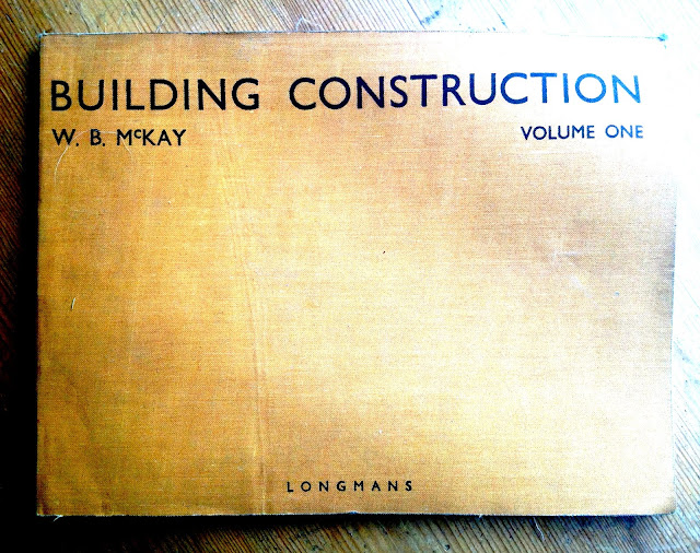
Fig.1. Building Construction W B McKay 1943

Are you the learning architect or the learning builder?

It is flattering to the group from Learning & Development that they can be likened to architects. Whilst many will have a degree, some don't - whilst some may have a post graduate qualification, very few do. None I'm sure will have spent six or seven years in formal study that has lead to recognition by the Royal College of E-Learning Designers - there is no such professional qualification, nor is there any period of formal study, a mix of studio work and academic research, that leads to a qualification of  this calibre.

The exceptions are those with first degrees and MBAs and at the pinnacle of this discussion, Christopher Alexander who has first and second degrees from Cambridge and a PhD in architecture from Harvard.

Many in academia have the second degree and PhD - but they generally lack the experience designing learning outside undergraduate and postgraduate tertiary education, which is quite a diffderent beast to the short courses and continual professional development desired in the workplace.

If I were to take the building trade by way of an analogy I would say that the learning and development manager is the client - while the architect is an agent or agency that you hire in for their design expertise and knowledge of foremen and project managers, builders and electrcians - the project leaders, programmers and art directos of e-learning creation.

The L&D manager may be a subject matter expert but is far more likely to draw upon expertise from within their organisation.

Which of the following made the biggest contribution to your learning when you first set out in your current career asked Clive Shepherd?
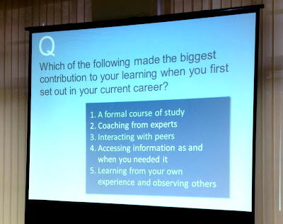
Fig.2. What has contributed most to your learning?

This depends of course on when a person knew they were set on a career path.

How many people come into Learning & Development (L&D) having decided on this path as an undergraduate?

As a graduate trainee I expected a mix of on the job and formal training - this mix turned out to be around 95% to 5% while contemporaries elsewhere were getting 50/50 of none at all. This is the formal way of graduate training and can last two or three years. Think of lawyers (barristers and trainee solicitors), accounts, bankers and teachers ... doctors, dentists, vets and architects.

Clive Shepherd who recently gave an insightful presentation on The New Learning Architect says he got the idea of the new learning architect at presentation gave by Jay Cross on informal learning.  

Away from the presentation I like to click around as for me to understand a concept it helps to perceive its inception.

In turn, if you check the references for Jay Cross’s 2006 ‘Informal Learning: Rediscovering the Natural Pathways that Inspire Innovation and Performance' you’ll find where his ideas may have came from -  Robert A Heinlein (1961) ‘Strangers in a Strange Land’ and R Nelson Bolles (2005) ‘What Color’s Your Parachute’ are there along with John Seely Brown (2005) ‘The Only Sustainable Edge’.

There are some inspirational ideas and link here:

Jay Cross : Important Stuff

Informal learning

Workflow learning ties learning into the actual workflow within an organisation. According to Jay Cross it takes us to support and on-demand services that are designed to exist within the real tasks we do in our everyday work.Out of this work on workflow learning came an even wider, and what he regards as more important set of reflections.
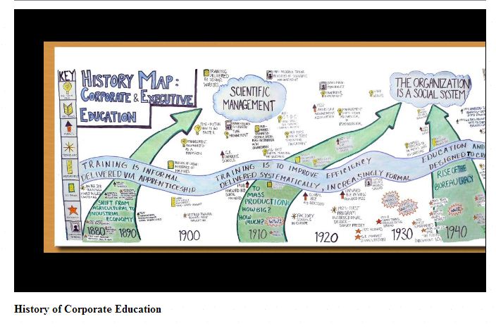


Fig.3. Zoom.It History of Corporate Education.

This timelines the history of corporate and executive training. It is like a touch-screen and zoome control all in one. The Bayeux Tapestry in digital form (now there's an idea over 900 years old). I spotted a typo - you'll find it says something about  ‘Toyota: Clean Production’ rather than Lean Production. We should consider the content in other ways - I know a PLC that set up an internal ‘university’ in the mid 1970s - or maybe they called in a training centre. Same difference?

If Clive Shepherd got his idea of the learning architect from Jay Cross I imagine Jay Cross  in turn got the idea from a Christopher Alexander.

Christopher Alexander's Notes on the Synthesis of Form was required reading for researchers in computer science throughout the 1960s. It had an influence in the 1960s and 1970s on programming language design, modular programming, object-oriented programming, software engineering and other design methodologies.  He is cited through-out the Open University's Masters in Open and Distance Education (MAODE) as an originator of design practice that was applied to computer design and therefore could be applied to e-learning design.

Here's the education of someone who can rightfully call themselves an architect and do so in the context of learning, even of e-learning.

In 1954, Christopher Alexander was awarded the top open scholarship to Trinity CollegeCambridge University in chemistry and physics, and went on to read mathematics. He earned a Bachelor's degree in Architecture and a Master's degree in Mathematics. He took his doctorate at Harvard (the first Ph.D. in Architecture ever awarded at Harvard University), and was elected fellow at Harvard. During the same period he worked at MIT in transportation theory and in computer science, and worked at Harvard in cognition and cognitive studies.

Fig.4. The Timeless Way of Building

'The Timeless Way of Building' proposes a new theory of architecture (and design in general) that relies on the understanding and configuration of design patterns.It is these design patterns that came to the attention of creators of e-learning modules in the 21st century, the idea that designs for subjects or cohorts might be replicated and shared across the online learning community so that you might say a fits an undergraduate arts course, while b is the model for a health & safety module in industry, c gives you language learning in primary school while d offers an elective in urology to 4th year medical students.

To become an architect requires a considerable commitment.

Take the three year undergraduate course in architecture at the University of Cambridge

Entry Requirements: A* AA : Likely to include Maths and Art or History of Art.

Students may stay on at Cambridge to complete an MPhil at RSA exams to qualify in six years (this includes a year in a placement)

‘The three year BA(Hons) course is unusual in the University in combining both arts and sciences. As such it provides a unique range of skills which lead to a wide range of careers, not just architecture’.


Throughout the BA tripos studio work carries 60% of the marks.

The remaining 40% is made up from exams and other forms of coursework (dissertations, etc). Studiowork in all years is handed in for marking at the end of the year. Studiowork is time-consuming and probably requires more hours per week than any other course in the University. Students are also expected to work during the Christmas and Easter vacations.

I labour this point because as someone who has gone from corporate communications and video based training to computer based training and e-learning I would never liken myself to a cardiologist, even a qualified lawyer or certified accountant, let alone an architect. An educator perhaps, but I don't have a formal teaching qualificaiton, only sports coaching and the MAODE when I graduate early next year.
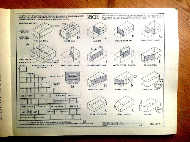
Fig. 5. BRICKS - Building Construction W B McKay 1943

Several other analogies have been used in the e-learning literature, some that still have a building or architecture theme to them.

What we get here is learning design broken down to brick sized components, some call them 'interactivities' (a term I often here working in a design agency). I find the idea of atoms in a chemical reaction (Wiley, 2001) too small, even if we are dealing with binary code it isn't something that we see anymore. Gilly Salmon (2002) would have liked 'e-tivities' to catch on - she puts these in a logical sequence, building blocks towards a module. At the Open University they tend to be called 'Learning Objects'. Chris Pegler (2004) finds this too static and unresponsive preferring if we go with the Lego analogy, or Technics. Littlejohn et al (2008) describe these components as:

Digital assets - a single item, image, video or podcast or an nformation objects: a structured aggregation of digital assets designed purely to present information.

Learning activities -tasks involving interactions with information to attain a specific learning outcome.

Learning design - structured sequences of information and learning activities to promote learning.
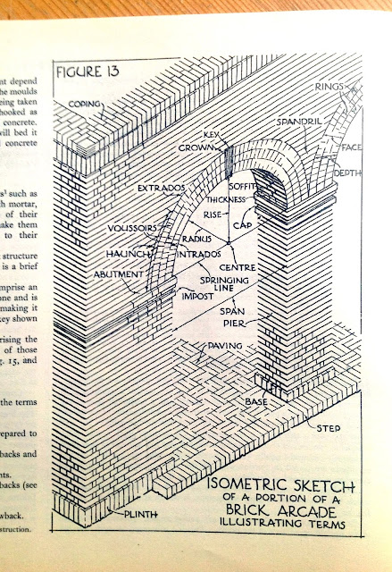
Fig. 5. BRICKS - Building Construction W B McKay 1943

For pure aspiration I like the digital architect as a goal for an undergraduate setting out on a long course of formal and applied study. L&D directors and managers approach an e-learnign agency as they would a firm of architects and together they write a brief. This is propoposed, scheduled and costed then a scheme of work begins.

The delivery, depending on the scale of it, might be akin to anything from a brick arcade (health and safety induction to leisure staff) to a bungalow to a housing estate (induction of trainee solicitors in an national firm of solictors), an office block or a factory (long term management development for an international engineering business).

REFERENCE

Alexander, C (1970) The Timeless Way of Buidling

Cross, J (2006) The Informal Learner

Downes, S (2000) Learning Objects. Available from http://www.newstrolls.com/news/dev/downes/col;umn000523_1.htm

Littlejohn, Falconer, Mcgill (2008) Characterising effective eLearning (sic) resources

Pegler, C and Littlejohn, A (2004) Preparing for Blended e-Learning, Routledge.

Salmon, G (2002) E-tivities

Shepherd, C (2011) The New Learning Architext

Wiley, D.A. (2000) Connecting Learning Objects to instructional design theory: a definition, a metaphor, and a taxonomy. In D.A. Wiley (ed), The instructional use of Learning Objects. Available from http://reusability.org/read/chapters/wiley.doc


Permalink Add your comment
Share post
Design Museum

h810 Activity 21.1 Scripting for the visually impaired

Visible to anyone in the world
Edited by Jonathan Vernon, Saturday, 10 Nov 2012, 06:32

1) Find an example of an online learning resource from your own context that has plenty of visual content that might need to be described for a visually impaired student.

Teaching breaststroke : symmetrical whip kick and glide, arms in front of the shoulders during the pull, head still looking no further than in front of your hands.

Coach Marlins - my swim teaching and coaching blog.

A personal resource, reflection on swimming (masters) and coaching for Mid Sussex Marlins Swimming Club.  A first step towards creating a mobile resource. Below is an excerpt from a typical morning teaching four groups - three grade groups (4.5.7) typically 7 - 11 year olds) and a disability swimming group of children and adults.

See 'The Swim Drills Books'

The introduction read here : YouTube

Grade 7 are technically superior and have more stamina and may be a little older. The ones I watch out for are the 7 year olds in with 10 and 11 year olds as they need a different approach, TLC and play.

WARM UP

  • 3 x 50m warm up of front crawl and backstroke

Always giving a tip before starting them off (and accommodating the odd swimmer who is invariably late), say 'smooth swimming' or 'long legs'. i.e. reducing splashing and creating a more efficient swimmer.

  1. Make sure too that there is a 5m between each swimmer.
  2. 25m of Breaststroke to see what I've got and potentially adjust accordingly.

LEGS

Breastroke%2520breathe%2520kick%2520glide%2520drill%25207.JPG

  • Kick on front with a kicker float.
  • Taking tips from 'The Swim Drill Book'
  • I remember to put as much emphasis on keeping the chin in.

The glide is key - this is where to put the emphasis.

  • May start the 'Kick, Pull, Glide' or better 'Kick, Pull, Slide' mantra to get it into their heads.

ARMS


Breastroke%2520poolside%2520drill%25201.JPG

Standing demo of the arm stroke, from Guzman, forming an equilateral triangle and keeping the fingers pointing away.

  • Will 'describe' the triangle poolside then ask what it is and what kind of triangle.
  • Anything to get them to think about it a little.

Breaststroke%2520poolside%2520drill%25202.JPG

  • I show this as a single action.
  • Other things I might say include 'heart shaped' *(upside down).
  • And making a sound effect 'Bu-dooosh' as I push my arms out.

Breastroke%2520poolside%2520drill%25203.JPG

Repeat the need for a pronounced glide, even asking fo a 2 second count (one Mississippi, two Mississippi)

I support by showing images from 'The Swimming Drill Book' on an iPhone or the Kindle

Leading into the turn we do in sequence (from the shallow end):

    • Push and glide for count of 5 seconds
    • Same, then add the underwater stroke and See how far you can go.

Legs Only Drill (Advanced)

Arms outstretched above the head. No kicker float

  • The whole BR transition counting 3,2,1.

2) Use the resources for this activity to help you to decide which visual content needs describing.

  • The objects that need describing might be photos, diagrams, models, animations and so on.

In the resources I was impressed by the clear, logical, analytical description of some of the complex bar charts, flow charts, pie charts and others. This is how all descriptions should be. In 2010 or 2011 the BBC reviewed how weather forecasts were delivered. It was determined that they were far too flowery. A plainer, clearer approach - overview, identified the region, immediate and forecast weather. Move on. Much more like 'The Shipping Forecast' was wanted and worked better. No more 'weather-caster personalities' then. It isn't entertainment, it is information.

3) For those objects that need describing, decide what kind of description would be needed.

'Before beginning to write a description, establish what the image is showing and what the most important aspects are'. UKAAF

'Consider what is important about the photograph in the context of how the image is going to be used, and how much detail is essential'. UKAAF

In swimming, any description of these visuals should emphasise the purpose of the action, the key action in relation to the physics and physiology of the pull, the action in relation to the rules of competitive swimming.

  • Keep it simple
  • Get to the point
  • Choose the right words

4) Choose two visual objects and write a description of each.

Kick without a float. Arm pull practice standing in water or on the side of the pool.

If you can, ask someone who has not seen these visual objects to read your descriptions. Then show them the object and the context. What was their reaction? (If you have online tools to share visual resources, ask another student in your tutor group to do this activity with you.)

5) Which aspects of this task were straightforward?

Knowing that gender is irrelevant. Putting it in context.

6) Which aspects of the task were difficult?

Care not to use terms or metaphors that the swimmer may not be familiar with if they have never seen them.

Reading text on a diagram and wanting to shut my eyes so that I can hear the description without the image. Need to use screen reader or record and play back.

'Remember that blind or partially sighted people cannot skim read, so let them know how long the description is likely to be'. UKAAF

Knowing what to leave out, being confident to leave something out then knowing how to handle it.

'It is important that information provided for sighted people is also made available to blind and partially sighted people, even if the way the information is given is different'. RNIB (2009)

An author should write with a single reader in mind - in this instance while visual impairment is the modus operandi - they are first of all a swimmer or swim teacher/assistant - so the description must be given with this in mind, which in turn defines the writing/editing process of what to put in or what to leave out.

7) What else might have helped you to do it more easily or helped to improve your descriptions?

Physically moving the student athletes arms and legs through the positions. With their consent, allowing a visually impaired swimmer lay the hands on the arms then legs of someone as they go through the movement.

  • An artist's manikin or a jointed doll, male or female action figure,
  • Braille embossed outline.

'However converting a visual graphic to an appropriate tactile graphic is not simply a matter of taking a visual image and making some kind of "tactile photocopy". The tactile sense is considerably less sensitive than the visual sense, and touch works in a more serial manner than vision. Therefore the visual graphic needs to be re-designed to make sense in a tactile form for blind and partial sighted readers'. RNIB (2009)

In some subjects, interpreting an image or diagram could be a key skill that students are expected to learn.

Drill-down organization

Descriptions should follow a drill-down organization, e.g., a brief summary followed by extended description and/or specific data. Drill-down organization allows the reader to either continue reading for more information or stop when they have read all they want.

Keeping this logic rather than imaging the sighted eye skipping about the page, so I imagine I am not allowed to lift the stylus from the screen ... it has to be ine continuous, logical flow. Constructing a narrative would add some logic to it as well.

10) Can descriptions be done in such a way that you are not giving students the answers?

This was an interesting and relevant point regarding humorous cartoons 'Cartoons and comic strips need to be described if necessary. Set the scene of the cartoon without giving away the joke Provide a brief overview of the image.'

The same therefore applies to 'giving the answer' - treat it as the punch line but leave it out. and like a quiz book say, 'answers on page x'.

11) What do you think your strategy would be if you can’t find a way to give a description without compromising the learning outcomes?

Script differently - this is after all a different audience - and all students are ultimately an audience of one. Perhaps all resources will become highly personalised in future?

12) How can providing descriptions be included in the workflow process of delivering an online module? (This was touched on in the discussion for Activity 17.3.)

  • I liked this quotation:

"When organisations send me information in formats that I can read myself it allows me to be independent, feel informed and appreciated - just like every other customer." End-user UKAAF

From Describing images 2: Charts and graphs

  • Definition of print disability
  • A print-disabled person is anyone for whom a visual, cognitive, or physical disability hinders the ability to read print. This includes all visual impairments, dyslexia, and any physical disabilities that prevent the handling of a physical copy of a print publication.

REFERENCE

RNIB Tactile Images : http://www.rnib.org.uk/professionals/accessibleinformation/accessibleformats/accessibleimages/Pages/accessible_images.aspx

RNIB Image Descriptions : http://www.rnib.org.uk/professionals/accessibleinformation/accessibleformats/accessibleimages/imagedescriptions/Pages/image_descriptions.aspx

Gould, B., O’Connell, T. and Freed, G. (2008) Effective Practices for Description of Science Content within Digital Talking Books [online], National Center for Accessible Media (NCAM), http://ncam.wgbh.org/ experience_learn/ educational_media/ stemdx (last accessed 10 November 2012).

UK Association for Accessible Formats (UKAAF) (undated) Formats and Guidance: Accessible Images [online], http://www.ukaaf.org/ formats-and-guidance#accessible (last accessed 10 November 2012).

University of Aberdeen (undated) Keep It Simple [online], http://www.abdn.ac.uk/ eLearning/ accessibility/ checklist/ keep-it-simple/ (last accessed 10 November 2012).

Permalink Add your comment
Share post
Design Museum

Learning Design looks like this

Visible to anyone in the world
Edited by Jonathan Vernon, Sunday, 4 May 2014, 09:26

Gagnés events of instruction:

1. Gaining attention. The scene opener, even the preview or title sequence.

2. Informing the learner of the objective . Laying out your stall

3. Stimulating recall of prerequisite learning . Tapping into what has already been understood - creating empathy.

4. Presenting the stimulus material . Presenting the case, offering evidence that might impress or inspire, that could be controversial and memorable.

5. Providing learning guidance. Offering a way through the maze, the thread through the labyrinth or the helping hand.

6. Eliciting the performance . Now it's their turn.

7. Providing feedback . Sandwiched, constructive feedback on which to build.

8. Assessing the performance . How are targets going?

9. Enhancing retention and transfer . Did it stick, could they pass it on and so become the teacher?

Permalink Add your comment
Share post
Design Museum

Rethinking pedagogy for a digital age - mind map

Visible to anyone in the world
Edited by Jonathan Vernon, Sunday, 16 Mar 2014, 08:55


Mind map based on two key chapters from 'Rethinking Pedagogy for a Digital Age' by Helen Beetham and Rhona Sharpe.

Click on the image for the Picasa Gallery and download. Created using the iPad APP 'Simple Minds'.

Permalink Add your comment
Share post
Design Museum

Gagne's nine steps for instructional design

Visible to anyone in the world
Edited by Jonathan Vernon, Sunday, 4 May 2014, 12:22

Picking through the OU Library for something on Gagné I found two great articles:

How to use Gagné's model of instructional design in teaching psychomotor skills

and

Using Gagné's theory to teach chest X-ray interpretation

However, no one can tell me how to put an acute accent on Gagné (neither of these reports did so).

Any suggestions?

And how to put an umlaut on Engeström.

I ask as I am fed up having this pointed out in every assignment I submit.


Permalink 4 comments (latest comment by Jonathan Vernon, Wednesday, 8 Aug 2012, 21:41)
Share post
Design Museum

An introduction to rethinking pedagogy for a digital age.

Visible to anyone in the world
Edited by Jonathan Vernon, Sunday, 16 Mar 2014, 08:25

An introduction to rethinking pedagogy for a digital age

Beetham and Sharp

This is my third, possibly my fourth read of the book Rethinking Pedagogy for a digital age. Now that I am in the thick of it working on quality assurance and testing for corporate online learning it has enormous relevance and resonance.

Reading this I wonder why the OU changed the MAODL to MAODE? Around 2000-2003? From the Masters in Open and Distance Learning to the Masters in Open and Distance Education.

Beetham and Sharpe have much to say about the relevance or otherwise of pedagogy and its teaching bias.

Pedagogy = the science of teaching not the activity of learning. (L460: Kindle Reference)

The term ‘teaching; denies the active nature of learning an individuals’ unique capacities to learn (Alexander, 2002) L477

How does e-learning cater for the fact the learners differ from one another in the way that they learn? L477

Guiding others to learn is a unique, skilful, creative and demanding human activity that deserves scholarship in its own right. L477

This quote is relevant to H807 Innovations in e-learning and other MAODE modules:

'Papyrus and paper chalk and print, overhead projectors, educational toys and television, even the basics technologies of writing were innovations once'. L518

I like this too:

The networked digital computer and its more recent mobile and wireless counterparts are just the latent outcomes of human ingenuity that we have at our disposal. L518

  • Learning resources and materials
  • Learning environment
  • Tools and equipment
  • Learning activities
  • Learning programme or curriculum

Designed for:

  • Practice
  • Feedback
  • Consolidation
  • Learning Design – preparational and planning
  • Investigation
  • Application
  • Representation or modelling
  • Iteration
  • Teachers tailor to learner needs
  • Tutors can ascertain who needs what
  • Validation
  • Process
  • QA
  • Review

Are there universal patterns of learning or not?

Pedagogical Thought

Constructivism – Jonassen et al 1999

Social Constructions – Vygotsky 1986

Activity Theory – Engeström et al 1999

Experiational Learning – Kolb 1984

Instructional Design – Gagné et al 2004

Networked and collaborative work – McConnell 2000

Learning Design Jochems et al 2004

I was wondering whether, just as in a story, film or novel requires a theme, so learning asnd especially e-learning, according to Mayes and de Frietas ‘needs to be based on clear theoretical principles.

E-enhancements of existing models of learning.

Technology enables underlying processes common to all learning.

Cf Biggs 1999 Constructivist L737

Teaching for Quality Learning at University Buckingham SRHE OUP


Permalink Add your comment
Share post
Design Museum

Testing and proof reading

Visible to anyone in the world
Edited by Jonathan Vernon, Tuesday, 24 July 2012, 05:55
I find it remarkable to be in such a valued and valuable role for e-learning. Testing might be a nearly finished or finished e-learning product, but proof reading can start with the initial proposal document and the first plans, or blue prints or wireframes for the course itself. I am therefore being a second pair of eyes to support sales, project management, learning design, build and graphics. I am looking to support, comment on or correct grammar and spelling, but also thinking about how well something communicates, whether it works or not - anything to ease the user experience, while adhering to appropriate style guides of course. Along the way I am having my own usage and abusage of English fixed, so at last I can correct who to whom, while deleting commas, and reducing the use of parentheses to aid clarity of communication.
Permalink Add your comment
Share post

This blog might contain posts that are only visible to logged-in users, or where only logged-in users can comment. If you have an account on the system, please log in for full access.

Total visits to this blog: 13019949